Difference between revisions of "Typography In London"
From Londonhua WIKI
| (15 intermediate revisions by 3 users not shown) | |||
| Line 10: | Line 10: | ||
}} | }} | ||
| − | + | =Abstract= | |
| − | + | Our objective was to explore the different typography in London and its history. We will go through defining what typography is with a focus on calligraphy. We also talk about the history of typography and how it transformed the London underground, including the artists who brought it here. We end with our deliverable of Keeping Note; our calligraphy attempts of capturing our observations in different London locations. Our background in humanities includes modern art class along with philosophy and religion. We walked away with a new knowledge of typography and the big role it plays in London. | |
__TOC__ | __TOC__ | ||
| − | |||
| − | |||
| − | |||
<br><br> | <br><br> | ||
| Line 177: | Line 174: | ||
|title = London HUA Home Page | |title = London HUA Home Page | ||
|bodystyle = width:25em | |bodystyle = width:25em | ||
| − | |image = [[File: | + | |image = [[File:OGLondonHUAHomePage.jpg|x450px|alt=Milestone Image]] |
|label2 = ''' ''' | |label2 = ''' ''' | ||
|data2=''Example of diverse fonts and constant updates'' | |data2=''Example of diverse fonts and constant updates'' | ||
| Line 273: | Line 270: | ||
|data2=''Our Practice Notebooks'' | |data2=''Our Practice Notebooks'' | ||
}} | }} | ||
| − | It has been quoted by the calligrapher master and founder of the Underground's first alphabet, “Johnston believed that ‘no man can know “how it is done” until he himself has done the thing.’” <ref>Spencer, H. (1972). Master calligrapher Edward Johnston (1872-1944) [Pamphlet]. London: RCA Galleries Kensington Gore.</ref>Which is why we too decided to try calligraphy for ourselves where his career began. We took a workshop with [http://www.alicegabb.com/ Alice Gabb] called ''Modern Calligraphy for the New & Curious'', where she went on to explain the basics of calligraphy and began to teach us her modern alphabet. Throughout the course of the last few weeks we took what we learned from the workshop to practice and improve our calligraphy. We have each kept a journal with us where ever we went and documented what we saw, heard and observed at different locations throughout London in our calligraphy. Below are our own reflections on learning calligraphy. | + | It has been quoted by the calligrapher master and founder of the Underground's first alphabet, “Johnston believed that ‘no man can know “how it is done” until he himself has done the thing.’” <ref>Spencer, H. (1972). Master calligrapher Edward Johnston (1872-1944) [Pamphlet]. London: RCA Galleries Kensington Gore.</ref>Which is why we too decided to try calligraphy for ourselves where his career began. We took a workshop with [http://www.alicegabb.com/ Alice Gabb] called ''Modern Calligraphy for the New & Curious'', where she went on to explain the basics of calligraphy and began to teach us her modern alphabet. Alice is a professional calligrapher, illustrator, and stationary designer. Her studio is in Hackney which is in East London, and our workshop took place at Hatch Cafe in Hackney. Throughout the course of the last few weeks we took what we learned from the workshop to practice and improve our calligraphy. We have each kept a journal with us where ever we went and documented what we saw, heard and observed at different locations throughout London in our calligraphy. Below are our own reflections on learning calligraphy. |
<br><br> | <br><br> | ||
| Line 286: | Line 283: | ||
}} | }} | ||
<br> | <br> | ||
| − | After reading and learning all about typography we wanted to get a hands on experience so we went to a Modern Calligraphy class hosted by Alice Gabb. Here we learned how to do her modern calligraphy alphabet, and how to correctly hold the quill. Holding the quill was difficult at first as you hold it straight up to where as a pencil is titled. Also you have to be very careful with the strokes you make sing the nib, down strokes use more pressure than upstrokes. The difference in the pressure of the strokes are what makes it modern calligraphy. It took a lot of practice but after the class we felt comfortable enough to take on a project of writing down our observations in a notebook, from the different places we have been. By doing this it allowed us to continue to practice our calligraphy skills that we had just learned. | + | After reading and learning all about typography we wanted to get a hands on experience so we went to a Modern Calligraphy class hosted by Alice Gabb. Here we learned how to do her modern calligraphy alphabet, and how to correctly hold the quill. Holding the quill was difficult at first as you hold it straight up to where as a pencil is titled. Also you have to be very careful with the strokes you make sing the nib, down strokes use more pressure than upstrokes. The difference in the pressure of the strokes are what makes it modern calligraphy. This was the first time I had ever tried calligraphy so it was a learning process. In order for her to be able to tell if we were writing correctly we had to copy her alphabet. When we copied her alphabet it allowed her to see where we were making mistakes. Her alphabet is very whimsical, with long leading lines and very light ends. I could copy her alphabet, but I was not comfortable with the long leading lines of her work. It took a lot of practice but after the class we felt comfortable enough to take on a project of writing down our observations in a notebook, from the different places we have been. By doing this it allowed us to continue to practice our calligraphy skills that we had just learned. Once I learned how to shape all of the letters, I no longer needed the alphabet in front of me at all times to write, so I stopped looking at it. I noticed a change in my hand writing, from simply copying her to creating my own. My calligraphy was still modern with light upstrokes and pressure on the down strokes, but i slowly got rid of the long leading lines, and have more sharp, noticeable ending curves on certain letters. In our background I talked about how any one can copy a handwriting, just like we do in elementary school, and how calligraphy used to be that way until students were told to question what they had been told. I did just that, I questioned the need for long leading lines, as it just made the letters more difficult to connect, and I questioned the ending curves as they were so small they were not noticeable. From there I created my own font, and it was not even intentional, it was just me subconsciously questioning what I had been taught. You can see an example of this change in the gallery. |
<br> <br> | <br> <br> | ||
Keeping the notebook was an interesting experience, as it really had me paying very close attention to my surroundings all the time. Not only did it allow me to notice my surroundings more but it also allowed me to continue to improve my calligraphy. I practiced writing my name at least one hundred times before I finally wrote it down on the first page of my notebook, and with the gold ink it was a great start to this project. My next page says London HUA and I was so excited with how my first page had turned out that my writing became a little slanted. I think it was important though that there was an imperfection at the very start of the notebook, otherwise the mistakes I made later on would have been more difficult to deal with. This showed me that calligraphy is not easy and you will make mistakes. One common occurrence was that sometimes I would interchange the cursive alphabet that we learned in elementary school, which looks okay but it was not technically correct. Another mistake I would sometimes make would be spelling, even on simple words, I got into the flow of the nib on the paper and not having to think about the next letter that I would write the wrong one. Some other observations made form this project were that some words just do not look right in calligraphy. We were sitting eating lunch one day by the Thames and there was a group of people working out who were on their lunch break. I had written down a ton of quotes from them that were very funny but included a lot of curse words. When I went to write these quotes down they just did not look like they belonged in such delicate writing. This was a perfect example of typography, and how certain words need a different font in order to convey it's meaning. In the end this project was a great way to put our background down onto a piece of paper, and get to experience typography. | Keeping the notebook was an interesting experience, as it really had me paying very close attention to my surroundings all the time. Not only did it allow me to notice my surroundings more but it also allowed me to continue to improve my calligraphy. I practiced writing my name at least one hundred times before I finally wrote it down on the first page of my notebook, and with the gold ink it was a great start to this project. My next page says London HUA and I was so excited with how my first page had turned out that my writing became a little slanted. I think it was important though that there was an imperfection at the very start of the notebook, otherwise the mistakes I made later on would have been more difficult to deal with. This showed me that calligraphy is not easy and you will make mistakes. One common occurrence was that sometimes I would interchange the cursive alphabet that we learned in elementary school, which looks okay but it was not technically correct. Another mistake I would sometimes make would be spelling, even on simple words, I got into the flow of the nib on the paper and not having to think about the next letter that I would write the wrong one. Some other observations made form this project were that some words just do not look right in calligraphy. We were sitting eating lunch one day by the Thames and there was a group of people working out who were on their lunch break. I had written down a ton of quotes from them that were very funny but included a lot of curse words. When I went to write these quotes down they just did not look like they belonged in such delicate writing. This was a perfect example of typography, and how certain words need a different font in order to convey it's meaning. In the end this project was a great way to put our background down onto a piece of paper, and get to experience typography. | ||
<br><br> | <br><br> | ||
| + | <gallery> | ||
| + | EWfirstnameattempt.jpg| ''The first attempt at writing my full name'' | ||
| + | EWrecentnameattempt.jpg| ''How I write my name now'' | ||
| + | EWfirstattemptalpha.jpg| ''How my alphabet looked when I copied straight from her page'' | ||
| + | EWfirstpage.jpg| '' First page of my notebook'' | ||
| + | EWsecondpage.jpg|'' Second page of my notebook with slanted writing'' | ||
| + | EWfirstfullpage.jpg| '' First page full of notes'' | ||
| + | EWmiddlefullpage.jpg| ''One of the last pages of taking notes'' | ||
| + | </gallery> | ||
==Olivia's Experience== | ==Olivia's Experience== | ||
| Line 305: | Line 311: | ||
This project has forced me to stop and really observe and appreciate what is around me. From taking time to sit in parks, by the water, at shows or even on transportation I had actively listened to the conversations around me. I have learned more about the people of London than I thought I would which makes it really interesting. And having to write all the words, observations and quotes in calligraphy has taught me hands on the power of typography. For example, I wrote the word ‘Screech’ since it was the sound the train made as it rounded the corner, but writing it in a delegate curvy line felt wrong. The word screech, to me, made me think it should be in bold or times new roman not an elegant font. <br><br> | This project has forced me to stop and really observe and appreciate what is around me. From taking time to sit in parks, by the water, at shows or even on transportation I had actively listened to the conversations around me. I have learned more about the people of London than I thought I would which makes it really interesting. And having to write all the words, observations and quotes in calligraphy has taught me hands on the power of typography. For example, I wrote the word ‘Screech’ since it was the sound the train made as it rounded the corner, but writing it in a delegate curvy line felt wrong. The word screech, to me, made me think it should be in bold or times new roman not an elegant font. <br><br> | ||
| + | |||
| + | Over the course of the few weeks I was able to see my own typography start to take place as I began to adapt Gabb's own alphabet to my liking. This is what makes typography unique and diverse. For me it can be seen I prefer to write smaller and thinner, which means I barely hold any pressure on the quill both on the up and down stroke. Also I emphasized the lead in and end tails, the curly lines before and after each letter. And with the longer led in lines my letters are more spaced out, creating a softer read as the letters are spread out in a flow and not crammed together. All these little features took me forever to complete during the first few days of practicing, but now I don't have to think twice about how the letters connect or what the letter shape is. I know my own alphabet and can write a lot quicker, producing journal pages more quickly too. <br><br> | ||
Overall I have really enjoyed this project, learning how to analyze and now appreciate all that is around me- WORDS!- and learning a new skill which I hope to keep up with and continue to improve. I am excited to get home to create more signs and letter headings for gifts and decoration, no more Etsy shopping when I have the knowledge, materials and skills to do it myself! <br><br> | Overall I have really enjoyed this project, learning how to analyze and now appreciate all that is around me- WORDS!- and learning a new skill which I hope to keep up with and continue to improve. I am excited to get home to create more signs and letter headings for gifts and decoration, no more Etsy shopping when I have the knowledge, materials and skills to do it myself! <br><br> | ||
| − | <gallery mode=packed> | + | <gallery mode=(packed)> |
file:OGworkshopsetup.jpg|Workshop Set Up | file:OGworkshopsetup.jpg|Workshop Set Up | ||
file:OGwriting1stday.jpg|Workshop Practice In Progress | file:OGwriting1stday.jpg|Workshop Practice In Progress | ||
file:OGnamecalligraphy.jpg|First Try at My Full Name | file:OGnamecalligraphy.jpg|First Try at My Full Name | ||
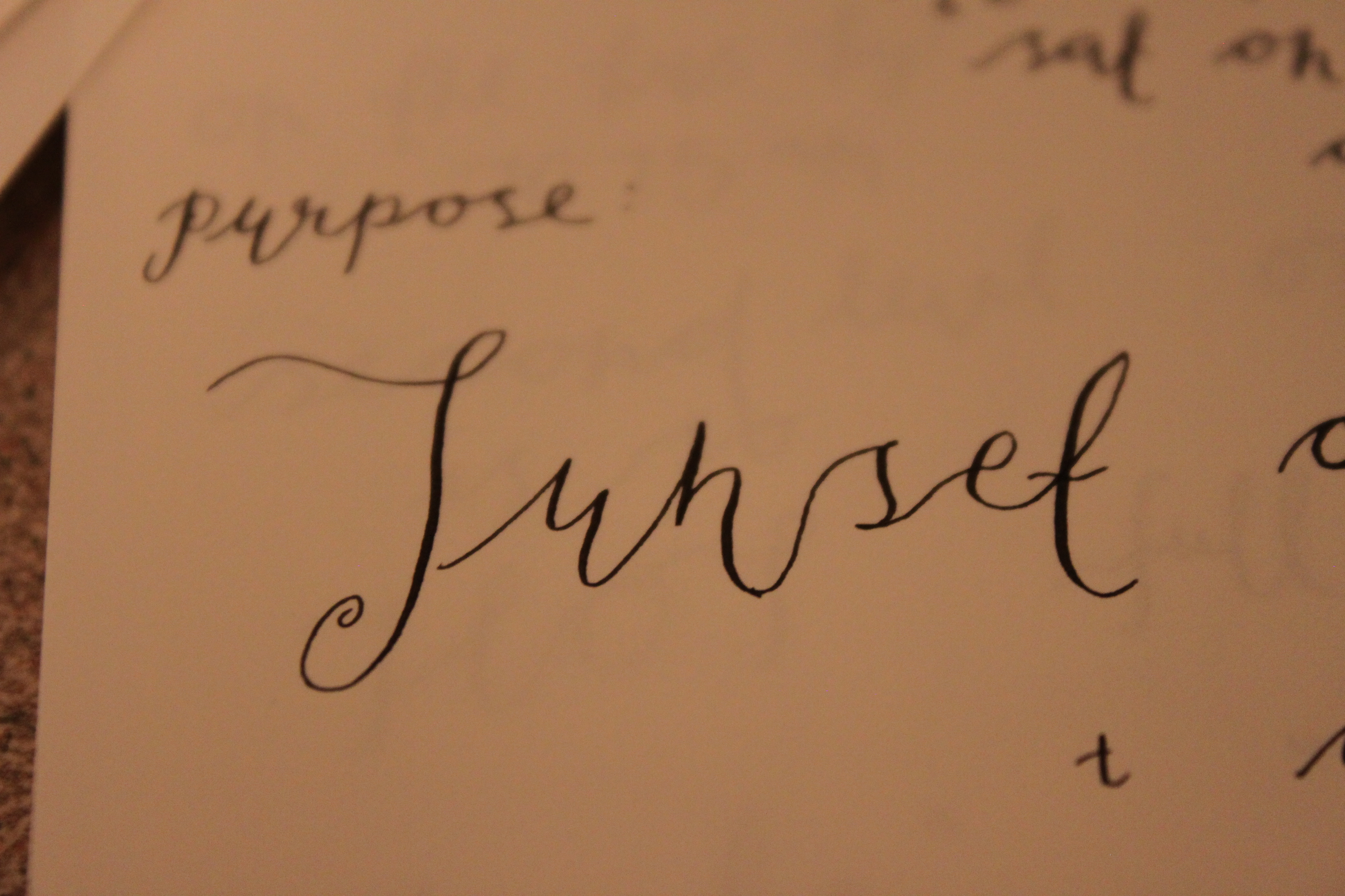
| − | + | OGbigsunset.JPG|Big Letters and Spacing "Sunset" | |
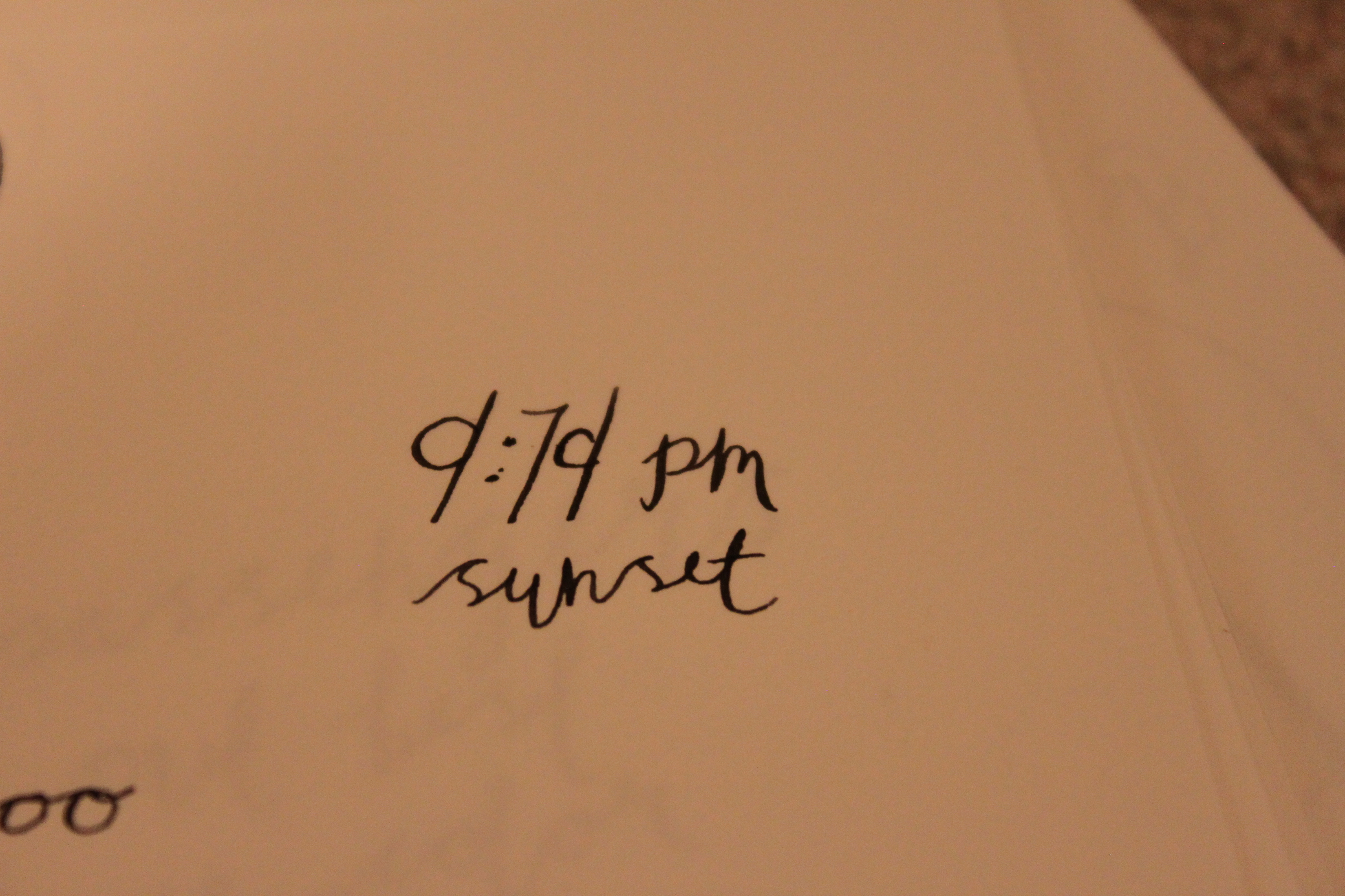
| + | OGlittlesunset.JPG|Tiny Letters and Spacing "Sunset" | ||
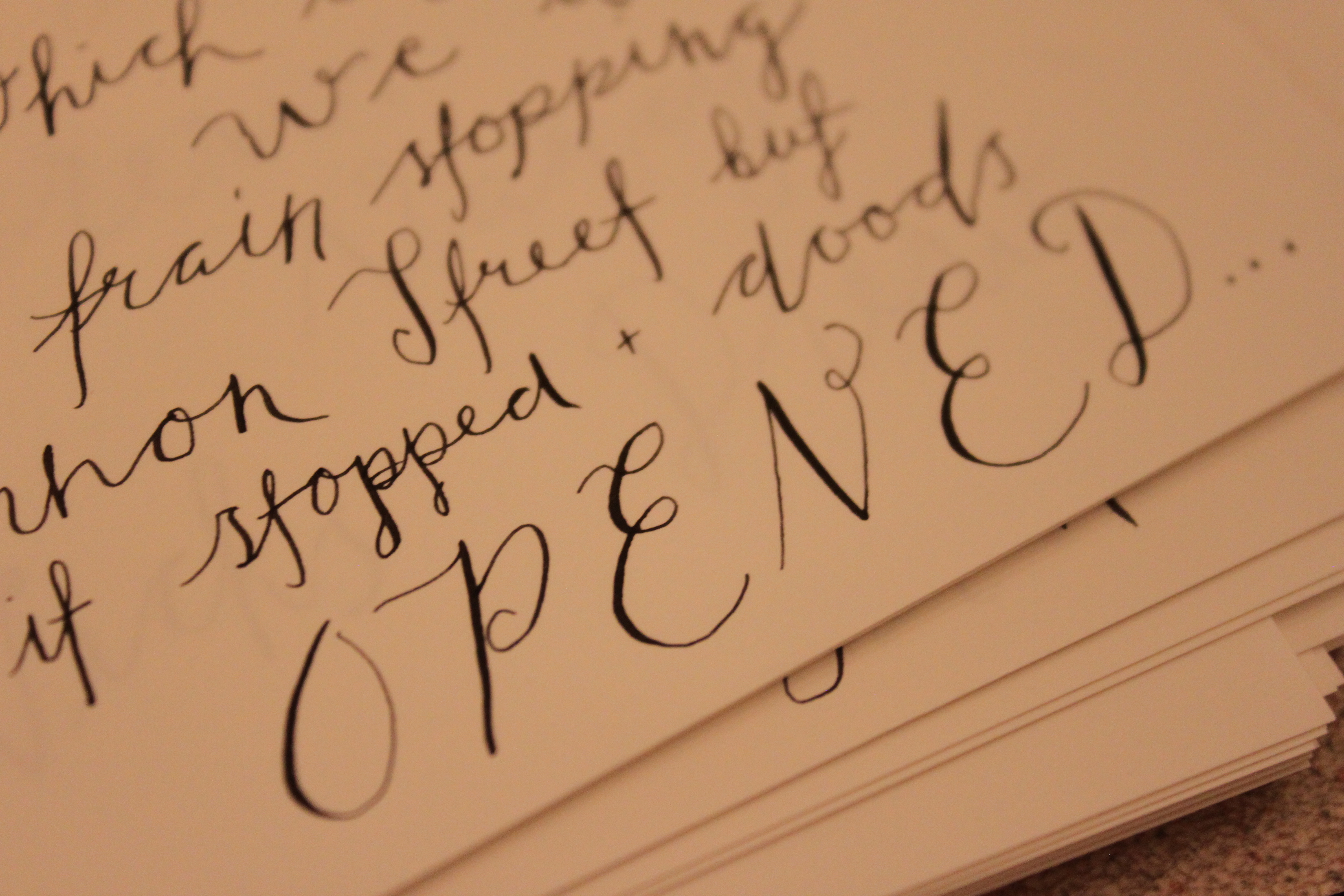
| + | OGcaps.JPG|Capital Letters Unattached "OPENED" | ||
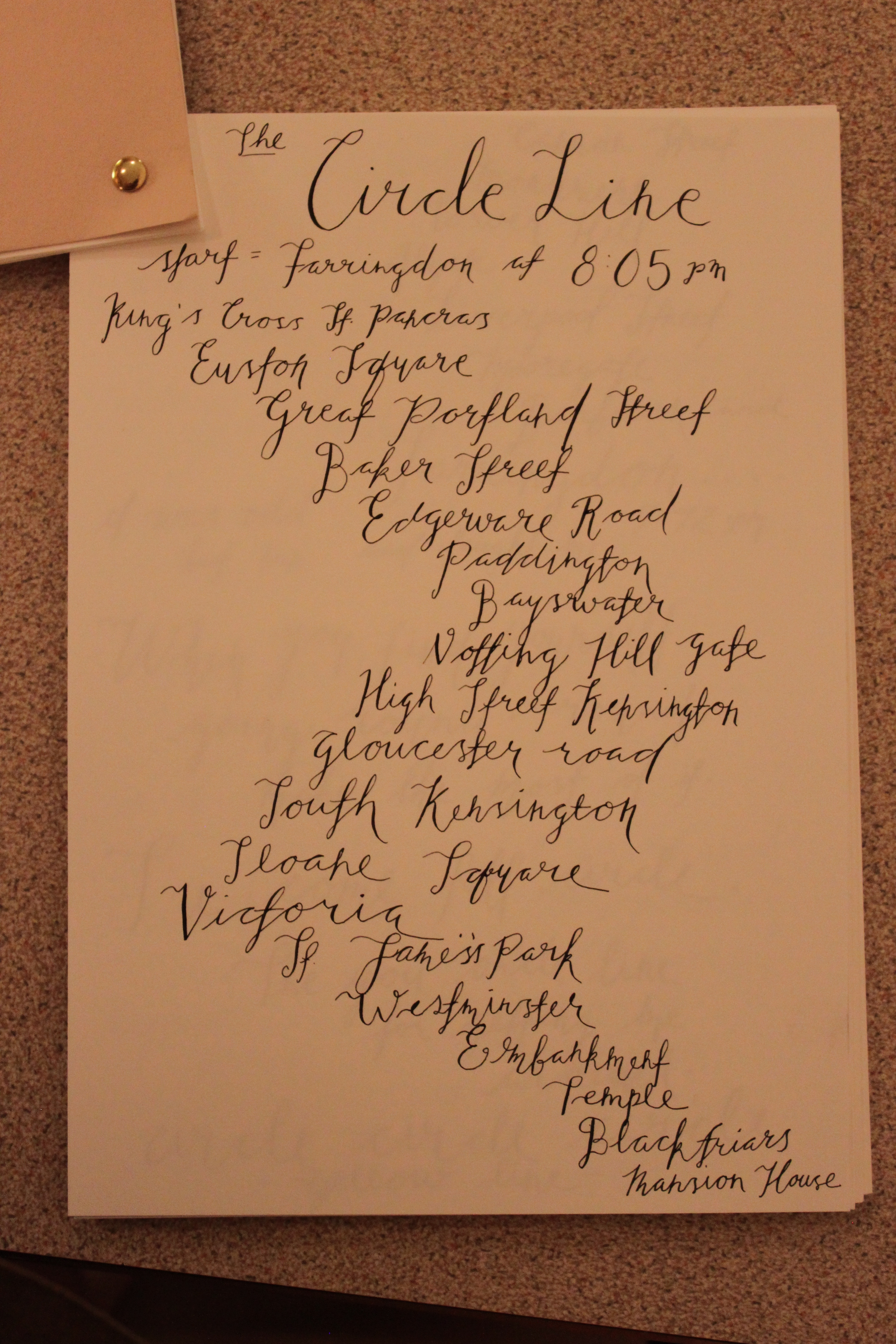
| + | OGCircleLine.JPG|Circle Line Varying Page Arrangement | ||
| + | OGdark.JPG|Thin and Thick Lines | ||
| + | OGquote.JPG|Quoted Passenger | ||
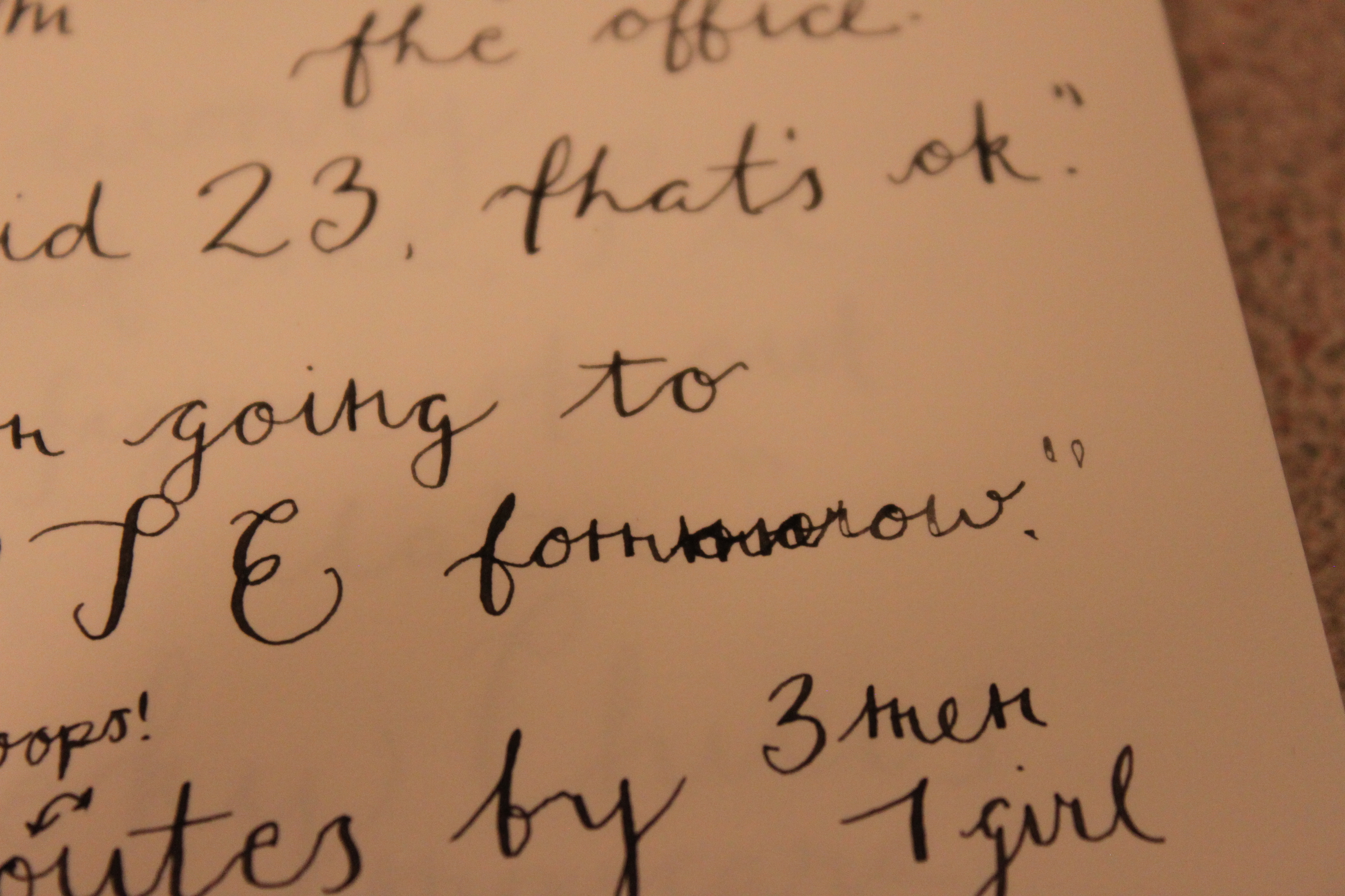
| + | OGspeltwrong.JPG|Misspelling Tomorrow and Ink Low | ||
</gallery> | </gallery> | ||
<br><br> | <br><br> | ||
| + | |||
=Gallery= | =Gallery= | ||
<gallery mode="packed"> | <gallery mode="packed"> | ||
| Line 325: | Line 340: | ||
Image:OGOutoftheDarkintoLight.jpg | Image:OGOutoftheDarkintoLight.jpg | ||
Image:OGSweetLikeChocolate.jpg | Image:OGSweetLikeChocolate.jpg | ||
| − | Image: OGReal.jpg | + | Image: OGReal.jpg |
| + | Image: EWfine.jpg | ||
| Line 348: | Line 364: | ||
<br><br> | <br><br> | ||
[[Category:Art Projects]] | [[Category:Art Projects]] | ||
| + | [[Category:2017]] | ||
| − | [[Category: | + | |
| + | |||
| + | |||
| + | <!--DO NOT COPY THE FEATURED CATEGORY CODE BELOW--> | ||
| + | [[Category:Featured Projects]] | ||
| + | <!--ONLY LONDON HUA ADVISORS MAY USE THE FEATURED CATEGORY TAG ABOVE--> | ||
Latest revision as of 17:10, 22 June 2017
Typography in London
by Emily Wilson and Olivia Gibbs
 | |
| Example of the variety of fonts available and Gills Sans | |
Abstract
Our objective was to explore the different typography in London and its history. We will go through defining what typography is with a focus on calligraphy. We also talk about the history of typography and how it transformed the London underground, including the artists who brought it here. We end with our deliverable of Keeping Note; our calligraphy attempts of capturing our observations in different London locations. Our background in humanities includes modern art class along with philosophy and religion. We walked away with a new knowledge of typography and the big role it plays in London.
Contents
- 1 Typography in London
- 2 Abstract
- 3 Introduction
- 4 Section 1: Background
- 4.1 Defining Typography and Calligraphy
- 4.2 History of Typography
- 4.3 What is Typography?
- 4.4 Anatomy of Typography
- 4.5 Speaking, Reading, and Writing Typography
- 4.6 Not Just Letters
- 4.7 Learning Typography
- 4.8 Where to find Typography
- 4.9 Recognition of Lettering in Britain
- 4.10 Edward Johnston
- 4.11 Eric Gill
- 5 Section 2: Deliverable
- 6 Gallery
- 7 Conclusion
- 8 Attribution of Work
- 9 External Links
- 10 References
Introduction
What is typography and how does it relate to London? This is the question have answered, by covering everything from the history of typography, the detail that is put into each letter, and where you can see it on your everyday commute around London. If you ever have made a poster, and struggled with choosing the right font, this page will help you think through the important decision. Many people have looked into the London Underground, but instead of looking at the transportation system itself, we have looked into why the underground sign catches your eye. A very common type of typography is calligraphy, and in our deliverable we show how even the inexperienced can attempt to learn the trade.
For our background we started out by researching typography, calligraphy, and famous London Typographers. After we did a lot of research we went to a calligraphy lesson, in order to gets some hands on experience with the trade, as well as first hand information from a practicing calligrapher. All this information was put together in order to get a solid background before we tackled practicing calligraphy ourselves for our deliverable.
Section 1: Background
Defining Typography and Calligraphy
The definition of Typography is the style, arrangement, or appearance of a type set matter. [1] It is a word that encompasses all the types of writing and print that we see around us everyday. Calligraphy is artistic, stylized, or elegant handwriting or lettering. [2] Each brushstroke of written text, weighs differently in order to convey a different message. Master calligraphers not only write but they draw what they observe. Calligraphy can be seen as the reproduction of rhythms and movements of the world. [3]
History of Typography
While there is no precise starting date when is comes to typography what we do know is that what was being taught in the 1900s was the result of publications that were seen fifty years earlier.[4] Handwriting is influenced by parents and teachers, so in typography you will see the past continually repeat itself.[5] In a survey by Reginald Piggot, he found that 43% of people today still write in a civil service hand which is a simplified model of the Copperplate handwriting, which is a type of cursive handwriting. This type of handwriting was introduced to Great Britain in the 1860's and was taught in schools beginning in the 1920's. [6] The handwriting we use today can be traced back to the letters and writing of Roman times and beyond. While typography has not changed drastically over time, it has changed to suite our current needs. [7] Professor Julian Brown stated, “ The successive cursive scripts of western Europe have all been generated out of set scripts by the need to write quickly: pen-lifts have been eliminated, and new letter-forms have evolved more or less automatically. Once in being the cursives have been promoted from the world of day-to-day affairs and correspondence into the formal worlds of books and the solemn diploma; and when this has happened they no less than the set scripts, have been subjected to stylization, systematization and elaboration.” [8]
What is Typography?
 | |
| Example of the authority of the font | |
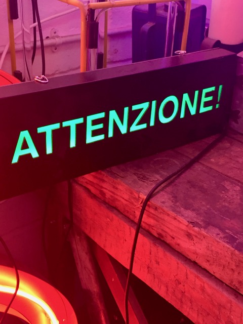
Typography has changed a lot over the years, especially with the introduction of digital technology. With this change, typography has become something that everyone does almost every single day, even though most do not realize it. From the definition above you can see how typography is generally associated with the design and printing industry. The word "typography" itself is used to refer to the arrangement of any written material. Thanks to the advancements of technology everyone can be a typographer! The discipline of typography is the professional practice that is the mediator between the contents of the message and the person reading it. [9] An example of this is when is come to the "authority" of typography. When a sign is put up by the government, such as road signs, and parking notices, they have consistent lettering which gives it authority. The consistency of the spacing and sizing of the letters is what gives it the authority. When someone writes something on a piece of paper, or on the wall such as no parking, and the spacing is off, the letters are different sizes, the inconsistency gives it a lack of authority. The same thing happens when a sign is not maintained, if letters are peeling off or it is faded it loses authority. [10] This is an example of typography in our every day lives, and how it impacts us, without us even knowing.
Conventions of Typography
 | |
| Example of same page in journal but different style of modern calligraphy | |
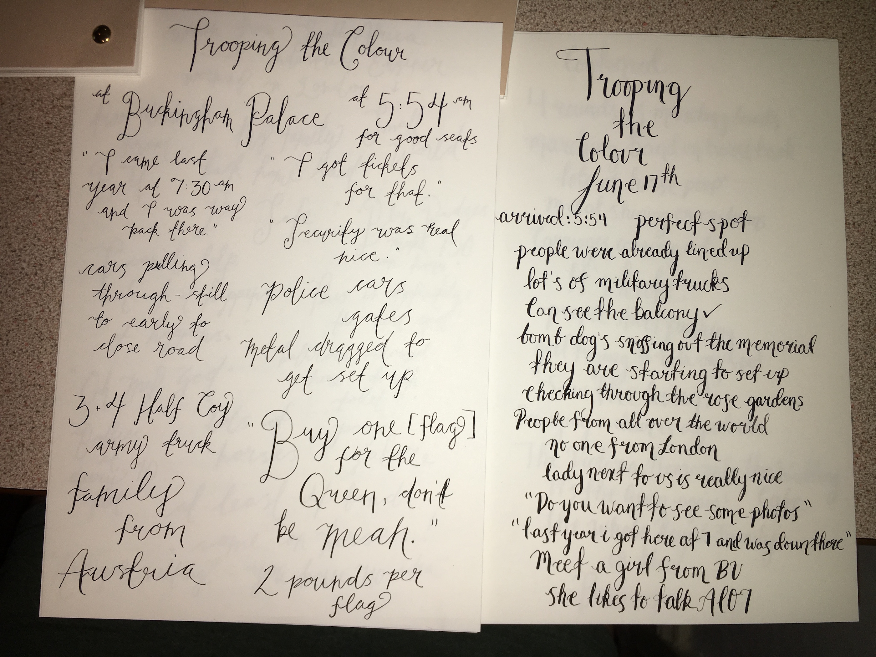
While some typography is taught in schools, mainly a version of Copperplate handwriting, there is not usually and explanation of where all the conventions came from, and what the purpose of them is. Some of the conventions of typography include but are not limited to, how to draw and write letterforms clearly, how to present words, sentences, paragraphs, how to arrange text on paper, and how to provide emphasis. [11] There are so many basic principles of typography that are often ignored, people realize the importance of these conventions when they go to make a flyer or poster, and see that they are not easily able to get the message across that they wanted to. People do not realize it, but you are thinking about some of these conventions in your head, whenever you are making some sort of visual aid. However, people do not know the correct uses of the conventions, so they do not end up being of much help. [12]
In the past many typographers believed that the art form that they participated in was an activity in which it was not possible to produce something that was correct.[13] Typography used to be considered a discipline in which standards were set by professionals, and the goal was to reach that standard. When working this way, it does not leave much room for creativity, and therefore creates a right and a wrong way to do things. [14] This process actually made the work of typography more complex. Efficiency however became of importance, and any changes you could make to speed up the process would save a lot of time, and were appealing. After World War II is when changes started to be made in the way the rules were followed. It was encouraged in schools to question the conventions, and people started to realize that there was not a need for rules and formulas in typography. [15]
Work as a Typographer
There are many specialists in the area of typography who study the varying aspects of typography. There has been analysis of the letters of the alphabet and the forms that the letters take. The specialists include a wide range of people from type designers, art and design historians, manufacturers, etc. A typographer deals with everything on the page or screen and anything and everything that many contribute to the effectiveness of the typographic information. [16] They have to look at shape, weights, and sizes of individual letter forms, diacritics, punctuation marks and special symbols, the amount of space between characters, words, punctuation, the space between lines, the size of margins, the position, size, and weight of page headings and associated page numbers inside them, the selection figures, and reference material. A typographer not only looks at just characters, but also tables and diagrams, which can require captions. The typographer goes beyond the characters themselves and chooses the method of printing, the paper, and all the finishing elements including laminates, varnishing, creasing and binding.[17]
When a typographer is trying to create the arrangement of text for a science textbook, or business card, they have to look at the relationship of social practice and spoken language to typography. How effective text comes across is all a part of the work of a typographer. Joseph Moxon wrote in Mechanick Exercises, “ A good [typographer] is ambitious as well to make the meaning of his author intelligent to the reader, as to make his Work shew graceful to the eye, and pleasant in reading: Therefore if his Copy be Written in Language he understands, he reads his Copy with consideration; so that he may get himself into the meaning of the Author, and consequently considers how to order his Work the better both in the Title Page, and in the matter of the books: As how to make his Indenting, Pointing, Breaking, Italicising &c. the better sympathise with the Author’s genius, and also with the capacity of the Reader.” [18] . In this quote Moxon had intentional capitalization, and punctuation that we are not used to seeing. When reading that quote those "mistakes" throw you off, and it shows the importance of the work of a typographer.[19]
Aspects of Typography
 | |
| Example of a basic font | |
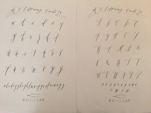
With the many different aspects of typography including the terminology, the technology, the rule-bound conventions and micro-attention to details; it give people the impression that it is a discipline of much precision. Surprisingly though, there is very little about typography that is actually precision based, as there is not much written down about what is considered "necessary" when it comes to typography. [20] If you want a very comprehensive font there is a basic range of characters that is used in any lengthy text that you will need. The characters include, capitols, lowercase, lining and nonlining numerals, punctuation, small capitals, diacritic characters, mathematical characters, currency symbols, referral characters, graphics such as bullets and braces, and ligatured characters, two or more characters combined to make one character. They should be in at least roman and italic, and at least in two weights.[21] While it may require all those characters to make a very comprehensive font, there is no standard that describes what might be considered a font. A font could just be 26 characters and a few punctuation marks. If you want a comprehensive font, it could easily add up to more than 1,000 characters. Some fonts can contain more and some can contain less, which shows how every font is different. There are technically no standards having to do with the weight of characters, and how many different weights are needed. There is not even a standard way to measure and describe the weights. Even the angle of the italicized characters can differ slightly from font to font, there are some cases where the italicized version is just a sloped version of the roman characters.[22]
While knowledge, experience, and practical limitations are what have “regulated” typography, there is a lot of room for interpretation. Typography is often known for precision and exactness, and many people appreciate that fact as it is something they can understand. Nowadays in school typographers are taught that texts can be designed with a passion, and it is not all about exactness.[23]
Using Fonts
Every time a typographer sees a new message they are presented with a new problem to solve. They need to figure out what to use for the typeface, size, fit and arrangement, and its not easy as the typeface must fit with is purpose. They are presented with the goal of connecting the text to the reader, and there are many different ways they can do that. The nature of font design is the result of a few factors including, historic, cultural, and technological advancements. All these changing factors allow new fonts to be created, each with a new purpose. [24]
Anatomy of Typography
 | |
| Base Line | an example of x-height |
|---|---|
As mentioned earlier there are a lot of different factors that go into making a good font, or a good form of typography. This section will explain this further.
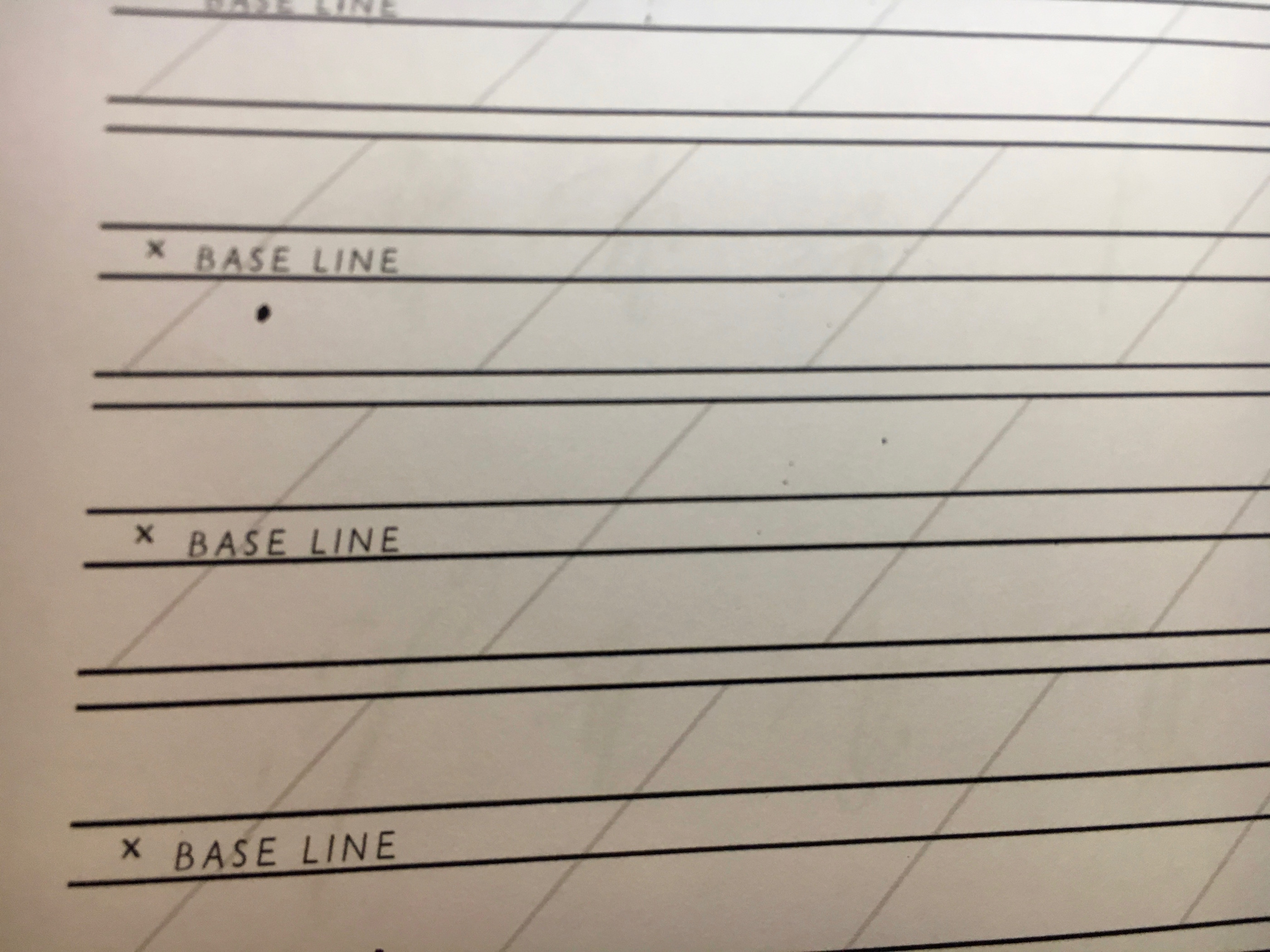
Legibility is extremely important when designing a font. Mentioned earlier was readability, but legibility is different, its the ability of the letters to be distinguished from one another. One example of this is Edward Johnston's Underground font. It is important that all the letters are clearly legible in the fast paced environment, and that people are able to read the stations signs with names that they might not be familiar with. When you are looking for a legible typeface the characteristics include larger open or closed spaces, which means a larger x-hieght. [25] You have to be careful with a lager x-height however because that means you will have shorter ascenders and descenders, and this can cause confusion between certain letters such as i and l. Large counters are also very important when it comes to being able to tell the difference between letters such as e, a, s, c, and o. The size of the font also plays into how legible it is. Many people cannot read small text, so if your font is 6pt or smaller most of your audience will not be able to read it.[26] One last aspect that plays into legibility is the contrast between the background and the color of your font. If the tone of the two is close, then the text will be less legible. Something to keep note of is that when printing black ink on glossy white paper, it will actually become less legible than printing it on matte paper, because of the reflection of light. Something which is very similar to legibility but slightly different is readbility. [27]
 | |
| Examples of different spacing and styles used on the same phrase | |
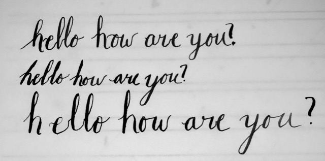
When we learn how to read, we learn different skills which are necessary to read all the different categories of information. As talked about earlier the ability to read, and read quickly depends on the arrangement of letters. When there is a "surprise" in what font is used, it actually slows us down as it takes longer to process because we are not used to reading it.[28] This is why there are a small range of fonts that are commonly used everywhere from the school to the office today. As talked about earlier, every font is legible, and you can make it readable with practice, but some fonts will always be less efficient to read than others. The best type of font you can have is a predictable font, as it allows the reader to easily skim through the text. Not only is how something is written important, but also the letters that make up the reading. [29]
The alphabet we use is the latin alphabet, made up of 26 characters. Unfortunately it is not a great match for modern spoken English. They way we pronounce things today we need more characters. Because of this only 75% of English spelling is predictable. The other 25% of words is made up of some of the most commonly used words in both written and spoken English. [30] There are also many dictionaries for the same language, and they do not all agree on the spelling of words. For example in the English alphabet the u is still used in, for example, colour and honour, which in the North American dictionary would be color and honor. When a typographer is working for an author they have to pay very careful attention to the spelling as they are responsible for the presentation of the text. Proofreading is a skill that while separate from typography is very important for typographers to have. Besides proofreading, there is another component to typography that can change the entire meaning of a sentence. [31]
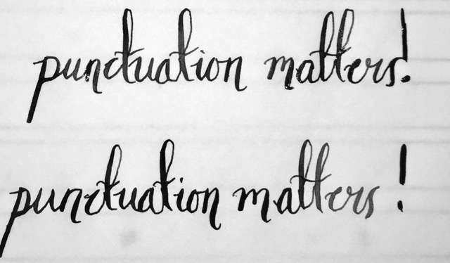 | |
| Example punctuation placement in calligraphy | |
Most type fonts will include about 24 different signs of punctuation. The punctuation that we use today comes from what was used in classical rhetoric. At first punctuation was used when where there would be breaks or pauses in the spoken language. Now however it is used when there are spaces needed, or when it is the end of the statement. This change is what makes our writing and speech different today. Not only is what ends the sentence important, but so is the spacing between the characters.[32]
Spaces in between letters, words, paragraphs, and statements can change the inflection of what is being written. The careful introduction of a space will cause a pause, and can be used to add effect. In academic writing you will see more space, as the spacing allows the writing to be thoroughly examined, which is necessary when people are using text for research. In novels you will notice there is less spacing, as the goal of the typographer is to continue the flow of the story. [33] The spacing also influences the effect of punctuation, such as using exclamation points and question marks. When an exclamation point is used immediately after the last word ( last word!) it does not apply the same emphasis as if you were to use a space ( last word !). The same thing goes for a question mark, by adding in the space the punctuation now applies to the whole statement, rather than just the last word. [34]
There is a lot more that goes into the anatomy of typography but these are some of the most important factors, that look at the different aspects of typography. As a typographer there is a lot that needs to be taken into account, even in just one sentence.
Speaking, Reading, and Writing Typography
 | |
Speaking is known as an informal activity, because you do not really pay attention to the efficient use of language when you are talking. The meaning of what you say can be repeated, rephrased, and elaborated using facial expressions and physical gestures, which cannot be done over written correspondence. [35] Writing is known as a formal activity because it requires the efficient use of language, and should be able to function by itself, as you will not be able to see a visual response to show whether or not what you have written was understood. This is why often times over a message, if there is not correct typography chosen, there can be misunderstandings and confusion.[36] Because writing is more formal, it is used in the cases of relaying and displaying very important information. Because the reader can go back to it as many times as they want written material can cover more complex subjects. Typographers have to be aware of how we use inflections, pace, and volume in our voices to show emphasis, expression, and even clarification in the printed word. [37]
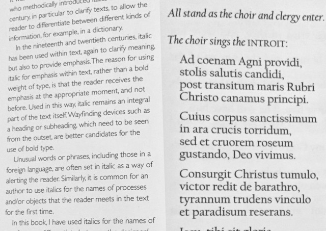 | |
| on the left is text from a book, on the right is text from a mass pamphlet | |
The results that are seen from studies that look into how we read are often seen as controversial as it is not easy to obtain information on what exactly is happening. [38]When you test people after they have read something they can tell you about what they have read, which shows what material was retained but not how they read it. One thing that has been established though is that while we are reading our eyes do not follow a line of words in a straight, smooth, paced patters. Our eyes actually move in what is called saccades, or “the flick of a snail”. [39] This is shown by looking at where the eye lands, which is called a fixation. When reading, the reader usually makes three or four fixations per second. Even though fixations are short, studies have shown that the eye and brain can recall between three or four letters, or a few short words, in just one hundredth of a second. Typographers take this into account when deciding which size type they should use. Readers are more efficient when they can identify more letters in each fixation, which tells typographers that the size font they use should not be any larger than necessary. Research shows that the agreed upon size for continuous text is between 10pt and 12pt font. [40]
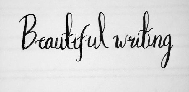
Calligraphy is the art of handwriting, or hand written typography. In Greek Calligraphy means “ beautiful writing” and is an art form in Asia, China, Korea, Japan, and Arabic speaking countries. [41] In order for typographers to communicate effectively through handwriting, it is generally expected that the text will be conventional. Unique and complex text, will slow down the reader, which is why it is not often seen.[42]
Not Just Letters
Typography, in a written form is greatly dependent on the writing utensil you use. As a pen changes, you might need to change the way you hold the pen. Ink flows differently in different types of pen and this is why the grip may need to change. [43] When a quill or nib was used for the Copperplate-based writing the hand was not firmly on the writing surface with the only support coming from your pinky finger. The light pressure allows you hand to glide more freely. [44] The way it is taught to hold pens now is to have the hand resting on the table, this slight change in support created the need to use print script and semi cursive models. Copperplate-based cursives do not work well today for a combination of reasons including the fact that they do not work well with free flowing pens, and the fact that we need to have our hand firmly supported in order to hold modern pens.[45] When switching from pencil to pen, the change in how you hold them becomes evident. You cannot hold a pencil the same way as a pen, because of the amount of pressure needed to use them differs, resulting in two very different holds. [46]
Learning Typography
There are three colleges for calligraphy in Britain, the East Surrey College, Regiate, Digby Stuart College, and the City of Guilds of London Art School. [47] In order to effectively teach lettering you have to look at the person using it, and what the purpose is. Some lettering might be great for an adult, but very difficult for a child to use. A student can sit down with a copy book in front of them and learn a model type if a teacher helps them. When a student learns in this way though it then becomes difficult for them to break the mold that they learned and create a style that works well for them. In personal writing there are many shortcuts you can take, but they will vary depending on the person. When it comes to teaching typography and handwriting there are not guidelines for good or bad handwriting as that all depends on the eyes of the reader. [48] There are also two professional associations for Calligraphy in Britain. There is the Society of Scribes and Illuminators which was founded in 1921 for “the advancement of the crafts of writing and illuminating by the practice of them for themselves alone” and the Letter Exchange which was formed in 1988 and is a group of designers, artists, and craftspeople who are “devoted to the professional expression of fine and imaginative lettering, to all its forms, to a wider audience”. [49]
Where to find Typography
In Business Settings
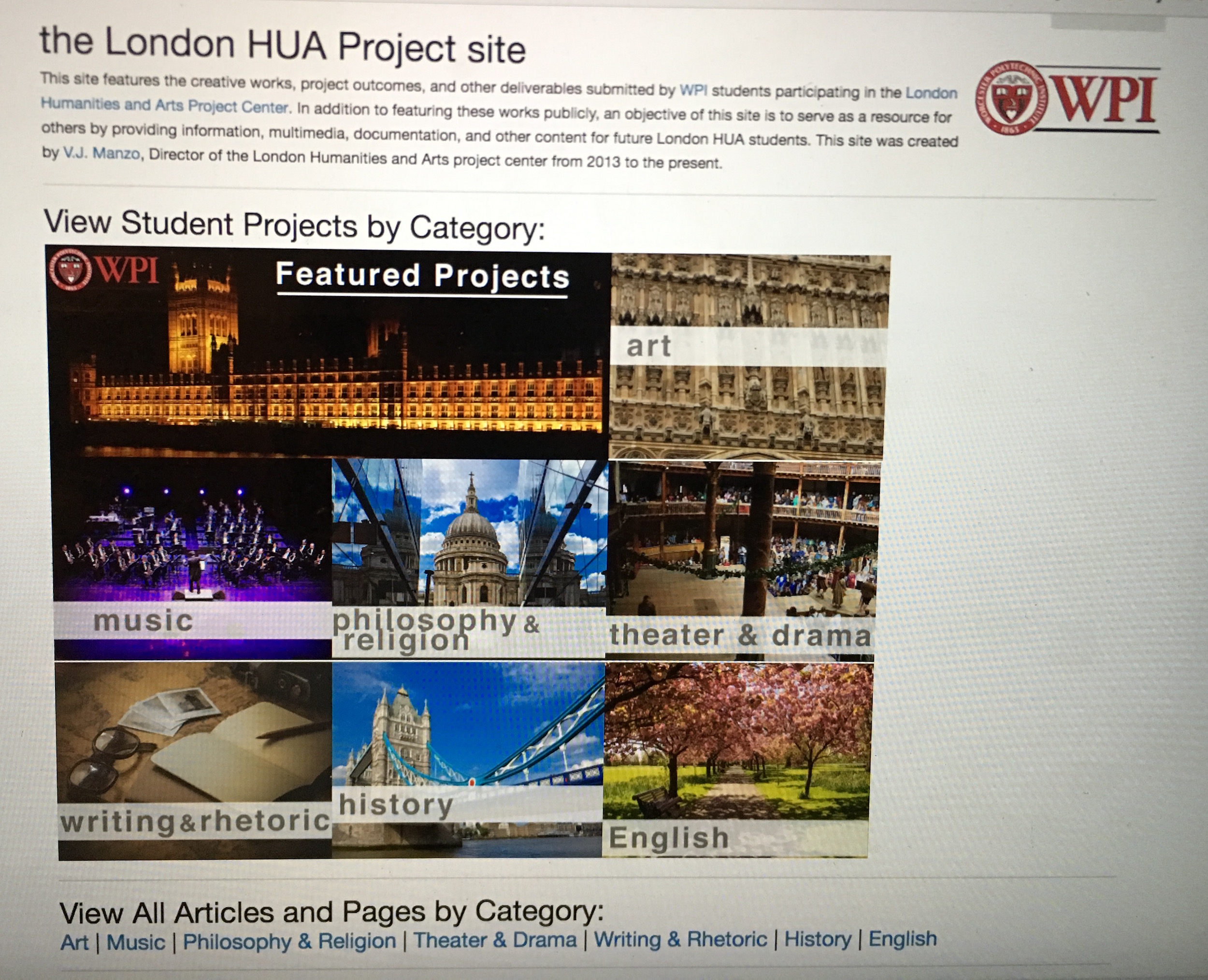 | |
| Example of diverse fonts and constant updates | |
For many generations secretarial staff were the ones who produced all forms of documentation required for businesses and originations. This staff was usually made up of all females, and had its own structure of hierarchy, and was a large part of an organization. When personal or department secretaries started to come around, these people had the qualities that followed the rules of typing manuals. [50] They used to be trained either in their houses or at colleges in the art of typewriting, shorthand, business conventions, and English. This book on personal type writing became an authority and a very useful tool. At first this book was not really useful to typographers until the creation of desktop publishing software. This book was useful to typographers because of the strict practices that were created for the limitations of the typewriter. When using a typewriter it made the text easier to read and insured that the space between each word and character was identical. You could even estimate how many pages where going to be required for the text, no matter the size or weight of the character. [51]
When personal computers and advancements in technology came about so did new possibilities for typography. The standard for typography was being deviated from, and it opened up a world of more possibilities. One of the first examples of this was actually in London with the publication of Sniffin’ Glue, which was started by Mark Perry in 1976 and lasted just over a year. He made the first issue with just a children type writer and a felt-tip pen. [52]
In 1984 came about what some call the “revolution” for typographers. With the creation of Apple, Adobe, and Aldus, typographers could create typographic designs on a computer. This new technology really opened up the creative ability of typographers. [53]
While there are some differences between screen and print typography it is not about the font but rather how people use it. With printed typography, since there is a physical dimension added to it, there can be differences in texture, size, and weight as well as the finishing effects. When on the screen there is also the ability to be interactive and have audio or video components. The best apart about it is its ability to have constantly updated information. [54]
In Rural and Urban Settings
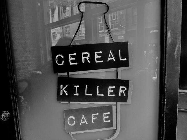 | |
| A bold font is used to match the bold name of the restaurant | |
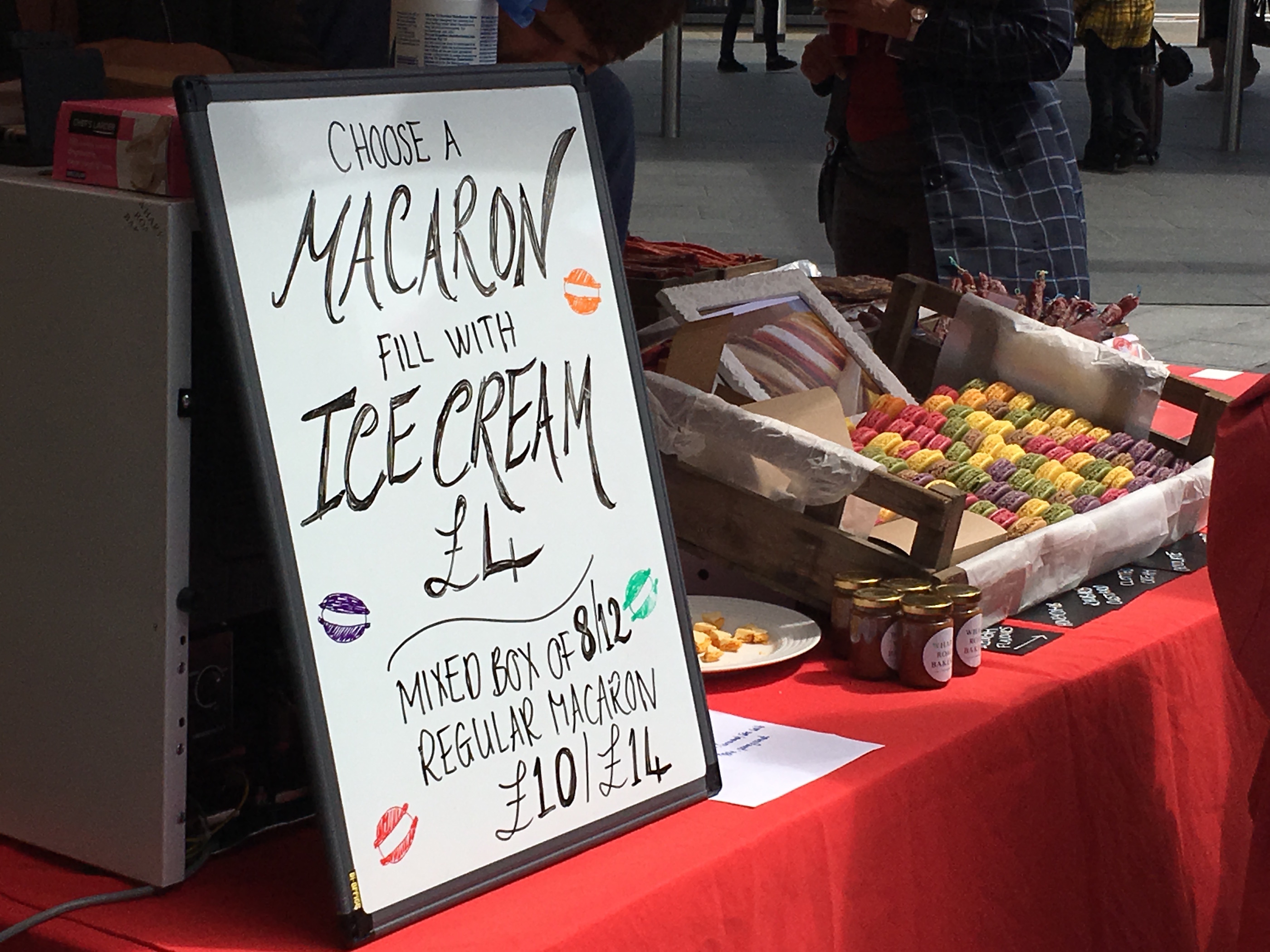 | |
| A temporary sign is used to allow changing of prices | |
In the rural setting typography has not changed much over the years. Even with the advancements of technology people still use the same techniques. [55] When you look at a poster hung up on a bulletin board, it will be easy to see that words of emphasis are underlined, the text is centered, and all capitals are usually used. With the technology we have today more design is possible, you can change the font easily, and the text does not have to be centered. In the rural setting typography has become so familiar to the viewer that they do not even realize it is typography. Every day people in schools, homes, communities, use typography, but no only typographers refer to it as that. [56]
Walking around in an urban setting typography is all around us, from the graffiti scribbled on the wall, to the stop signs at intersections. When it comes to a restaurant in an urban setting it is important that the writing on their signage stands out, as it is what will draw your attention to it. The organization of the signs with the typography on it is also important. When looking at a construction area, if the signs are neatly organized and look like time and consideration were put into the signage, then it will be believed that the construction was planned and not just random.[57] The same goes for a department store, they have very formal looking signage and typography. When they have a sale however, the typography tends to become informal, but as soon as the sale is over the informal typography is gone in order to bring back the formal setting. With the organization of text, order is also important. When looking at a unorganized specials board, it will often stress the reader out, as they are not guided through what to read.[58]
Recognition of Lettering in Britain
When it comes to using letters in a public place there is a lot of thought that has to go into it. The text needs to give information but also be direct, warn, divert, excite, and if badly positioned can confuse people. Letters need to function in a variety of situations, and they need to be easy to read despite everything from weather to lighting conditions. The Spirit of the Letters featured several British Letterers and talked about how they try to get across the importance of lettering. [59]Richard Kindersley is an architectural letterer, and his projects focus on lettering in public places which allows him to show people that architectural lettering should not be an afterthought. [60]Sally bower created banners for protesting at the Chunnel routes in London. She created a design that was described as accurate and sympathetic in an intense atmosphere.[61] Bryant Fedden uses the art of lettering as a decorative element in furniture and craft objects. He became successful by integrating the decoration with the form of the object. [62]
History of Lettering in the Underground
As stated in the introduction of Johnston and Gill Very British Types by renowned transport author Mark Ovenden, "Almost all the lettering in view in British streets stem from the typefaces created by Edward Johnston and Eric Gill." [63]But first let’s start with lettering in general.
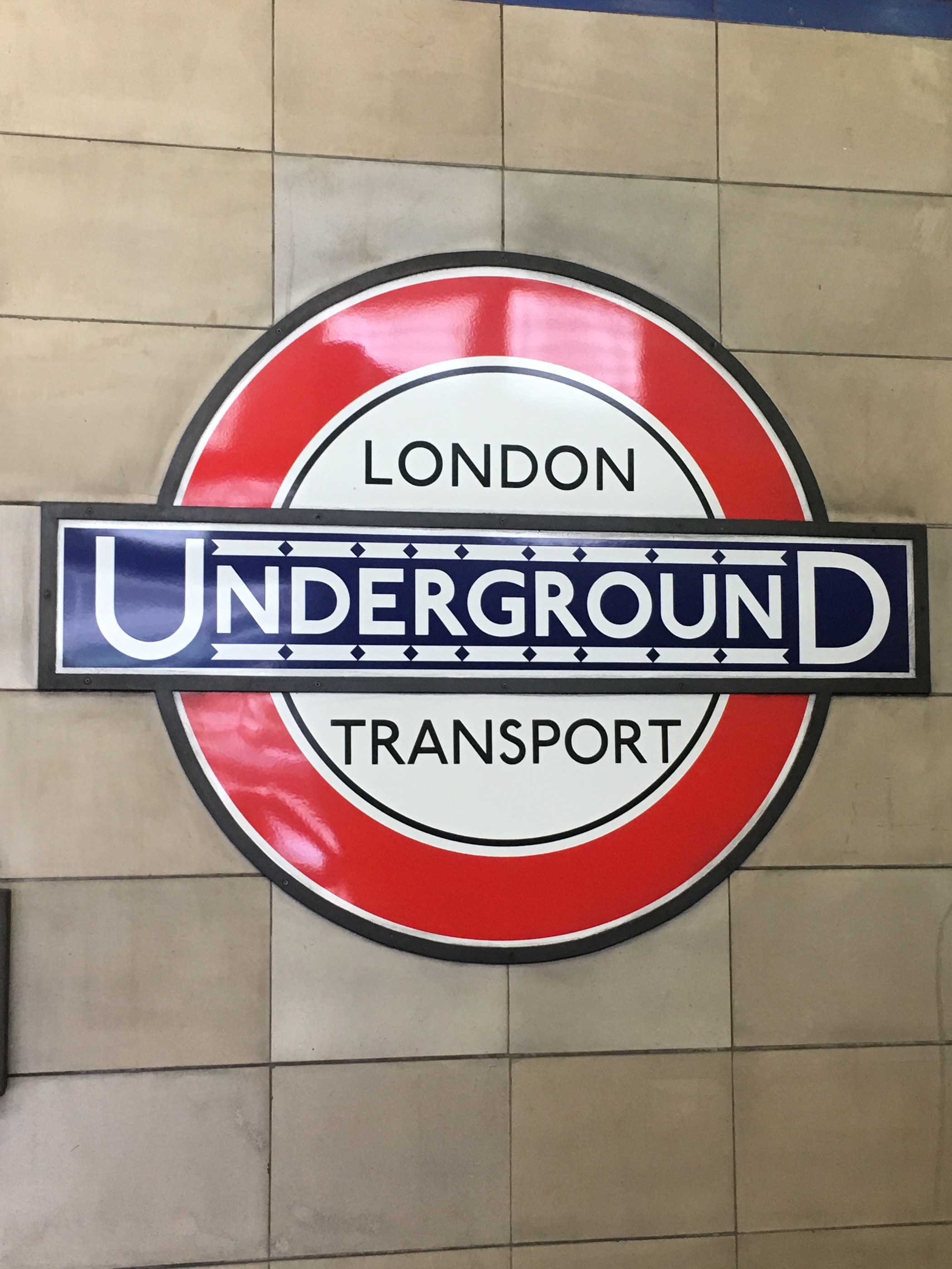 | |
| Example of thin letters and wide spacing of London Transport | |
San serifs which was derived from French and Dutch to mean without line, is lettering introduced in the early 1800s[64] for our sake (even though some of its origins can be seen in caves dated back to 500 BC James Mosely). It wasn’t used for printing until 1830 when posters and displays started to use the typeface to make the words stand out. It was never used for books because the thickness could not be changed and the words only appeared bolded. It wasn’t until 1828 when Vincent Figgins, a type-foundry owner, coined the term ‘sans-serif’.[65] And by 1830, because of Industrial Revolution, all the ads filled any and all spaces available including shop windows and brick walls but everything was in all capital letters so to us today it would have appeared as the ads were yelling at us. Since there were so many, there was a need for clarity in the underground and transportation- so directional signage could stand out from all the posters.
San serifs can be broken down into five major groups; a) grotesques b) humanists c) geometrics d)neo-grotesques e)non-classifiable. The grotesques sans serifs was first developed in the first half of the 19th century and has a vertical axis with a stroke width almost uniform from end to end and the height of the capital and lower case letters are the same. The humanists san serif emerged from 1915 onwards and simply had varying widths. This style appears more calligraphic because it has a larger flow when vertically hand drawn. Johnston Sans and Gill Sans were one of the first types to belong in this category. The geometrics has a visually perfect circle for the ‘o’ and was developed in 1920s. The neo-grotesques, which evolved from grotesques, in the 1950s differentiates with its little embellishments. And the last group, non-classifiable, included type face that contain a mix of characteristics such as URW Grotesk, created in 1985, but contains both geometric and neo-grotesque characteristics. [66]
With those types explained, posters and signage in each station ranged from modern design to a ragtag collection all because of the different type-face available at each print shop. While the first few years of the 1900s the Underground improved immensely with branding, now having the bull’s eye logo created by Sir George Gibb, it still lacked unification.[67] A new alphabet was wanted, one that created authority and unification. And Johnston was the man. Johnston, with a little help from Gill, created a full alphabet for the Underground on February 6th, 1916 but the final draft was submitted in June of 1916 with the lower case alphabet submitted a month later.[68]
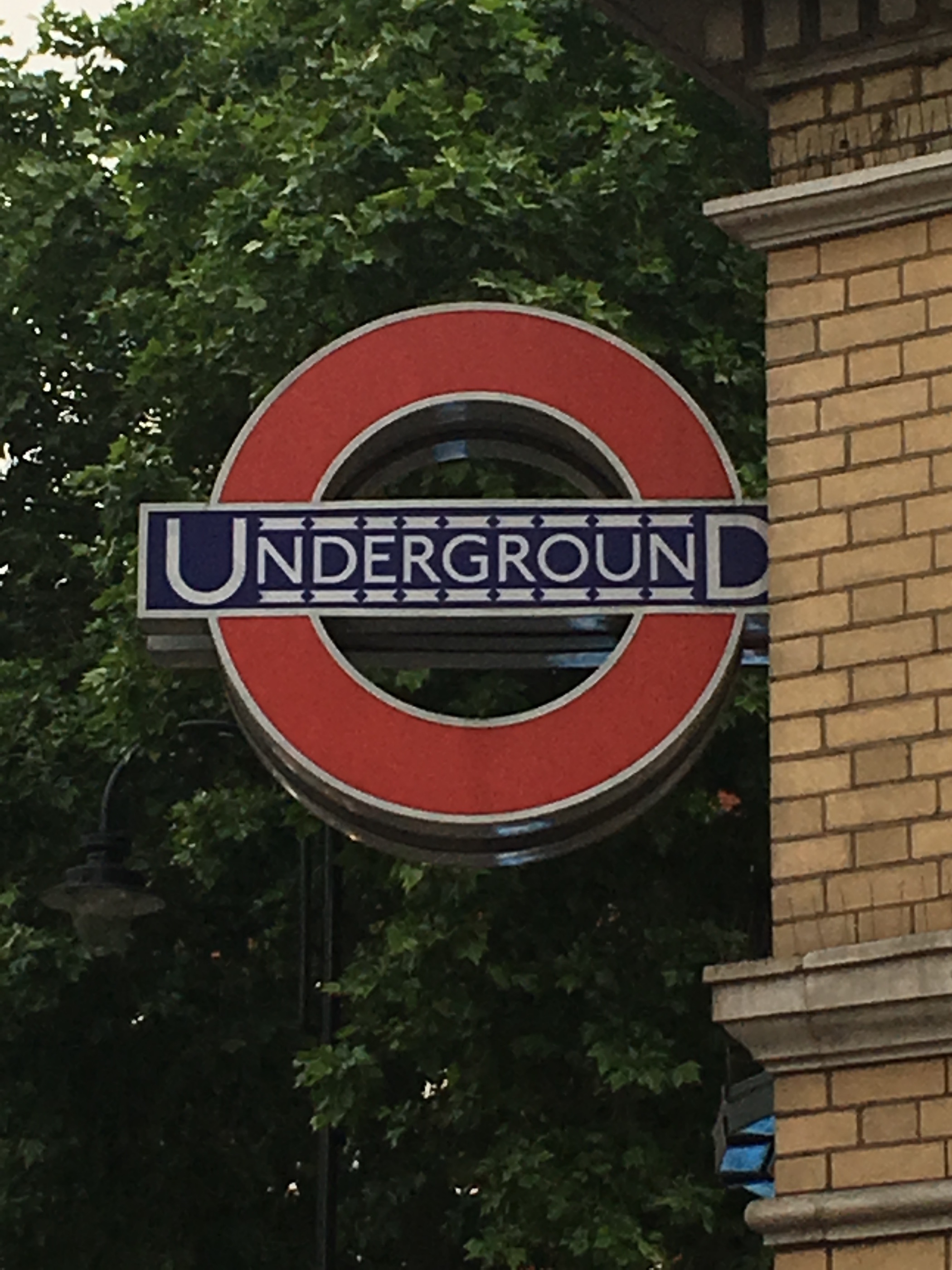 | |
| Example of uneven letters with lines above | |
Upper case were 2 inches and 1 1/3 inch while the lower case was 1 inch high.[69] Five hundred copies of each set of lettering were then lithographically printed so the letters could be shipped to various printers, this was important so all future posters and signage had the same font for unification. In 1920, when a few underground extensions were built Johnston’s alphabet was used instead of the standard, all capital, alphabet which was never heard of before. [70]Also, to keep unified, his alphabet remained the intellectual property of London Transport and its descendants so no random advertisers could use it to create confusion.
In 1928, Gill Sans Monotype was create which later became known as LNER Standardisation in 1929. [71]This lettering competed with the Johnston alphabet and quickly over took it since Gill Sans was more bold. And by the early 1930s, series of accents and other special characteristics were added to the typeface enabling it to be used for French and the US. Eric Gill was asked personably to hand paint the headboard for the LNER’s most famous engine, the Flying Scotsman. [72]The pocket tube map was created all using Gill Sans. But since Gill Sans was not the intellectual property of London Transport, it had become used for the General Post office as well. More and more variations of Gill Sans were created to make it more or less bolded, simply by adding different weights. There was many more sizes and thickness to Gill Sans alphabet and many more printers had his font than Johnston were it slowly began to take over all other major institutions including National Health Service, Central Electricity Authority, British Transport docks, British Road Services (BRS), Pickfords and Thomas Cook & Sons. [73]It wasn’t until the big four, LNER, LMS, SR, GWR all came under British Transport Company that again unification was required but this time Gill Sans was chosen as many printers already had the font. Up to 10,000 signs were printed. Gill Sans Medium had later become the first typecast for television since it was easy to read with well-defined edges. Because of its clear and legible font, Gill Sans was also used on vinyl record sleeves including The Beatles and The Whos which was created by London born designer John Kosh.[74]
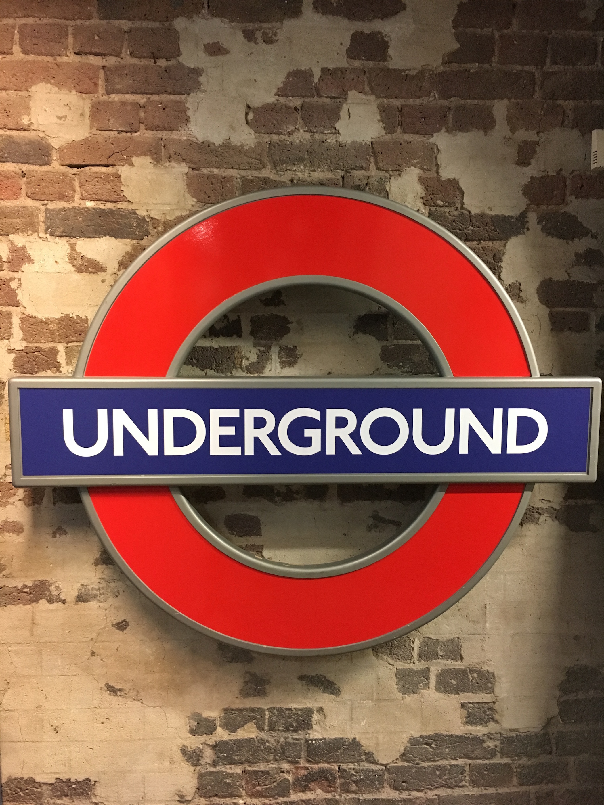 | |
| Example of all even letters | |
During the Second World War both Johnston lettering and Gill Sans were used for all different posters and signage to help the war efforts. And post- war not many, if any, new signs were made for the Underground. During the 1970s it was recognized not many signage remained with Johnson lettering, yet the London Transport design company didn’t want to abandon it as it was part of the heritage. So, London Transport hired B&M to revive and modernize the Johnston lettering for continued use.[75] Eiichi Kono, the company’s newest recruit and Japanese-born, was put on the task and created nine fonts in three weights called the New Johnston. The first weight was available in mid 1980s but the entire font wasn’t available until 1991.[76] And to keep the usage of the new revived frontage unified throughout all stations, the London Transport Marketing Team and development director, D. Henry Fitzhugh created the London Underground Sign Manual explaining what version of font, size and weight was to be used when and where. And finally in 1999, the International Typeface Corporation released ITC Johnston with light, medium and bold which allowed the Johnston lettering to be used in the public.[77] But in 2000 when London Transport became a new government body called Transport for London (TfL), new computer system was used so another version of Johnston was created so it could be used more easily and it is called TfL Johnston with a few slight variations including a tick above the ‘1’ and included roundels, the transport logo.[78] TfL Johnston is still in use today throughout and beyond the London stations. However, oddly enough the Oyster Card for London was launched in 2003 with non-Johnston sans serif. Just last year Johnston100 was created by designer Marlou Verlome and Nadine Cahine which includes a ‘hairline’ weight adding a new dimension to the font and it included the hashtag and at symbol. [79]
Nearly a hundred years later and both Johnston and Gill Sans are still actively being used today with no signs of diminishing. The newest version of Johnston, Johnston100, will be used for the Elizabeth Line which is scheduled to open in 2018. Gill Sans has been and is currently still used by BBC, John Lewis and the Church of England as their in-house typeface with no sign of changing. [80]
Edward Johnston
Edward Johnston was born in Uruguay in 1872 but then moved to London with his family. [81]He was seventeen years old when he made his first piece of fine lettering on parchment which was for his Aunt Maggie. Aunt Maggie brought it to Mr. Whittingham’s local shop, where he sold that card and other Christmas cards made by Johnston believing it was gorgeous calligraphy. Johnston had read Lessons in the Art of Illuminating by Lotus when he was younger which sparked his interest in writing. Johnston never sought out calligraphy as a career since by the turn of the century it was effectively a dead art with no one but Cowlishaw, a full time architect, and Morris who thought it could be a career. [82]So, he went after a career in medicine, but after realizing he hated it he began to study illuminated manuscripts at the British Museum and Cowlishaw taught him out to prepare a goose quill for broader nibs. After attending some classes, the professor turned to him and asked him to teach his own class. His first ever class was taught on September 21, 1899 on writing and illuminating called ‘practically lost art worth reviving’ at Morely Hall on upper Regent Street. [83]This led to his second class in 1901 at Royal College of Art in South Kensington. This class focused on studying famous monuments from antiquity to Trajan’s Column in Rome. He then famously created the alphabet for the Underground in 1916. Johnston later created Society of Calligrapher and the Housemaker’s Society to help expand and teach calligraphy. To improve school children’s handwriting he wrote, Manuscript & Inscription Letters. And together with Eric Gill, they took four years to write Writing & Illuminating & Lettering which had become the best handbook ever written.[84] Johnston died in 1944, after giving direct instructions from bed to his former student, Irene Wellington, on a piece for Winston Churchill. [85]
Eric Gill
Eric Gill was born in Steyning, Sussex in 1882 and first went to school for architect at Westminster Technical Institute. He signed up for stonemasonry, which put him in the direction of cutting letters into stone.[86] He attended Johnston’s 1901 classes at Royal College of Art which is where their friendship began. [87]He quickly moved into Johnston’s inn as it was a shorter commute and he could help pay for rent. Since he was preoccupied working on the Station of the Cross at Westminster Cathedral he only helped a little at creating the Johnston Alphabet for the Underground. He then famously created Gill Sans Monotype in 1928 on his own which had become the transportation unified alphabet. Gill’s last contribution to his font family was Bold Extra Condensed which he made three years before he died on November 17, 1940. [88]
Section 2: Deliverable
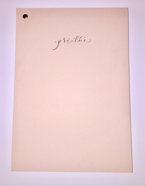 | |
| ' | Our Practice Notebooks |
|---|---|
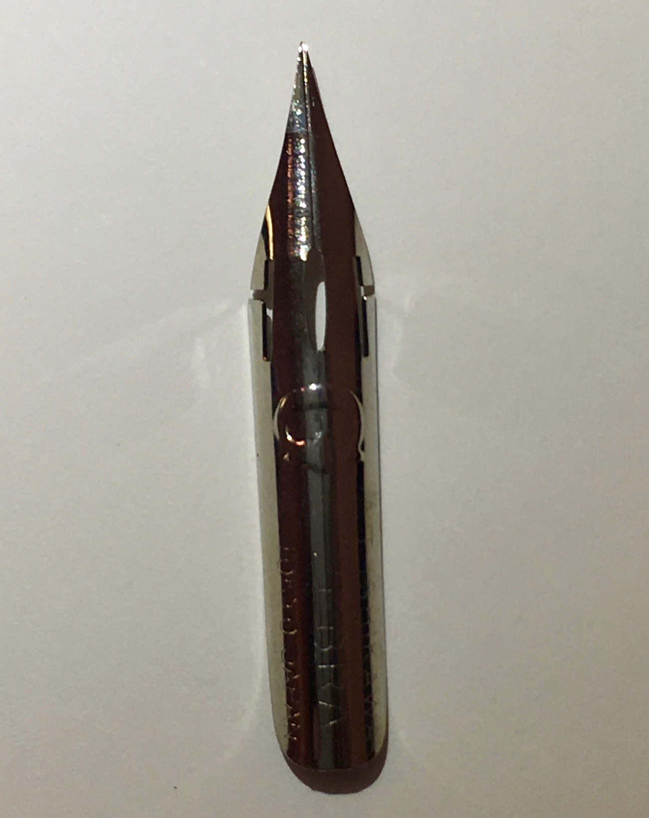
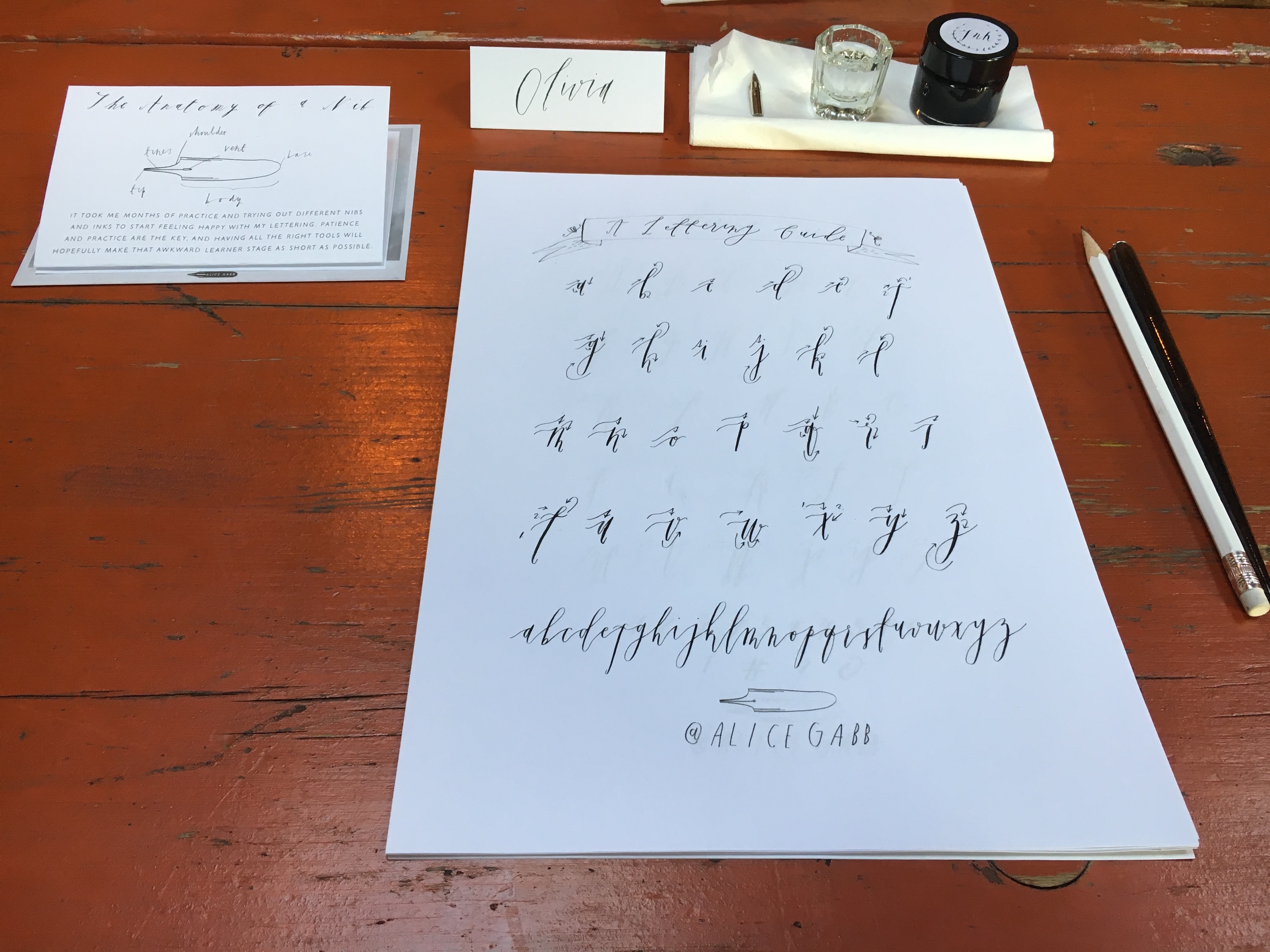
It has been quoted by the calligrapher master and founder of the Underground's first alphabet, “Johnston believed that ‘no man can know “how it is done” until he himself has done the thing.’” [89]Which is why we too decided to try calligraphy for ourselves where his career began. We took a workshop with Alice Gabb called Modern Calligraphy for the New & Curious, where she went on to explain the basics of calligraphy and began to teach us her modern alphabet. Alice is a professional calligrapher, illustrator, and stationary designer. Her studio is in Hackney which is in East London, and our workshop took place at Hatch Cafe in Hackney. Throughout the course of the last few weeks we took what we learned from the workshop to practice and improve our calligraphy. We have each kept a journal with us where ever we went and documented what we saw, heard and observed at different locations throughout London in our calligraphy. Below are our own reflections on learning calligraphy.
Emily's Experience
 | |
| Emily Wilson | Practicing at The Wren |
|---|---|
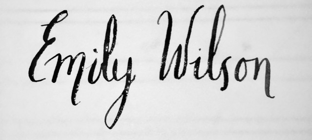
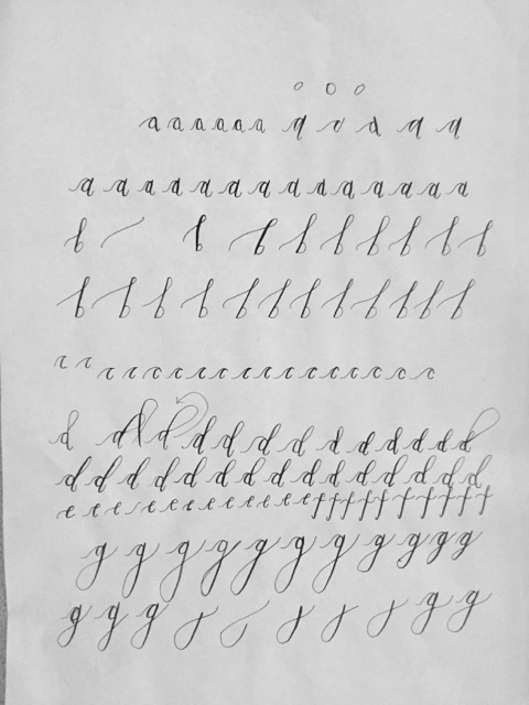
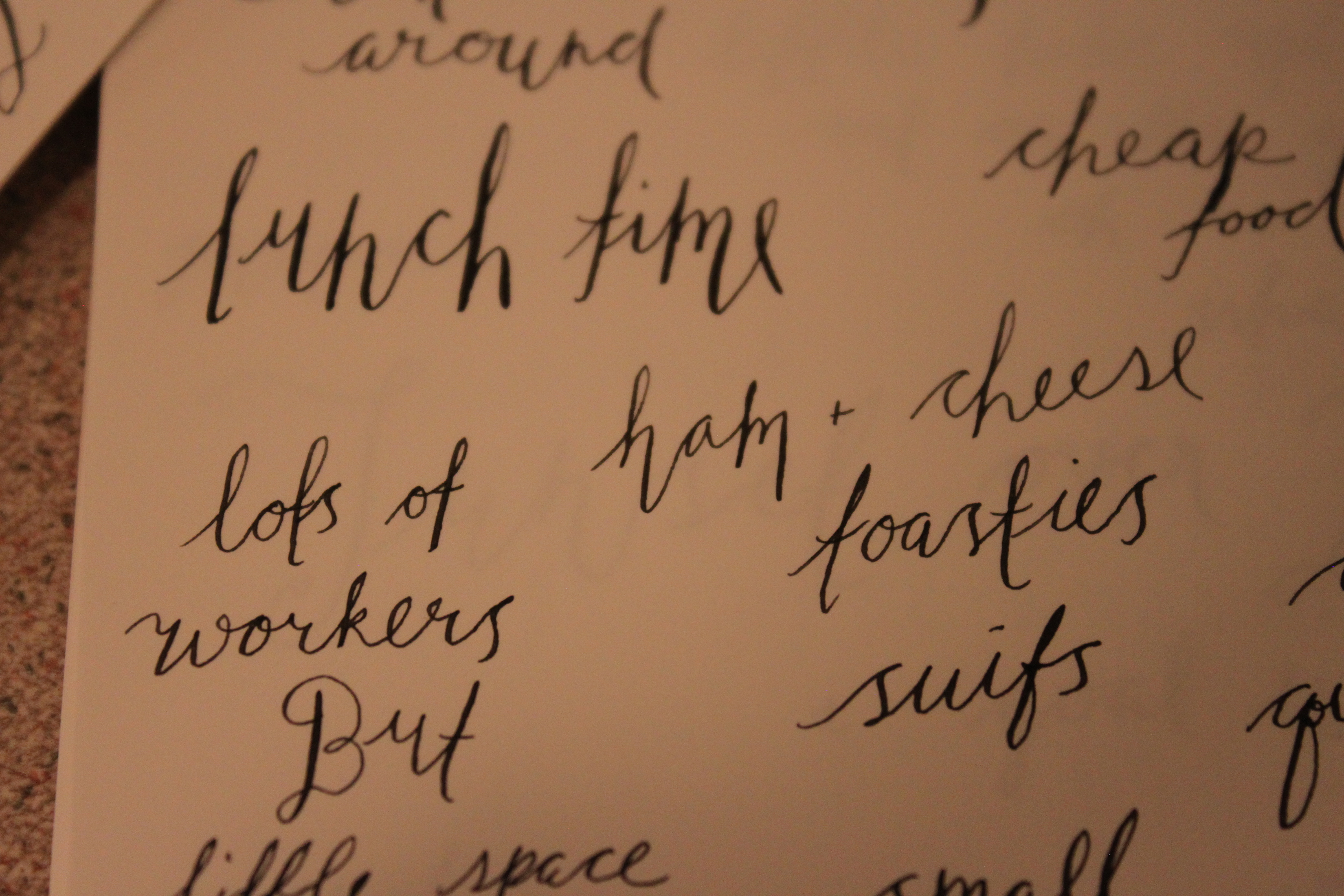
After reading and learning all about typography we wanted to get a hands on experience so we went to a Modern Calligraphy class hosted by Alice Gabb. Here we learned how to do her modern calligraphy alphabet, and how to correctly hold the quill. Holding the quill was difficult at first as you hold it straight up to where as a pencil is titled. Also you have to be very careful with the strokes you make sing the nib, down strokes use more pressure than upstrokes. The difference in the pressure of the strokes are what makes it modern calligraphy. This was the first time I had ever tried calligraphy so it was a learning process. In order for her to be able to tell if we were writing correctly we had to copy her alphabet. When we copied her alphabet it allowed her to see where we were making mistakes. Her alphabet is very whimsical, with long leading lines and very light ends. I could copy her alphabet, but I was not comfortable with the long leading lines of her work. It took a lot of practice but after the class we felt comfortable enough to take on a project of writing down our observations in a notebook, from the different places we have been. By doing this it allowed us to continue to practice our calligraphy skills that we had just learned. Once I learned how to shape all of the letters, I no longer needed the alphabet in front of me at all times to write, so I stopped looking at it. I noticed a change in my hand writing, from simply copying her to creating my own. My calligraphy was still modern with light upstrokes and pressure on the down strokes, but i slowly got rid of the long leading lines, and have more sharp, noticeable ending curves on certain letters. In our background I talked about how any one can copy a handwriting, just like we do in elementary school, and how calligraphy used to be that way until students were told to question what they had been told. I did just that, I questioned the need for long leading lines, as it just made the letters more difficult to connect, and I questioned the ending curves as they were so small they were not noticeable. From there I created my own font, and it was not even intentional, it was just me subconsciously questioning what I had been taught. You can see an example of this change in the gallery.
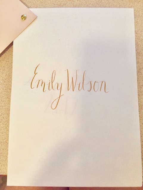
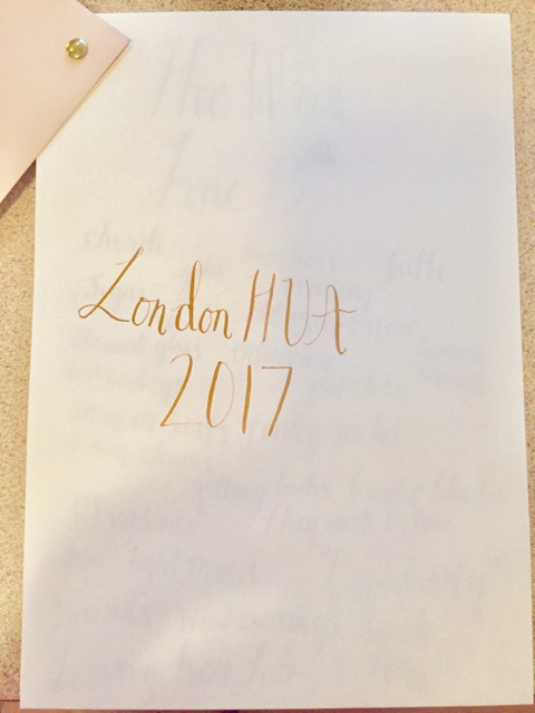
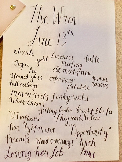
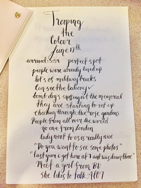
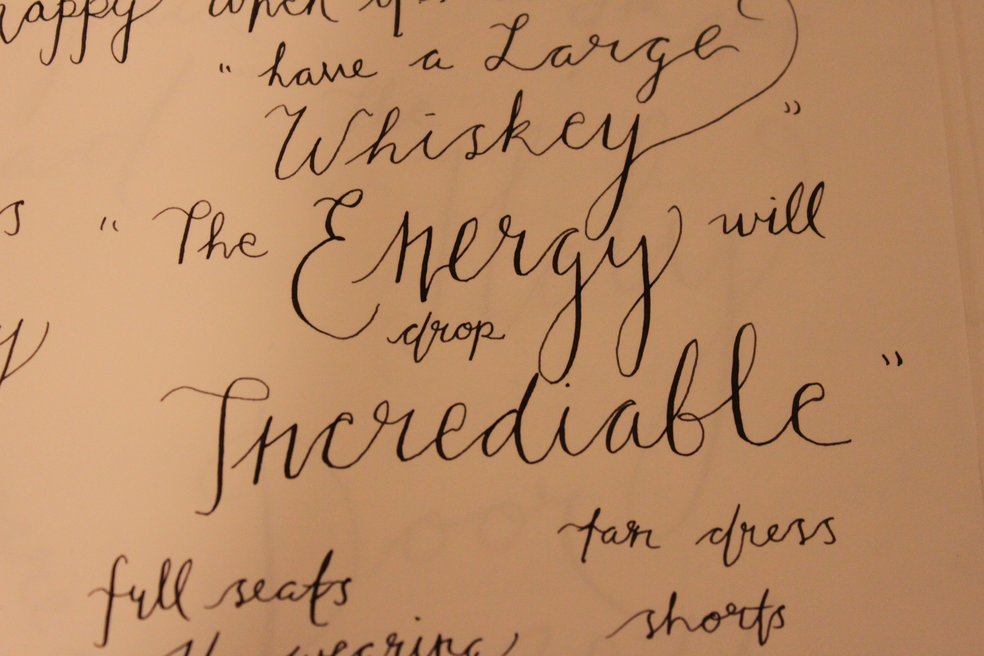
Keeping the notebook was an interesting experience, as it really had me paying very close attention to my surroundings all the time. Not only did it allow me to notice my surroundings more but it also allowed me to continue to improve my calligraphy. I practiced writing my name at least one hundred times before I finally wrote it down on the first page of my notebook, and with the gold ink it was a great start to this project. My next page says London HUA and I was so excited with how my first page had turned out that my writing became a little slanted. I think it was important though that there was an imperfection at the very start of the notebook, otherwise the mistakes I made later on would have been more difficult to deal with. This showed me that calligraphy is not easy and you will make mistakes. One common occurrence was that sometimes I would interchange the cursive alphabet that we learned in elementary school, which looks okay but it was not technically correct. Another mistake I would sometimes make would be spelling, even on simple words, I got into the flow of the nib on the paper and not having to think about the next letter that I would write the wrong one. Some other observations made form this project were that some words just do not look right in calligraphy. We were sitting eating lunch one day by the Thames and there was a group of people working out who were on their lunch break. I had written down a ton of quotes from them that were very funny but included a lot of curse words. When I went to write these quotes down they just did not look like they belonged in such delicate writing. This was a perfect example of typography, and how certain words need a different font in order to convey it's meaning. In the end this project was a great way to put our background down onto a piece of paper, and get to experience typography.
Olivia's Experience
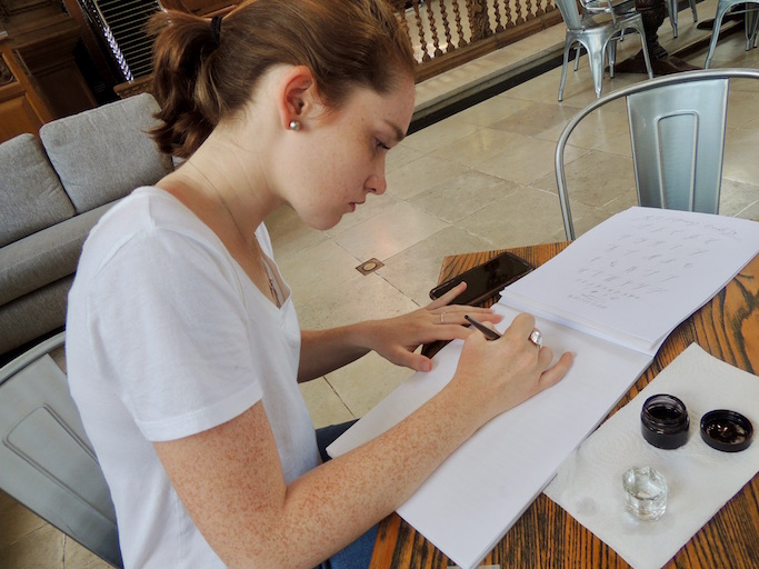 | |
| Olivia Gibbs | practices at The Wren |
|---|---|
I have always had an interest in calligraphy after seeing my art teachers hold a mini workshop, but never really took it seriously. So when I attended Alice Gabb’s beginners workshop it was basically all new to me, especially since she was teaching us her modern alphabet that she had created. I learned the importance of lining the nib up with the top of the page and not holding it at a slant, at first I had to keep readjusting my hand placement but slowly got into the right habit for holding the quill correctly. She had us start with the lower case alphabet which she said would be more challenging since they are smaller, but I disagree. Even after having practiced a few weeks, I still wrote rather small and it was a mental challenge to try to write in bigger letters. At the workshop I also learned brand new nibs come with a clear coating over them so it is essential to drop them in boiling water for a minute to wash away the residue so the ink will not be repelled. I had never heard of this before, but is very important to remember so in the future when I want to purchase different sized nibs I need to wash them! Also I learned it takes very fine and smooth paper for calligraphy to work well. The nibs can pick up the slightest amount of paper fiber and are unable to write smoothly again. Those are just a few of the essential tips I learned from the hands on workshop.
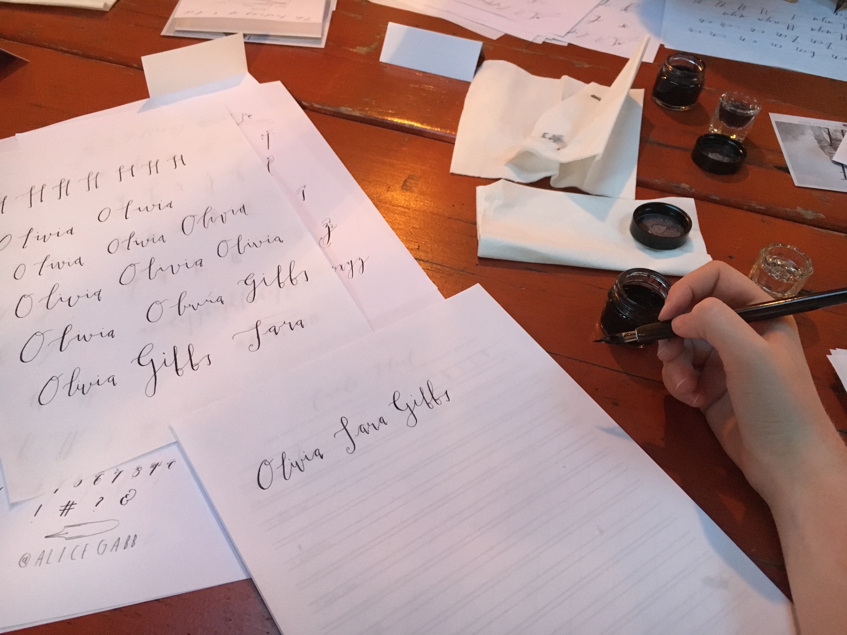
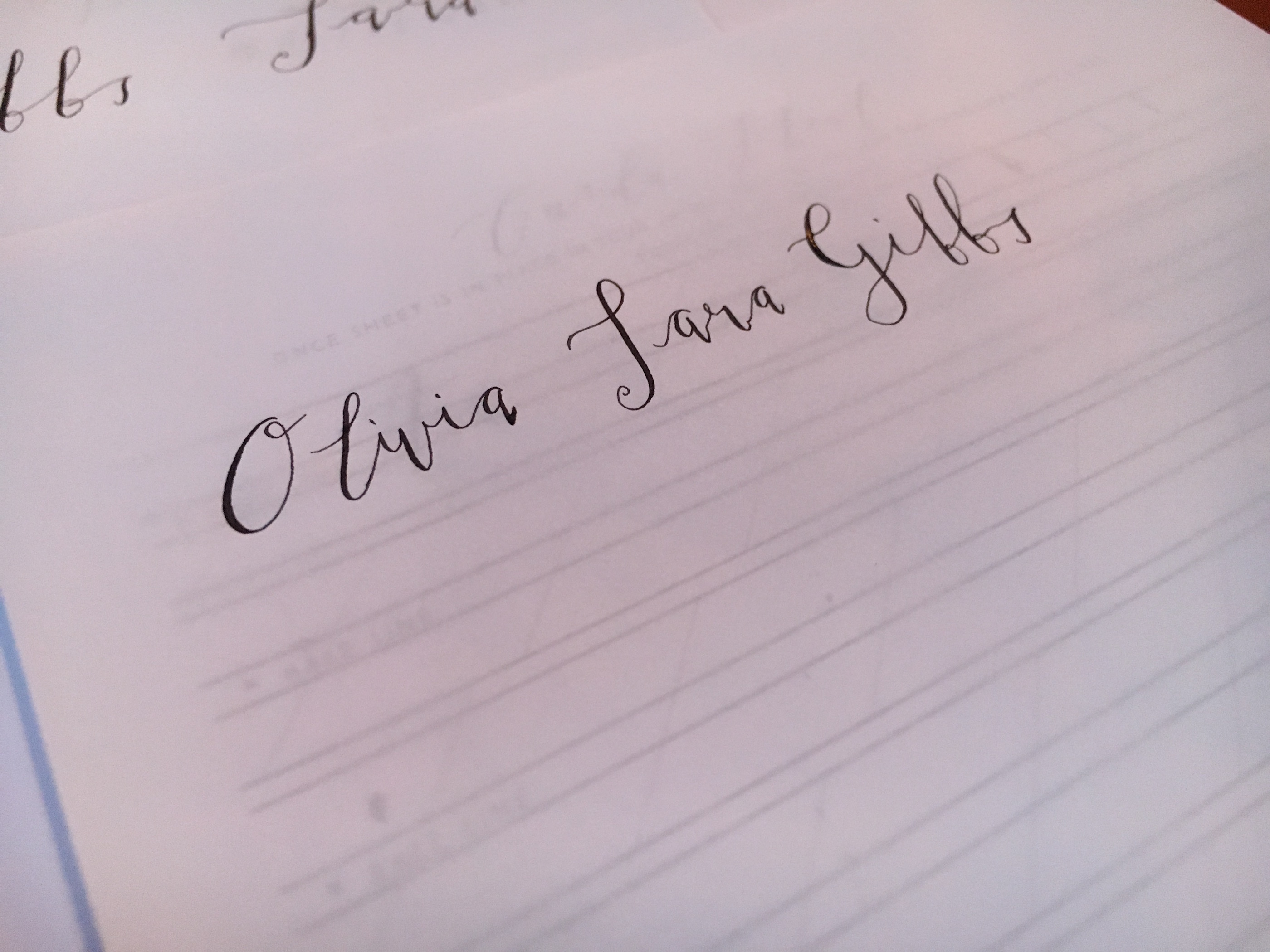
I had purchased a regular sized notebook from Alice Gabb the same night as the workshop so I had more paper to practice on and it was transparent so I could place the guided paper she made with the lines underneath to practice. The guided lines brought me back to kindergarten and first grade when I was first learning to write and calligraphy is basically the same thing. I had to retrain my brain on how to write each letter. Any time I would practice I made sure to have both Alice Gabb’s lower and upper case alphabets out in front of my so I could refer back to them. After I few weeks of practice, I knew most of them and had adapted a few letters to my own liking. Learning how to write new letters really required complete concentration and I had to think ahead of how I was going to connect each letter which made me realize mistakes can not be fixed! There is no real way to go back over your letters if you misspelt a word, you need to simply start over since no two letters connect the same way. I cannot imagine writing a long letter or address and messing up at the very end only to start over again. Also, with long writings in general I thought after the first night it would be annoying to have to keep refilling the nib with ink, but as I practiced more and more I did not even realize when I went to refill. It had become an automatic habit.
This project has forced me to stop and really observe and appreciate what is around me. From taking time to sit in parks, by the water, at shows or even on transportation I had actively listened to the conversations around me. I have learned more about the people of London than I thought I would which makes it really interesting. And having to write all the words, observations and quotes in calligraphy has taught me hands on the power of typography. For example, I wrote the word ‘Screech’ since it was the sound the train made as it rounded the corner, but writing it in a delegate curvy line felt wrong. The word screech, to me, made me think it should be in bold or times new roman not an elegant font.
Over the course of the few weeks I was able to see my own typography start to take place as I began to adapt Gabb's own alphabet to my liking. This is what makes typography unique and diverse. For me it can be seen I prefer to write smaller and thinner, which means I barely hold any pressure on the quill both on the up and down stroke. Also I emphasized the lead in and end tails, the curly lines before and after each letter. And with the longer led in lines my letters are more spaced out, creating a softer read as the letters are spread out in a flow and not crammed together. All these little features took me forever to complete during the first few days of practicing, but now I don't have to think twice about how the letters connect or what the letter shape is. I know my own alphabet and can write a lot quicker, producing journal pages more quickly too.
Overall I have really enjoyed this project, learning how to analyze and now appreciate all that is around me- WORDS!- and learning a new skill which I hope to keep up with and continue to improve. I am excited to get home to create more signs and letter headings for gifts and decoration, no more Etsy shopping when I have the knowledge, materials and skills to do it myself!
Gallery
Conclusion
In conclusion, typography is everywhere and now every time something is read it can be analyzed for its spacing, shape and size to understand how it is being affective. Edward Johnston and Eric Gill are still huge influences in typography today. Johnston is still used in the public transportation of London and Gill is too along with the mix of the public and other business. For future projects, students can explore the many different types that have emerged from Gill Sans and Johnston and perhaps even try their own hand at the old fashion printing where the blocks of letters had to be places separately. If the students did this themselves, they can really learn, understand and appreciate all the thought that is put into the signage we see today.
Attribution of Work
We both have contributed evenly to each and every section on this page making it impossible to split up. We both worked on the background, added pictures to the gallery, wrote about the photos, talked about our deliverables, filled an entire practice journal and edited the page as well.
External Links
References
- ↑ Typography. (n.d.). Retrieved May 30, 2017, from https://www.merriam-webster.com/dictionary/typography
- ↑ Calligraphy. (n.d.). Retrieved May 30, 2017, from https://www.merriam-webster.com/dictionary/calligraphy
- ↑ Ingold, T. (2016). Lines a brief history. London: Routledge classics.
- ↑ Sassoon, R. (2007). Handwriting of the twentieth century. Bristol, UK: Intellect.
- ↑ Sassoon, R. (2007). Handwriting of the twentieth century. Bristol, UK: Intellect.
- ↑ Sassoon, R. (2007). Handwriting of the twentieth century. Bristol, UK: Intellect.
- ↑ Sassoon, R. (2007). Handwriting of the twentieth century. Bristol, UK: Intellect.
- ↑ Sassoon, R. (2007). Handwriting of the twentieth century. Bristol, UK: Intellect.
- ↑ Jury, D. (2016). What is typography. Brighton, UK: The Ivy Press.pg.8-14.
- ↑ Jury, D. (2016). What is typography. Brighton, UK: The Ivy Press.pg.8-14.
- ↑ Jury, D. (2016). What is typography. Brighton, UK: The Ivy Press.pg.8-14.
- ↑ Jury, D. (2016). What is typography. Brighton, UK: The Ivy Press.pg.8-14.
- ↑ Jury, D. (2016). What is typography. Brighton, UK: The Ivy Press.pg.34-35.
- ↑ Jury, D. (2016). What is typography. Brighton, UK: The Ivy Press.pg.34-35.
- ↑ Jury, D. (2016). What is typography. Brighton, UK: The Ivy Press.pg.34-35.
- ↑ Jury, D. (2016). What is typography. Brighton, UK: The Ivy Press.pg.8-14.
- ↑ Jury, D.\ (2016). What is typography. Brighton, UK: The Ivy Presspg.8-14..
- ↑ Jury, D. (2016). What is typography. Brighton, UK: The Ivy Press.pg.8
- ↑ Jury, D. (2016). What is typography. Brighton, UK: The Ivy Press.pg.8-14.
- ↑ Jury, D. (2016). What is typography. Brighton, UK: The Ivy Press.pg.14-17.
- ↑ Jury, D. (2016). What is typography. Brighton, UK: The Ivy Press.pg.14-17.
- ↑ Jury, D. (2016). What is typography. Brighton, UK: The Ivy Press.pg.14-17.
- ↑ Jury, D. (2016). What is typography. Brighton, UK: The Ivy Press.pg.14-17.
- ↑ Jury, D. (2016). What is typography. Brighton, UK: The Ivy Press.pg.20-30
- ↑ Jury, D. (2016). What is typography. Brighton, UK: The Ivy Press. pg.76-77.
- ↑ Jury, D. (2016). What is typography. Brighton, UK: The Ivy Press.pg.76-77.
- ↑ Jury, D. (2016). What is typography. Brighton, UK: The Ivy Press.pg.76-77.
- ↑ Jury, D. (2016). What is typography. Brighton, UK: The Ivy Press.pg.78-79.
- ↑ Jury, D. (2016). What is typography. Brighton, UK: The Ivy Press.pg.78-79.
- ↑ Jury, D. (2016). What is typography. Brighton, UK: The Ivy Press.pg.80-83.
- ↑ Jury, D. (2016). What is typography. Brighton, UK: The Ivy Press.pg.80-83.
- ↑ Jury, D. (2016). What is typography. Brighton, UK: The Ivy Press.pg.84-85.
- ↑ Jury, D. (2016). What is typography. Brighton, UK: The Ivy Press.pg.88-89.
- ↑ Jury, D. (2016). What is typography. Brighton, UK: The Ivy Press.pg.88-89.
- ↑ Jury, D. (2016). What is typography. Brighton, UK: The Ivy Press.pg.18-19.
- ↑ Jury, D. (2016). What is typography. Brighton, UK: The Ivy Press.pg.18-19.
- ↑ Jury, D. (2016). What is typography. Brighton, UK: The Ivy Press.pg.18-19.
- ↑ Jury, D. (2016). What is typography. Brighton, UK: The Ivy Press.pg.20-21.
- ↑ Jury, D. (2016). What is typography. Brighton, UK: The Ivy Press.pg.20-21.
- ↑ Jury, D. (2016). What is typography. Brighton, UK: The Ivy Press.pg.20-21.
- ↑ Jury, D. (2016). What is typography. Brighton, UK: The Ivy Press.pg.24-25.
- ↑ Jury, D. (2016). What is typography. Brighton, UK: The Ivy Press.pg.24-25.
- ↑ Sassoon, R. (2007). Handwriting of the twentieth century. Bristol, UK: Intellect.
- ↑ Sassoon, R. (2007). Handwriting of the twentieth century. Bristol, UK: Intellect.
- ↑ Sassoon, R. (2007). Handwriting of the twentieth century. Bristol, UK: Intellect.
- ↑ Sassoon, R. (2007). Handwriting of the twentieth century. Bristol, UK: Intellect.
- ↑ P. (1989). The Spirit of the Letter. Old Portsmouth: Portsmouth City Museums.
- ↑ Sassoon, R. (2007). Handwriting of the twentieth century. Bristol, UK: Intellect.
- ↑ Sassoon, R. (2007). Handwriting of the twentieth century. Bristol, UK: Intellect.
- ↑ Jury, D. (2016). What is typography. Brighton, UK: The Ivy Press.pg.40-54.
- ↑ Jury, D. (2016). What is typography. Brighton, UK: The Ivy Press.pg.40-54.
- ↑ Jury, D. (2016). What is typography. Brighton, UK: The Ivy Press.pg.40-54.
- ↑ Jury, D. (2016). What is typography. Brighton, UK: The Ivy Press.pg.40-54.
- ↑ Jury, D. (2016). What is typography. Brighton, UK: The Ivy Press.pg.40-54.
- ↑ Jury, D. (2016). What is typography. Brighton, UK: The Ivy Press.pg.54-57.
- ↑ Jury, D. (2016). What is typography. Brighton, UK: The Ivy Press.pg.54-57.
- ↑ Jury, D. (2016). What is typography. Brighton, UK: The Ivy Press.pg.58-61.
- ↑ Jury, D. (2016). What is typography. Brighton, UK: The Ivy Press.pg.58-61.
- ↑ P. (1989). The Spirit of the Letter. Old Portsmouth: Portsmouth City Museums.
- ↑ P. (1989). The Spirit of the Letter. Old Portsmouth: Portsmouth City Museums.
- ↑ P. (1989). The Spirit of the Letter. Old Portsmouth: Portsmouth City Museums.
- ↑ P. (1989). The Spirit of the Letter. Old Portsmouth: Portsmouth City Museums.
- ↑ Ovenden, M. (2016). Johnston and Gill. Very British types. London: Lund Humphries Publ.
- ↑ Ovenden, M. (2016). Johnston and Gill. Very British types. London: Lund Humphries Publ.
- ↑ Ovenden, M. (2016). Johnston and Gill. Very British types. London: Lund Humphries Publ.Ch.1.
- ↑ Ovenden, M. (2016). Johnston and Gill. Very British types. London: Lund Humphries Publ.Ch.1.
- ↑ Ovenden, M. (2016). Johnston and Gill. Very British types. London: Lund Humphries Publ.Ch.3.
- ↑ Ovenden, M. (2016). Johnston and Gill. Very British types. London: Lund Humphries Publ.Ch.3.
- ↑ Ovenden, M. (2016). Johnston and Gill. Very British types. London: Lund Humphries Publ.Ch.4.
- ↑ Ovenden, M. (2016). Johnston and Gill. Very British types. London: Lund Humphries Publ.Ch.4.
- ↑ Ovenden, M. (2016). Johnston and Gill. Very British types. London: Lund Humphries Publ.Ch.5.
- ↑ Ovenden, M. (2016). Johnston and Gill. Very British types. London: Lund Humphries Publ.Ch.5.
- ↑ Ovenden, M. (2016). Johnston and Gill. Very British types. London: Lund Humphries Publ.Ch.7.
- ↑ Ovenden, M. (2016). Johnston and Gill. Very British types. London: Lund Humphries Publ.Ch.7.
- ↑ Ovenden, M. (2016). Johnston and Gill. Very British types. London: Lund Humphries Publ.Ch.8.
- ↑ Ovenden, M. (2016). Johnston and Gill. Very British types. London: Lund Humphries Publ.Ch.8.
- ↑ Ovenden, M. (2016). Johnston and Gill. Very British types. London: Lund Humphries Publ.Ch.8.
- ↑ Ovenden, M. (2016). Johnston and Gill. Very British types. London: Lund Humphries Publ.Ch.8.
- ↑ Ovenden, M. (2016). Johnston and Gill. Very British types. London: Lund Humphries Publ.Ch.8.
- ↑ Ovenden, M. (2016). Johnston and Gill. Very British types. London: Lund Humphries Publ.Ch.8.
- ↑ Ovenden, M. (2016). Johnston and Gill. Very British types. London: Lund Humphries Publ.Ch.2.
- ↑ Ovenden, M. (2016). Johnston and Gill. Very British types. London: Lund Humphries Publ.Ch.2.
- ↑ Ovenden, M. (2016). Johnston and Gill. Very British types. London: Lund Humphries Publ.Ch.2.
- ↑ Ovenden, M. (2016). Johnston and Gill. Very British types. London: Lund Humphries Publ.Ch.2.
- ↑ Ovenden, M. (2016). Johnston and Gill. Very British types. London: Lund Humphries Publ.Ch.2.
- ↑ Ovenden, M. (2016). Johnston and Gill. Very British types. London: Lund Humphries Publ.Ch.2.
- ↑ Ovenden, M. (2016). Johnston and Gill. Very British types. London: Lund Humphries Publ.Ch.2.
- ↑ Ovenden, M. (2016). Johnston and Gill. Very British types. London: Lund Humphries Publ.Ch.2.
- ↑ Spencer, H. (1972). Master calligrapher Edward Johnston (1872-1944) [Pamphlet]. London: RCA Galleries Kensington Gore.
