Difference between revisions of "London Architecture"
From Londonhua WIKI
| Line 211: | Line 211: | ||
==The jewel tower == | ==The jewel tower == | ||
| + | <br> | ||
| + | The Jewel Tower is one of three remaining buildings from the medieval Palace of Westminster with a lot of its 14th century architecture still remaining relatively unchanged. The building was constructed in the early 1360's, and at that point until the early 16th was used to store the royal jewels and plate which is how it got its name. From the 16th century until 1864 however it was used to store the records of the house of Lords, which is considered the nations 'memory'. The Jewel Tower shows the evolution form state, to monarchy, to parliamentary democracy, to an imperial power. | ||
| + | It was built as a medieval treasury, so there are no windows on the ground floor and only two small windows on the first floor. Form the remains they believe there were to double doors at the entrance to the top floor. They believe this level contained particularly sensitive or valuable items. The master mason who worked on this building was Henry Yevele and master carpenter Hugh Herland, the used rough stone and dressed stone to construct the tower. This was built in a medieval style, however unfortunately many of the medieval features have been defaced or removed when renovations were made to the building. | ||
| + | Observations that were made presume that the building was a very functional building and it did not have many ostentatious features. A lot of the information on this building are presumptions because of its age. They believe because of the distinctive shape of the windows mean that Architect Nicholas Hawksmoor helped in designing the buildings. | ||
| + | |||
| + | http://www.english-heritage.org.uk/visit/places/jewel-tower/history/significance/what i | ||
| + | |||
===Style === | ===Style === | ||
===Designer === | ===Designer === | ||
| Line 220: | Line 227: | ||
===Purpose/ function === | ===Purpose/ function === | ||
<br><br> | <br><br> | ||
| + | |||
==Kensington Palace == | ==Kensington Palace == | ||
===Style === | ===Style === | ||
Revision as of 17:21, 11 May 2017
Top 20 Architectures
by Olivia Gibbs, Natalie Bloniarz & Emily Wilson
 Your Project Page Picture Caption |
Upload an image of your own that captures the essence of this milestone, then replace the "ProjectPicture.jpg" above with the new image name. Replace "Your Project Page Picture Caption" above with your first and last name. Delete this whole paragraph beneath the Project Title and credit up til but not including the Table of Contents tag __TOC__.
Contents
- 1 Top 20 Architectures
- 2 Abstract
- 3 Introduction
- 4 Section 1: Background
- 4.1 The Gherkin
- 4.2 Barbican Center
- 4.3 The Lloyd’s Building
- 4.4 St. Pancras Hotel and Train Station
- 4.5 The Shard
- 4.6 The Globe Theatre
- 4.7 Tower Bridge
- 4.8 St. Paul's Cathedral
- 4.9 Westminster Abbey
- 4.10 Royal Albert Hall
- 4.11 Leadenhall Building
- 4.12 City Hall
- 4.13 The British Library
- 4.14 London Eye
- 4.15 The Royal Exchange
- 4.16 Buckingham Palace
- 4.17 The jewel tower
- 4.18 Kensington Palace
- 4.19 NCP Car Park
- 5 Section 2: Comparisons
- 6 Section 3: Deliverable
- 7 Conclusion
- 8 References
- 9 Attribution of Work
- 10 External Links
- 11 Image Gallery
Abstract
The paragraph should give a three to five sentence abstract about your entire London HUA experience including 1) a summary of the aims of your project, 2) your prior experience with humanities and arts courses and disciplines, and 3) your major takeaways from the experience. This can and should be very similar to the paragraph you use to summarize this milestone on your Profile Page. It should contain your main Objective, so be sure to clearly state a one-sentence statement that summarizes your main objective for this milestone such as "a comparison of the text of Medieval English choral music to that of the Baroque" or it may be a question such as "to what extent did religion influence Christopher Wren's sense of design?"
Introduction
I suggest you save this section for last. Describe the essence of this project. Cover what the project is and who cares in the first two sentences. Then cover what others have done like it, how your project is different. Discuss the extent to which your strategy for completing this project was new to you, or an extension of previous HUA experiences.
As you continue to think about your project milestones, reread the "Goals" narrative on defining project milestones from the HU2900 syllabus. Remember: the idea is to have equip your milestone with a really solid background and then some sort of "thing that you do". You'll need to add in some narrative to describe why you did the "thing that you did", which you'd probably want to do anyway. You can make it easy for your advisors to give you a high grade by ensuring that your project milestone work reflects careful, considerate, and comprehensive thought and effort in terms of your background review, and insightful, cumulative, and methodical approaches toward the creative components of your project milestone deliverables.
Section 1: Background
The Gherkin
30 St Mary Axe, London EC3A 8EP
The tall cigar or pickled shaped 180 meter building that lines the London skyline is The Gherkin. From the very beginning of the design it had been a controversy building. The new radical design of size and shape quickly gave it the nickname, 'the erotic gherkin'. Having been the location of previous bomb landings and in the middle of the financial district made it even more controversial when the first steel beam was erected only a month and a day after The World Trade Center in the fall of 2001. The previous building was the historic Victoria Baltic Exchange, built in 1903. While many pushed to salvage the building it was too expensive after it had been damaged in a terrorist bombing. That building was heavily damaged in by the Irish Republican Army in 1992. So, despite the rocky beginning to the Gherkin, today it is known as one of the head features in the London Skyline.
The Gherkin was commissioned by the Swiss Re Insurance Company with the goal of creating a landmark, and sure enough it has become one with the rounded top and what appears to be triangle windows but are really only rectangle window panes. It appears to be in a spiral and have rounded edges, but it actually all straight window panes. The five degree difference between each floor is what makes it appear to be spiraling. The top of the building, the dome top, is the only piece with a rounded piece of glass. The majority of the building is made out of glass. Ironically, it was designed by Mr. Shuttleworth who reported to the Telegraph in 2011 that 'he regrets his design of 30 St Mary Axe, the 40-floor City office block known as "the Gherkin", which won the Stirling Prize in 2004', thinking to himself about glass filling the entire building, Why on earth did we do that?'" believing there are better ways.
However, the Gherkin's unique shape allows more air to easily pass through creating a comfort area for pedestrians below unlike rectangle office buildings. Also the towers diagonally braced structural envelope allows column-free floor space and a fully glazed facade, which opens up the building to light and views.It is home to offices as rises forty-one stories and provides 76,400 square meters, which also include a shopping area and club on the top floors for those who work there can relax with a drink. The club room also offers a 360 degree panorama view of the city.
For more information about the current building follow their website: The Gherkin
Links
http://www.telegraph.co.uk/news/newstopics/mandrake/8598889/Architect-behind-the-Gherkin-says-he-has-finished-designing-strangely-shaped-edifices.html http://www.buildingthegherkin.com/ http://www.londonarchitecture.co.uk/Building/731/30-St-Mary-Axe.php http://www.bestbuildings.co.uk/commercial/the-gherkin/ Conn, David R. "Building the Gherkin." Library Journal, 1 Aug. 2007, p. 126. Biography in Context, libraries.state.ma.us/login?gwurl=http://link.galegroup.com/apps/doc/A168088996/BIC1?u=mlin_c_worpoly&xid=e5a35856. Accessed 11 May 2017.
Barbican Center
Silk St, London EC2Y 8DS
The Barbican Center is Europe's largest multi-arts and conference center venue. It took over a decade to build and was opened by the Queen in 1982. It contains The Hall (for concerts of 1,943 people), Theatre ( for shows holding 1154 people), The Pit (which is a 164 seat studio theatre), three Cinemas, an art gallery, The Curve (an exhibition space), Conservatory (home to exotic fish and over 2,000 species of tropical fish),library and restaurants. It was designed by architects Chamberlin, Powell and Bon who was working to recreate an area of London that was destroyed during World War II. The theme was to create a utopian vision, which resulted in Europe's best example of Brutalist architecture. Brutalist architecture is what flourished from the 1950s to the 1970s after the modernist architecture. It is synonymous of concrete since that is the main material used for all brutalist buildings including the Barbican. The unique concrete ziggurat design allows different locations throughout for people to enjoy, however it is also controversial with many Londoners describing it as the ugliest building. This is similar to project architect John Honer who later worked on the British Library at St Pancras – a red brick ziggurat.Over the years, different architects have tried to enhance and embellish the building to make improvements for the people. Including the circulation improvement by architect Allford Hall Monaghan Morris in 2005-2006 included creating an internal linkage bridge from Silk Street entrance to lakeside foyer area.
Please note the Barbican Estates was constructed before the Barbican Center and is a neighboring building in similar style.
To learn more about current events going on at the Barbican check out their website: Barbican
Links
http://www.barbican.org.uk/about-barbican/history https://www.dezeen.com/2014/09/10/dezeen-guide-to-brutalist-architecture-owen-hopkins/
The Lloyd’s Building
One Lime Street, London, England, The City EC3
The Lloyd’s building is home to Lloyd's of London Headquarters. It was designed by the architect Richard Rogers and took eight years to build. 33,510 cubic meters of concrete, 30,000 square meters of stainless steel and 12,000 square meters of glass were used during the construction. This skyscraper was officially completed in 1984 and brought a high-tech architectural aesthetic to the medieval financial district of London. What makes it different is all the ductile work can be seen on the outside unlike other office building where it is typically tucked inside. The stairway itself is on the outside too, as seen in the image the six towers of stairs is what is typically notice by tourists first. The real advancement in architecture here is the internal atrium, which means all bathrooms, stairwells, kitchens etc. are all on the outer edge so as to not disturb the business inside. This also allows easy access to these departments so things can be replaced and fixed quickly and without disturbing the work being conducted. The stainless steel towers juxtaposition right next to the utilities show the mix of modern with technology. The cranes from the building were left on the top of it to highlight again the advancement and overlooking into modernism.
To see more about current business within the Llyod's building check out their website: Llyod's
Links
http://www.londonarchitecture.co.uk/Building/264/Lloyds-of-London-Headquarters.php
http://www.archdaily.com/90668/ad-classics-lloyds-of-london-building-richard-rogers
St. Pancras Hotel and Train Station
Style
Designer
Material
Date Built
Purpose/ function
The Shard
Style
Designer
Material
Date Built
Purpose/ function
The Globe Theatre
Style
Designer
Material
Date Built
Purpose/ function
Tower Bridge
Style
Designer
Material
Date Built
Purpose/ function
St. Paul's Cathedral
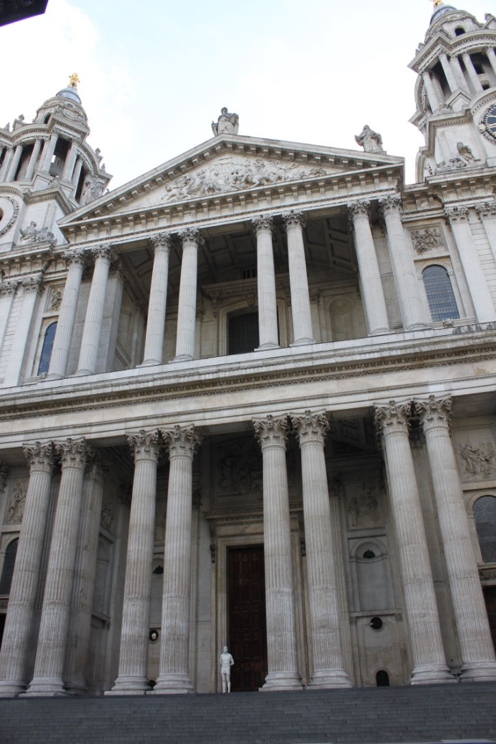
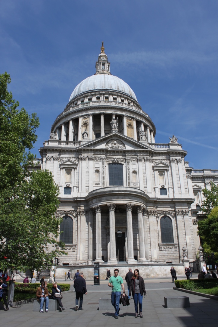
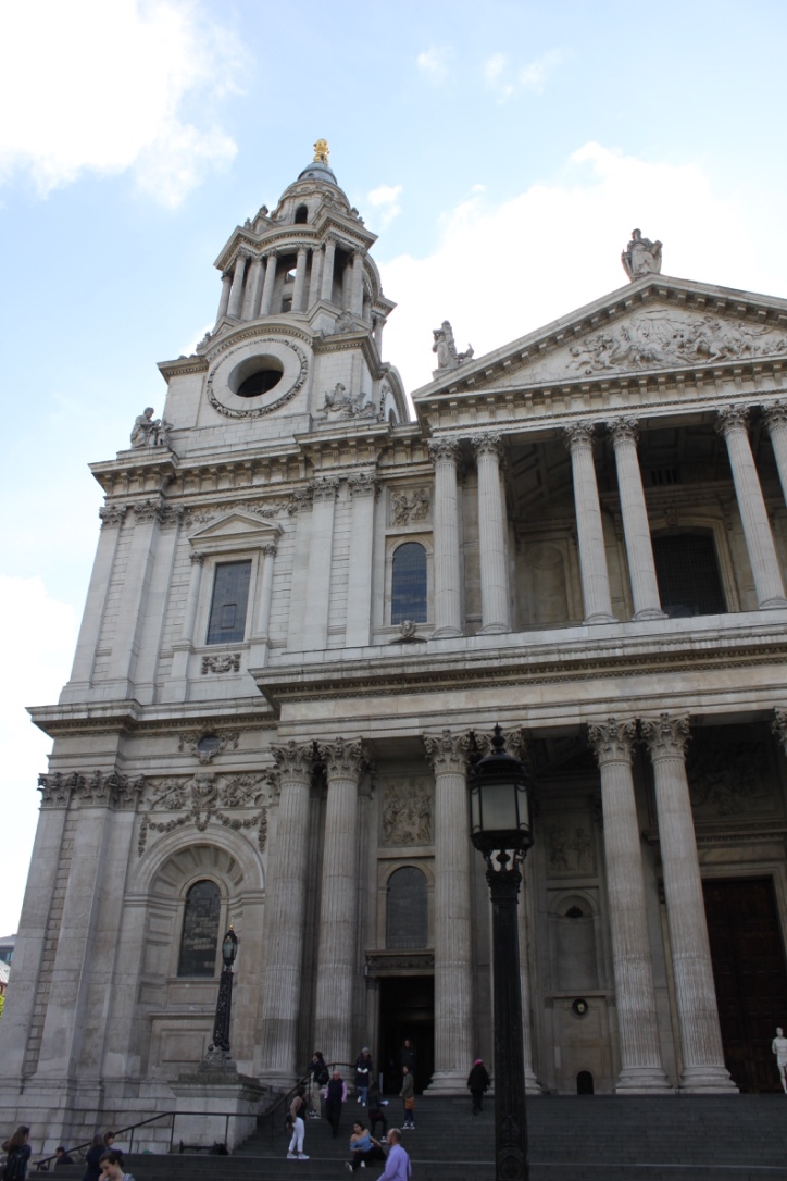
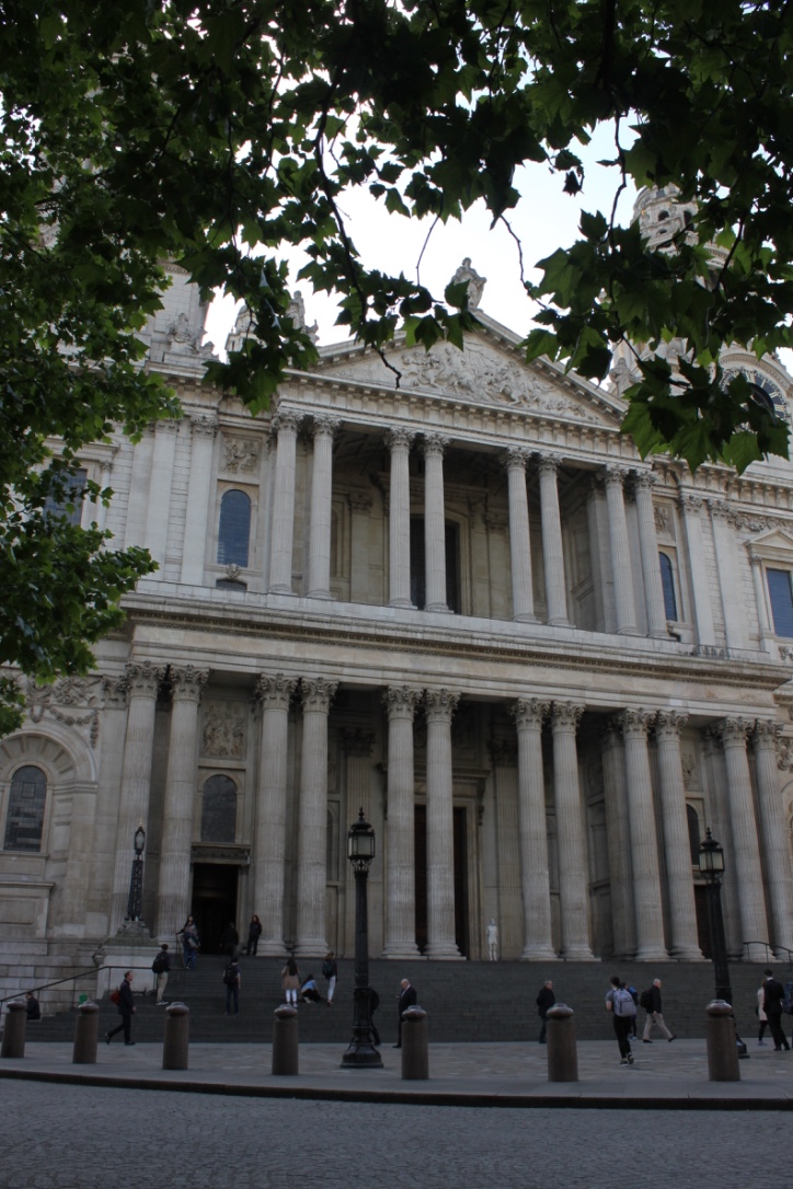
The current version of St. Paul's Cathedral that people are able to visit today was completed in 1711 in an English Baroque style, though originally it was a Gothic style cathedral. Christopher Wren the architect wanted the redesigned cathedral to be both grand and functional, s symbol for the Church of England. Wren chose to construct his masterpiece out of Portland stone, which is a type of limestone from an area of Portland in Dorset; he used this so that the cathedral would have a light and beautiful interior. His design was unlike any other Anglican cathedral, in that it had characteristics of Roman cathedrals. The dome, rounded arches, portico, and the columns are all elements of the Baroque style of architecture that he included. It gains the title of English Baroque because it is much more elaborate than its plainer counterparts. This stylist overhaul created by Christopher Wren was only possible because the cathedral had been heavily damaged by the Great Fire of London. Over the 39 year period of construction, from 1675 to 1711, Wren oversaw the entire construction, living to see the cathedral's completion.
Links
https://www.stpauls.co.uk/history-collections/history/cathedral-history-timeline
Westminster Abbey
In stark contrast to the appearance of St. Paul's Cathedral, Westminster Abbey was created in the Gothic style. Due to its long period of construction, the abbey transitions into the Neo-Gothic style with the addition of the western tower. This imposing church with its tall spires, pointed windows, and stained glass windows, serves to exemplify the Gothic Style. The abbey had its final construction completed in 1745, though is currently undergoing construction to make it more accessible to the handicapped. Westminster Abbey is home to all of the coronations of the British monarchy since 1066, the coronations of both King Harold and William the Conqueror. It also serves as a place for royal weddings and christenings.
more will be added later
Links
Royal Albert Hall
Style
Designer
Material
Date Built
Purpose/ function
Leadenhall Building
Style
Designer
Material
Date Built
Purpose/ function
City Hall
Style
Designer
Material
Date Built
Purpose/ function
The British Library
After separating from the British Museum in 1973, The British Library began construction in
Style
Brutalist/ Scandinavian modernism
Designer
Colin St John Wilson
Material
Needs more research
Date Built
Finished in 1998
Purpose/ function
National library of the UK, library with the second largest number of total items in the world
Facts
- The middle contains a 6 story glass tower containing the King's library
- Largest public building constructed in the UK in the 20th century
- 300 km of shelves
- Outdoor courtyard
Links
London Eye
The London Eye is the largest cantilevered observation wheel at a hieght of 135 meters. Its style can be considered modern, it is a new take on the traditional ferris wheel. It was designed by Marks Barfield Architects as a part of a competition to best celebrate the turn of the century. The base of the London Eye is made of a steel A frame, and the wheel part of the London Eye is connected to the rim by cables. Because of these heavy duty materials the London Eye can withstand winds up to 50 miles per hour. It was Launched in 2000 to celebrate the millennium, with 32 capsules on it representing the 32 boroughs of London. Originally it was built to be a temporary structure, made so that they could dismantle it and move it. It was only supposed to be in its location for 5 years but it became such a tourist attraction and staple it is now a permanent addition to the London skyline.
The Royal Exchange
The first Royal Exchange was built as the center for trading stocks in London. It was built in 1566 by Thomas Gresham in the Neoclassical style and was opened by Queen Elizabeth I in 1571. In 1666 The Royal exchange was destroyed in the Great Fire of London, and a second site opened up in 1669. This building was designed in a Baroque style by Edward Herman. The second Royal Exchange was also destroyed by a fire in 1838, which leads us to the third and current Royal Exchange. In 1844 there was an architectural competition to deign the third Royal Exchange and Sir William Title wins, and builds it as its originally layout from the first Stock Exchange. He however added eight columns to the entrance, which was inspired by the Pantheon in Rome. The building was opened by Queen Victoria in 1844. Since then the Royal Exchange has been home to stock trading, theater shows, and now a luxury shopping mall. The building was constructed out of concrete.
http://www.theroyalexchange.co.uk/heritage/
Buckingham Palace
The Buckingham Palace we know today has been worked on by many architects including John Nash, Edward Blore, Aston Webb, William Winde,James Pennethorne, and Thomas Cubitt. It was built in the Neoclassical style. The first build was in 1703 and was later redone in the 1820s when King George wanted a renovation. The last major construction was in the 1840's so Queen Victoria could have more space for her family. The material used to construct the palace was Caen stone, which is usually reserved for important religious buildings. When John Nash did his renovation however the palace was refaced in bath stone. In 1913 the Palace was refaced again in Portland stone as one of the first acts of conservation. The Buckingham Palace was first considered Buckingham house and was not used for its now purpose as the home of the Royal Family until Queen Victoria.
The jewel tower
The Jewel Tower is one of three remaining buildings from the medieval Palace of Westminster with a lot of its 14th century architecture still remaining relatively unchanged. The building was constructed in the early 1360's, and at that point until the early 16th was used to store the royal jewels and plate which is how it got its name. From the 16th century until 1864 however it was used to store the records of the house of Lords, which is considered the nations 'memory'. The Jewel Tower shows the evolution form state, to monarchy, to parliamentary democracy, to an imperial power.
It was built as a medieval treasury, so there are no windows on the ground floor and only two small windows on the first floor. Form the remains they believe there were to double doors at the entrance to the top floor. They believe this level contained particularly sensitive or valuable items. The master mason who worked on this building was Henry Yevele and master carpenter Hugh Herland, the used rough stone and dressed stone to construct the tower. This was built in a medieval style, however unfortunately many of the medieval features have been defaced or removed when renovations were made to the building.
Observations that were made presume that the building was a very functional building and it did not have many ostentatious features. A lot of the information on this building are presumptions because of its age. They believe because of the distinctive shape of the windows mean that Architect Nicholas Hawksmoor helped in designing the buildings.
http://www.english-heritage.org.uk/visit/places/jewel-tower/history/significance/what i
Style
Designer
Material
Date Built
Purpose/ function
Kensington Palace
Style
Designer
Material
Date Built
Purpose/ function
NCP Car Park
Style
Designer
Material
Date Built
Purpose/ function
Section 2: Comparisons
Section 3: Deliverable
In this section, provide your contribution, creative element, assessment, or observation with regard to your background research. This could be a new derivative work based on previous research, or some parallel to other events. In this section, describe the relationship between your background review and your deliverable; make the connection between the two clear.
Interactive Map
https://maphub.net/bloniarzna/London-Architecture
Gallery
Conclusion
In this section, provide a summary or recap of your work, as well as potential areas of further inquiry (for yourself, future students, or other researchers).
References
Add a references section; consult the Help page for details about inserting citations in this page.
Attribution of Work
For milestones completed collaboratively, add a section here detailing the division of labor and work completed as part of this milestone. All collaborators may link to this single milestone article instead of creating duplicate pages. This section is not necessary for milestones completed by a single individual.
External Links
If appropriate, add an external links section
Image Gallery
If appropriate, add an image gallery
