London Architecture
From Londonhua WIKI
Twenty of London's Architectures
by Olivia Gibbs, Natalie Bloniarz & Emily Wilson
 Your Project Page Picture Caption |
Contents
- 1 Twenty of London's Architectures
- 2 Abstract
- 3 Introduction
- 4 Section 1: Background
- 5 Section 2: Deliverables
- 6 Conclusion
- 7 Attribution of Work
- 8 External Links
- 9 References
Abstract
The paragraph should give a three to five sentence abstract about your entire London HUA experience including 1) a summary of the aims of your project, 2) your prior experience with humanities and arts courses and disciplines, and 3) your major takeaways from the experience. This can and should be very similar to the paragraph you use to summarize this milestone on your Profile Page. It should contain your main Objective, so be sure to clearly state a one-sentence statement that summarizes your main objective for this milestone such as "a comparison of the text of Medieval English choral music to that of the Baroque" or it may be a question such as "to what extent did religion influence Christopher Wren's sense of design?"
Introduction
I suggest you save this section for last. Describe the essence of this project. Cover what the project is and who cares in the first two sentences. Then cover what others have done like it, how your project is different. Discuss the extent to which your strategy for completing this project was new to you, or an extension of previous HUA experiences.
As you continue to think about your project milestones, reread the "Goals" narrative on defining project milestones from the HU2900 syllabus. Remember: the idea is to have equip your milestone with a really solid background and then some sort of "thing that you do". You'll need to add in some narrative to describe why you did the "thing that you did", which you'd probably want to do anyway. You can make it easy for your advisors to give you a high grade by ensuring that your project milestone work reflects careful, considerate, and comprehensive thought and effort in terms of your background review, and insightful, cumulative, and methodical approaches toward the creative components of your project milestone deliverables.
Section 1: Background
10th Century
Westminster Abbey
Dean's Yard, Westminster London, SW1
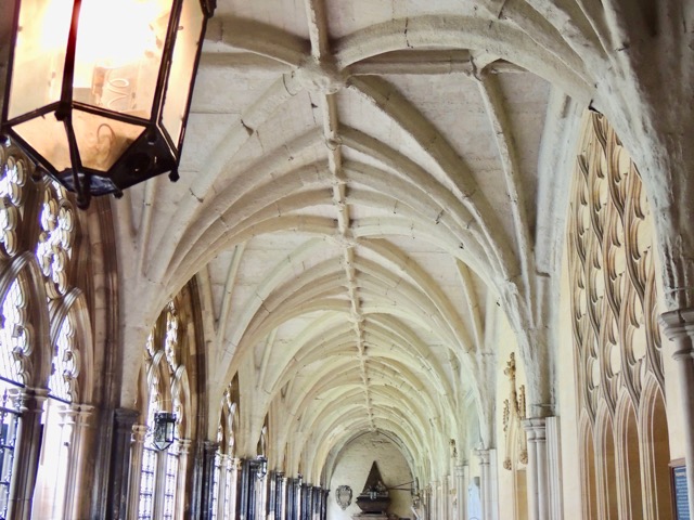
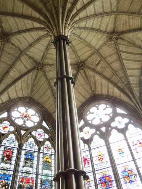
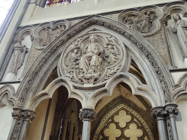
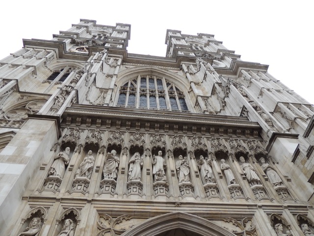
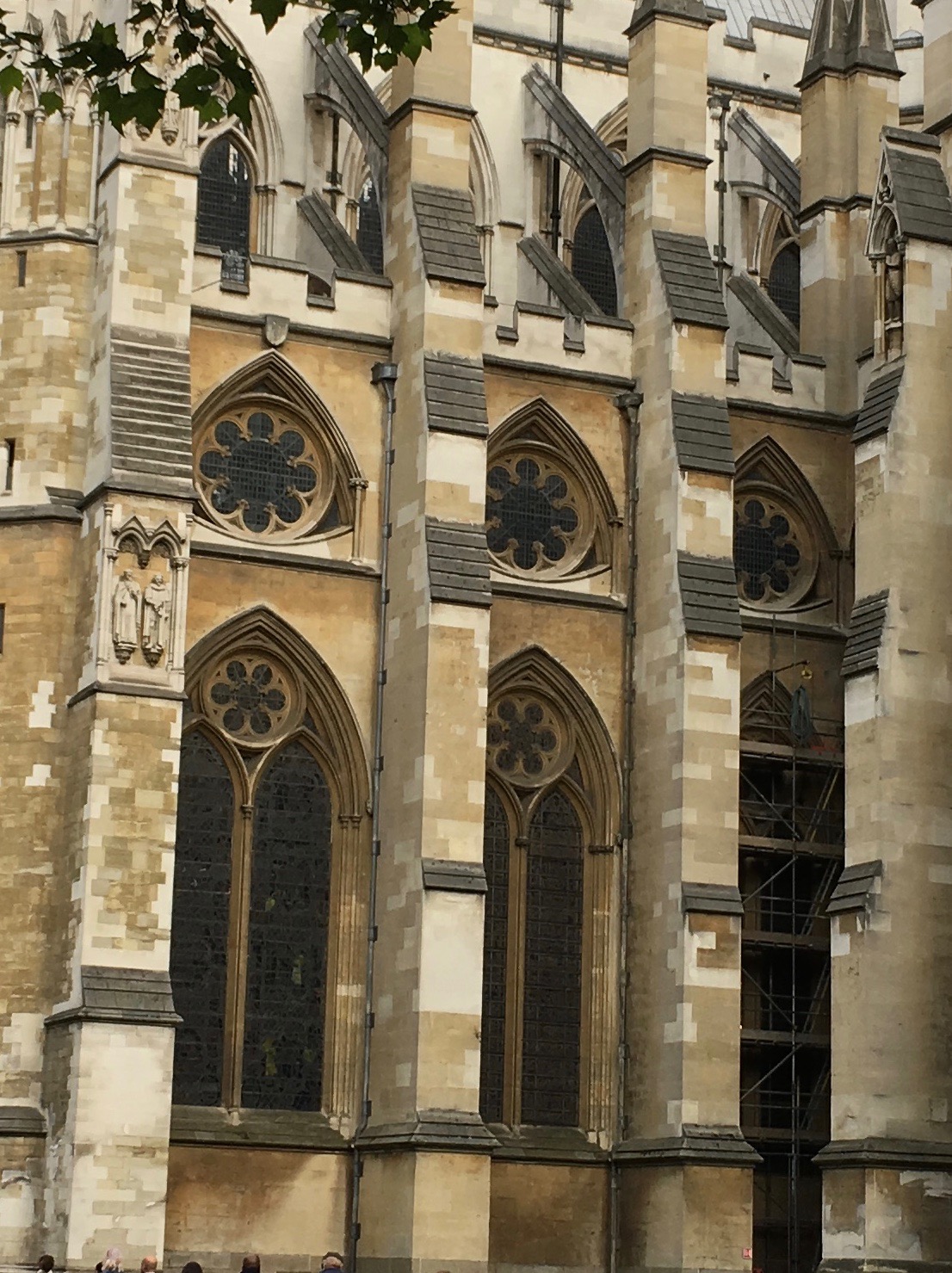
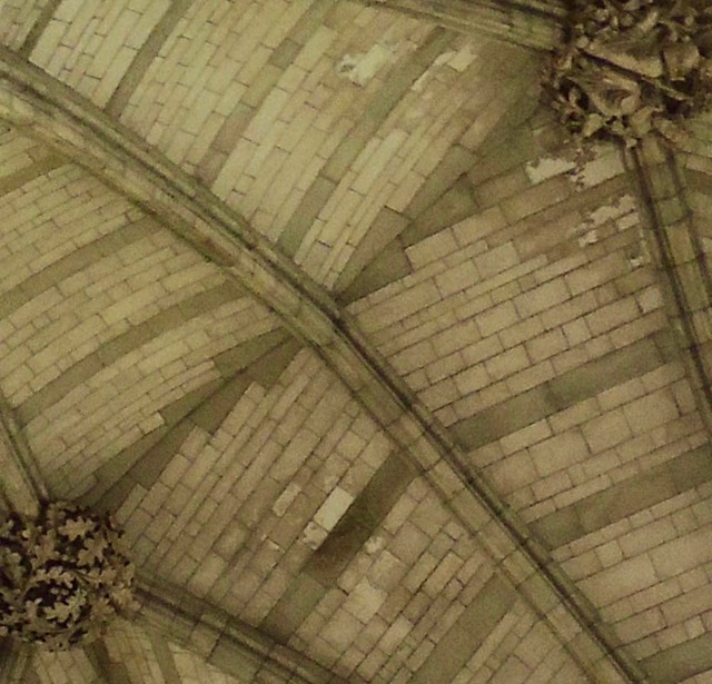
Westminster Abbey was created in the Gothic style, though it has transitioned across styles over its long existence. Originally opened in 1065 as a more medieval style church, due to its long period of construction and many renovations, the abbey transitions into the Neo-Gothic style. The architect that added on to this great abbey was Nicholas Hawksmoor in the 18th century designing and constructing the west towers, an addition creating the transition into the Neo-Gothic Style. This imposing church with its tall spires, pointed windows, and stained-glass windows, serves to exemplify the Gothic Style. It also follows the format of most Anglican churches, forming a Latin cross and having the longer part of the cross running from west to east. The abbey had its final construction completed in the 16th century, though it has undergone many restorations and is currently undergoing construction to make it more accessible. Westminster Abbey is home to all of the coronations of the British monarchy since 1066, the coronations of both King Harold and William the Conqueror. It also serves as a place for royal weddings and christenings. Read more.[1]
14th Century
The Jewel Tower
Abingdon St, Westminster SW1P 3JX
The Jewel Tower is one of three remaining buildings from the medieval Palace of Westminster with a lot of its 14th century architecture still remaining relatively unchanged. The building was constructed in the early 1360's, and at that point until the early 16th was used to store the royal jewels and plate which is how it got its name. From the 16th century until 1864 however it was used to store the records of the house of Lords, which is considered the nations 'memory'. The Jewel Tower shows the evolution form state, to monarchy, to parliamentary democracy, to an imperial power.
It was built as a medieval treasury, so there are no windows on the ground floor and only two small windows on the first floor. Form the remains they believe there were to double doors at the entrance to the top floor. They believe this level contained particularly sensitive or valuable items. The master mason who worked on this building was Henry Yevele and master carpenter Hugh Herland, the used rough stone and dressed stone to construct the tower. This was built in a medieval style, however unfortunately many of the medieval features have been defaced or removed when renovations were made to the building.
Observations that were made presume that the building was a very functional building and it did not have many ostentatious features. A lot of the information on this building are presumptions because of its age. Historians believe because of the distinctive shape of the windows that Architect Nicholas Hawksmoor helped in designing the buildings. [2] [3]
16th Century
Shakespeare's Globe
21 New Globe Walk, London SE1 9DT
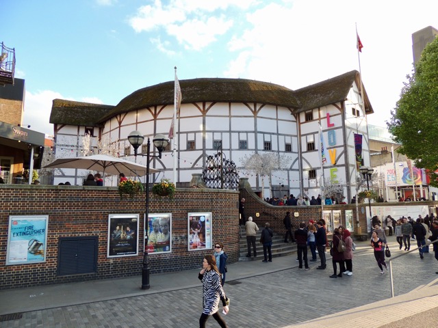
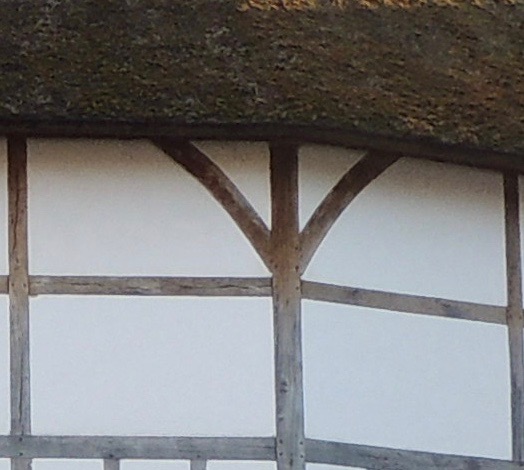
Shakespeare Globe today stands only 180 meters from its original site after the original one was destroyed in a fire in 1613. The original one was built by carpenter Peter and his workers in 1597/1598 out of timber, nails, stone (flint), plaster and thatched roofs. It was built to look similar to Roman Coliseum but on a smaller scale. They believed if they had a similar building than they would give them an aura of respectability. After being rebuilt after the fire, it was shortly closed down by Puritans in 1642 and then demolished in 1644. Fortunately, rebuilding was resuscitated by actor Sam Wanamaker who established the Globe Playhouse Trust in 1970. That same year, Southward Council offered the trust their now 1.2 hectare site which is home to the Globe. Peter McCurdy's team spent six years researching about the Globe to design as close to the original as possible. They learned it held “Twenty bays form a galleried perimeter wall, each three stories high and thatched in Norfolk reed with lime plaster."[cite] The stage was built with a 14 meter canopy coverage supported on two 8.5 meter high timber columns. Remaining true to the sixteenth century materials which craftsman used the Globe is made from unseasoned green oak and each joint is unique and identified with the carpenter's numeral too. The chief architect was Theo Crosby but he died during the building process so Peter McCurdy tried to remain true to the original plan as possible so the audience can experience the authentic stage in of Shakespeare's theatre, an Elizabethan style. [4] Cite error: Closing </ref> missing for <ref> tag [5]
To learn more about current shows check out their website: Globe
17th Century
Kensington Palace
Kensington Gardens, London W8 4PX
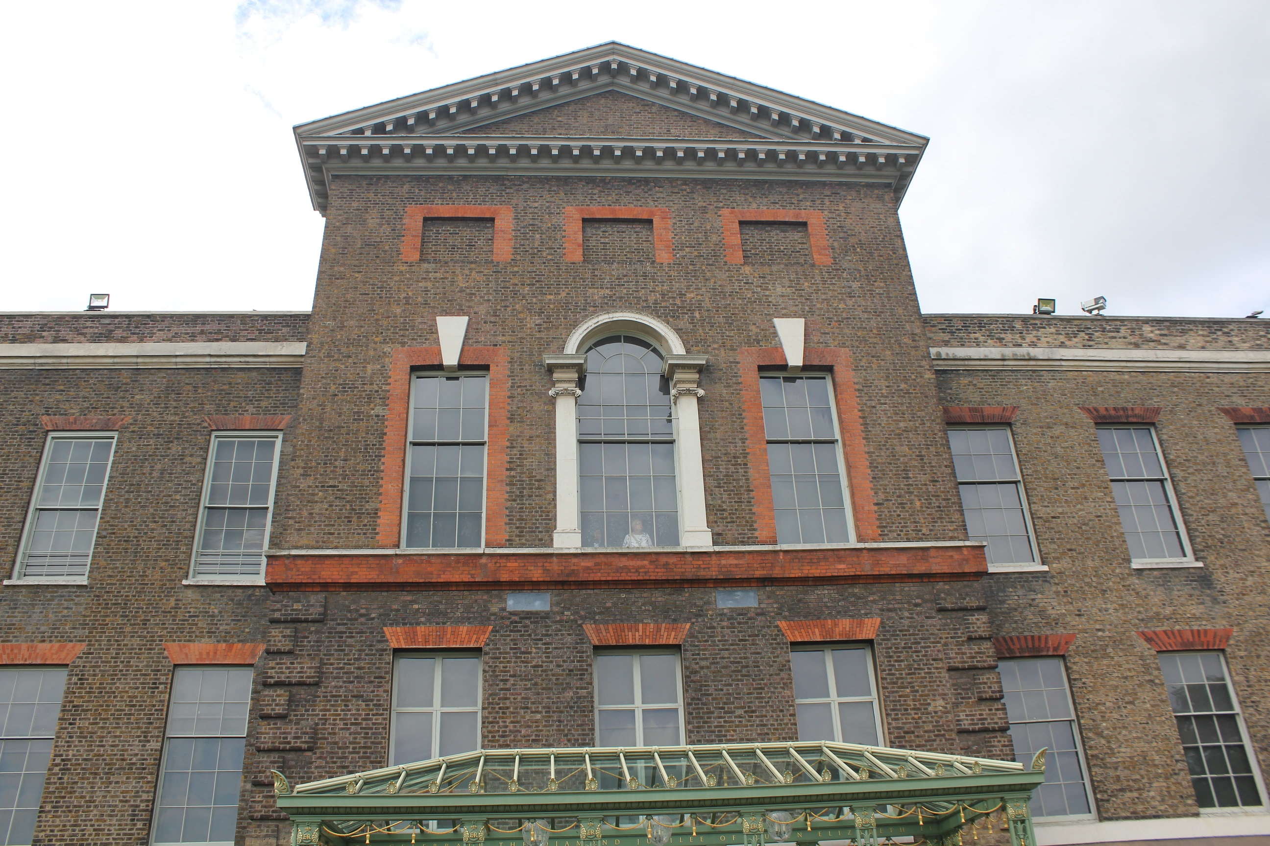
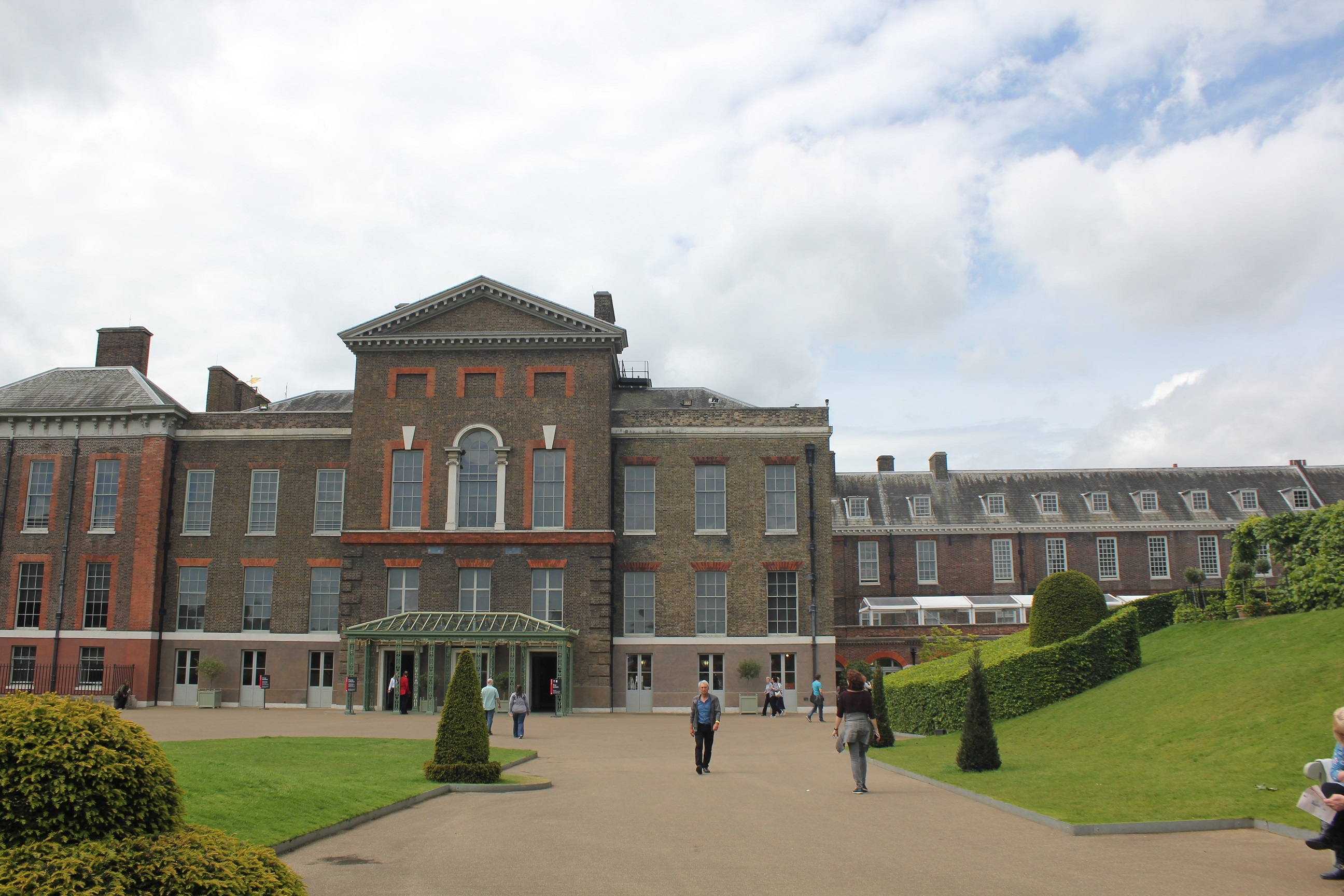
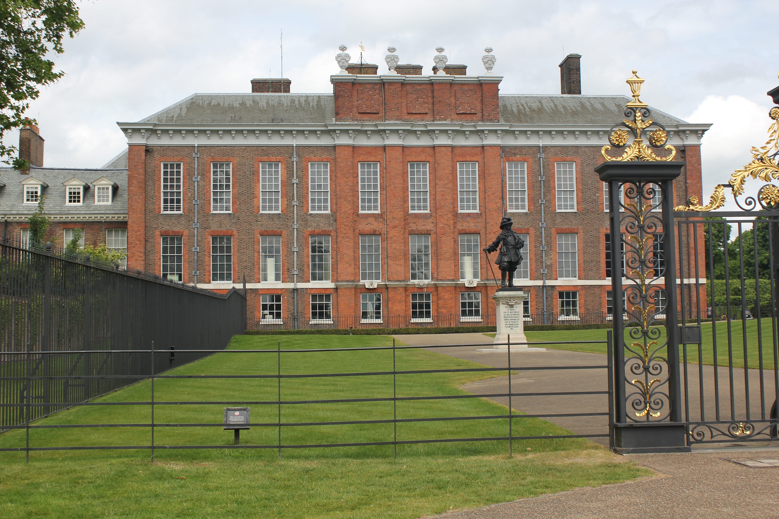
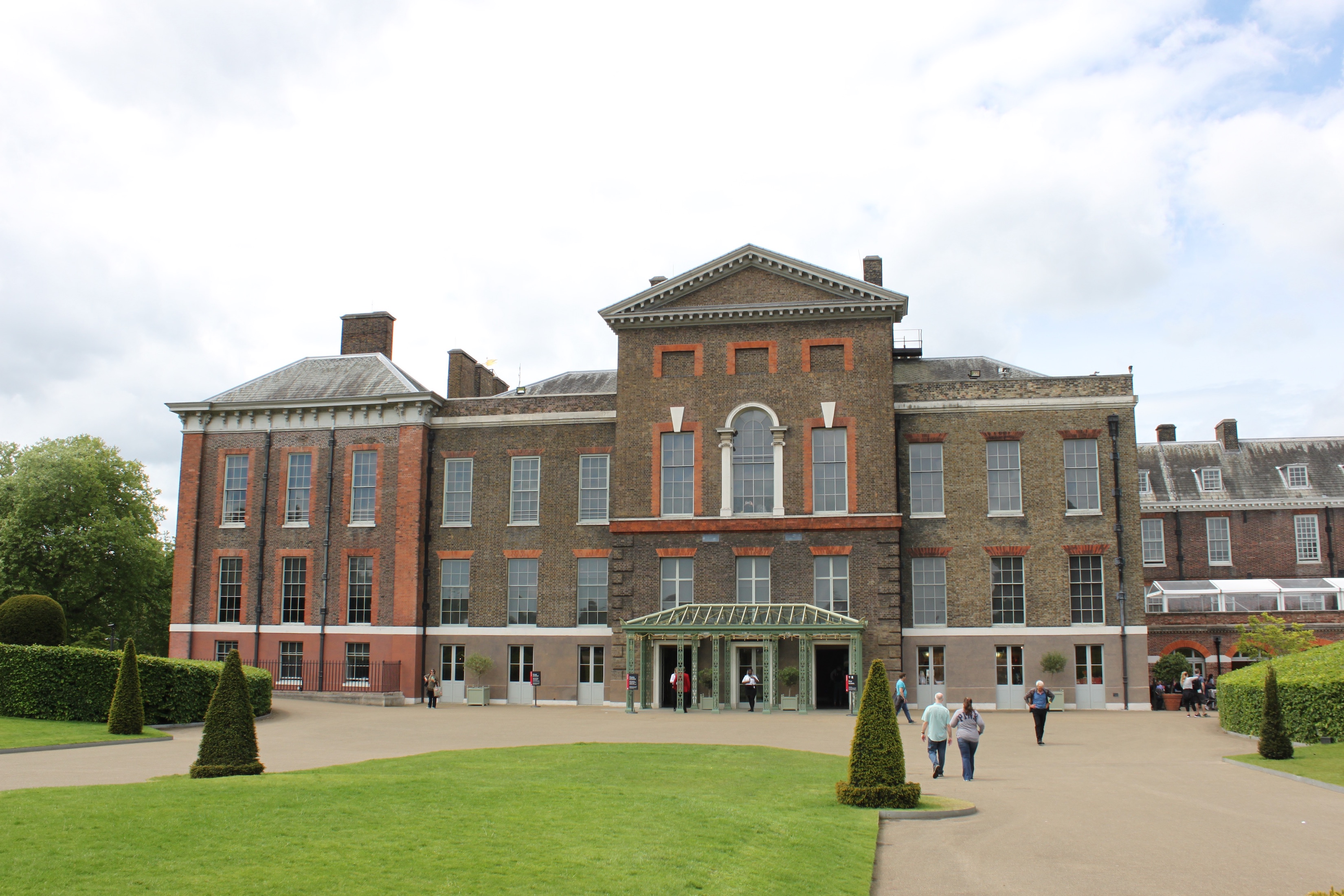
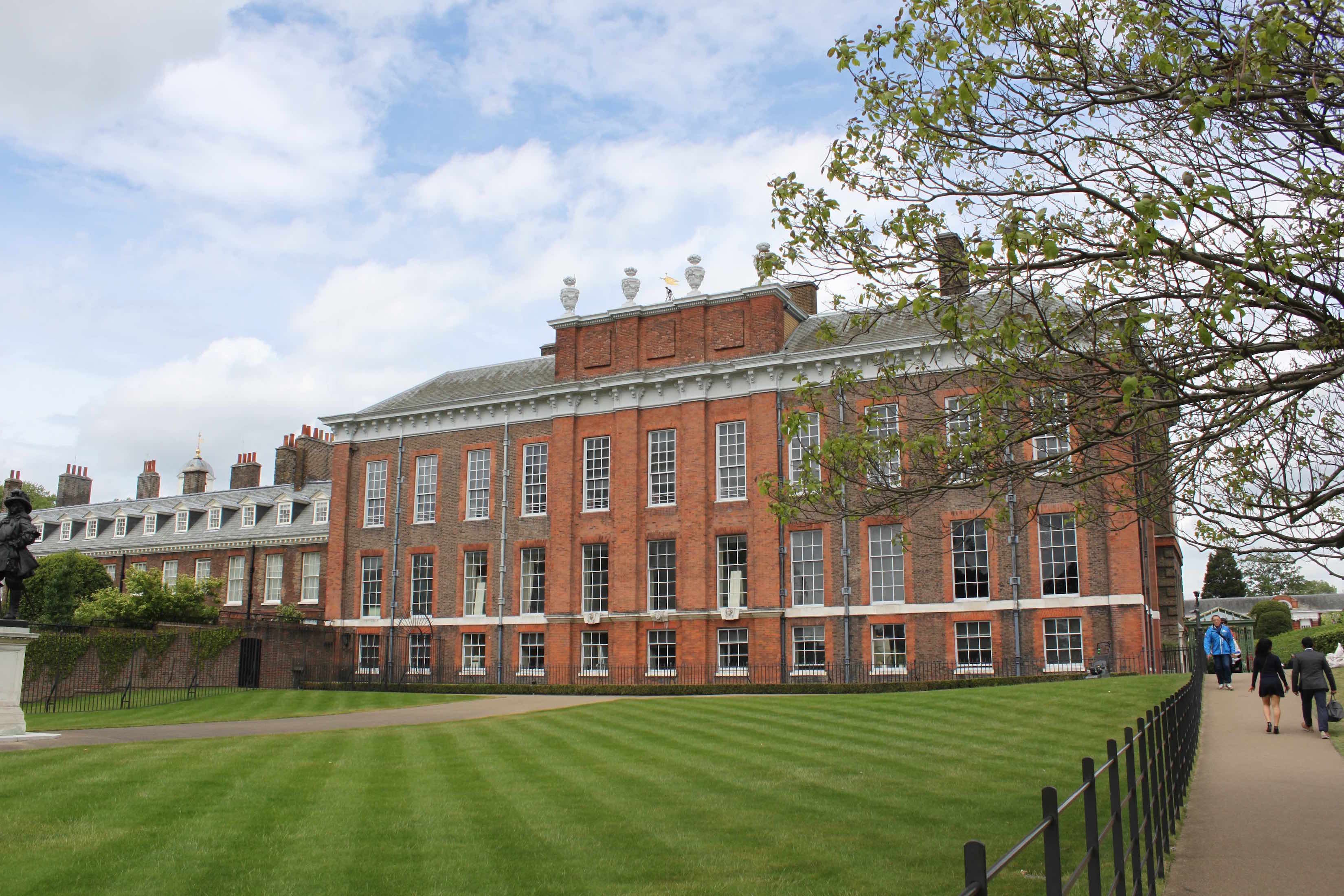
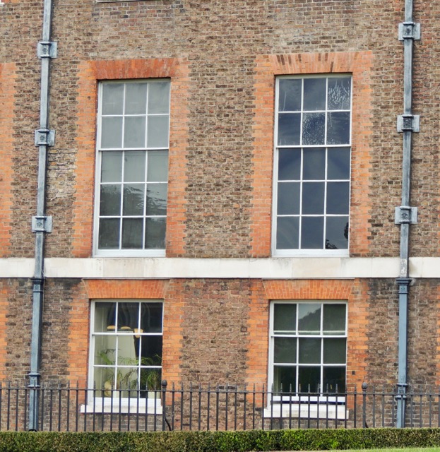
King William III and Mary II purchased Nottingham house which was a Jacobean mansion that was built around 1605. They made the purchase in order to escape the London smog that was plague gin King William III at the time. They hired Christopher Wren to work on it, and he got to work on it right away and in order to save money and time he added pavilions to the four corners of the Jacobean house and he used red brick for the material. He also placed the main entrance on the west side of the building under a two-storied portico, which altered the face of the building, and had you approach through a courtyard that was guarded by a gate tower. There were in such a hurry to complete the renovation for the king and queen that the architects took some risks, which caused part of the building to collapse under the weight of the new lead roof, which killed a few of the workmen. What Mary was most excited about was here ability to look out and see gardens, so she created 26 acres of flower beds in the formal French style. In 1670 Mary did another round of improvements by adding in the Queens Gallery. It had its very own staircase and gave a space for her Maids of Honor. In November of 1961 a fire destroyed the new south wing and part of the Great Court, which allowed for a remodel of the royal apartments. The kings staircase was rebuilt, this time in marble, and a Guard Chamber was constructed. The final addition to the Palace by William was done in 1695 which was the the South Front of the building. When Queen Anne took the throne she tended to renovating the gardens. She spent of 26,000 pounds on building garden buildings, and some are still standing today. Because Anne enjoyed tending to the gardens so much, she build a red-brick greenhouse with round domes on each end, with [[Christopher Wren, Vanbrugh, and Hawksmoor, all having helped design it.
When George I came into the palace he commissioned a dramatic rebuild in order to be better then Blenheim Palace, he insisted that it be more regal. In 1718 the renovation as done by William Benson. William Benson designed and added in a suite of ornate state rooms. King George was a big fan of William Kent's work and commissioned him to elaborately decorate the Cupola Room of Nottinghouse, it was decorated in the style of Imperial Rome: with column, gilded statutes of gods and goddesses, marble floors, and large chandeliers. Kent also painted a large Garter Star on the ceiling which is a symbol of regal continuity in England. William Kent was the one who changed Christopher Wren's King's Staircase into the Grand Stair case which lead into the Presence Chamber. Towards the end of his reign King George gave orders to Henry Wise to prepare plans for landscaping the gardens south of the palace, which gives us most of Kensington Gardens and Hyde Park how they are known today.
Through the 19th century there was not a lot of care done for the palace. When Queen Victoria was raining there were ideas to demolish it or change it into a museum or gallery. Queen Victoria however refused to destroy the place she was born. A restoration process took place to restore it as close to as possible the way it looked during George II reign. In 1899 the state apartments were opened to the public and it was both the public museum and a royal home.
In 1910 the Kensington Palace was opened to the public as a museum to display objects that had to do with the City of London and royal relics. In 1914 the museum was moved and the state apartments at Kensington Palace were used as office space during the First World war. The palace was not reopened until 1923. During the second world war however there was bomb damage and it caused it to close until 1949. Nowadays Kensington is again a home for members of the royal family. [6] [7]
18th Century
Buckingham Palace
Westminster, London SW1A 1AA
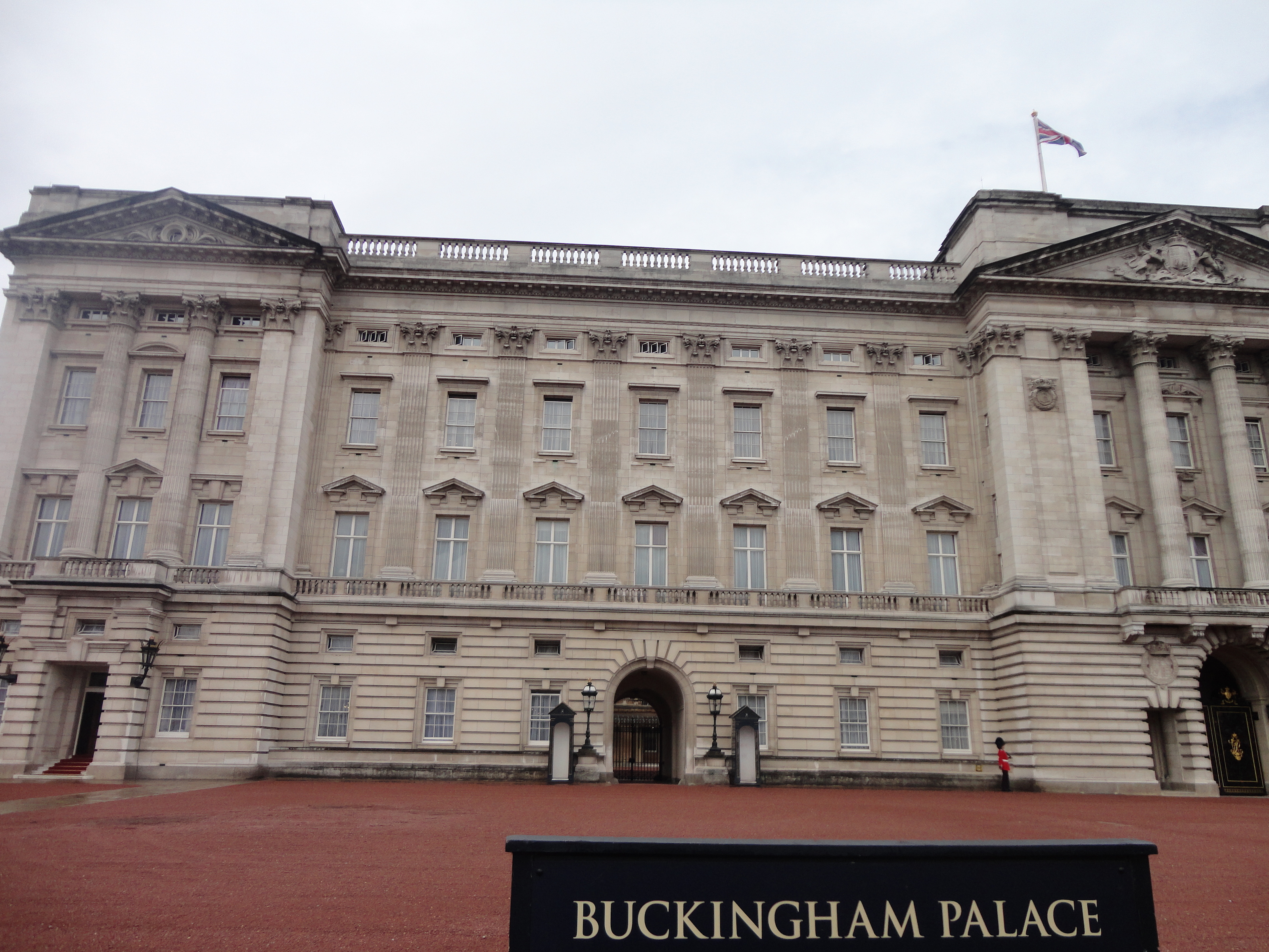
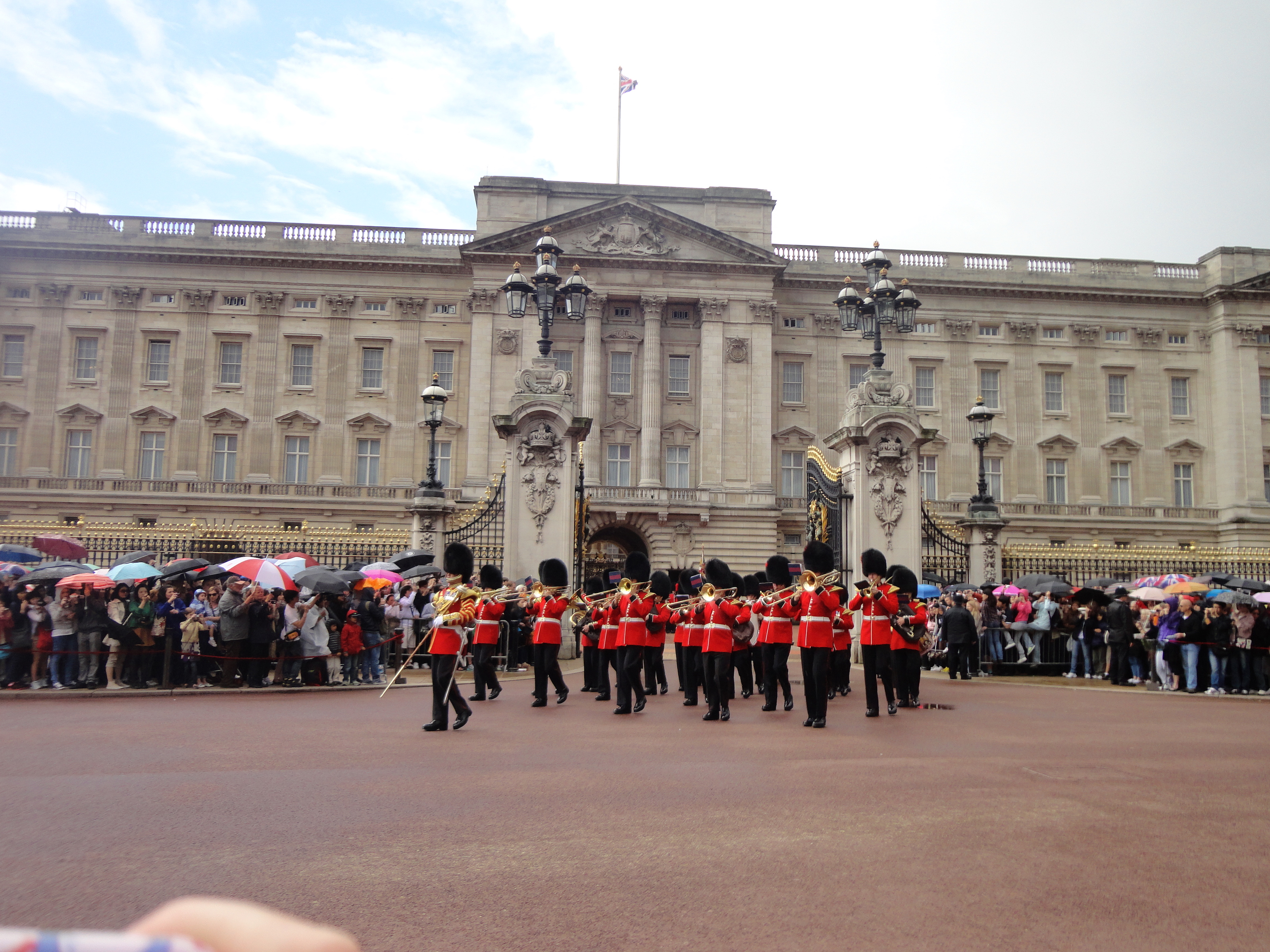
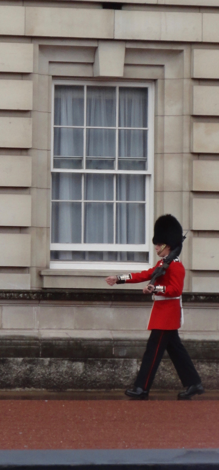
The reason Buckingham Palace is today was because of Queen Elizabeths need for silk, since she decided she would were nothing but silk on her legs. After this there became a royal interest in silver making, and James I planted where Buckingham Palace stand today, 10,000 mulberry trees. James I had hoped that silkworms spinning on the leaves of these trees would bring a fortune to Britain. Unfortunately however he bought the wrong type of mulberry tree and the ones he bought produced delicious berries, but silkworms would not touch them. Buckingham Palace, which is in Westminster London, was originally known as Buckingham house. It was called this because it was built for John Sheffield, the duke of Buckingham. The Buckingham Palace we know today has been worked on by many architects including John Nash, Edward Blore, Aston Webb, and James Pennethorne. It was built in the Neoclassical style, and there have been many modest alterations and additions to the house. One of them was the King's Library, which is now a part of the British Library.
Nash constructed the Palace which considered of a main building that incorporated the old Buckingham house, with two low wings that extended eastwards. On the inside Nash redid the entrance into the Grand Hall. The Grand staircase that was made of marble lead to the Picture Gallery. There are two sets of state rooms on each side of the palace. There are the Green Drawing Room,Throne Room,State Dining Room, the Blue Drawing Room, and the domed Music room which was in the bow. The first floor of the north wing was occupied by the royal private suite. Trying to save money Nash promised to use an many materials from the dismantled Carlton house, but his grand entrance, the marble arch, cost nearly 35,000 Pounds. The last major construction was in the 1840's so Queen Victoria could have more space for her family.This was done by architect Sir Edward Blore, who built a new east front which completed the quadrangle. In order to do this they had to move the marble arch to the site of the old gallows at Tyburn, and was a monument in a traffic island. That very same year Sir James Pennethorn who studied under John Nash, did some work on interior alterations. He replaced the armory and Octagon Library with a new ballroom. The last changes made to the Palace where by Kind Edward Vii. His architect was Sir Aston Went, who replaced the Caen Stone on the east front with Portland stone, which was meant to act as a backcloth to the memorial to Queen Victoria. At the other end of the mall was the Admiraly Arch that Webb built as a grand entrance to the Processional Way.
[8] [9] [10] [11]
St. Paul's Cathedral
St. Paul's Churchyard, London EC4M 8AD
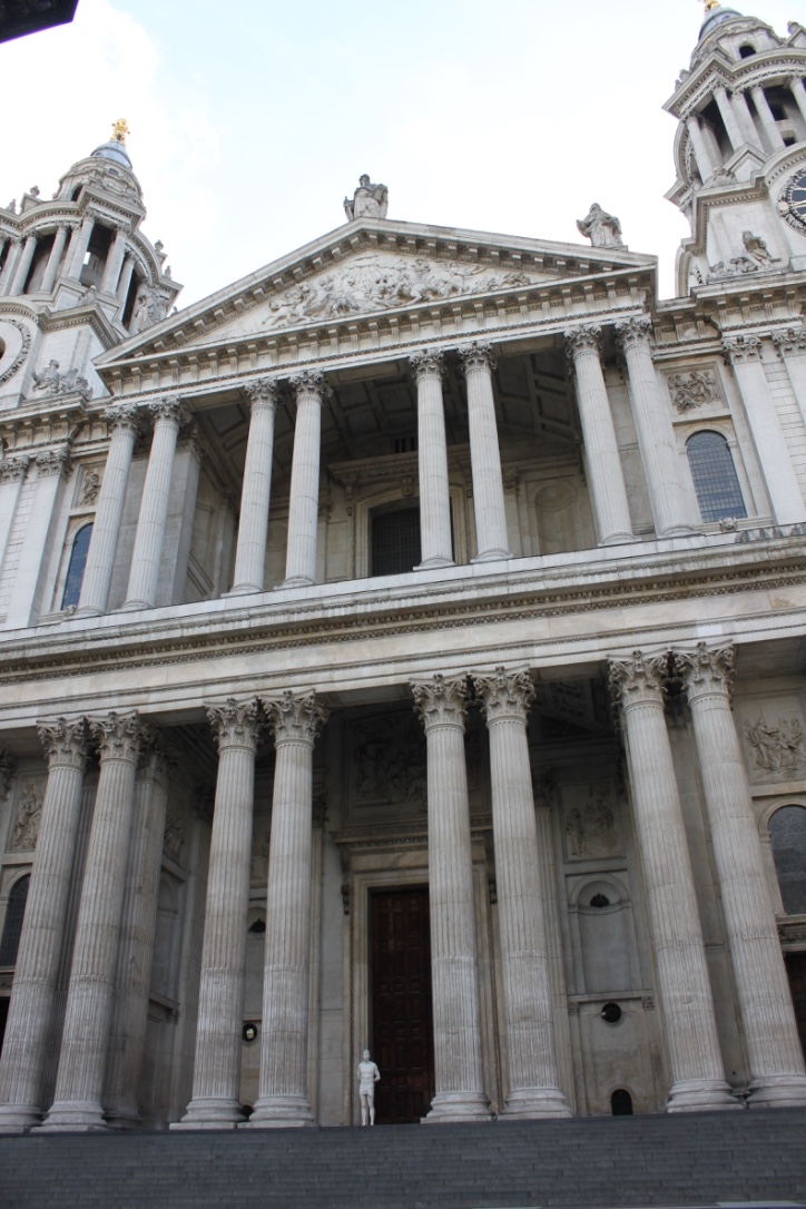
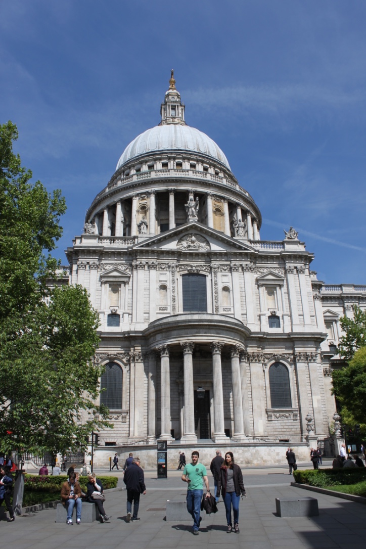
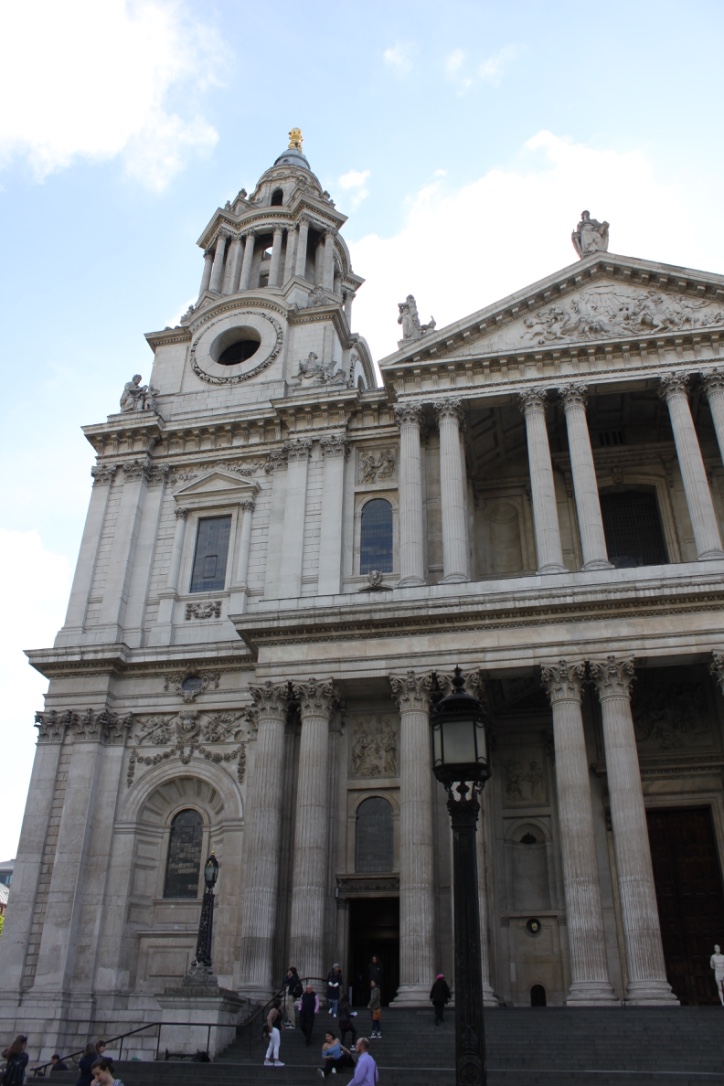
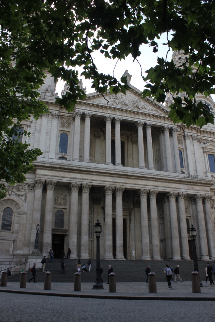
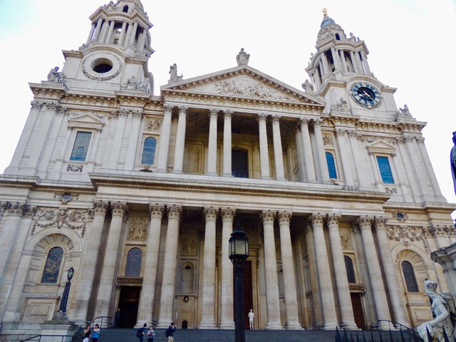
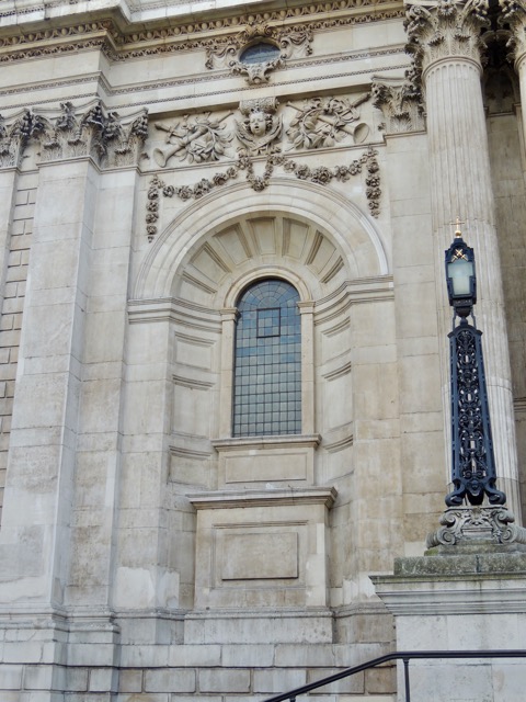
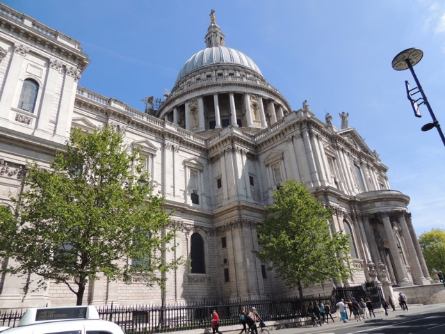
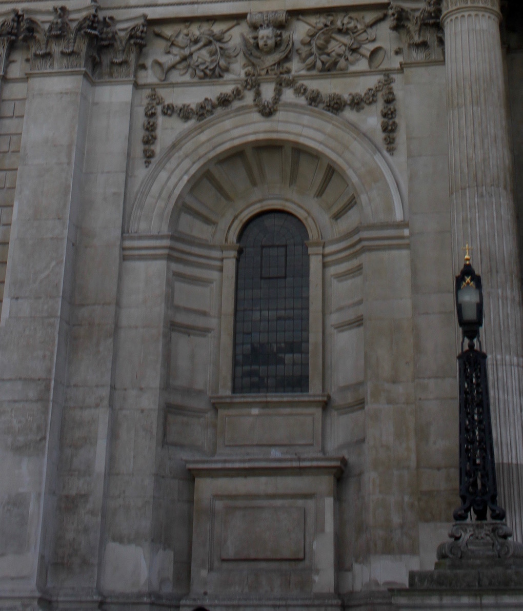
The current version of St. Paul's Cathedral that people are able to visit today was completed in 1711 in an English Baroque style, though originally it was a Gothic style cathedral. Christopher Wren, the architect, wanted the redesigned cathedral to be both grand and functional, creating a symbol for the Church of England. Wren chose to construct his masterpiece out of Portland stone, which is a type of limestone from an area of Portland in Dorset; he used this so that the cathedral would have a light and beautiful interior. His design was unlike any other Anglican cathedral in that it had characteristics of Roman Cathedrals. The dome, rounded arches, portico, and the columns are all elements of the Baroque style of architecture that he included. It gains the title of English Baroque because it is much more elaborate than its plainer counterparts. This stylistic overhaul created by Christopher Wren was only possible because the cathedral had been heavily damaged by the Great Fire of London. Over the 39 year period of construction, from 1675 to 1711, Wren oversaw the entire construction, living to see the cathedral's completion.[12]
19th Century
The Royal Exchange
3 Royal Court, Royal Exchange, Unit 15C, London EC3V 3LN
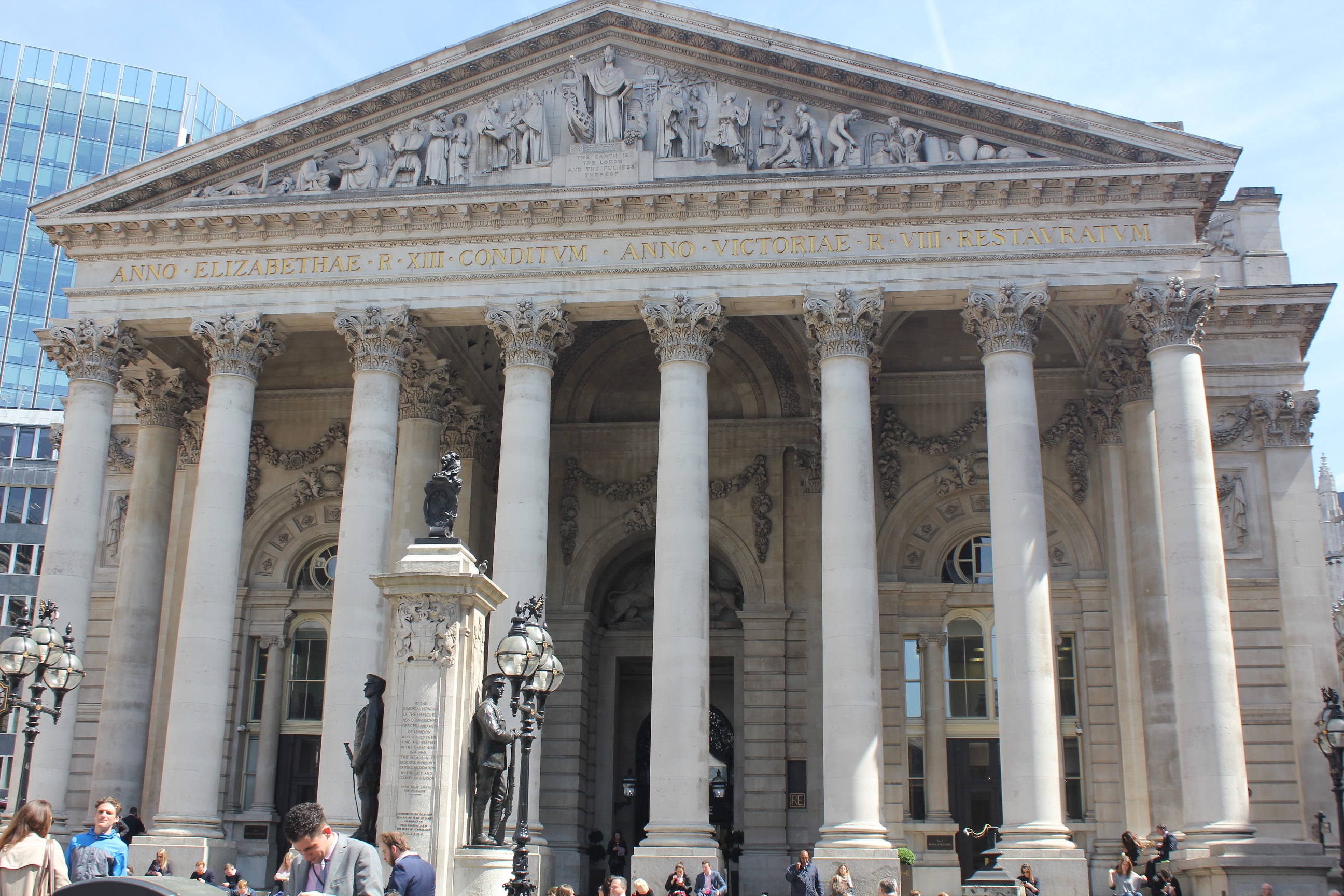
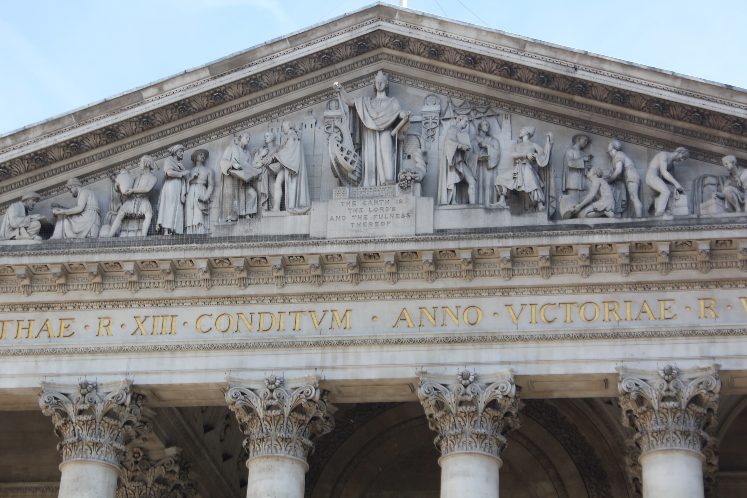
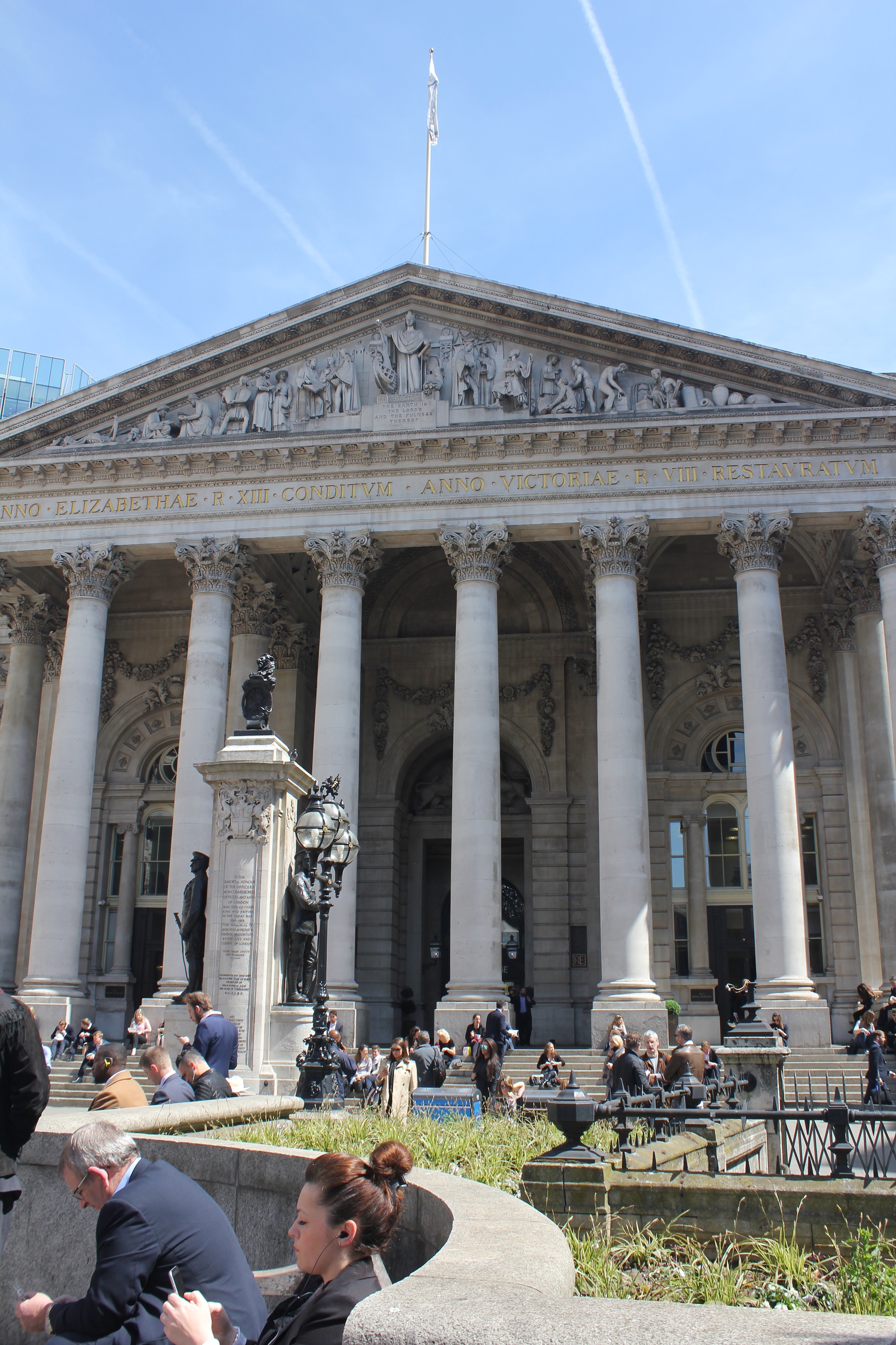
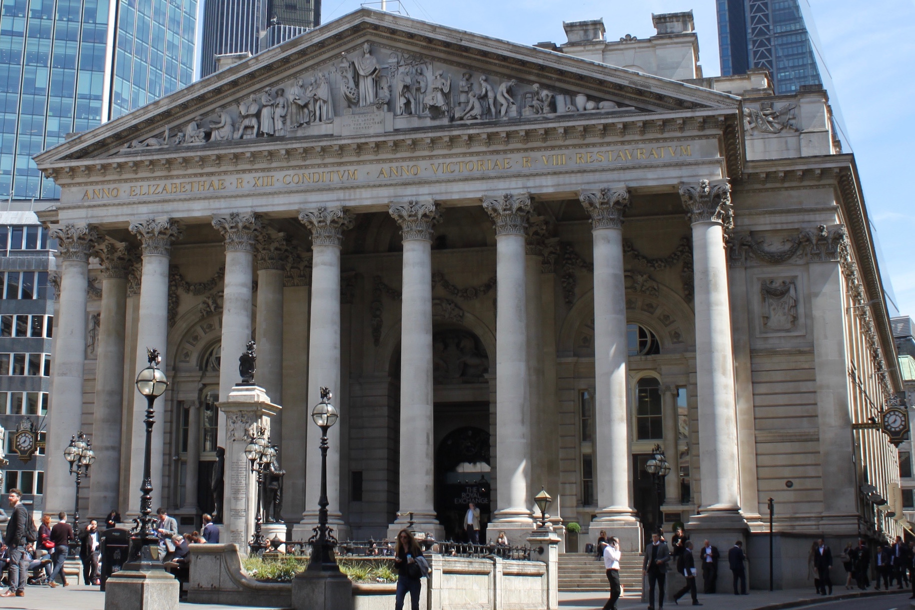
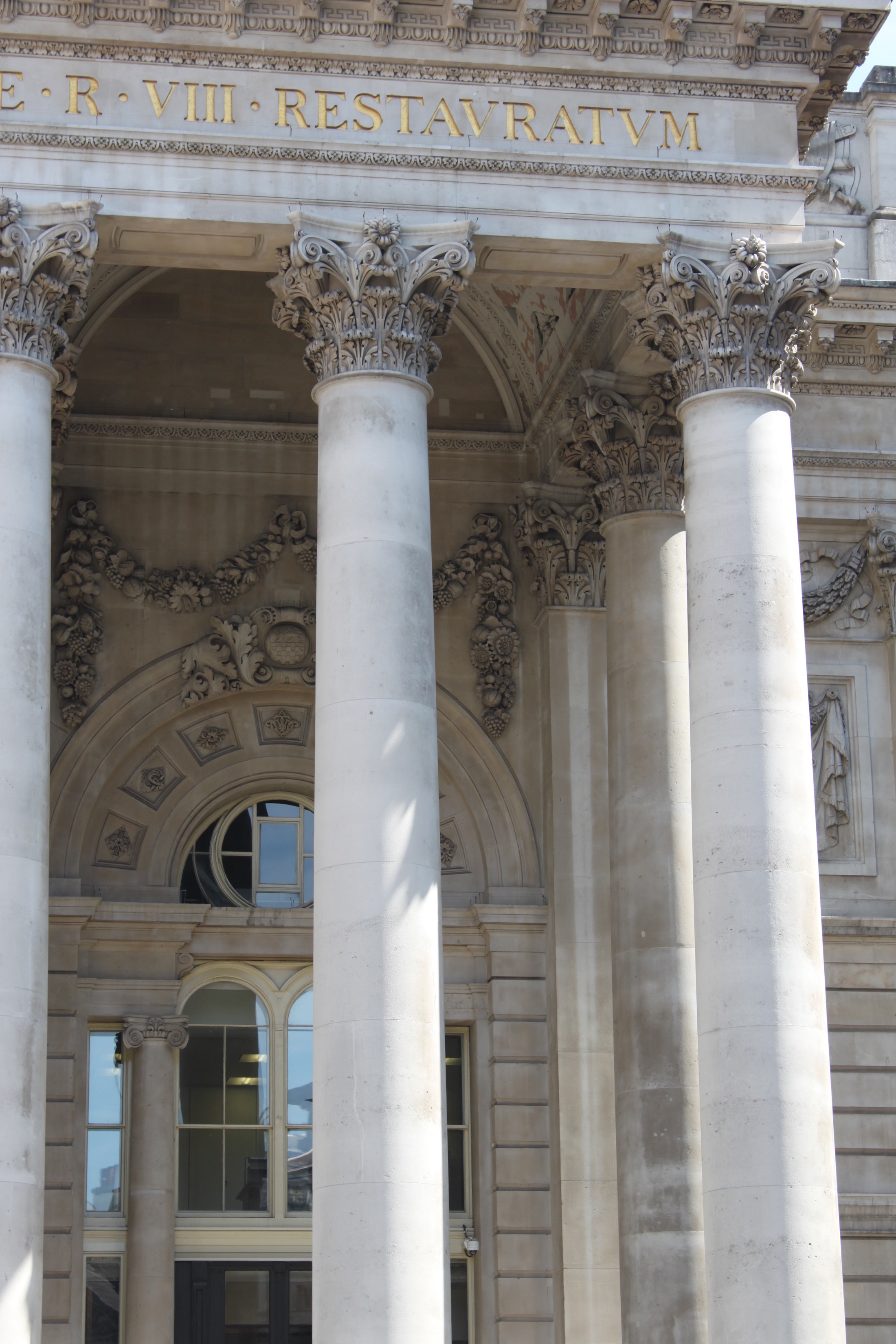
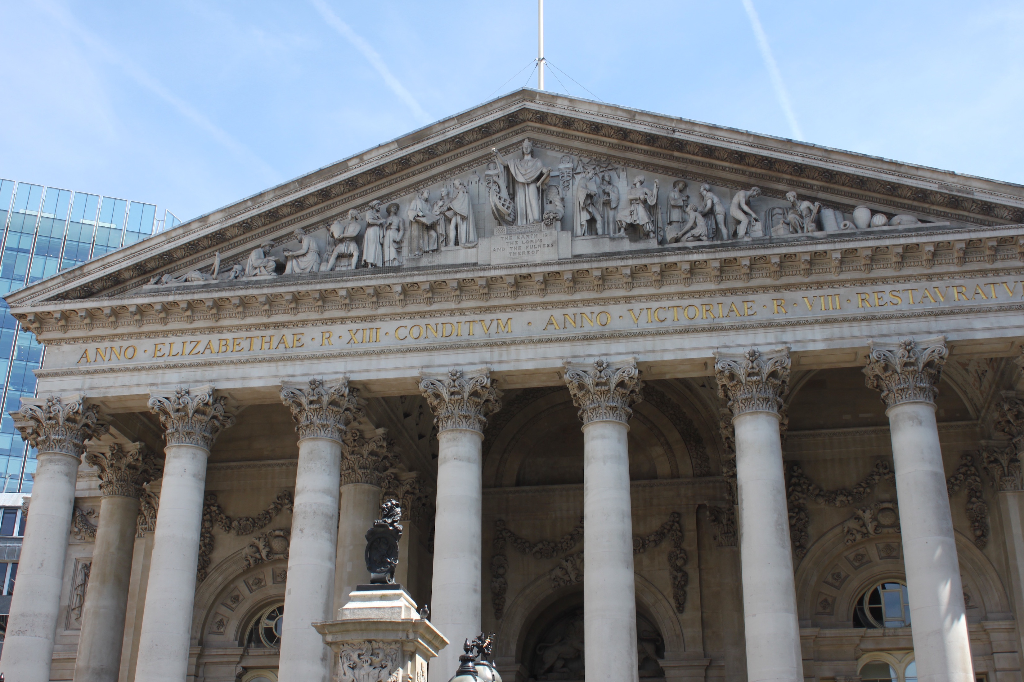
The first Royal Exchange was built as the center for trading stocks in London. It was built in 1566 by Thomas Gresham in the Neoclassical style and was opened by Queen Elizabeth I in 1571. In 1666 The Royal exchange was destroyed in the Great Fire of London, and a second site opened up in 1669. This building was designed in a Baroque style by Edward Herman. The second Royal Exchange was also destroyed by a fire in 1838, which leads to the third and current Royal Exchange. In 1844 there was an architectural competition to deign the third Royal Exchange and Sir William Title wins, and builds it as its originally layout from the first Stock Exchange. He however added eight columns to the entrance, which was inspired by the Pantheon in Rome. The building was opened by Queen Victoria in 1844. Since then the Royal Exchange has been home to stock trading, theater shows, and now a luxury shopping mall. The building was constructed out of concrete.
[13]
St Pancras Station & Hotel
Euston Rd, Kings Cross, London N1C 4QP
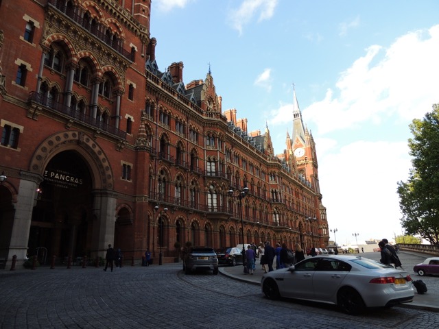
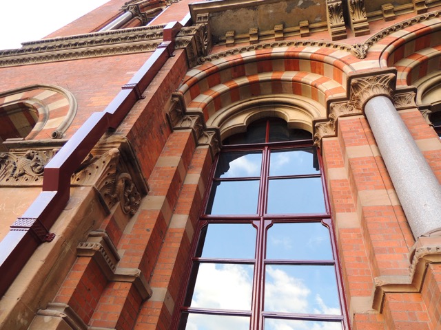
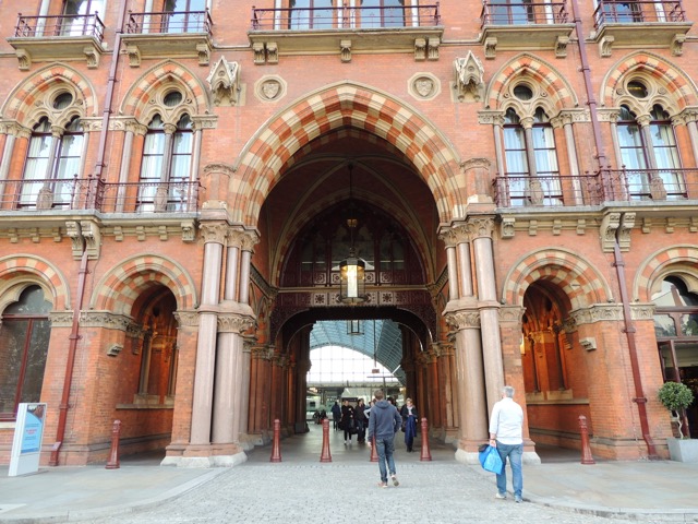
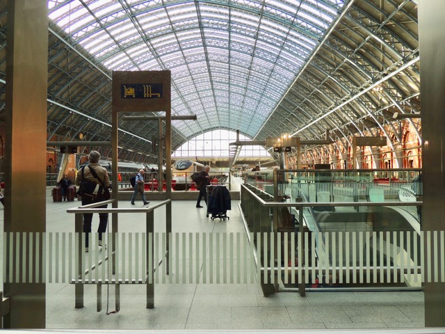
St Pancras Station opened in 1868 (but the hotel and station weren't completed until 1876) becoming one of the most elegant stations in the world. It is an exquisite example of Victorian Gothic architecture. It was first built by Midland Railway Company (MRC) led by head engineers William Henry Barlow and Roland Mason Ordish along with architect George Gilbert Scott who's job was to create a connection from London to other major cities in England. MRC wanted to make a grand statement for their company which they successfully accomplished. Not only is it gorgeous from the outside but the functions inside where advancements at the time for trains by having the platform deck raised above so the steam engines can pass over the Regent’s canal. Also, the space below known today as The Arcade, was designed to store and sell beer. The most noticeable feature is the roof of the station, the iron ribs create a 100ft high, 240ft wide and 700ft long arch, which at the time was the longest spanning one rib. This roof design has been copied all over the world including New York's Grand Central Station. The hotel architecture all around complements the trusses which form at the top of the ribs. Both the hotel and station were bombed multiple times during World War I, but it was the fifth bomb that caused the most casualties and destroyed the Booking Office roof which has since been replaced with a simpler one. Again during World War II more bombs had been dropped from air raids destroying the underground workings, but with time they had been reconfigured. The station more recently underwent an expansion to fulfill the modern international train system to include the Chunnel. The expansion included doubling it's length, and an additional 6 new platforms, but to preserve Scott and Barlow’s original design a separate extension was constructed in concrete, glass and steel. The greatest change though was converting the beer cellar to station facilities. The renewal was reopened by the Queen on November 6th, 2007 after taking three years to work on.
Once known as the Midland Grand Hotel, the St Pancras Renaissance hotel, has recently reopened in 2011 as a hotel. It was first closed in 1935 after World War II due to lack of profit and then used for miscellaneous offices for British Rail until it was at risked of being demolished. Fortunately, Sir John Betjeman started a campaign and was able to get it to get the hotel granted Grade I status in 1967 so it wouldn't be touched. It has become home to scenes in Harry Potter and 101 Dalmatians for its unique interior full of spiral staircases and high pointed windows and decked out in ornate stone details throughout. The main architectural features are the arched double doorway through to the main hotel, and the arcade on its left. The arches created a natural flow for citizens to get to and from the station. Currently it is a five star hotel with one night starting at 250 pounds a night.
Royal Albert Hall
Kensington Gore, Kensington, London SW7 2AP
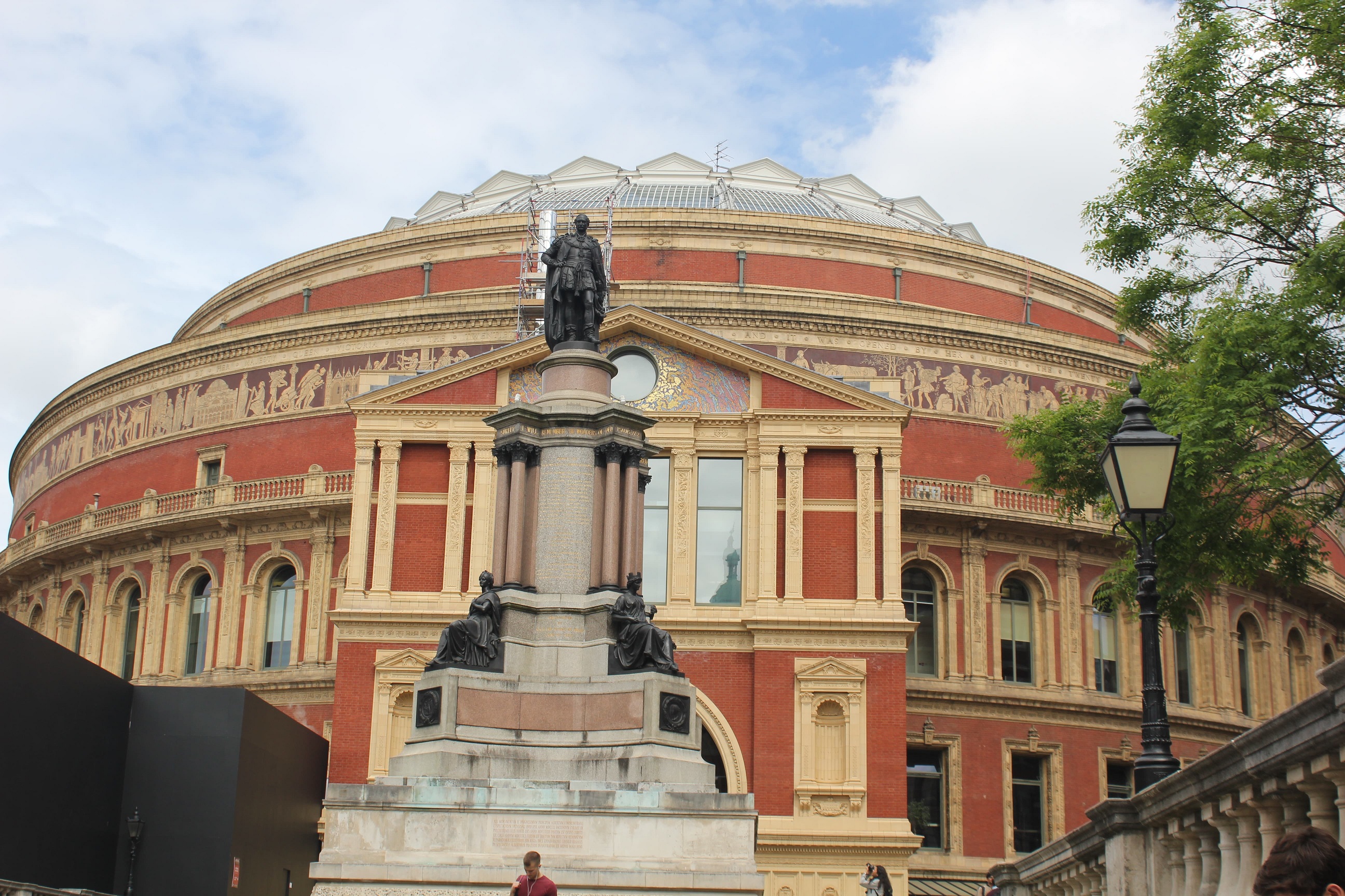
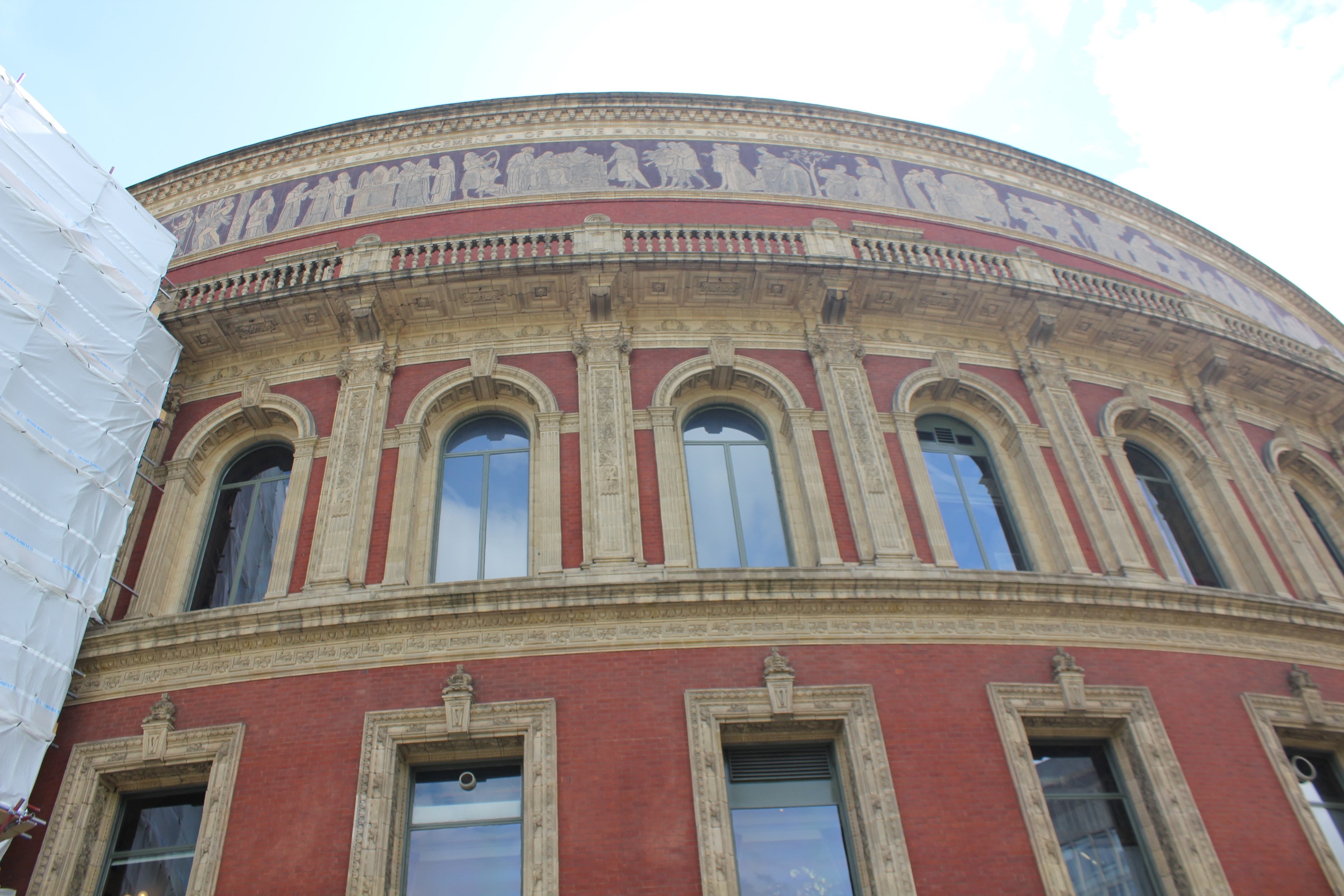
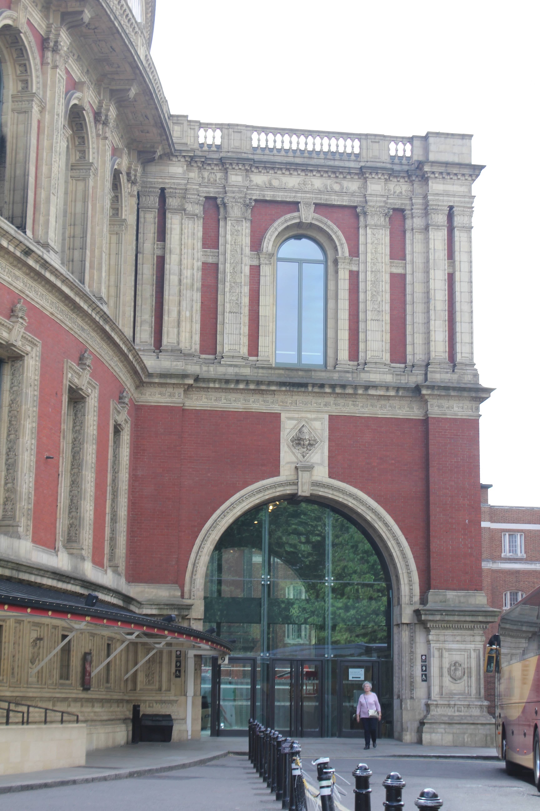
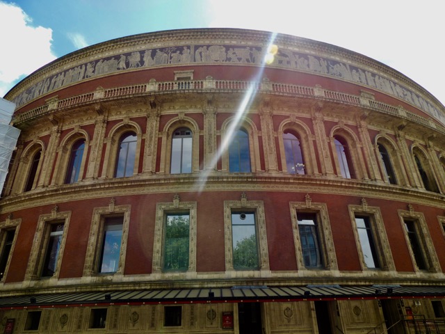
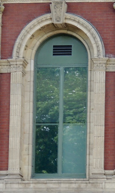
Located in South Kensington, the Royal Albert Hall resides among other famous buildings such as the Victoria and Albert Museum and The Natural History Museum. Built from 1866 to 1871 and designed by Captain Francis Fowke and Colonel H.Y. Darracott Scott of the Royal Engineers, the hall was built to be a permanent home to the exhibits featured during the Great Exhibition that had closed fifteen years before the construction began, which was housed on a temporary structure known as the Crystal Palace. A new cultural district was born in South Kensington under the nickname of "Albertopolis" was funded by the profits from the Great Exhibition, which would decide the location of this new hall. The foundation for the building was laid by the widow of Albert, Queen Victoria. The initial design was created by Fowke, but after his death it was taken over and completed by Scott. The design of the building called for it to resemble a Roman amphitheater, being oval in shape. The roof was to be made of iron-and-glass and a dome shape to help the building withstand the effects of the English weather. The hall was constructed out of an orange-red type of brick and golden terra-cotta and bares semblance to the Victorian and Classical styles. At the opening of the hall a concert was performed, but the acoustics were so horrid that the conductor would hear the piece twice over in its echos. In 1969, the acoustics were fixed with the addition of fiberglass placed high up into the dome. The hall was partly funded by the donations of patrons in the form of subscriptions to seats giving the patron the right to attend later performances. On the north side resided The Royal Box, which was Queen Victoria's subscription seat. In the situation that the hall is hosting an event that would need a larger floor space, a temporary floor can be constructed over the lower level seats. The hall annually hosts two events: the Festival of Remembrance in recognition of twentieth century war deaths and the Henry Wood Promenade Concerts. Because if its well designed Victorian construction, Royal Albert Hall has stood up to more modern fire codes only failing in areas of service like the restaurant and loading docks.[14]
Tower Bridge
Tower Bridge Rd, London SE1 2UP
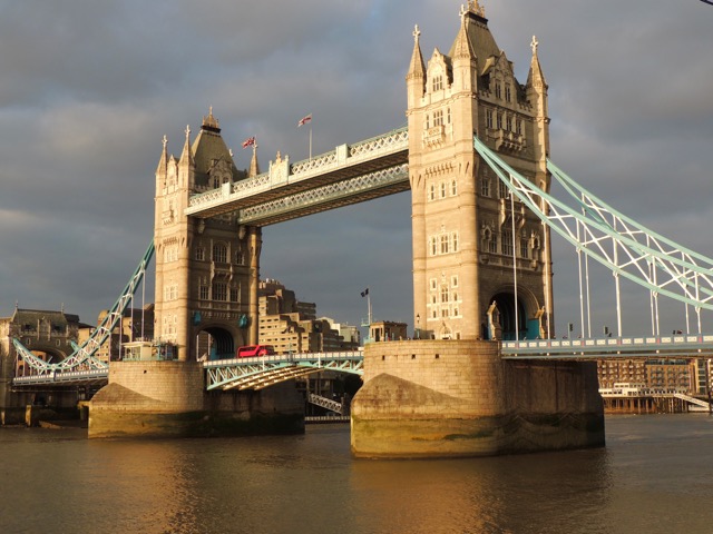
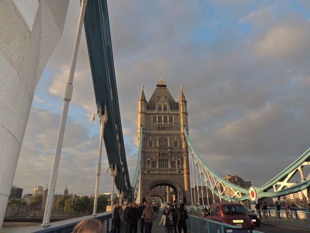
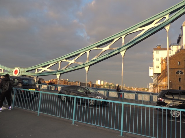
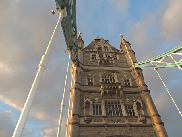
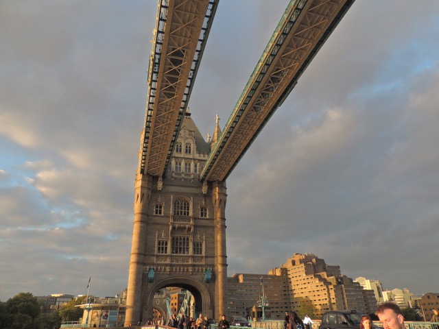
Constructed over 8 years, the Tower Bridge was built to create another path for people to journey across the river Thames. One of the problems it faced before construction began was, that the design of the bridge could not close off access to the ports. A multitude of designs were submitted in competition, but the one that was chosen was from Sir Joseph Bazalgette, and the architect appointed was Sir Horace Jones. His design consisted of two bridge towers with two leaves that could be raised to allow for ships to pass, and as per a design requirement, it was made to be in the Gothic style. When Jones died at the beginning of the construction, a new architect was brought on, George D. Stevenson. Stevenson proceeded to slightly alter the style to be Victorian Gothic, a more elaborate style than its predecessor. When the bridge was complete in 1894 it was opened officially by King Edward VIII.
Progressing forward to World War II, the suspension mechanism was modified to protect against attacks. In 1974, the bridge went under modernization replacing the old inefficient engines with a modern hydraulic system. Later in 1982, the Tower Bridge Exhibition was opened, creating a greater tourist attraction at the bridge. The exhibition was held between the two towers along the upper walkway and engine rooms, allowing for views of the skyline of the city and includes a portion with a glass floor added for the more thrill seeking visitor. Over four years, starting from 2008, Tower Bridge underwent a renovation to restore and revamp the facade, repainting the the suspension cables blue and white and installing lighting along the the pedestrian walkways allowing the bridge to be lit up a multitude of colors. In preparation of the Olympics in 2012, the Olympic rings were hung to commemorate the event, taken down shortly after the closing ceremony; this was also completed in a similar fashion when the Paralympics were held.
Tower Bridge is 800 feet across with the top of its two towers reaching a height of 213 feet. It allows for two lanes of traffic, and beside the road are two pedestrian walkways protected from the traffic by fences. The bridge is opened upon requests from ships and opens around 800 times a year at every time of the day. In an attempt to preserve the bridge, speed limits and weight restrictions are being enforced and monitored by cameras and sensors installed along the bridge road.[15][16]
Westminster Palace
Westminster, London SW1A 0AA
This building, also known as the Houses of Parliament, is not the original building that existed on its location on the Thames. The original palace was built in the 10th century and was the main residence of the monarchy until 1512. It was later rebuilt by Edward the Confessor when he constructed Westminster Abbey in the 11th century. The final reconstruction of the palace took place in 1836 after a fire had scourged the palace in 1834. Upon the chance to rebuild documents have stated that the design for the new building needed to be in a traditionally English style, Gothic or Elizabethan. The Gothic style won over its main competitor of the time, Classical, and the chosen design was created by Sir Charles Barry. He was more partial to Classical designs so his plan was to keep the outside appearance in the Gothic style while making the inside more Classical, with a very Classical style layout. The construction took only 12 year and was officially opened in 1852 by Queen Victoria. The only remaining parts of the palace's original form are the crypt of St. Steve's Chapel, once the king's private chapel, and Westminster Hall, also known as the Great Hall. In 1965 the palace officially stopped being a Royal Palace under the control of the monarchy. Westminster Palace is famous for its clock tower, which contains the bell known as "Big Ben," which chimes every hour.[17]
20th Century
Welbeck Street Car Park
77 Welbeck St, Marylebone, London W1G 0BB
This carpark was designed for Debehams department store in 1971, and it can be seen as a block-sized sculpture. It was made with diamond shaped modular concrete panels that lock together with the row above to form a geometrical pattern. It was designed by Michael Blampied, with a frame that is open to the outdoors which allows for ventilation of fumes from the building. The building material used was concrete, which is used in brutalist style architecture. Which is a mixture of water, and in this case Irish Milwhite aggregate, which gives it its pale color, sand, and some sort of binding agent, such as cement. When it dries it is as hard as stone, and it did not become a widespread material until the late 19th century. It had a brick spine wall, stair, and lift towers. This is a great example of when architecture and transportation are combined. Unfortunately the Welbeck Street Car park is at risk of being demolished. After and attempt to be put on the Listed Buildings and Conservation Areas that did not pass because it was constructed in a pop art style, which had already been a well established style before it was put into use. This design was a first of its kind for car parks, and can be seen as art in a building. . [18] [19]
The British Library
96 Euston Rd, Kings Cross, London NW1 2DB
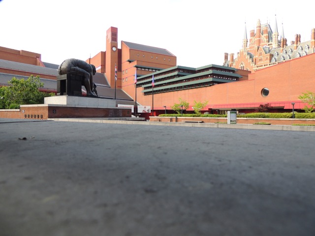
After separating from the British Museum in 1973, The British Library began construction in 1977 and was completed in 1997. The library was designed by Colin St. John Wilson and Sir Leslie Martin. The design was completed in 1964 and was based of the version of modernism at the time, now known as brutalism. The library contains a more organic feel and uses asymmetry to create visual interest also to contrast with the more traditional styles of architecture near by. The building's design is rooted in Gothic influences because the Gothic style lends itself to the visual effect that was desired by Wilson.
The material of choice was a combination of concrete and brick. The concrete provides a strong structural support and provides a stable foundation for the rest of the building. The brick was chosen to be in harmony with St. Pancras, and that the appearance of brick is improved as it is battered by both climate and time.
A major way the building was divided was based on the use of the space, following the modernist tradition that "form follows function." The open reading areas of the library are much smaller and have less access to natural daylight, as people spend shorter spans of time in those areas. The reading rooms have a greater access to natural light to help alleviate the monotony of long research. Rooms that would require people to spend the longest amount of time in have the most access to daylight through the use of windows and skylights. Another area with emphasis on daylight is the main entry, and the light is used to create a more welcoming atmosphere. The entryway is broken up into tiers to make it appear less intimidating to the visitor and it is also designed so that people can easily understand where to go.
A major design element of the library was the central tower that houses the King's Library, home to many important documents like the Magna Carta and original manuscripts. The collection that is the King's Library is housed on a glass case to show of the beauty of the books and to add a scholarly air to the building. Another point of design was the Piazza, with its many meeting places to draw people to the library.[20][21]
Barbican Center
Silk St, London EC2Y 8DS
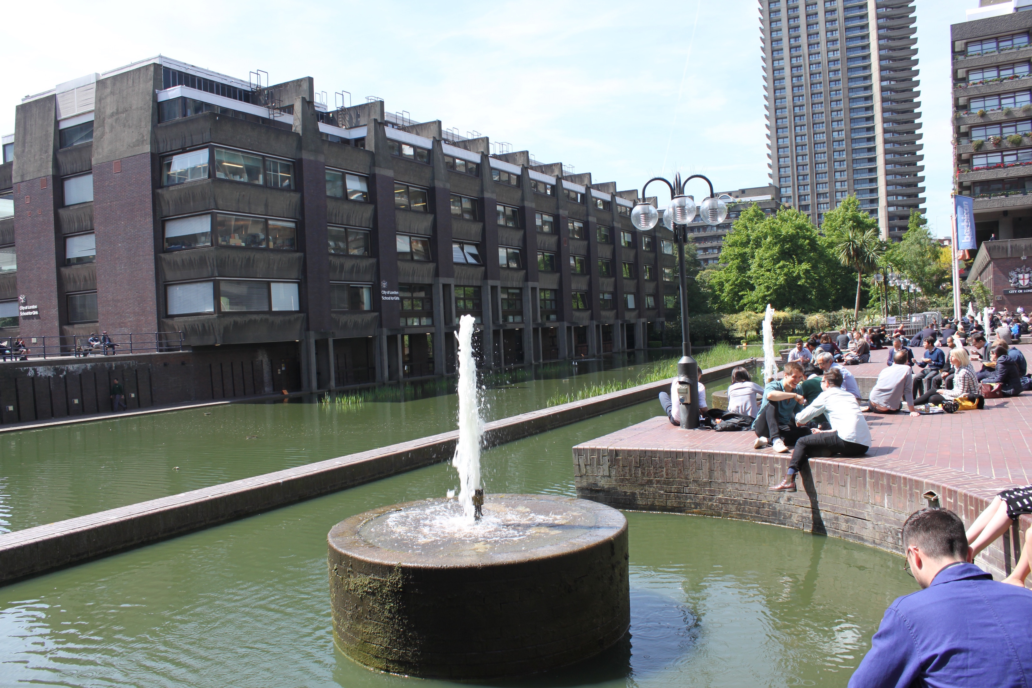
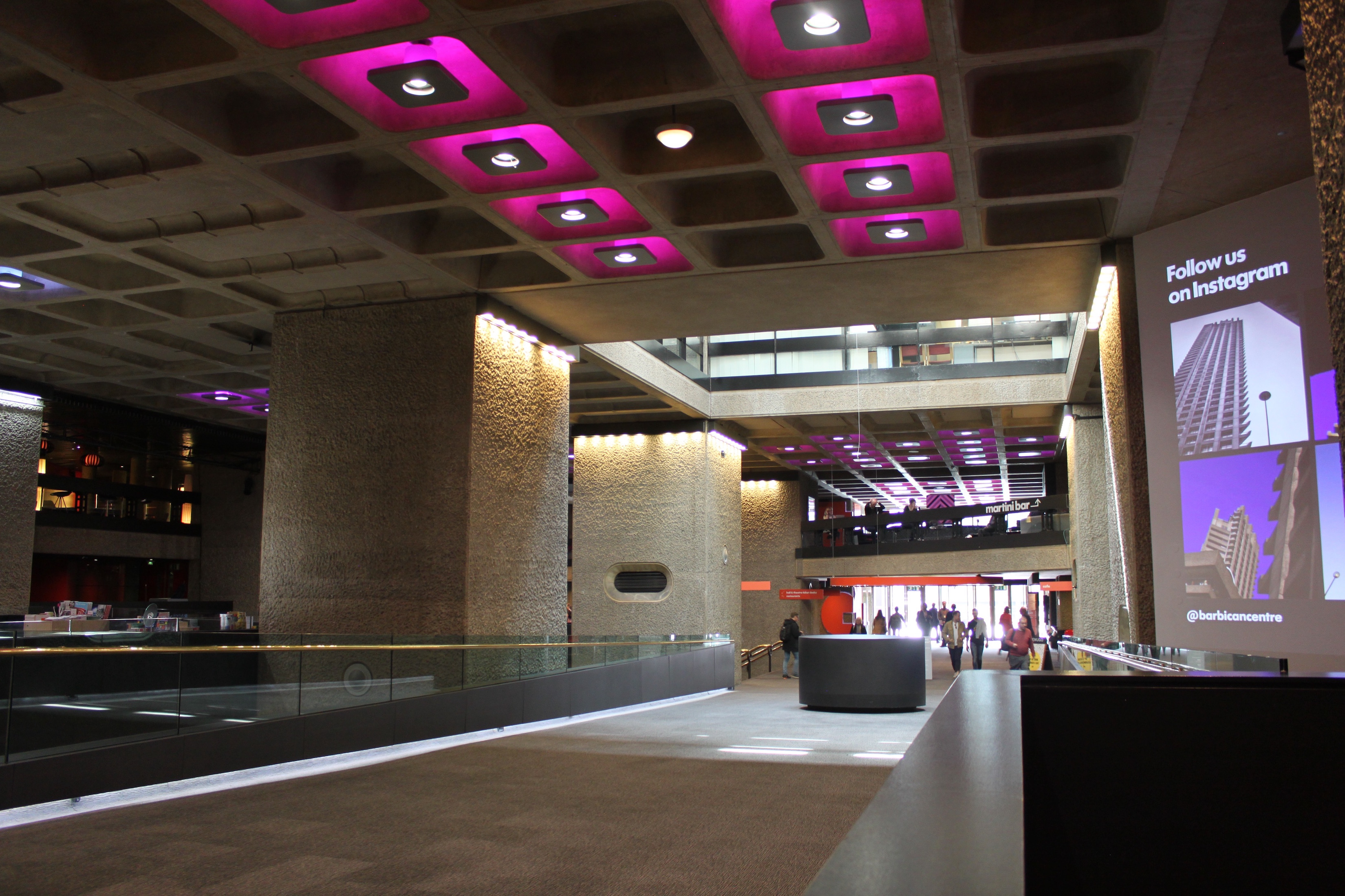
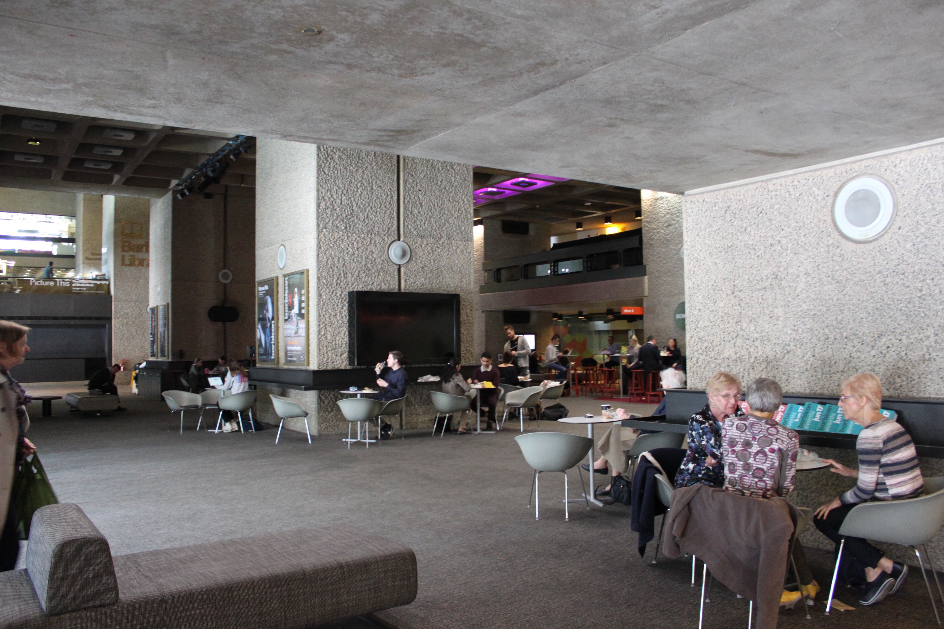
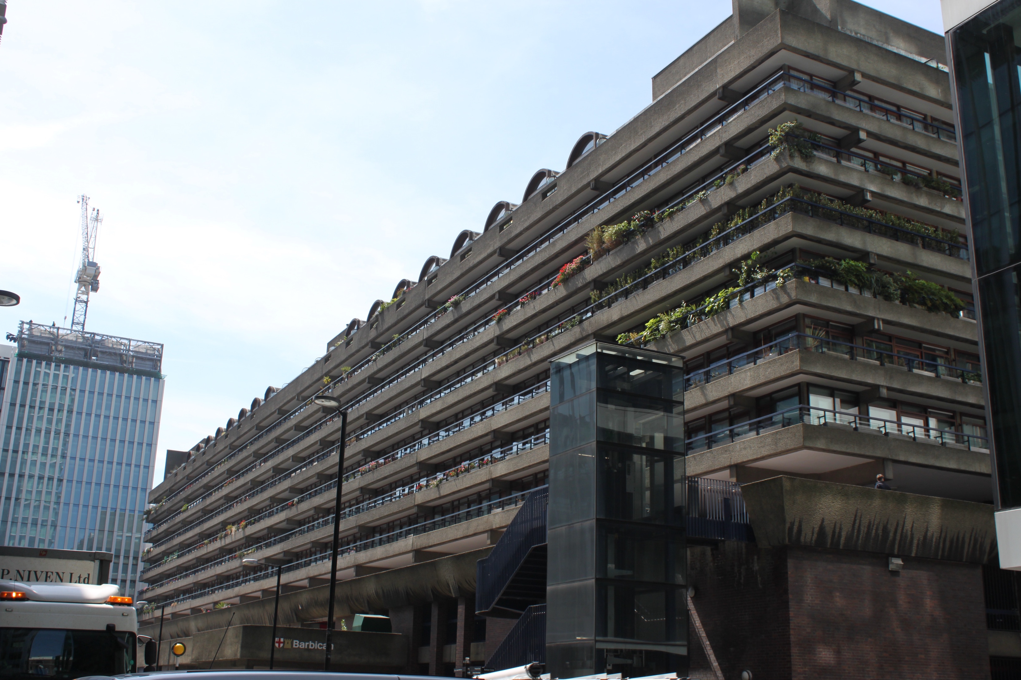
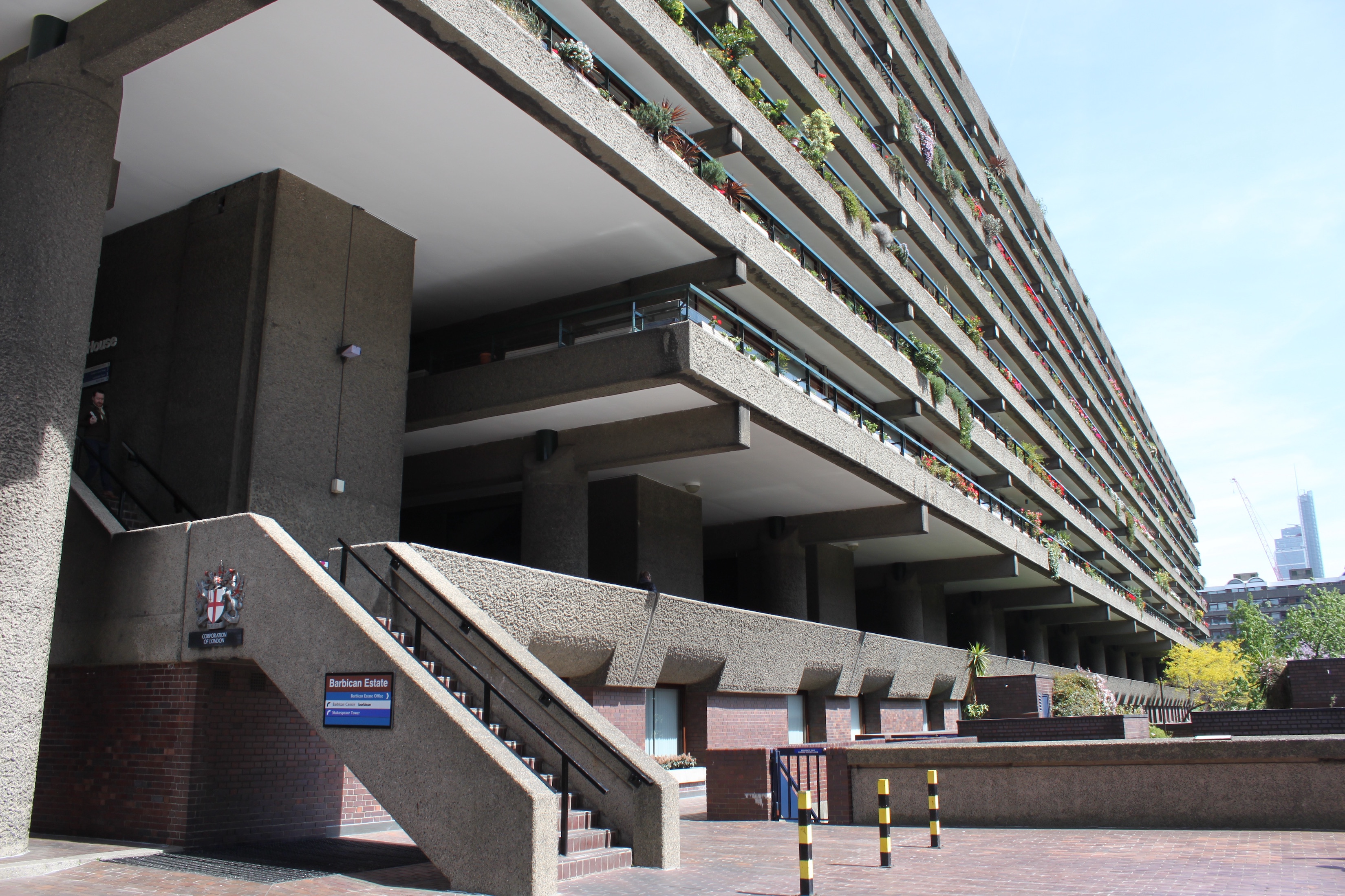
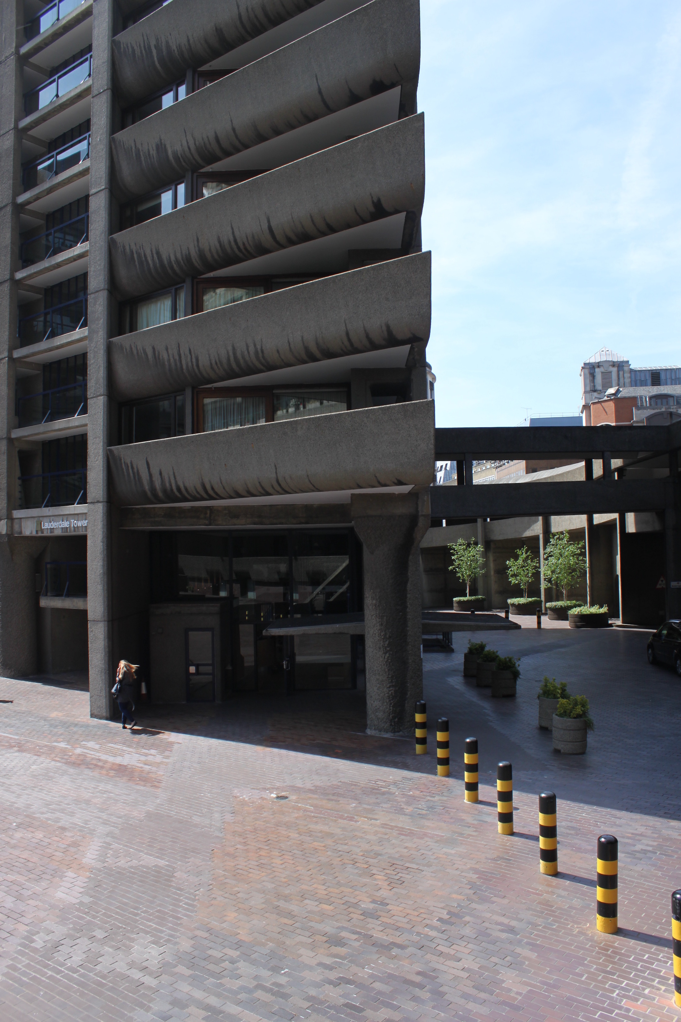
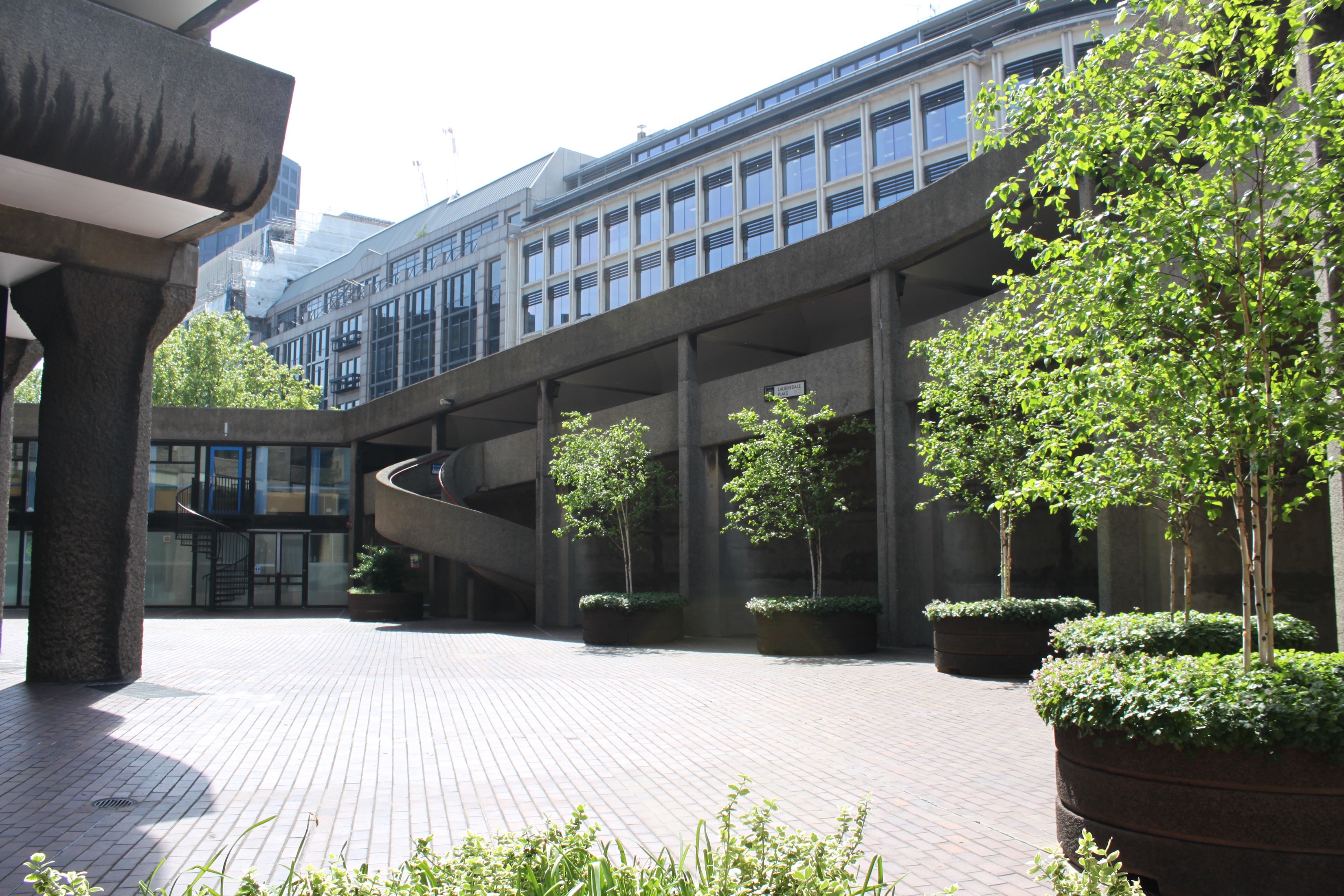
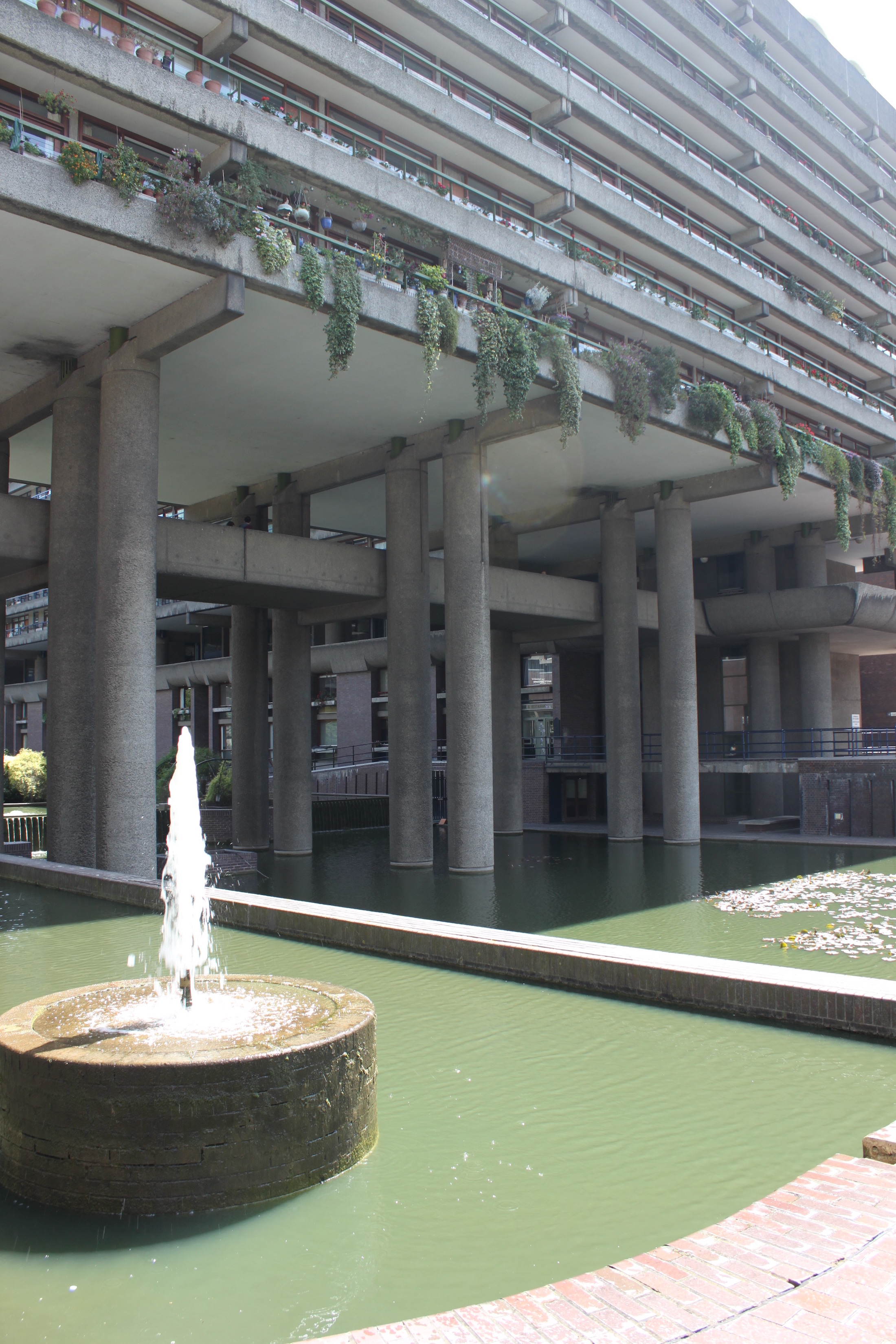
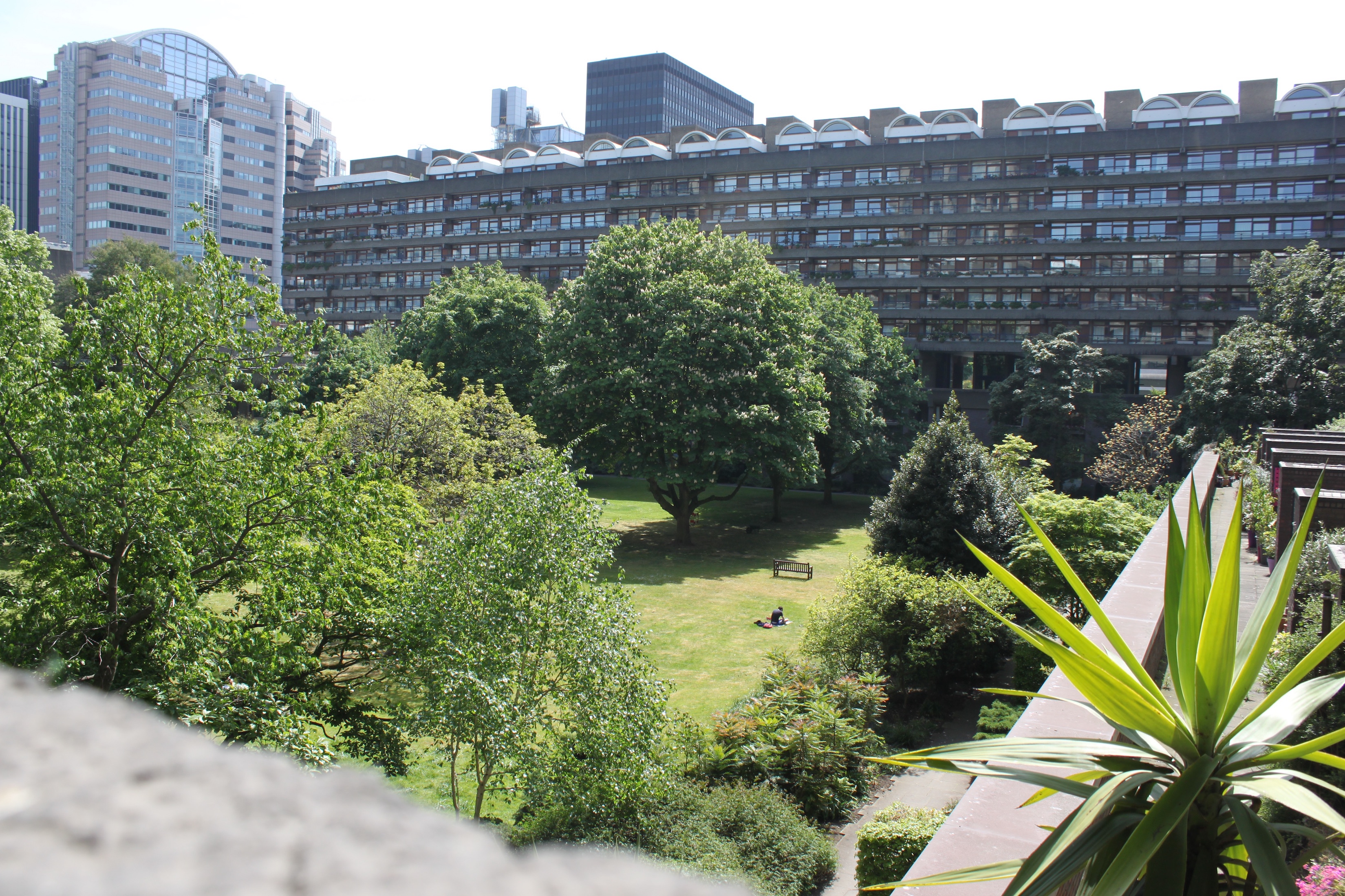
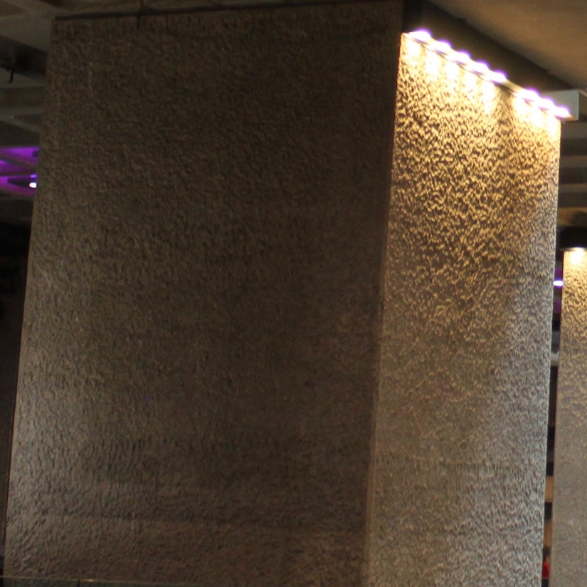
The Barbican Center is Europe's largest multi-arts and conference center venue. It took over a decade to build and was opened by the Queen in 1982. It contains The Hall (for concerts of 1,943 people), Theatre ( for shows holding 1154 people), The Pit (which is a 164 seat studio theatre), three Cinemas, an art gallery, The Curve (an exhibition space), Conservatory (home to exotic fish and over 2,000 species of tropical fish),library and restaurants. It was designed by architects Chamberlin, Powell and Bon who was working to recreate an area of London that was destroyed during World War II. The theme was to create a utopian vision, which resulted in Europe's best example of Brutalist architecture. Brutalist architecture is what flourished from the 1950s to the 1970s after the modernist architecture. It is synonymous of concrete since that is the main material used for all brutalist buildings including the Barbican. The unique concrete ziggurat design allows different locations throughout for people to enjoy, however it is also controversial with many Londoners describing it as the ugliest building. This is similar to project architect John Honer who later worked on the British Library at St Pancras – a red brick ziggurat.Over the years, different architects have tried to enhance and embellish the building to make improvements for the people. Including the circulation improvement by architect Allford Hall Monaghan Morris in 2005-2006 included creating an internal linkage bridge from Silk Street entrance to lakeside foyer area.
Please note the Barbican Estates was constructed before the Barbican Center and is a neighboring building in similar style.
To learn more about current events going on at the Barbican check out their website: Barbican
The Lloyd’s Building
One Lime Street, London, England, The City EC3
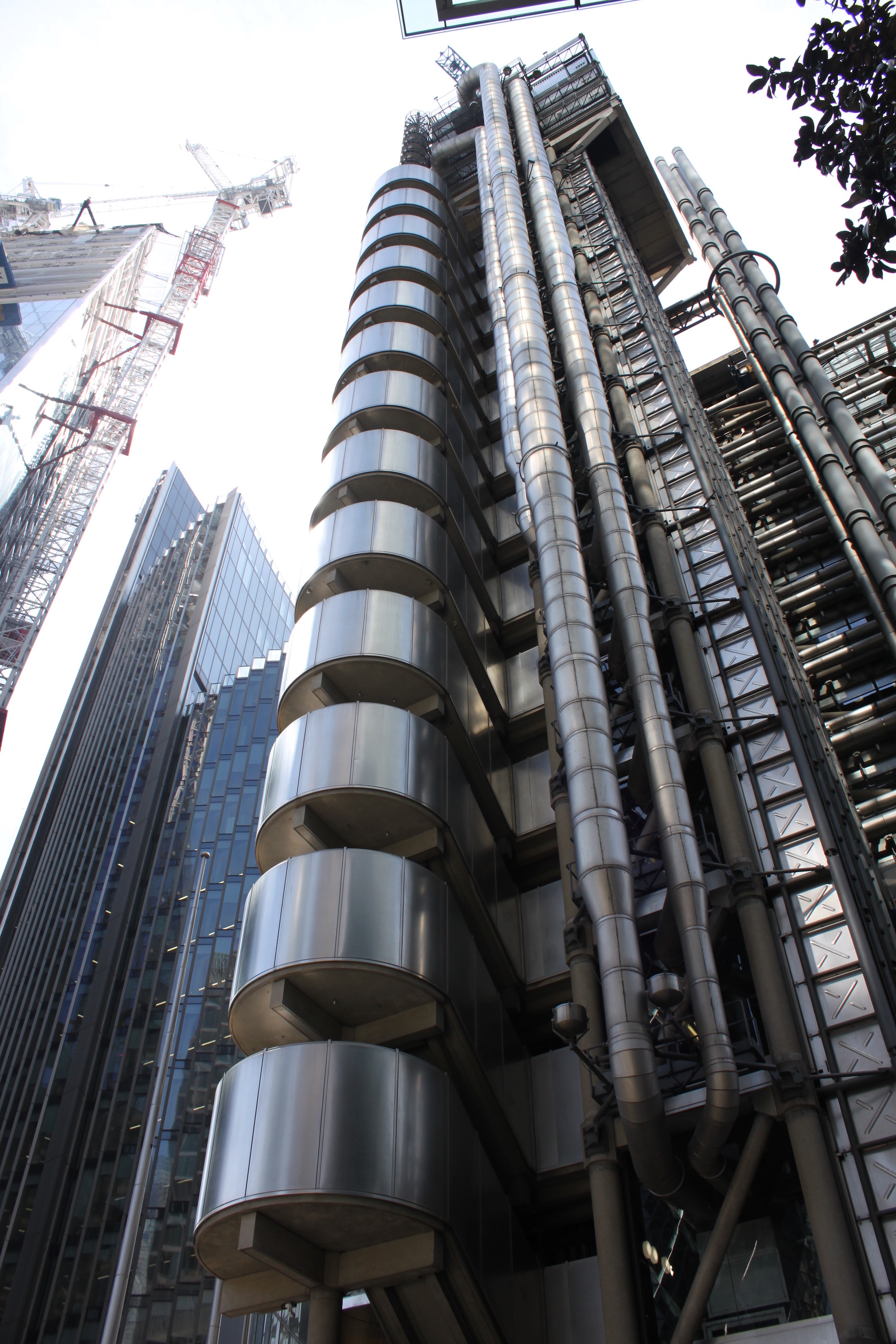
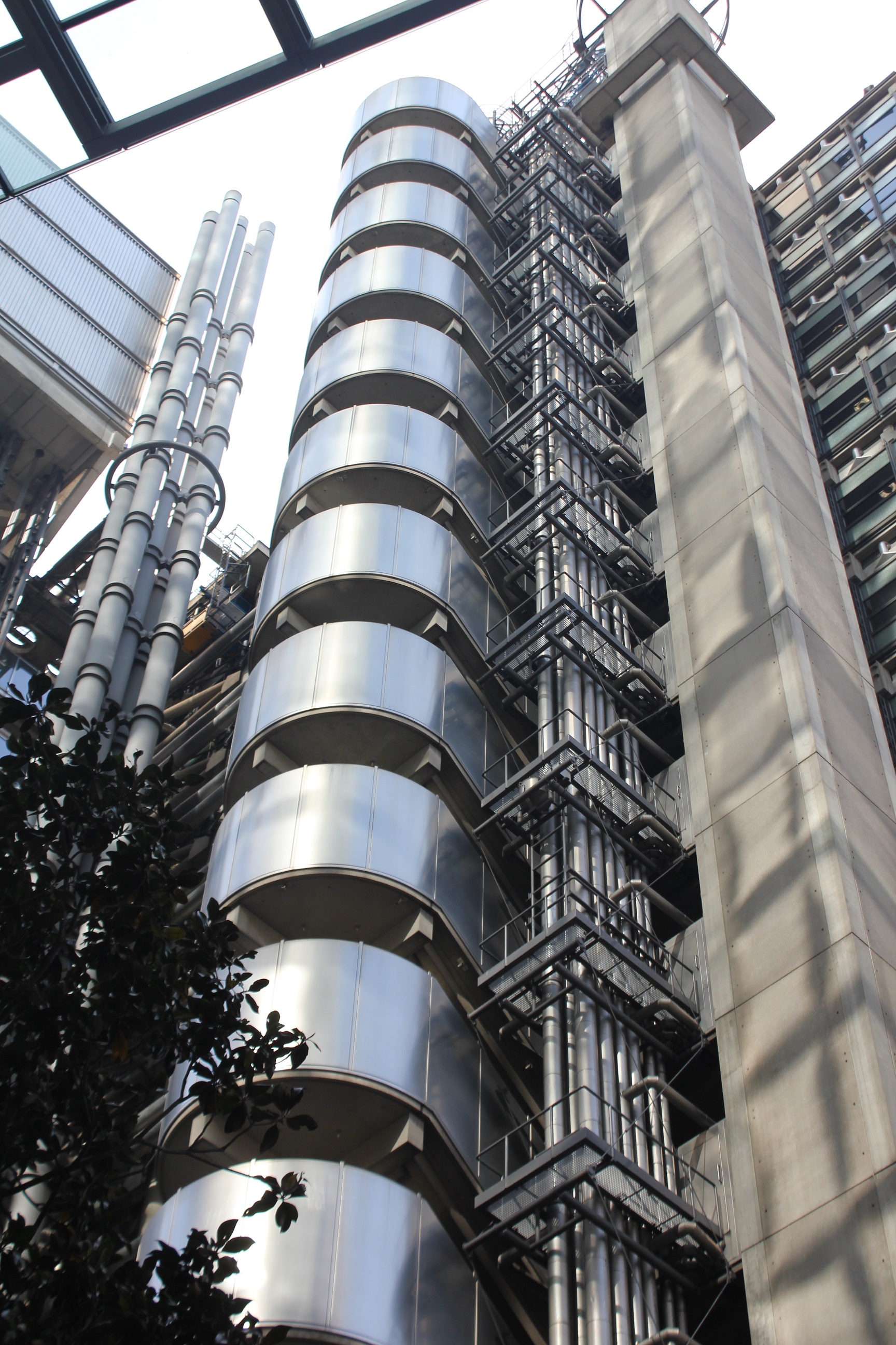
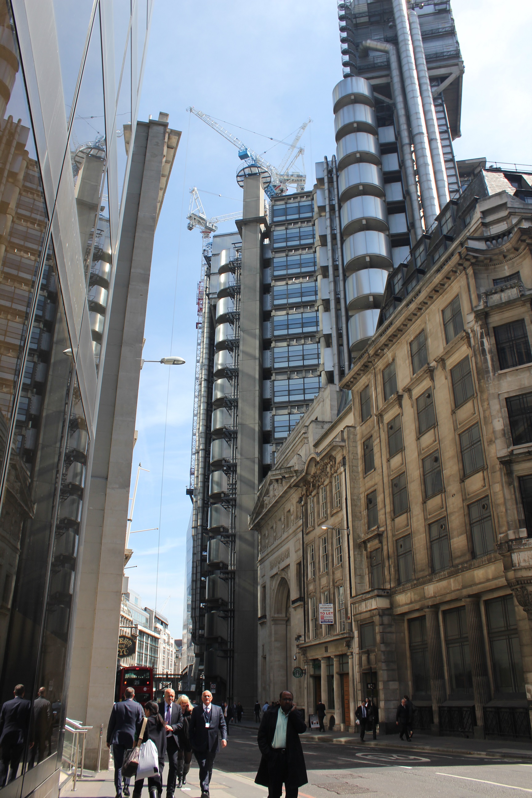
The Lloyd’s building is home to Lloyd's of London Headquarters. It was designed by architect Richard Rogers and took eight years to build. Made up of 33,510 cubic meters of concrete, 30,000 square meters of stainless steel and 12,000 square meters of glass it is considered High-Tech architecture. High-Tech architecture refer to buildings that look inside out typically maximizing the interior space by placing utilities on the outside and usually are made of bright cheerful colors.(pg 141) This skyscraper however is all one color, gray and silver, since Rogers looked to romanticism too. It was officially completed in 1984 and brought a high-tech architectural aesthetic to the medieval financial district of London. What makes it different is all the ductile work can be seen on the outside unlike other office building where it is typically tucked inside. The stairway itself is on the outside too, as seen in the image the six towers of stairs is what is typically notice by tourists first. The stairs are made out of stainless steel instead of aluminum because of its higher melting point in case of a fire. Inside the room frames are made of concrete though because of the fire restriction not allowing stainless steel. The real advancement in architecture here is the internal atrium, which means all bathrooms, stairwells, kitchens etc. are all on the outer edge so as to not disturb the business inside. This also allows easy access to these departments so things can be replaced and fixed quickly and without disturbing the work being conducted. The stainless steel towers juxtaposition right next to the utilities show the mix of modern with technology, highlighting another aspect of High-Tech architecture; exposing technology. Lloyd's building is an example of green internal climatic engineering too with light fixtures that draw in stale air to pass into gaps in the external triple layer glazing which in the end diffuses light and sparkles at night, the basement holds tanks for heat to be recycled,fresh air is distributed through systems under the floors, and overall the concrete structure is a “heat sink, absorbing heat by day and radiating it away by night”. (cite pg 152) The six blue cranes from the construction were left on the top of the building to highlight again the advancement and overlooking into modernism. And at night there are “strategically placed blue spotlights on the service towers make them look as if they belong to a Klingston spaceship. It’s just a hint of the amazing sci-fi interior, only open to the public one day each September.”
To see more about current business within the Llyod's building check out their website: Llyod's
21st Century
London Eye
Lambeth, London SE1 7PB
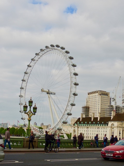
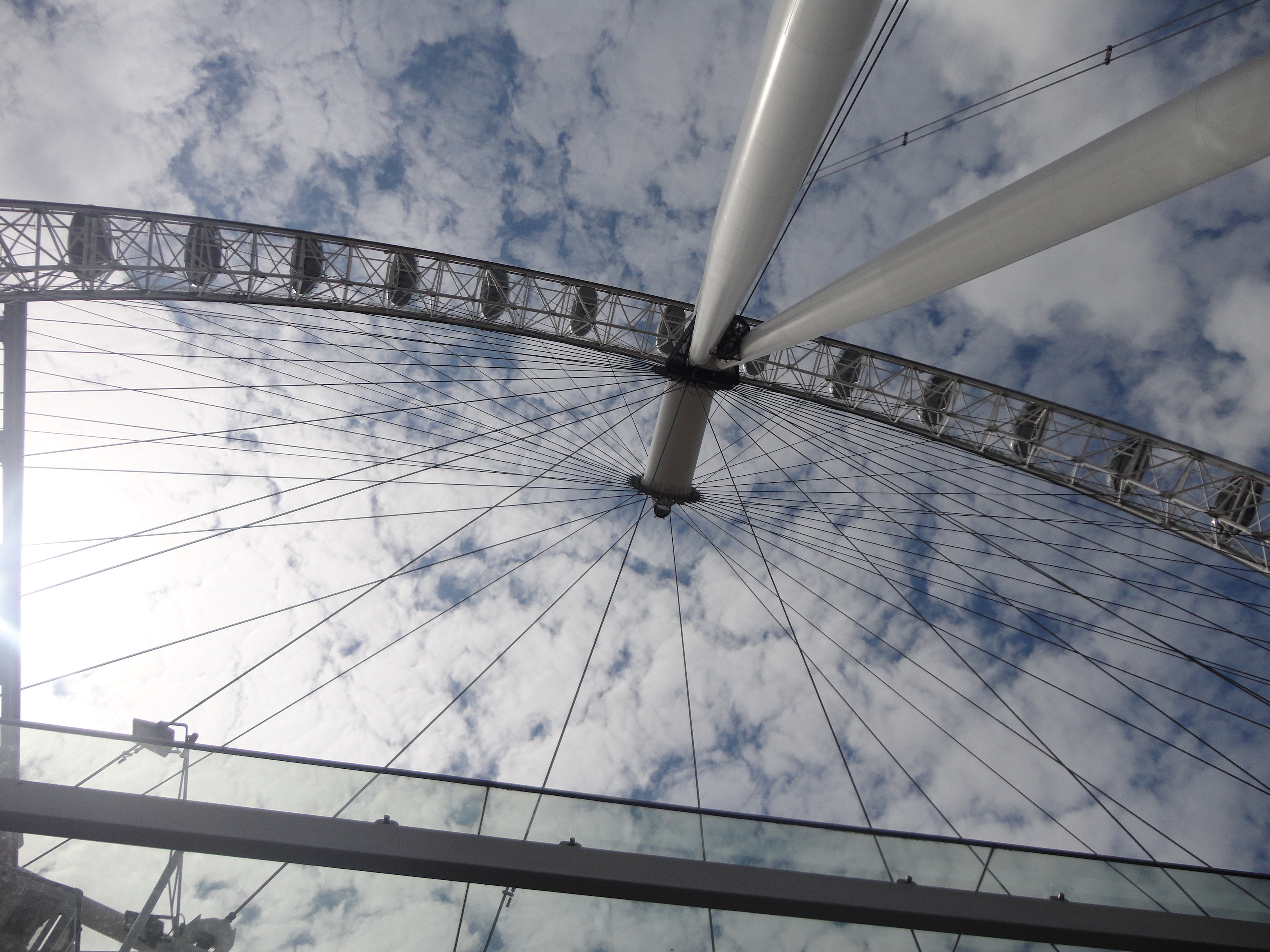
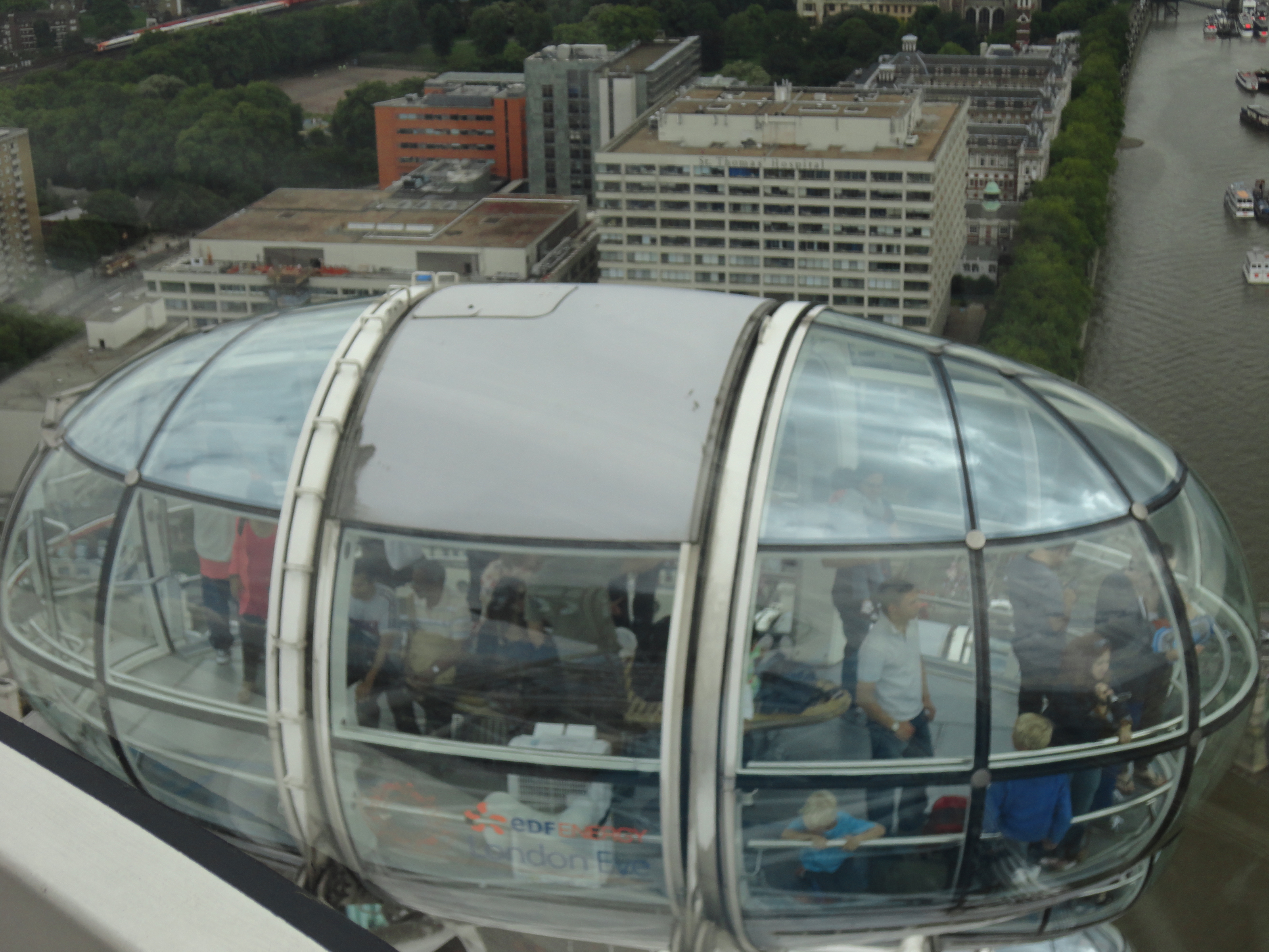
The London Eye is the largest cantilevered observation wheel at a hieght of 135 meters. Its style can be considered modern, it is a new take on the traditional ferris wheel. It was designed by Marks Barfield Architects as a part of a competition, hosted by the Architecture Foundation and the Sunday Times, to best celebrate the turn of the century. However there was no winner of the competition, and the firm decided to go ahead with the project anyways.The base of the London Eye is made of steel cables that radiate from the center of the wheel and a steel A frame that supports a triangular truss structure. The frame has two 165 foot legs that are anchored by cables that are buried 80 feet into the ground. Because of these heavy duty materials the London Eye can withstand winds up to 50 miles per hour. There are 32 steel-framed class passenger capsules that are fixed along the outside of the wheel that has a circumference of 1,392 feet. Each capsule has a motor which keeps it level as the wheel rotates, and keeps the unimpeded views. The glass that the capsules are made of are double curved and aerodynamically shaped to reduce wind drag. It was Launched in 2000 to celebrate the millennium, with 32 capsules on it representing the 32 boroughs of London. Originally it was built to be a temporary structure, made so that they could dismantle it and move it. It was only supposed to be in its location for 5 years but it became such a tourist attraction and staple it is now a permanent addition to the London skyline. More than 3.5 million people take a "flight" on the London Eye per year. [22] [23]
The Gherkin
30 St Mary Axe, London EC3A 8EP
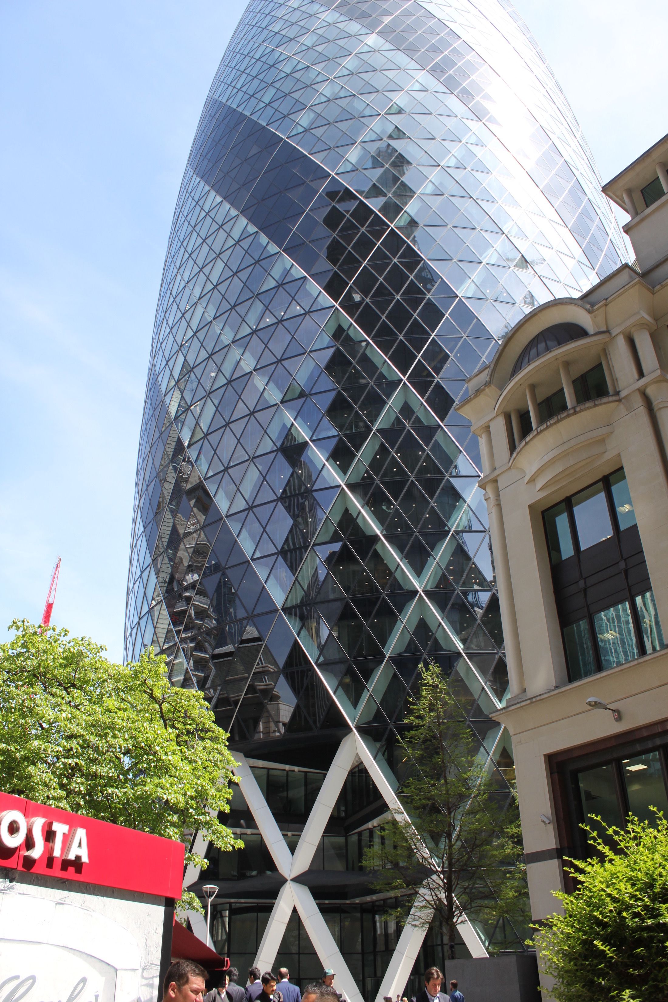
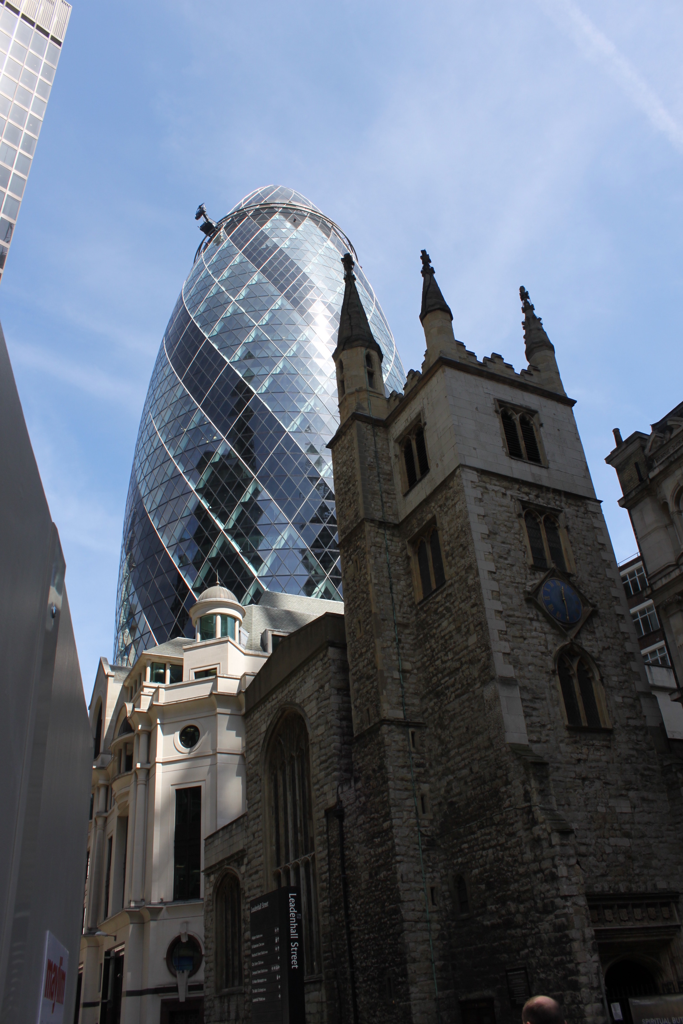
The tall cigar or pickled shaped 180 meter building that lines the London skyline is The Gherkin. From the very beginning of the design it had been a controversy building. The new radical design of size and shape quickly gave it the nickname, 'the erotic gherkin'. Having been the location of previous bomb landings and in the middle of the financial district made it even more controversial when the first steel beam was erected only a month and a day after The World Trade Center in the fall of 2001. The previous building was the historic Victoria Baltic Exchange, built in 1903. While many pushed to salvage the building it was too expensive after it had been damaged in a terrorist bombing. That building was heavily damaged in by the Irish Republican Army in 1992. So, despite the rocky beginning to the Gherkin, today it is known as one of the head features in the London Skyline.
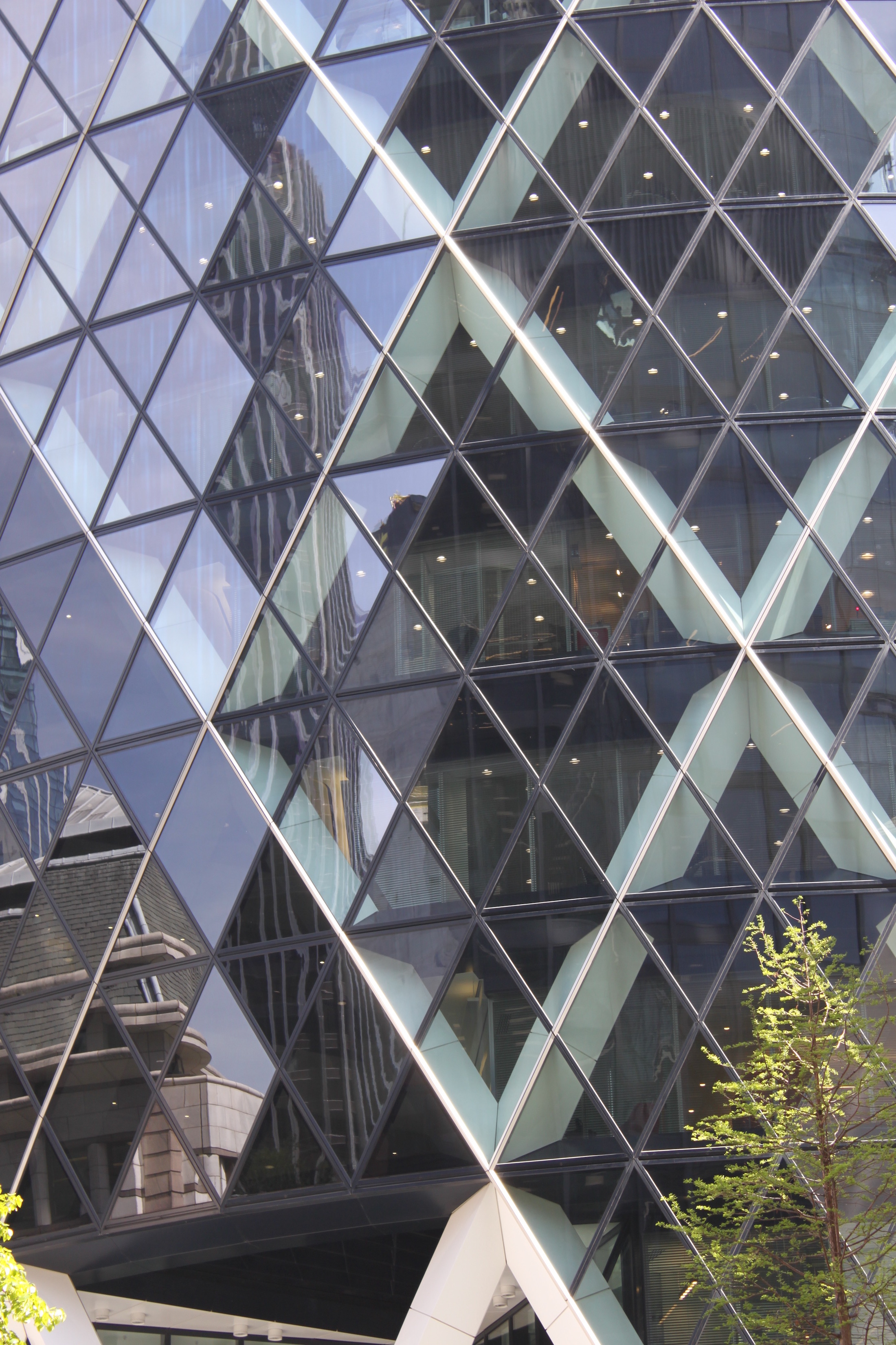
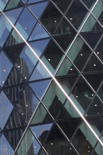
The Gherkin was commissioned by the Swiss Re Insurance Company with the goal of creating a landmark, and sure enough it has become one with the rounded top and what appears to be triangle windows but are really only rectangle window panes. It appears to be in a spiral and have rounded edges, but it actually all straight window panes. The five degree difference between each floor is what makes it appear to be spiraling. The top of the building, the dome top, is the only piece with a rounded piece of glass. The majority of the building is made out of glass. Ironically, it was designed by Mr. Shuttleworth who reported to the Telegraph in 2011 that 'he regrets his design of 30 St Mary Axe, the 40-floor City office block known as "the Gherkin", which won the Stirling Prize in 2004', thinking to himself about glass filling the entire building, Why on earth did we do that?'" believing there are better ways.
However, the Gherkin's developed scheme was for ‘London’s first ecological tall building’ (cite pg 295!). Its unique shape allows more air to easily pass through creating a comfort area for pedestrians below unlike rectangle office buildings. Also the towers diagonally braced structural envelope allows column-free floor space and a fully glazed facade, which opens up the building to light and views. Windows were made to be open so the use of air condition can be minimized. The sky gardens are mini-atria, creating ventilation largely by natural process. And integrated green work spaces were designed into the workplace. It is home to offices as rises forty-one stories and provides 76,400 square meters, which also include a shopping area and club on the top floors for those who work there can relax with a drink. The club room also offers a 360 degree panorama view of the city. This massive, unique and new building "undermines the contention that tall buildings are environmentally irresponsible, dependent on huge amounts of energy.” (cite page 295!)
For more information about the current building follow their website: The Gherkin
City Hall
The Queen's Walk, London SE1 2AA
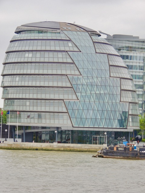
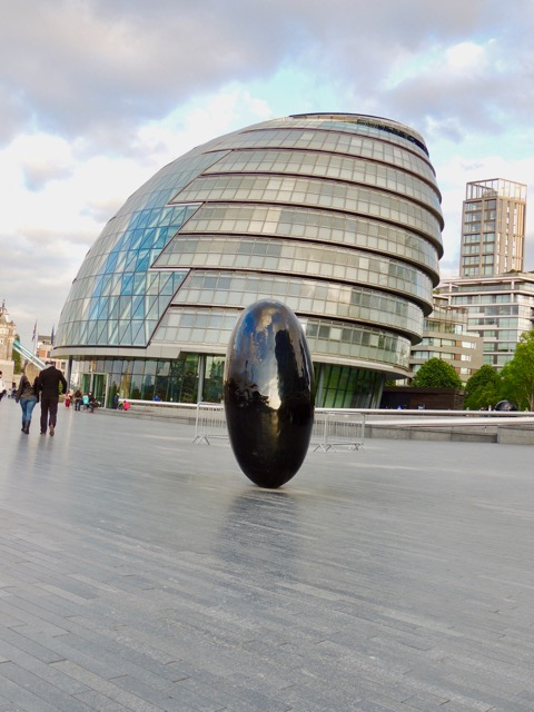
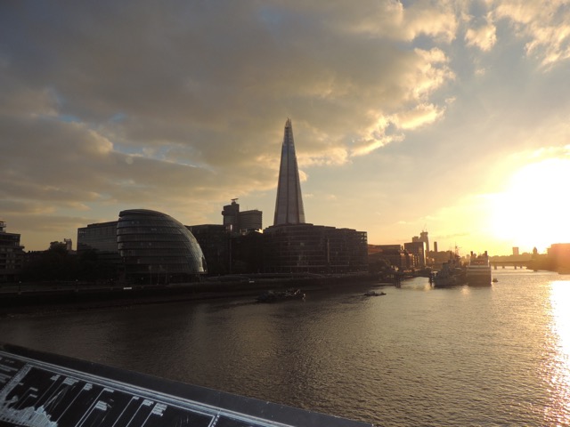
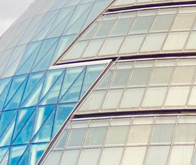
Due to the previous hall, County Hall, that housed the older ruling body of London called the Greater London Council being converted into a luxury hotel, a competition for the commission to create a new city hall to represent the new democracy, the new Greater London Authority, that would govern London was held in late 1990's. Norman Foster's design competed against fifty-five other submissions, and in 1999 Foster won the commission to build the new city hall. City Hall was constructed in the area at Tower Bridge known as London Bridge City. Some critics of the completed design of City Hall have called it a "glass-and-steel egg" and said that it bares resemblance to a helmet. One critic, the mayor at the time Ken Livingstone, went so far as to call the building a "glass testicle". The use of glass by Foster was to symbolize that the government would be transparent and its energy efficiency to to represent a non polluted government. The top of the building, known as "London's Living Room," is know for views across the city and a multipurpose room composed entirely of glass walls. The unique shape of the building and the implementation of a specific type of glass" called fritted glass that acts like a sun screen, allows for the building to be energy efficient in terms of heating and lighting. There is a spiral ramp that spans from the ground floor to the observation deck at the top of the building, a design that Foster has used in his design of the Berlin Reichstag. In celebration of Queen Elizabeth's Golden Jubilee, the building was formally opened in 2002.[24][25]
The Shard
32 London Bridge St, London SE1 9SG
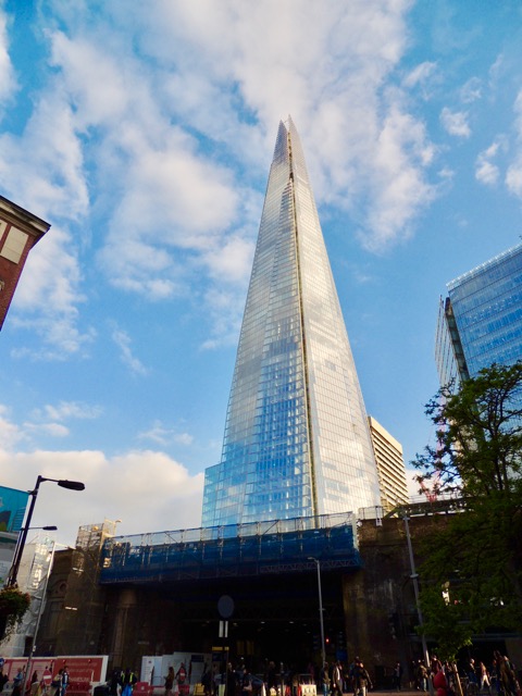
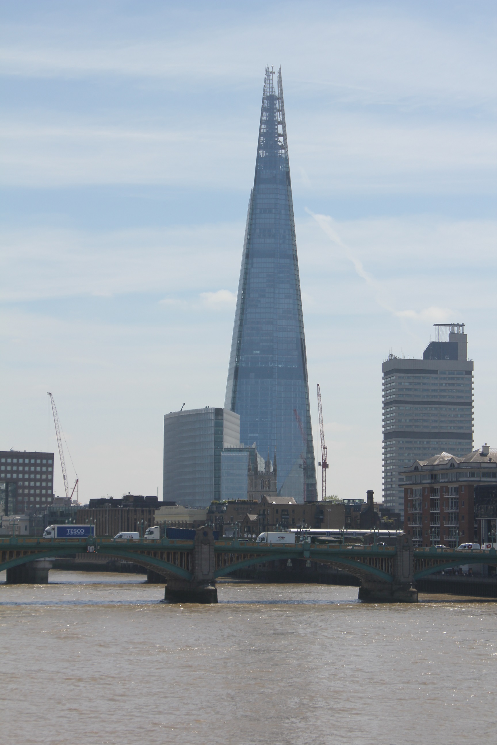
The Shard, also referred to London Bridge Tower, is one of the newest and tallest skyscrapers of the London skyline after construction was completed in 2012 by lead architect Renzo Piano. Its main material is glass, with a glass facade of 602,779 square feet, weighting in at 18,000 tons and makes up 11,000 panels. The entire building is 310 meters and has 95 floors, which is actually shorter than the original plans since it was refigured following the World Trade Center terrorist attack to have a more stable base and shorter exist routes. The Shard contains 54,000 sq meters of office space, 200-bed five star hotel on the top 18 floors and 14 floors of flats and estimated to have about 7000 people work and live there. It only offers 40 parking spots but because of its close proximity to public transport stations it is still highly attractable.
Unlike other skyscrapers, a steel frame is only used for the lower office floors and a concrete frame is used for the upper hotel and residential floors. Steel allows more open spaces in the office for work and the concrete creates a stronger sound barrier between living spaces and is more wind resistant. Also, unlike other skyscrapers it is covered in "extra" white glass which reflects the sky more so in some weather the top floors appear to be missing. The more reflection also means the building looks different season to season too. The Shard has a ventilated double skin of the building, which is designed to reduce heat and any extra hot air from the offices will be used to heat the hotel and flats above. Winter gardens with opening louvres still allow fresh air in during all the seasons. The Shard has been said to "consume 30 percent less energy than a conventional structure of comparable size”.
Leadenhall Building
122 Leadenhall St, London EC3V 4AB
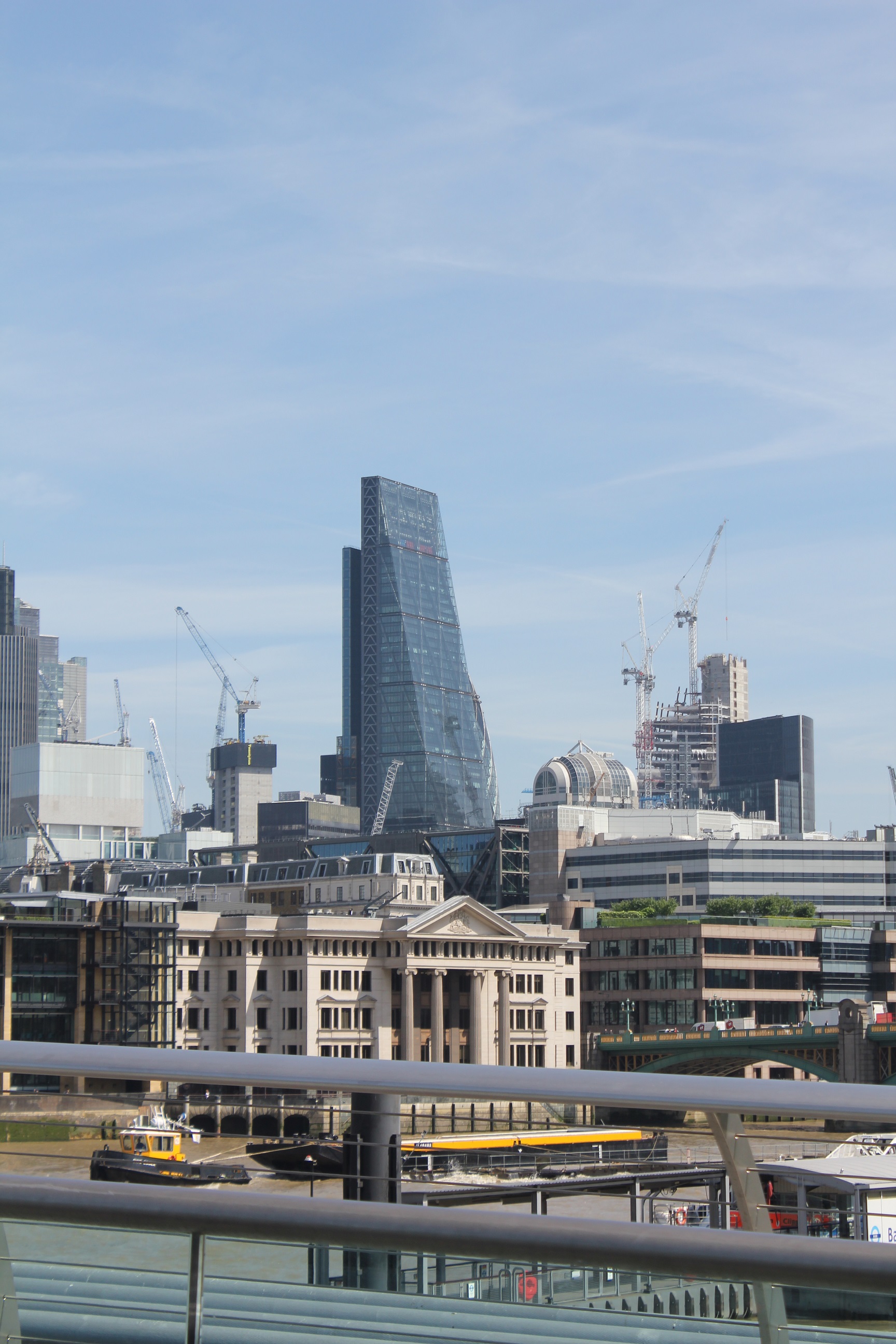
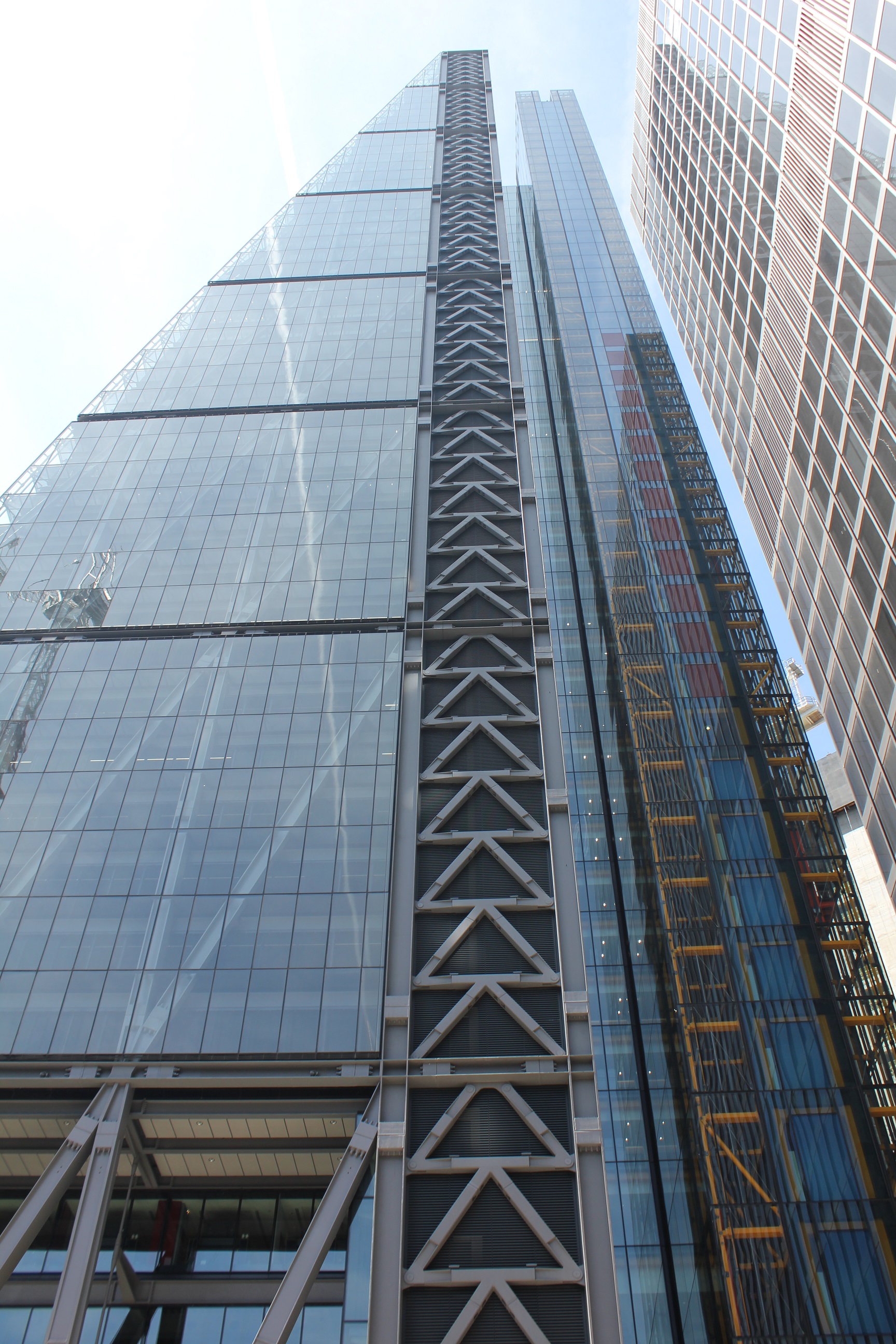
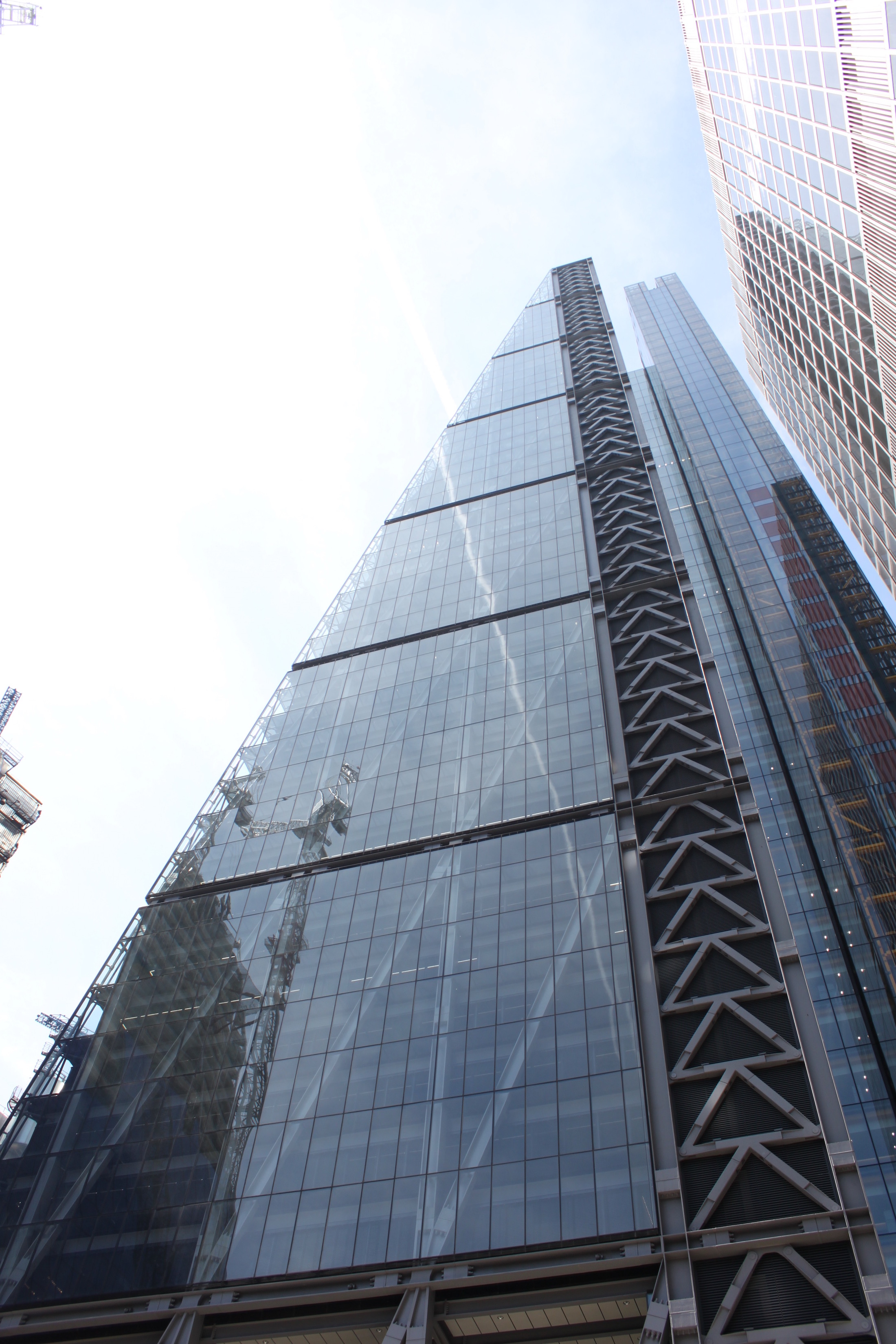
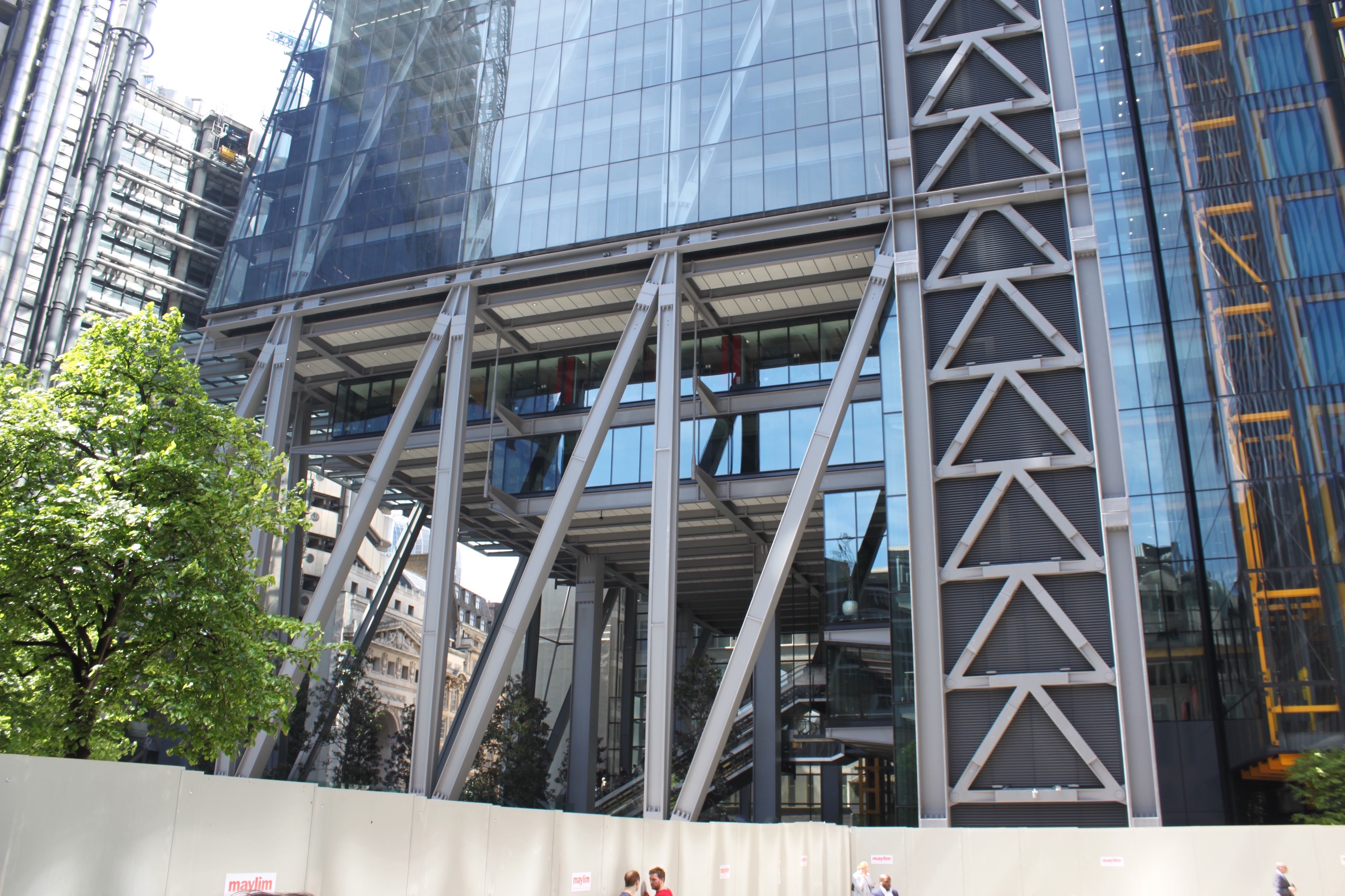
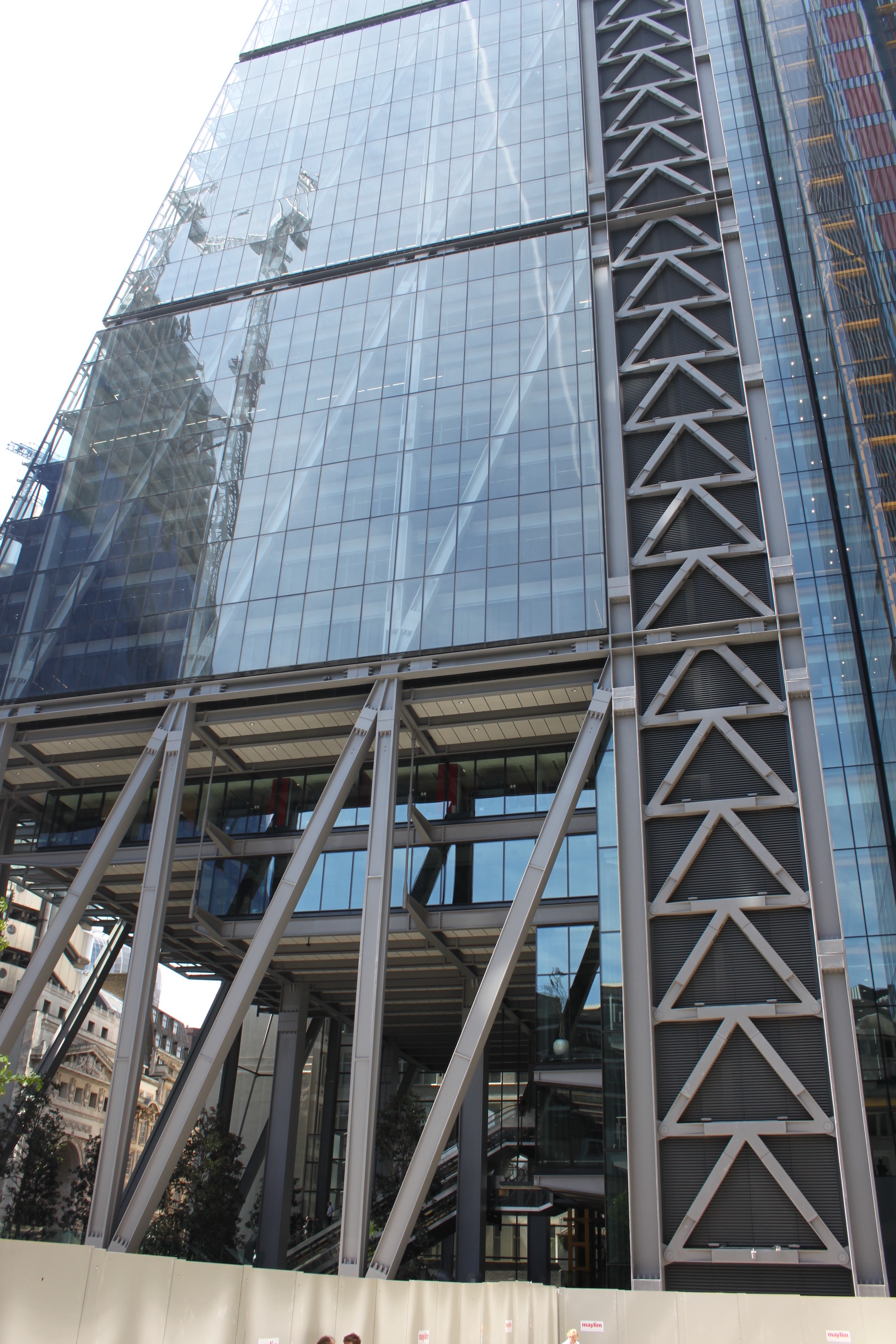
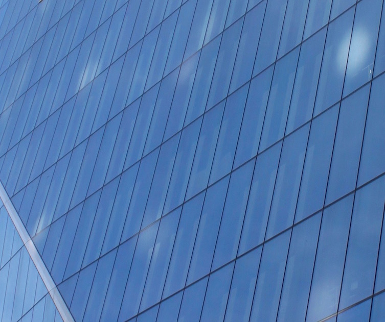
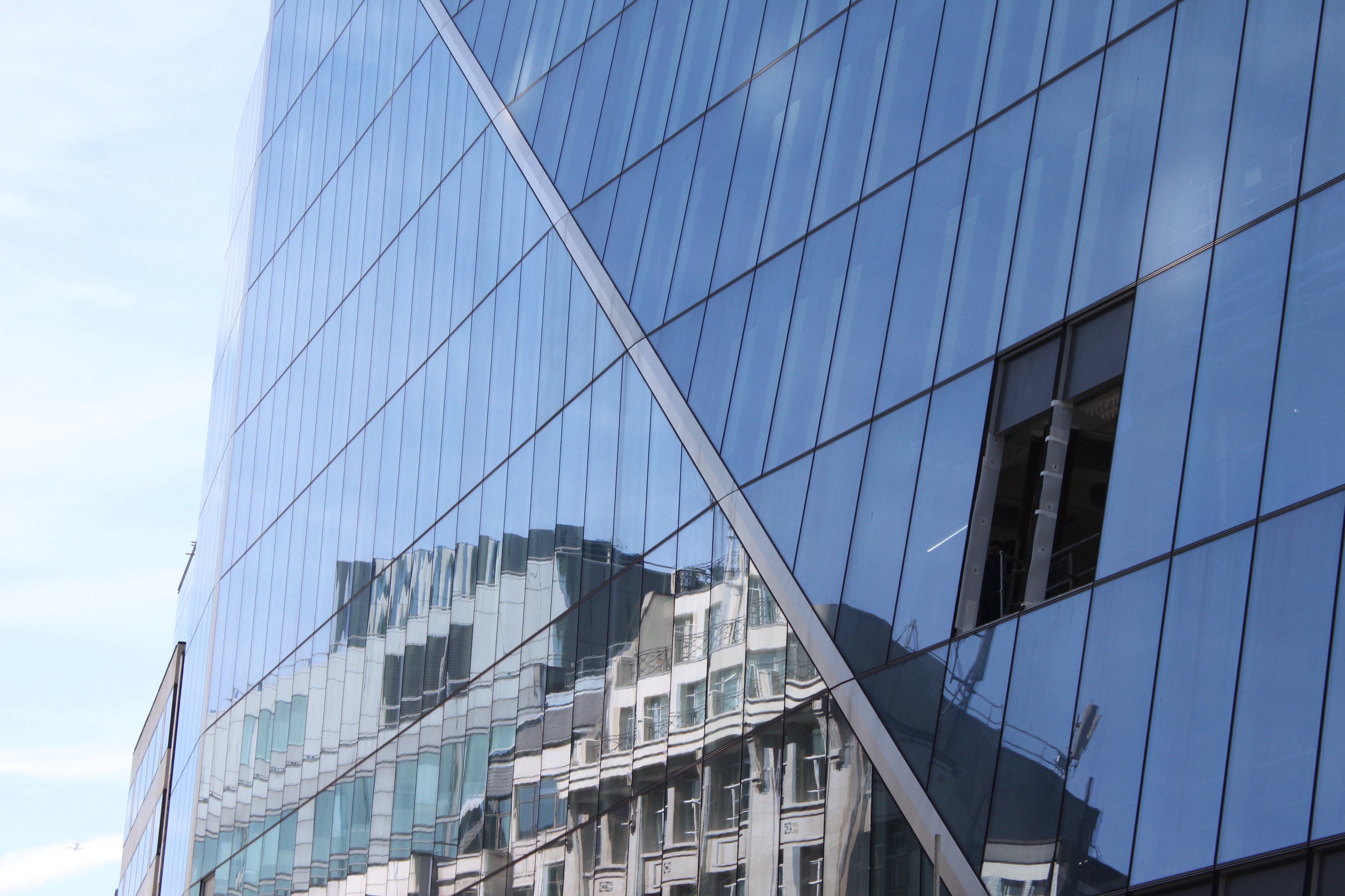
Recently constructed, starting in 2011 and being finished and declared open by Prince Harry in 2015, the Leadenhall Building has already become a recognizable part of the London skyline. To allow the construction to progress so quickly, the building was made almost entirely of prefabricated parts that were easily assembled onsite. The angle that the building rises at is specifically 10 degrees, to keep within ordinances protecting the views of the other major landmarks across the city including Westminster Palace and St. Paul's Cathedral. The building was designed by Rogers Stirk Harbour + Partners, keeping that core ordinance at heart. In reference to the shape caused by its sloping front, it has been nicknamed "The Cheesegrater". The shape of the building has a major draw back in that it limits floor space greatly with its shrinking footprint as one ascends the building. Another distinctive feature of the building is along the sides, the elevator shaft is exposed like its sister building, the Lloyd's Building; this allows for the mechanisms to be observed from the outside of the building. Because of the exposure of the elevator shafts, the surrounding supports appear to make an arrow pattern pointing up the sides of the building. The visible steel braces along the front side of the building create a diamond pattern and are exposed to emphasize the vertical of the building, strengthening the appearance.
[26][27]
Section 2: Deliverables
Photographic Comparisons
Materials
Windows
Pillars
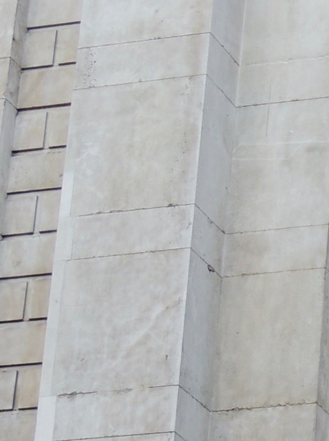
With the buildings that we researched pillars were no longer seen after the Royal Exchange.
Shape(including symmetry)
Size
In this section, provide your contribution, creative element, assessment, or observation with regard to your background research. This could be a new derivative work based on previous research, or some parallel to other events. In this section, describe the relationship between your background review and your deliverable; make the connection between the two clear.
Interactive Map
https://maphub.net/bloniarzna/London-Architecture
Conclusion
In this section, provide a summary or recap of your work, as well as potential areas of further inquiry (for yourself, future students, or other researchers).
Attribution of Work
Emily
I worked on the sections about the London Eye, The Royal Exchange, Buckingham Palace,The Jewel Tower , Kensington Palace and NCP Car Park. I also took photographs for St. Pancras Hotel and Train Station, The Shard, The Globe Theatre, Tower Bridge, Houses of Parliament/Big Ben, St. Paul's Cathedral, Westminster Abbey, Royal Albert Hall, City Hall, The British Library, London Eye, and Kensington Palace. I also worked on all the comparison sections, pulled together and formatted all the information for the map with Olivia, and edited the page.
Olivia
I worked on the sections about the The Gherkin, The Shard, Lloyd's Building, Shakespeare's Globe, St Pancras Station & Hotel, and Barbican Center. I also took photographs for Westminster Abbey, Kensington Palace, Buckingham Palace, St Paul's Cathedral, The Royal Exchange, Barbican Center, Lloyd's Building, The Eye, The Gherkin, and Leadenhall Building. I also worked on all the comparison sections, and editing the page.
Natalie
I worked on the sections for Westminster Palace, Westminster Abbey, Tower Bridge, St. Paul's Cathedral, Royal Albert Hall, the Leadenhall Building, City Hall, and the British Library. I also contributed photos of Kensington Palace, the Royal Exchange, Royal Albert Hall, the Llyod's Building, the Leadenhall Building, and the Shard. I created the interactive map and inputted all of our information and photos as well edited the page.
External Links
If appropriate, add an external links section
References
- ↑ Westminster Abbey » History. (n.d.). Retrieved May 18, 2017, from http://www.westminster-abbey.org/our-history
- ↑ Heritage, E. (n.d.). SIGNIFICANCE OF THE JEWEL TOWER. Retrieved May 12, 2017, from http://www.english-heritage.org.uk/visit/places/jewel-tower/history/significance/
- ↑ Downes, K., Bold, J. F., & Chaney, E. (Eds.). (1993). English Architecture Public & Private: Essays for Kerry Downes. A&C Black.
- ↑ Hardingham, Samantha. London: A Guide to Recent Architecture. London: Batsford, 2005. N. pag. Print.
- ↑ "About Us - Original Globe / Shakespeare's Globe." Shakespeare's Globe. The Shakespeare Globe Trust, n.d. Web. 10 May 2017.
- ↑ Palaces, H. R. (n.d.). A building history. Retrieved May 12, 2017, from http://www.hrp.org.uk/kensington-palace/history-and-stories/a-building-history/#gs.null
- ↑ Adair, J. E. (1981). The royal palaces of Britain. London: Thames and Hudson.
- ↑ Who built Buckingham Palace? (n.d.). Retrieved May 12, 2017, from https://www.royalcollection.org.uk/visit/buckinghampalace/about/who-built-the-palace
- ↑ Jones, N. (2005). Architecture of England, Scotland, and Wales (1st ed.). Westport, Conn.: Greenwood Press.
- ↑ Buckingham Palace. (2017). In Encyclopædia Britannica. Retrieved from http://academic.eb.com.ezproxy.wpi.edu/levels/collegiate/article/Buckingham-Palace/17892
- ↑ Adair, J. E. (1981). The royal palaces of Britain. London: Thames and Hudson.
- ↑ Cathedral History Timeline. (n.d.). Retrieved May 18, 2017, from https://www.stpauls.co.uk/history-collections/history/cathedral-history-timeline
- ↑ Heritage. (n.d.). Retrieved May 18, 2017, from http://www.theroyalexchange.co.uk/heritage/
- ↑ Jones, N. (2005). Architecture of England, Scotland, and Wales (1st ed., pp. 220-223). Westport, Conn.: Greenwood Press.
- ↑ Jones, N. (2005). Architecture of England, Scotland, and Wales (1st ed., pp. 283-286). Westport, Conn.: Greenwood Press.
- ↑ Tower Bridge History | Historic Bridges London. (2017). Towerbridge.org.uk. Retrieved 15 May 2017, from http://www.towerbridge.org.uk/bridge-history/
- ↑ Jones, N. (2005). Architecture of England, Scotland, and Wales (1st ed., pp. 146-151). Westport, Conn.: Greenwood Press.
- ↑ Lesser Known Architecture: London's most unappreciated buildings. (2013, July 10). Retrieved May 12, 2017, from http://www.telegraph.co.uk/finance/property/pictures/10171469/Lesser-Known-Architecture-Londons-most-unappreciated-buildings.html?frame=2613864
- ↑ Decision Summary. (n.d.). Retrieved May 16, 2017, from http://www.heritagegateway.org.uk/Gateway/Results_Single.aspx?uid=1425632&resourceID=7
- ↑ St. John Wilson, C. (1998). The Design and Construction of the British Library (1st ed.).
- ↑ Welch, A., Lomholt, I., Lomholt, I., & Welch, A. (2017). British Library Building, London - e-architect. e-architect. Retrieved 18 May 2017, from https://www.e-architect.co.uk/london/british-library
- ↑ Rose, S., & Robinson, M. (2007). Eye: the story behind the London Eye. London: Black Dog.
- ↑ Lubell, S. (2008). London 2000 : new architecture. New York: Monacelli Press.
- ↑ Jones, N. (2005). Architecture of England, Scotland, and Wales (1st ed., pp. 169-173). Westport, Conn.: Greenwood Press.
- ↑ Powell, K. (2011). 21st century London (1st ed., p. 18). London: Merrell.
- ↑ The Vision - The Leadenhall Building. (2017). The Leadenhall Building. Retrieved 18 May 2017, from https://www.theleadenhallbuilding.com/architecture/the-vision/
- ↑ Wright, H. (2006). London high (1st ed., pp. 214-215). London: Frances Lincoln.
