An Analysis of the Art Style of several British Filmmakers.
From Londonhua WIKI
Contents
Abstract
The paragraph should give a three to five sentence abstract about your entire London HUA experience including 1) a summary of the aims of your project, 2) your prior experience with humanities and arts courses and disciplines, and 3) your major takeaways from the experience. This can and should be very similar to the paragraph you use to summarize this milestone on your Profile Page. It should contain your main Objective, so be sure to clearly state a one-sentence statement that summarizes your main objective for this milestone such as "a comparison of the text of Medieval English choral music to that of the Baroque" or it may be a question such as "to what extent did religion influence Christopher Wren's sense of design?"
Introduction
In this project I examined the visual elements from a single movie by each of three British filmmakers, Ridley Scott, Danny Boyle, and Christopher Nolan. I looked at the cinematography, color usage, and psychological reasoning behind the both of these.
Section 1: Background
Ridley Scott
Alien
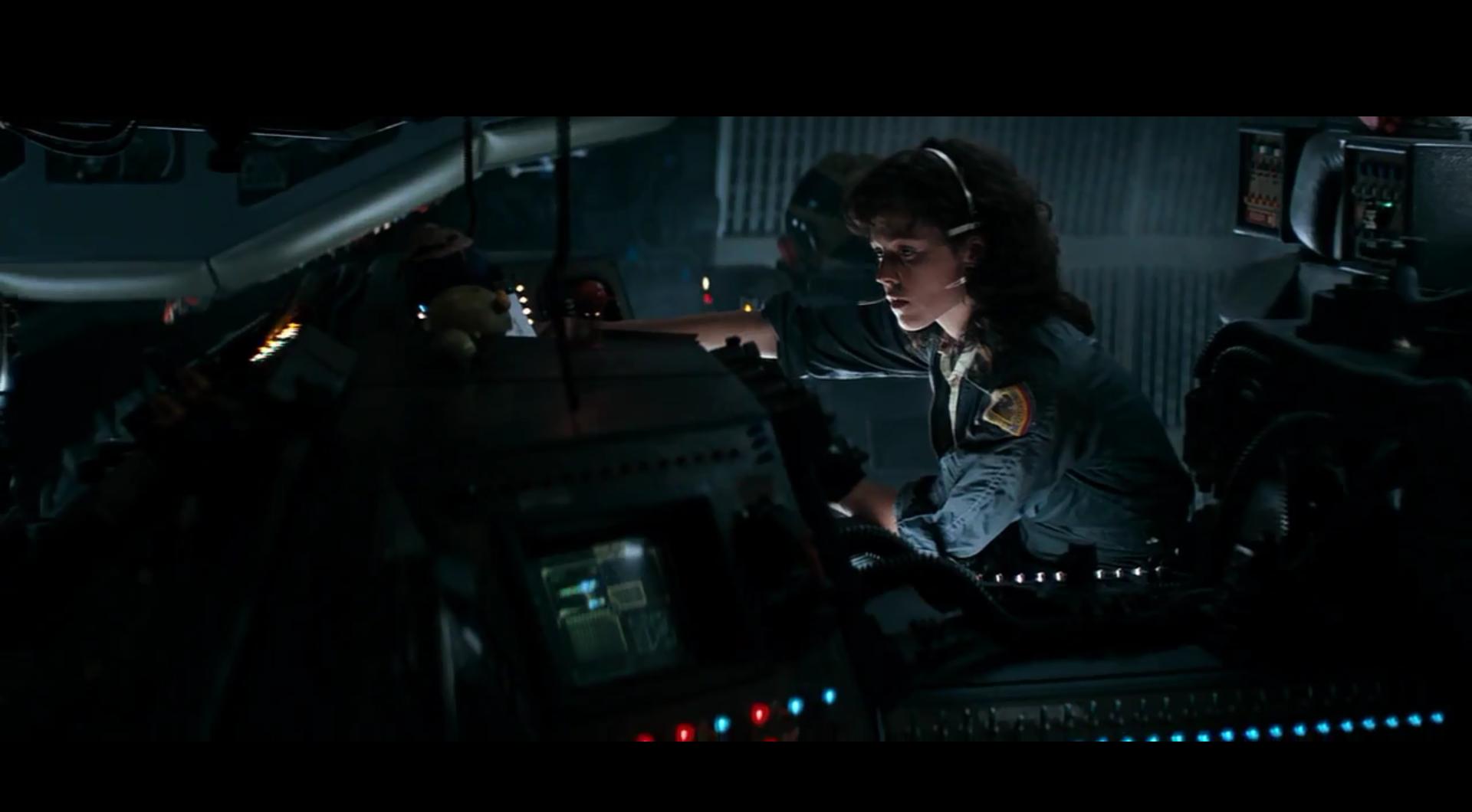
Alien, the film about an alien species being introduced to a ship and wreaking havoc on the crew, is widely considered one of Ridley Scott’s masterpieces. In the film he translates the traditional horror genre into a setting that it has rarely taken place, space. In the Nostromo, the ship that is the setting for most of the film, hallways are cramped, claustrophobic and poorly lit. When they are lit, lights are usually flashing, impairing the viewer’s vision. Psychological analyses have shown that "horror movies draw on primeval archetypes hidden deep in the subconscious; for example, shadows [and] the dark."[1] The titular alien is also designed to blend in with the textured paneling of each room, becoming a creature that can be in a scene without whoever is watching even noticing.
Scott used smoke uniformly dispersed across the set to create the mood that was achieved in the final product. Again impairing the viewers vision of what is happening, without the camera shake that many filmmakers use today in action sequences. As the writer for Alien said about Ridley Scott, “When it comes to texturing a scene, texture, mood, subtlety of mood and feeling and atmosphere, he really is superb. Without it, it would have been a much lesser picture.”[2] While Ridley Scott is a master at environment and atmosphere, perhaps because of his background in painting,[3] the strength of the stories in many of his productions is not quite as impressive.
Communication between Director Ridley Scott and Jerry Goldsmith, writer of the film’s score, was minimal. Ridley Scott was taken by the avant garde components of the music Jerry Goldsmith had composed, but did not want any of the Romantic style pieces. The eery, minimalistic music that is in the final version is what Scott wanted. However, Scott cut the music in the final stages of editing, which lead to an angry Goldsmith.[4] Despite the lack of communication and Goldsmith’s anger about the defilement of his work, the film has one of film history’s most iconic soundtracks.
The Reviews
English film critic, Derek Malcolm, writing for the Guardian, found Alien a fantastic horror film, even though the story was “basically just a mixture of The Creature from the Black Lagoon and The Thing from Outer Space.” He also commented on how the close quarters of the ship, as well as the extreme close-up shots helped create a feeling of tension.[5]
Section 2: Deliverable
Analysis of the average color of each film frame from several movies
By using several command line tools, including ImageMagick and ffmpeg, I was able to convert a handful of films by the directors above in order to examine the colors of the entire movie, as well as each scene.
Alien
 A still from Alien (1979) |
The dominant colors are very dark shades of blue, and sometimes even near-black, demonstrating the ambience that director Ridley Scott was aiming for. However, there are occasional scenes of nearly pure white, which might seem odd. If you zoom into the center light strip, at the very end you can see a significant amount of red mixed in with the white. In this scene, the sterile-looking interior of the mess hall of the ship is sprayed with blood as the infamous "chest-burster" scene takes place. When first viewed, this scene is incredibly shocking and gruesome, and the contrast between the sanitary-looking white with the dark crimson has a significant place in helping achieve this effect.
There is a second major white band that can be visible. In this part of the movie, Ash has been revealed as being a "synthetic," essentially a robot, that appears identical to a human, and was tasked with bringing the alien back for research, at the chagrin of the crew. After attacking the human crew, he is torn apart, and again with the background of a sterile and sanitary looking room aboard the ship, his synthetic guts are strewn everywhere, a different kind of gore. Although another explanation for the good lighting could be to allow the audience to focus on what is being said, without being distracted by looking into the shadows.
Trainspotting
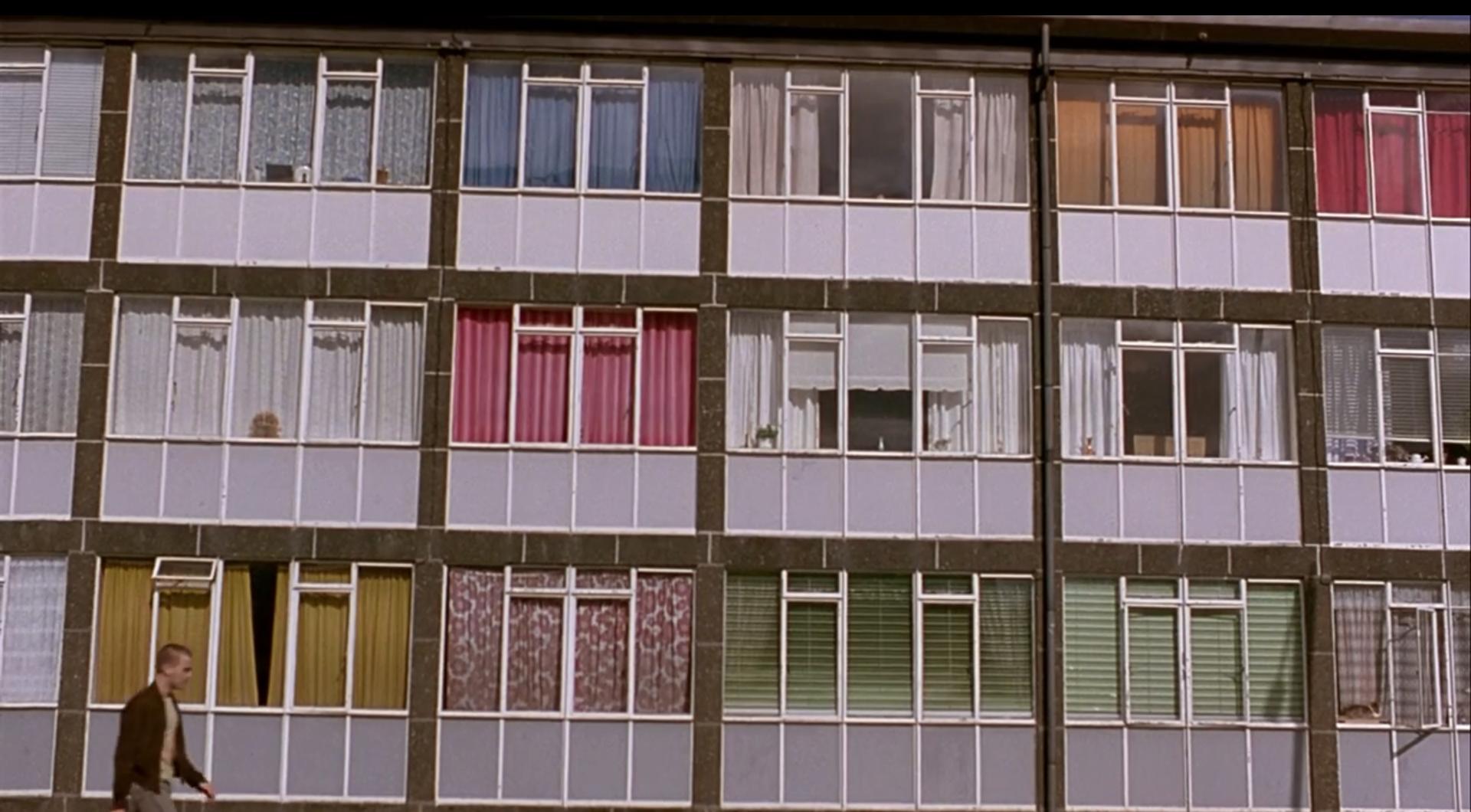
 A still from Trainspotting (1996) |
Immediately noticeable from Trainspotting's color barcode, is the use of bright, warm colors, with almost a pastel quality to them. This is likely meant to convey the feeling heroin gives the user. Although this color scheme continues throughout the movie, even through scenes that are dark or gruesome. Again, this could represent the filter that drug use puts over your life and modifies what you are seeing. In the movie, as the characters discover the dead, neglected baby while they are all on heroin, main character Mark Renton says, "I wished I could think of something to say. Something sympathetic. Something human."
This inviting and seemingly friendly color usage could be described as glorifying drug usage, but in my mind it requires the viewer to pull themselves out of a trance and see what is really going on, and how the drug usage is negatively impacting the characters. This is much like the process Renton must go through in the film, to wean himself off of drugs.
Interstellar
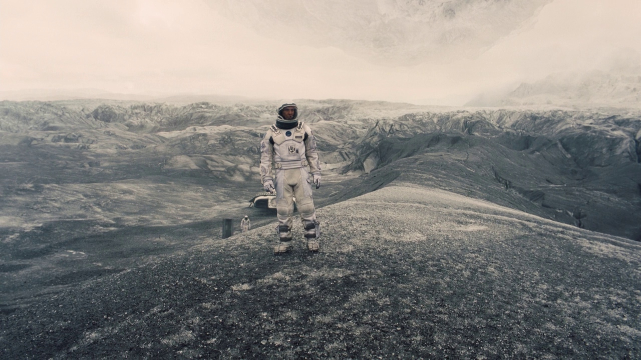
 A still from Interstellar (2014) |
What surprised me when seeing this image after it was rendered, was how different it was to Alien's "barcode." After all, both are space movies, so shouldn't they be similar? However the warmer colors and softer hues compared to Alien signify a focus not on space, but on the interactions between humans throughout the movie. These color choices represent Nolan's desire to make the film an optimistic outlook on the future of the human race. This is further evidenced by Nolan's change of the ending of the film, from one where the main character sends data through the wormhole before it collapses, and is pulled through a black hole without surviving, to the theatrical ending, where he survives long enough to see his daughter and the future of humanity.[6]
Conclusion
In this section, provide a summary or recap of your work, as well as potential areas of further inquiry (for yourself, future students, or other researchers).
References
- ↑ Xiangyi Fu - Horror Movie Aesthetics: How color, time, space and sound elicit fear in an audience.
- ↑ Director's Commentary - Alien (1979)
- ↑ Royal College of Art - Ridley Scott Interview
- ↑ Vulture - Why the Alien Franchise Has Such a Dramatic Musical Past
- ↑ https://www.theguardian.com/film/2009/oct/13/derek-malcolm-alien-review The Guardian - Derek Malcolm's Alien review from 1979
- ↑ Business Insider - The original ending to 'Interstellar' was much more depressing


