An Analysis of the Art Style of several British Filmmakers.
From Londonhua WIKI
Contents
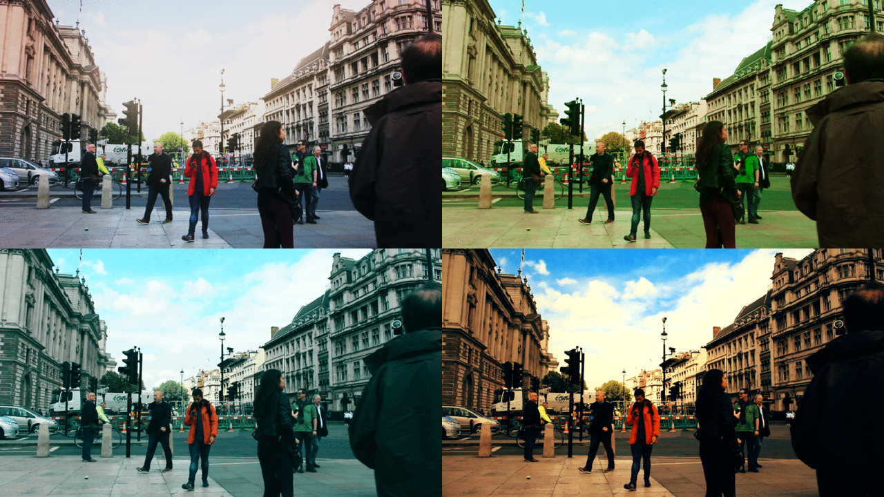 Color correction changes the mood of any footage. | |
| London | by Peter Beretich |
|---|---|
Abstract
In this project I examined the visual elements from a single movie by each of three British filmmakers, Ridley Scott, Danny Boyle, and Christopher Nolan. I looked at the cinematography, color usage, and psychological reasoning behind the both of these. I have discovered that there is a wide range of psychoanalytical evidence behind the cinematography of film. The greatest filmmakers are the ones who understand this, and incorporate it into their work in order to convey their message through more ways than one. My prior evidence with film is through personal research and film creation, as well as taking a video production course at WPI. My aim with this project is to show that while the medium of film is an art, there is interesting psychology and science behind some of the most seemingly trivial things.
Introduction
Artist-researcher Ivan Magrin-Chagnolleau, Head of the Aesthetics of Performing and Spectacular Arts Department at Sorbonne, says that colors "usually convey emotions in a very subtle way, but also in a very uncontrolled manner," and that they "can be consciously used or not, depending on the artist and on the process."[1]
My goal through this project is to see how certain filmmakers utilize color throughout their film to evoke a psychological response in their viewers, and whether they pay specific attention to the usage. Using the original technique of generating an average color timeline to analyse color progression over a film's duration has not been done before. Viewing the average color of different scenes in a film allows for an easy way to tell if directors payed attention to color throughout the film, or only for small scenes. I chose these filmmakers because they are all well-known, and their films have been wildly successful. This project will show how much these directors think about their use of color throughout their films.
Section 1: Background
Color and Film
Research in the association between color and emotions has existed for a considerable amount of time, but within the past decade those similarities have been further analysed with respect to films. A 2004 study found that there was 80% accuracy for sorting films by "mood tone classification." Essentially, two films with a similar genre or sub-genre had such similar color schemes, as well as resulting moods, that these films could be shown as related.[2] While this is particularly useful for sorting films by genre or mood, perhaps with a service like Netflix, this also shows how important choosing the right color scheme for a movie can help connect a viewer to the genre they are watching.
However, color can be difficult to implement exactly as the director wants it to be perceived, considering there are sometimes cultural differences in reactions to colors. A 1968 study found that red and blue were liked by American subjects, but not so much with individuals from other countries.[3] The challenge filmmakers face, should they decide to have color play a central role in their film, is deciding what audience is being targeted with the release of the film.
With this information in mind, even if color is not a significant consideration in the production of a certain movie, if the color palette is noticeably off, it can have an unsettling effect on the viewer. Whether or not the film feels like it follows generally with its sub-genre could have an effect on its reviews or whether the audience decides to recommend the film. Also, should the film use colors that unsettle the viewer, despite being a film without that intention, this can also leave the viewer feeling confused. The bottom line is that whether or not color plays a central role in a production, it should still be a focus of the filmmakers.
Average Color Timelines
Average Color timelines are a useful way to see the general color palette of a movie in a way that is easier to digest than watching a video. They can be created by using command line tools like ffmpeg and ImageMagick. Please see the External Links section for more information. These timelines provide the benefit of seeing the entire stretch of film in an easily digestible format. It is particularly useful in the examination of thoughtful color usage in scenes of films. However, this process has not been widely used before for analysis of films, and therefore has limited research and information surrounding it.
To view examples by Reddit user /u/etherealpenguin, please see External Links.
Ridley Scott
Alien
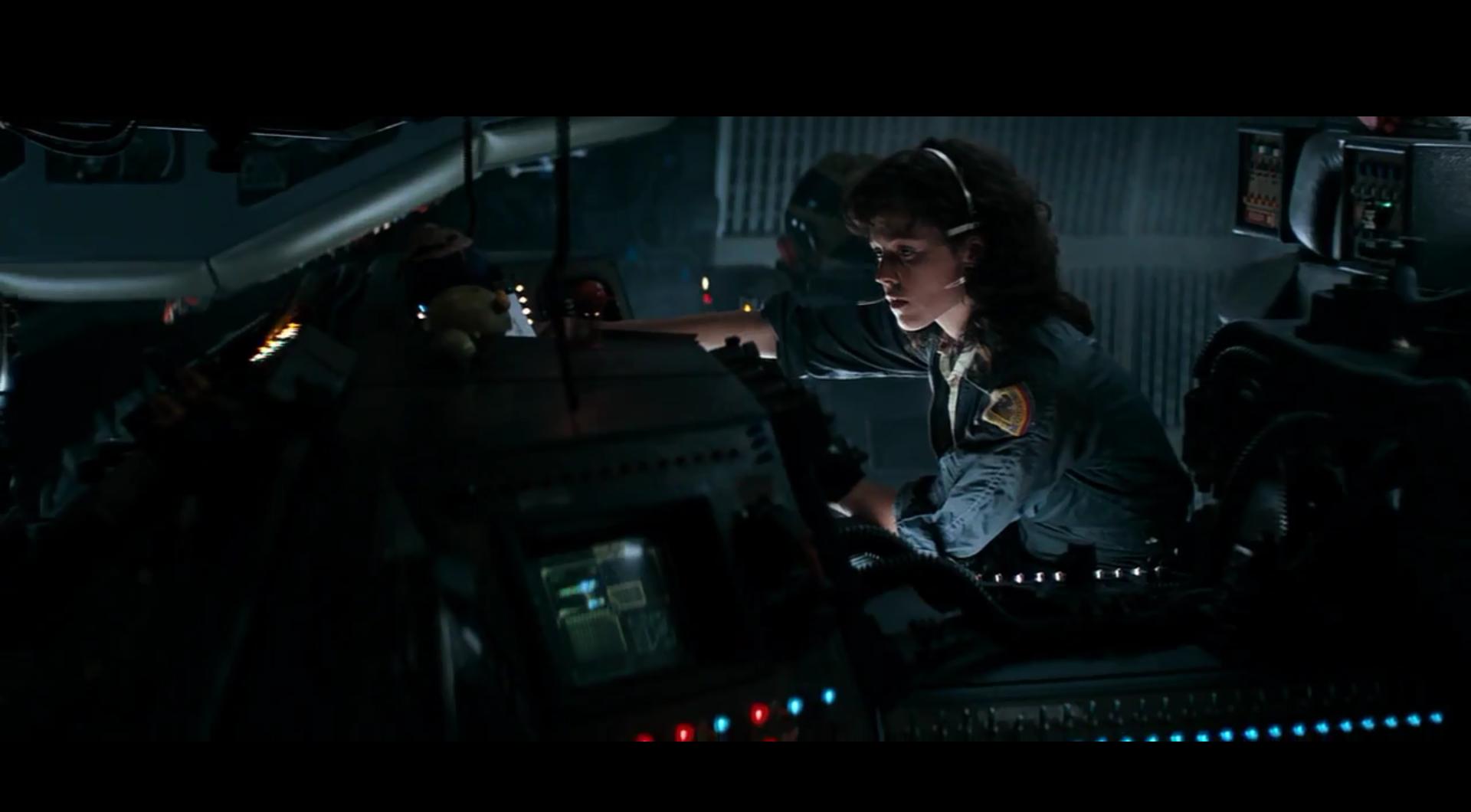
Alien, the film about an alien species being introduced to a ship and wreaking havoc on the crew, is widely considered one of Ridley Scott’s masterpieces. In the film he translates the traditional horror genre into a setting that it has rarely taken place, space. In the Nostromo, the ship that is the setting for most of the film, hallways are cramped, claustrophobic and poorly lit. When they are lit, lights are usually flashing, impairing the viewer’s vision. Psychological analyses have shown that "horror movies draw on primeval archetypes hidden deep in the subconscious; for example, shadows [and] the dark."[4] The titular alien is also designed to blend in with the textured paneling of each room, becoming a creature that can be in a scene without whoever is watching even noticing.
Scott used smoke uniformly dispersed across the set to create the mood that was achieved in the final product. Again impairing the viewers vision of what is happening, without the camera shake that many filmmakers use today in action sequences. As the writer for Alien said about Ridley Scott, “When it comes to texturing a scene, texture, mood, subtlety of mood and feeling and atmosphere, he really is superb. Without it, it would have been a much lesser picture.”[5] While Ridley Scott is a master at environment and atmosphere, perhaps because of his background in painting,[6] the strength of the stories in many of his productions is not quite as impressive.
Communication between Director Ridley Scott and Jerry Goldsmith, writer of the film’s score, was minimal. Ridley Scott was taken by the avant garde components of the music Jerry Goldsmith had composed, but did not want any of the Romantic style pieces. The eery, minimalistic music that is in the final version is what Scott wanted. However, Scott cut the music in the final stages of editing, which lead to an angry Goldsmith.[7] Despite the lack of communication and Goldsmith’s anger about the defilement of his work, the film has one of film history’s most iconic soundtracks.
The Reviews
English film critic, Derek Malcolm, writing for the Guardian, found Alien a fantastic horror film, even though the story was “basically just a mixture of The Creature from the Black Lagoon and The Thing from Outer Space.” He also commented on how the close quarters of the ship, as well as the extreme close-up shots helped create a feeling of tension.[8] A New York Daily News review also praises the horror film, with its use of "claustrophobic corners"[9] in order to strike fear into the audience.
Alien received a wide range of similar reviews, all complementing the frightening, well-implemented use of classic horror cinematography and design, as well as the films ventures into uncharted cinematic territory. Obviously Scott's cinematography and art style was taken just as he had wanted it - in a way that scared the audience without the usual cheesiness of sci-fi films from the team. Alien stands up even today as a horror film that will still evoke fear from its audience, a sign of a well crafted film.
Danny Boyle
Trainspotting
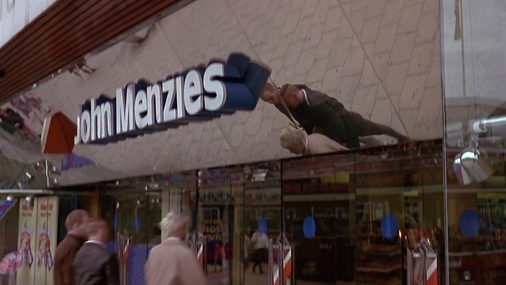
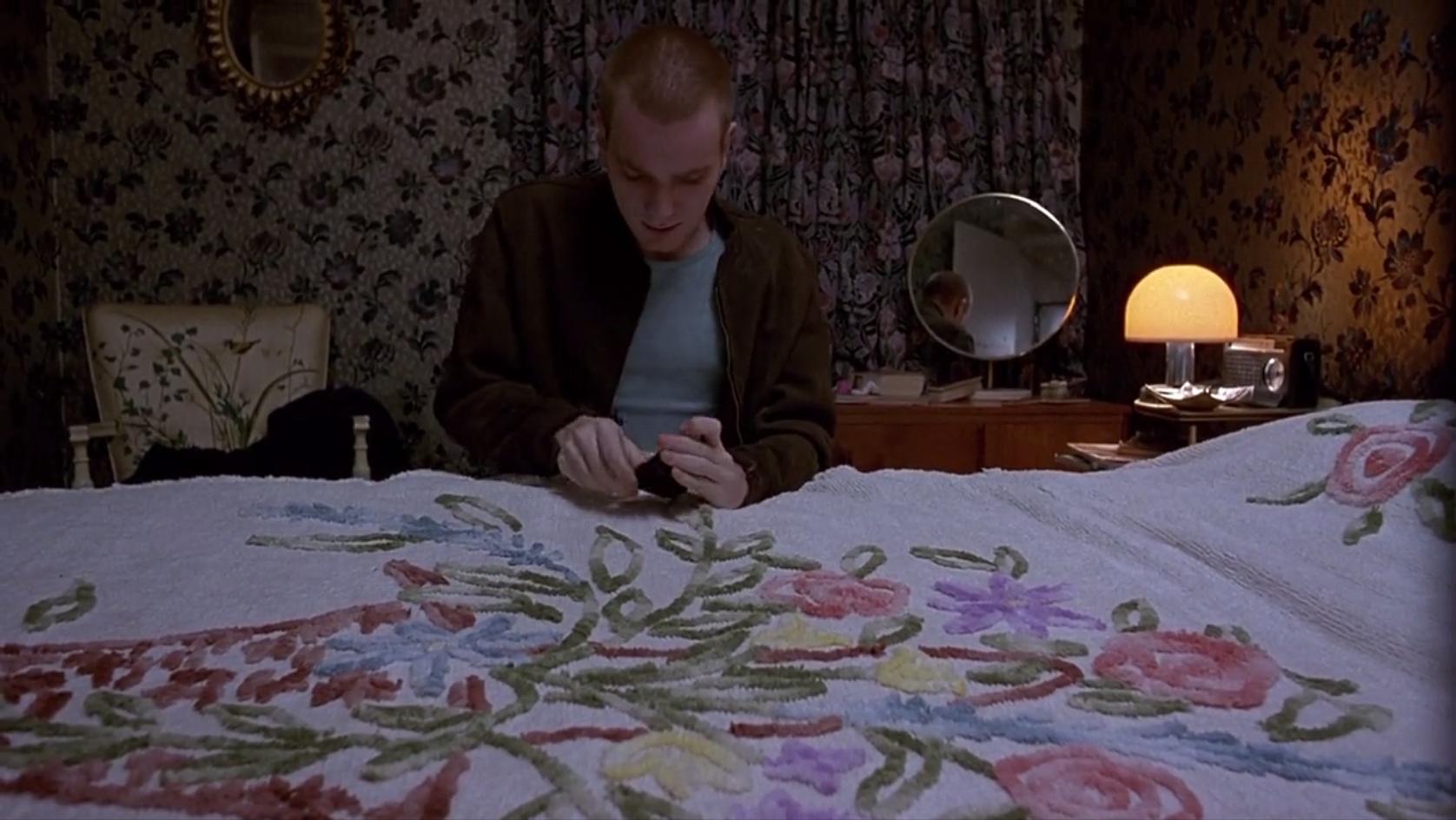
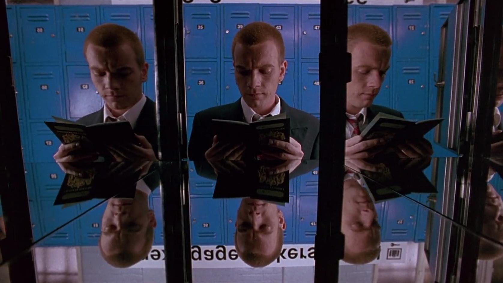
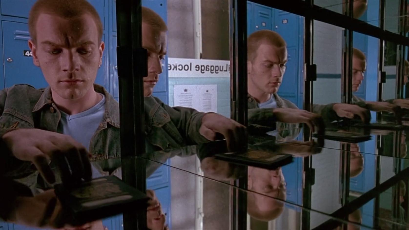
Trainspotting is a film about a group of heroin users in Edinburgh, Scotland, and the way the drug affects their lives and the decisions they make. The Protagonist, Mark Renton, played by Ewan McGregor, constantly tries to break his addiction but usually finds himself using again. Throughout the film there is a wide use of mirrors in many of the shots in the film. Psychoanalyst Jacques Lacan noted how when an infant views itself in a mirror, it supplies itself with an imaginary wholeness, that in reality, does not exist.[10] In Trainspotting, Mark Renton can be compared to an infant, especially when his parents forcefully break his addiction from drugs by locking him in his childhood room. At the same time he is haunted by the infant who died because of the neglect by her heroin-addicted mother and friends.
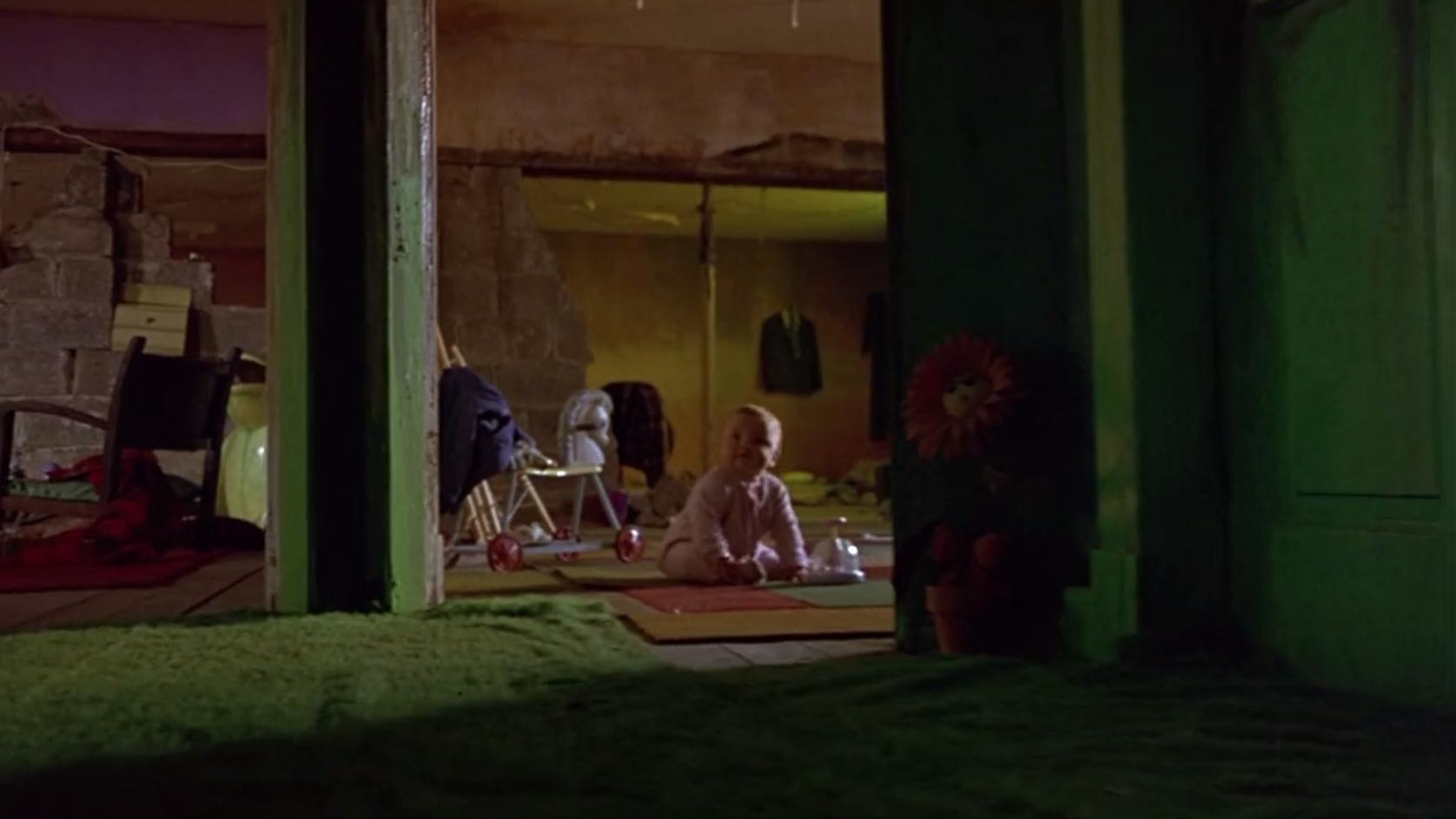
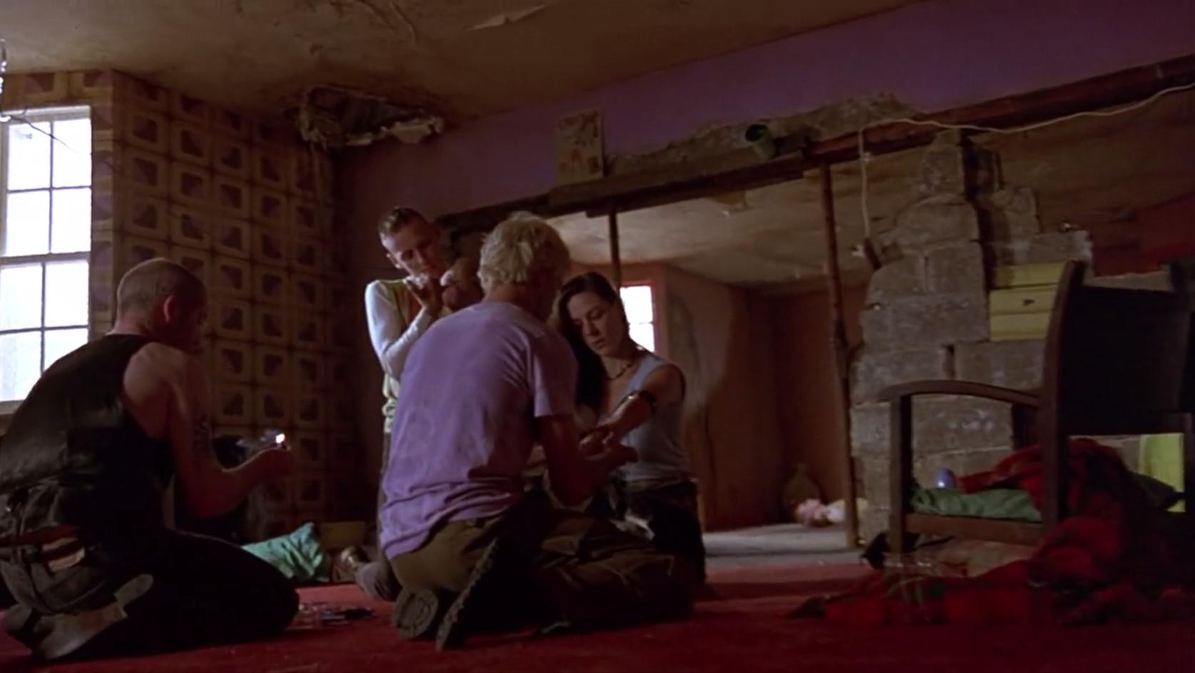
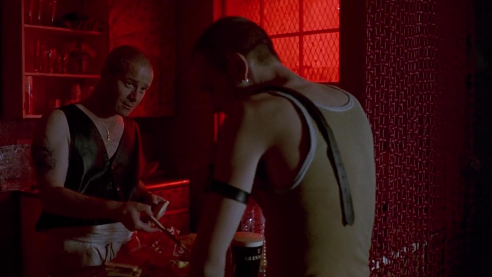
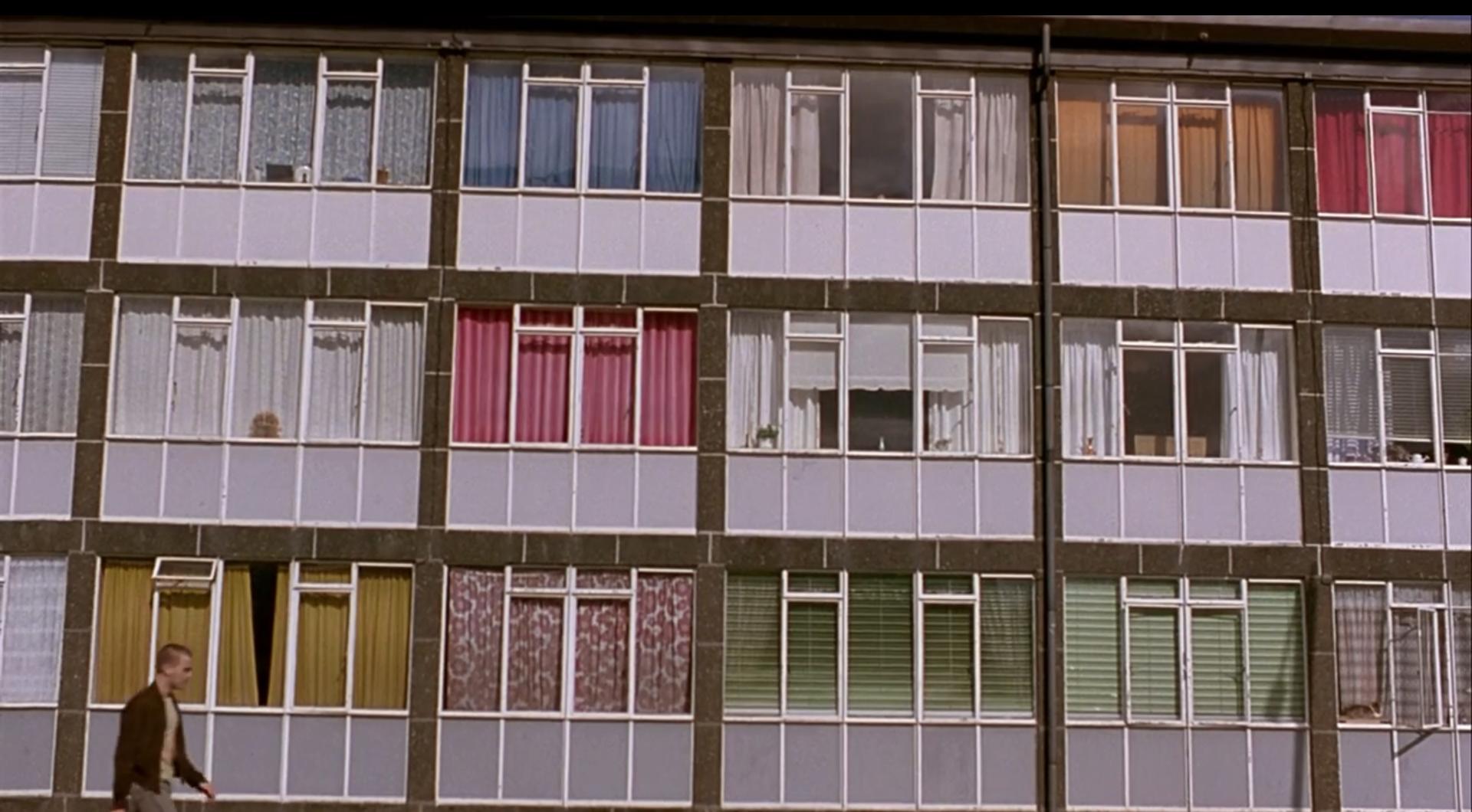
Danny Boyle placed a lot of thought into the use of colors in Trainspotting. Unlike many films, there are uses of bright colors, including red, yellow, blue, and green. The setting of many key moments of the film, Swanney or Mother Superior's flat, uses color to reinforce the sentiments characters feel in the movie. The bright red of the room where the characters shoot heroin represents the danger, risk, and reward of the pleasure of the drug. In the baby's room, the dominant color is yellow, which represents hope and optimism. However, when baby Dawn dies, she is atop a green blanket, with green generally representing sickness. The hallway leading to the outside is blue, representing the cold, and a place without the pleasures of drug use.[11]
Danny Boyle purposefully made British pop culture references in the film, that help viewers, especially those who were not British, immerse themselves in the setting. To help the actors prepare for their roles as rebellious young adults, Boyle had them watch films like Clockwork Orange, and he references this by designing the Volcano night club in Trainspotting after the Milk Bar in A Clockwork Orange. This reference to such a controversial film is especially appropriate for a movie discussing drug abuse.
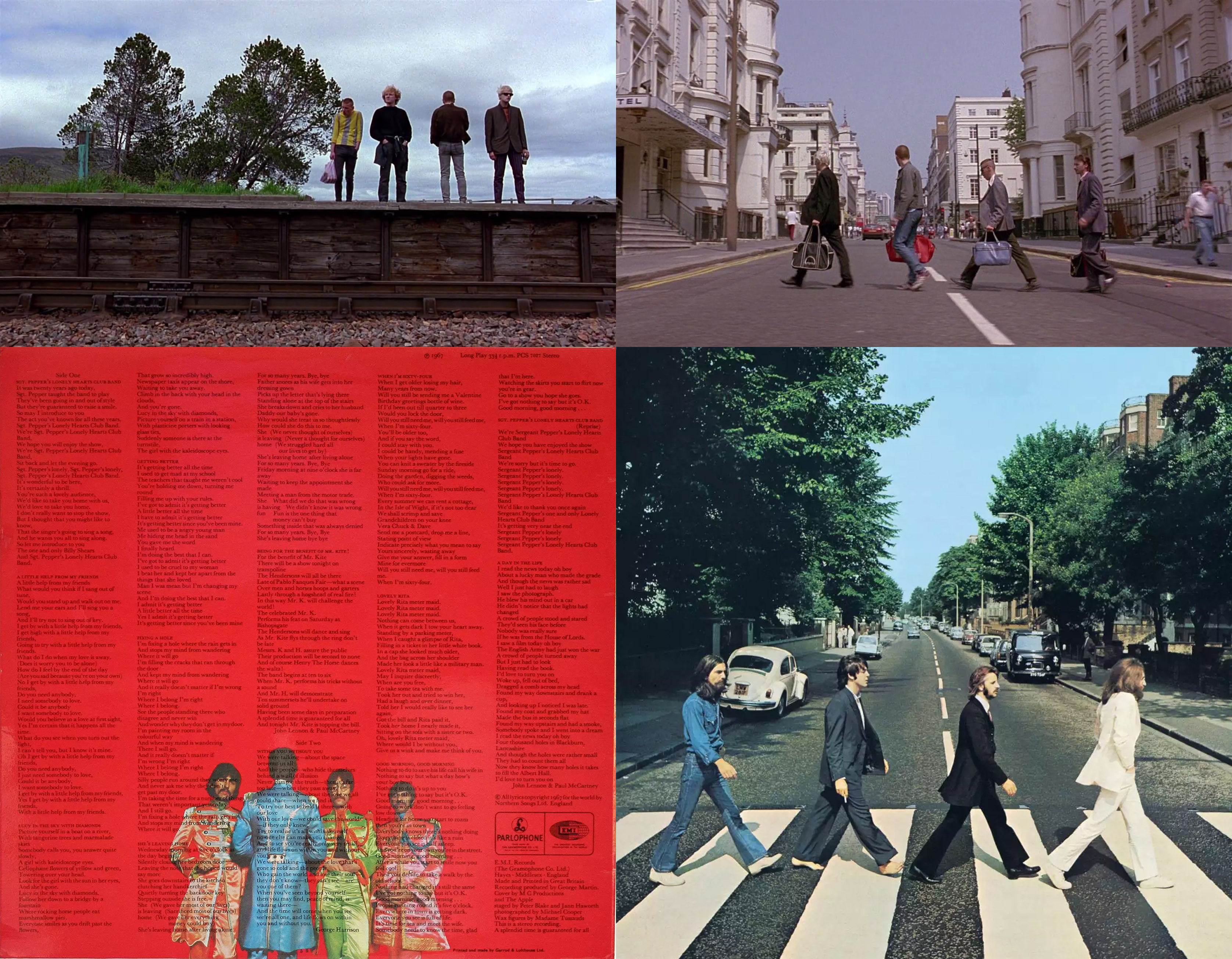
Danny Boyle made many visual references to the Beatles, likely as a way to allow non-British viewers to more easily relate to the film. The opening scene of Trainspotting, where Renton and his mates are chased down the street, is very similar to the opening scene of The Beatles movie "A Hard Day's Night," where The Beatles are chased by their fans. Also several scenes are reminiscent of The Beatles album covers, especially "Sgt. Pepper's Lonely Hearts Club Band" and "Abbey Road."
The Reviews
While New York Times film critic Janet Maslin was unimpressed with Trainspotting's narrative, she found "Mr. Boyle's savvy use of wide angles, bright colors, attractively clean compositions and a dynamic pop score" as enhancements to the film.[12] However the film received positive reviews in almost every publication, a testament to Boyle's hard work under limited budget, while still bringing something new to cinematography and film.
Christopher Nolan
Interstellar
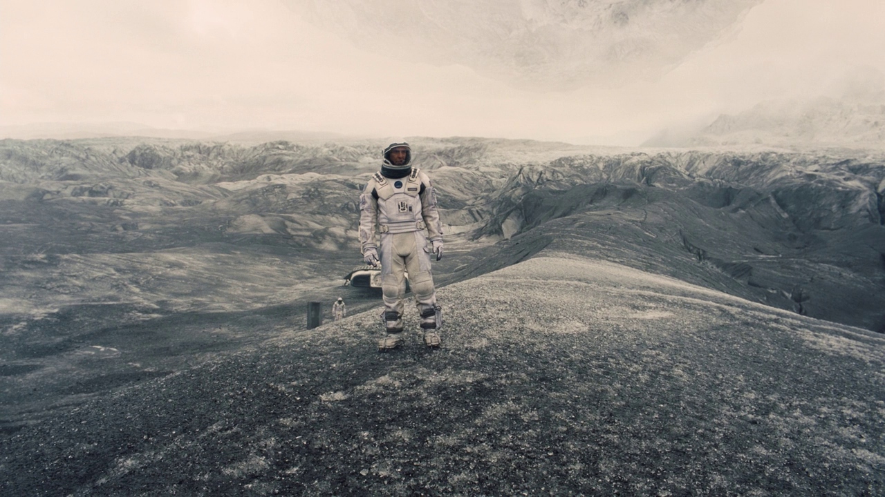
Interstellar begins by showing us a dystopian Earth where crops are dying, NASA has supposedly been defunded, and education has deteriorated. Eventually the main character, Cooper, played by Matthew McConaughey, agrees to fly a mission with the goal of finding a new home for humanity, for a now secret NASA. Director Christopher Nolan and his directors of photography are known for making every shot meaningful. In Interstellar, he uses lighting to reveal information about each character, as well as meaning behind each scene.
When we are first introduced to Dr. Brand, the mastermind behind the trip out of Earth, he seems relatively respectful and smart, and there is nothing through Michael Caine's acting that would indicate otherwise. However, when he is at his desk trying to convince McConaughey's character to agree to fly the ship, Nolan's choice of lighting allows us to gain a better idea of Caine's character. He is lit from the top, in a way that would be considered bad lighting, in a way known as "steep frontal key lighting." This is described in the 3rd edition of Lighting for TV and Film as resulting in "black eyes, harsh modeling, long nose shadows."[13] This is indicating that Dr. Brand is deceitful at least, and possibly an antagonist at worst. As we learn later, he does not actually have a way for humans still on Earth to leave.
In another scene hinting about the importance of gravity to the story, on Cooper's farm there is a gravitational anomaly within the house, which is of course a crucial component to the story, as discovered later. In this scene Nolan uses a lens with a slight distortion, causing an almost unnoticeable circular effect to the footage. Since this could have easily been avoided using very simple editing tricks, or by using a different lens, it leads me to believe it was a way to represent gravity in the scene. Gravity can bend light, and as it does on earth, this can create what is called a gravitational lens.[14] This effect is usually circular, and so is the lens distortion in the film.
The Reviews
A review by The Telegraph says "Outside, there are enough wonders to fill an entire Dawn Treader cruise: frozen clouds that hang in the sky like weightless glaciers, tidal waves as tall and wide as mountain ranges, strands of pure time, tight and strummable as zither strings. The film is a feast of extraordinary ideas, each one depicted by Nolan’s cinematographer, Hoyte van Hoytema, and his visual effects team with heart-swelling grandeur."[15] Film Critic Scott Foundas described the film as "as visually and conceptually audacious as anything Nolan has yet done," but is "more emotionally accessible" than the director's other films.[16] The film received generally positive reviews.
Section 2: Deliverable
Analysis of the average color of each film frame from several movies
By using several command line tools, including ImageMagick and ffmpeg, I was able to convert a handful of films by the directors above in order to examine the colors of the entire movie, as well as each scene. This technique has not been widely used in detailed analysis of intentional color change throughout a film.
Alien
The dominant colors are very dark shades of blue, and sometimes even near-black, demonstrating the ambience that director Ridley Scott was aiming for. However, there are occasional scenes of nearly pure white, which might seem odd. If you zoom into the center light strip, at the very end you can see a significant amount of red mixed in with the white. In this scene, the sterile-looking interior of the mess hall of the ship is sprayed with blood as the infamous "chest-burster" scene takes place. When first viewed, this scene is incredibly shocking and gruesome, and the contrast between the sanitary-looking white with the dark crimson has a significant place in helping achieve this effect.
There is a second major white band that can be visible. In this part of the movie, Ash has been revealed as being a "synthetic," essentially a robot, that appears identical to a human, and was tasked with bringing the alien back for research, at the chagrin of the crew. After attacking the human crew, he is torn apart, and again with the background of a sterile and sanitary looking room aboard the ship, his synthetic guts are strewn everywhere, a different kind of gore. Although another explanation for the good lighting could be to allow the audience to focus on what is being said, without being distracted by looking into the shadows.
Trainspotting
Immediately noticeable from Trainspotting's color barcode, is the use of bright, warm colors, with almost a pastel quality to them. This is likely meant to convey the feeling heroin gives the user. Although this color scheme continues throughout the movie, even through scenes that are dark or gruesome. Again, this could represent the filter that drug use puts over your life and modifies what you are seeing. In the movie, as the characters discover the dead, neglected baby while they are all on heroin, main character Mark Renton says, "I wished I could think of something to say. Something sympathetic. Something human."
This inviting and seemingly friendly color usage could be described as glorifying drug usage, but in my mind it requires the viewer to pull themselves out of a trance and see what is really going on, and how the drug usage is negatively impacting the characters. This is much like the process Renton must go through in the film, to wean himself off of drugs.
Author Patti Bellantoni describes the color red in her book "If It's Purple, Someone's Gonna Die: The Power of Color in Visual Storytelling," as "visual caffeine."[17] This is especially appropriate considering how both caffeine and heroin are drugs - although have nearly opposite effects on the human body. Danny Boyle used this color to display to the audience how invigorating drug use is, and the only way to illicit this response from the audience is through this color that can instigate many strong emotions.
Yellow, the color of the Baby's room, is also a color that instills varied emotions in a viewer. Bellantoni says that yellow can represent "powerful life energy" such as that from the sun, but at the same time can be cautionary and mean danger is approaching. In Trainspotting, this comparison is applicable as well. The Baby represents life and longevity, but when it dies from lack of care it shows the effects of heroin on family and yourself. The baby could also be a metaphor for the life of each of the characters, and how they are wasting theirs with their addiction.
Interstellar
What surprised me when seeing this image after it was rendered, was how different it was to Alien's "barcode." After all, both are space movies, so shouldn't they be similar? However the warmer colors and softer hues compared to Alien signify a focus not on space, but on the interactions between humans throughout the movie. These color choices represent Nolan's desire to make the film an optimistic outlook on the future of the human race. This is further evidenced by Nolan's change of the ending of the film, from one where the main character sends data through the wormhole before it collapses, and is pulled through a black hole without surviving, to the theatrical ending, where he survives long enough to see his daughter and the future of humanity.[18]
While Nolan uses color differently than Danny Boyle does in Trainspotting, color plays a large part in the visual information being displayed to the user. When we are shown the green corn crops, it seems that everything is all right on Earth, but after the dust storm, the initially vibrant greens are desaturated and depressing. This is an effective way of showing the audience that the Earth is dying. In the beginning of the movie, this green is the only vibrant color, and the audience realizes that, without it, there is only a sad scene.
Conclusion
By analyzing the colors of each movie, you can tell which director puts the most thought into their color scheme and how it helps convey the emotions of each film. While each director used color changes to convey meaning, it appears to me that director Danny Boyle put the most effort into this aspect of the production. This is especially noteworthy considering he had the smallest budget of the three directors when creating this movie. His use of sharp, bright, and colors It was beyond the scope of this project, but an analysis of multiple films by each director would be very interesting, in order to determine which filmmakers purposefully use color in their productions most consistently.
References
- ↑ Magrin-Chagnolleau, I. (n.d.). The Use of Color in Theater and Film. Paris Sorbonne & C.N.R.S.
- ↑ Wei, C. Y., Dimitrova, N., & Chang, S. F. (2004, June). Color-mood analysis of films based on syntactic and psychological models. In Multimedia and Expo, 2004. ICME'04. 2004 IEEE International Conference on (Vol. 2, pp. 831-834). IEEE.
- ↑ Choungourian, A. (1968). Color preferences and cultural variation. Perceptual and motor skills, 26(3_suppl), 1203-1206.
- ↑ Fu, X. (2016) "Horror Movie Aesthetics: How color, time, space and sound elicit fear in an audience." Northeastern University Department of Art and Design (Link)
- ↑ Alien - Director's Commentary. 20th Century Fox, 1979. DVD.
- ↑ Scott, R. Royal College of Art. Retrieved from https://www.rca.ac.uk/studying-at-the-rca/the-rca-experience/student-voices/rca-luminaries/sir-ridley-scott/
- ↑ T. G. (2017, May 23). Why the Alien Franchise Has Such a Dramatic Musical Past. Retrieved June 18, 2017, from http://www.vulture.com/2017/05/why-the-alien-franchise-has-such-a-dramatic-musical-past.html
- ↑ Malcolm, D. (2009, October 12). Derek Malcolm's Alien review from 1979. Retrieved June 18, 2017, from https://www.theguardian.com/film/2009/oct/13/derek-malcolm-alien-review
- ↑ Leogrande, E. (1979, May 25). A thoroughly creepy, scary, enjoyable 'Alien' New York Daily News, p. 5.
- ↑ Lacan, J. (1949). The mirror stage as formative of the function of the I as revealed in psychoanalytic experience (pp. 57-62). New York: Routledge.
- ↑ Lea Weller - A Case Study of Danny Boyle's Trainspotting
- ↑ Maslin, J. (1996, July 19). FILM REVIEW: Bad Taste in a Vile Story Doesn't Rule Out Fun. Retrieved June 22, 2017, from http://www.nytimes.com/movie/review?_r=1&res=9F07EEDA1F39F93AA25754C0A960958260&partner=Rotten%2520Tomatoes
- ↑ Millerson, G., & Safari Books Online. (1999;1991;2013;). Lighting for television and film (3rd, Paperback;3;3rd; ed.). Oxford;Boston;: Focal Press.
- ↑ Einstein, A. (1936). Lens-like action of a star by the deviation of light in the gravitational field. Science, 84(2188), 506-507.
- ↑ Collin, R. (2015, September 03). Interstellar review: Christopher Nolan's best film. Retrieved June 22, 2017, from http://www.telegraph.co.uk/film/interstellar/review/
- ↑ Foundas, S. (2014, November 22). Film Review: ‘Interstellar’. Retrieved June 22, 2017, from http://variety.com/2014/film/reviews/film-review-interstellar-1201338475/
- ↑ Bellantoni, P. (2013). If its purple, someones gonna die: the power of color in visual storytelling. Burglington, MA: Focal Press.
- ↑ Fitz-Gerald, S. (2015, March 21). The original ending to 'Interstellar' was much more depressing. Retrieved June 18, 2017, from http://www.businessinsider.com/interstellar-original-ending-2015-3
External Links
How to Create Average Color Timelines:
https://np.reddit.com/r/dataisbeautiful/comments/3rb8zi/the_average_color_of_every_frame_of_a_given_movie/cwmqw2q/
Examples by Reddit User /u/etherealpenguin:
http://imgur.com/a/1q9IO
