Difference between revisions of "Advertising Revelations"
From Londonhua WIKI
Akacherski (talk | contribs) (→Careless Talk) |
Akacherski (talk | contribs) (→References) |
||
| Line 170: | Line 170: | ||
#Harris, K., & Webb, C. (n.d.). Second World War Posters. Retrieved June 1, 2017, from http://www.iwm.org.uk/learning/resources/second-world-war-posters-0 | #Harris, K., & Webb, C. (n.d.). Second World War Posters. Retrieved June 1, 2017, from http://www.iwm.org.uk/learning/resources/second-world-war-posters-0 | ||
#Dig for Victory. (n.d.). Retrieved June 06, 2017, from http://www.bl.uk/learning/timeline/item107597.html | #Dig for Victory. (n.d.). Retrieved June 06, 2017, from http://www.bl.uk/learning/timeline/item107597.html | ||
| + | #Aldgate, A., & Richards, J. (2007). Britain can take it: The British cinema in the Second World War. IB Tauris. | ||
#New Restrictions on the Home Front- Britain is Blacked Out. (n.d.). Retrieved June 05, 2017, from http://www.homesweethomefront.co.uk/web_pages/hshf_blackout_pg.htm | #New Restrictions on the Home Front- Britain is Blacked Out. (n.d.). Retrieved June 05, 2017, from http://www.homesweethomefront.co.uk/web_pages/hshf_blackout_pg.htm | ||
#Dawson, E., & Rafferty, P. (2001). 'Careless talk costs lives': a case study examining the operation of information in British domestic posters of the Second World War. New review of information and library research, 7, 129-155. | #Dawson, E., & Rafferty, P. (2001). 'Careless talk costs lives': a case study examining the operation of information in British domestic posters of the Second World War. New review of information and library research, 7, 129-155. | ||
<br><br> | <br><br> | ||
[[Category:History Projects]] | [[Category:History Projects]] | ||
Revision as of 11:08, 7 June 2017
Advertising Revelations
 Piccadilly Circus |
Contents
Abstract
War advertising over the ages has changed. In this milestone I will compare the poster advertisements produced during the world wars to the ones produced today for the war on terror. Advertising will also change in the future. I plan to evaluate trends today to gauge where it is going in the future. World War II posters had many different kinds of posters, telling viewers many different messages. Today's posters all have a similar message: fight terrorism. I will briefly evaluate the history behind the World War II posters and compare them to today's posters on the war on terror.
Introduction
I suggest you save this section for last. Describe the essence of this project. Cover what the project is and who cares in the first two sentences. Then cover what others have done like it, how your project is different. Discuss the extent to which your strategy for completing this project was new to you, or an extension of previous HUA experiences.
As you continue to think about your project milestones, reread the "Goals" narrative on defining project milestones from the HU2900 syllabus. Remember: the idea is to have equip your milestone with a really solid background and then some sort of "thing that you do". You'll need to add in some narrative to describe why you did the "thing that you did", which you'd probably want to do anyway. You can make it easy for your advisors to give you a high grade by ensuring that your project milestone work reflects careful, considerate, and comprehensive thought and effort in terms of your background review, and insightful, cumulative, and methodical approaches toward the creative components of your project milestone deliverables.
Background
World War II
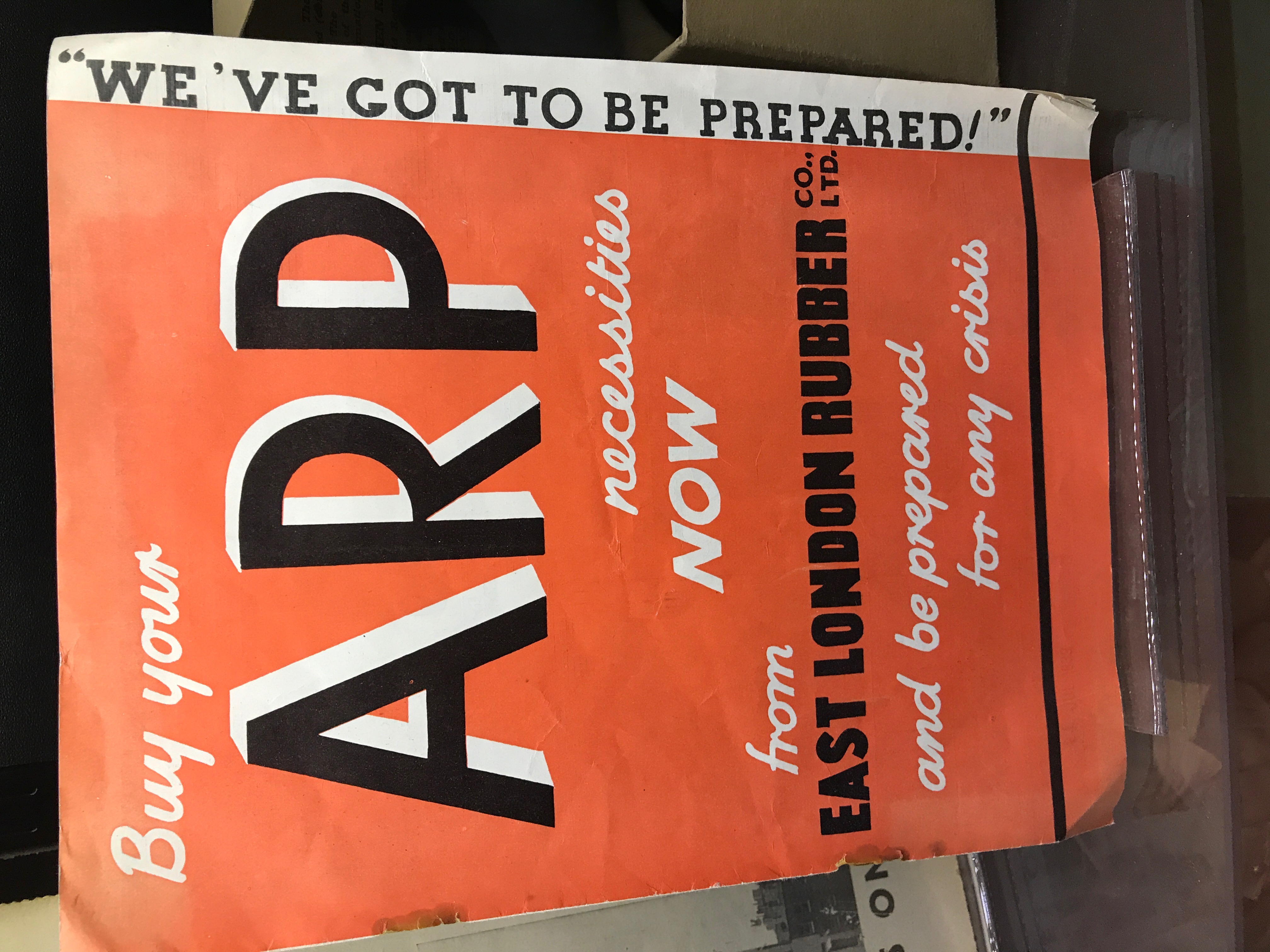
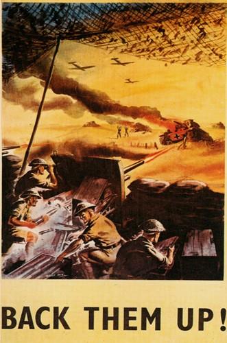
This time period was dominated by world war propaganda. Not just in the United Kingdom, but in all countries involved in the wars. Propaganda has a certain negative connotation when used today but that was not the case then. This was a way for the government and different companies to generate support for the war effort. This propaganda included posters, newspaper articles, radio transmissions, and films. These advertisements had the themes: resistance, victory, work, evacuation of children, blackout, preventing waste, good vs. evil, support, and careless talk [1]. These posters often depicted women working in factories or other male dominated jobs to show that they can replace men and help with the war efforts. These wars encouraged companies to increase advertising. Ad agencies focused on maintaining demand until the war was over and merchandise was readily available to consumers again [2].
In 1939, the Ministry of Information was formed to create posters to influence public opinion. There work included posters to convince people to grow their own food to cut down on import costs. Others encouraged people to reconsider their weekend trips and encourage the women to take jobs in the factories. [3]
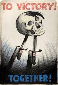
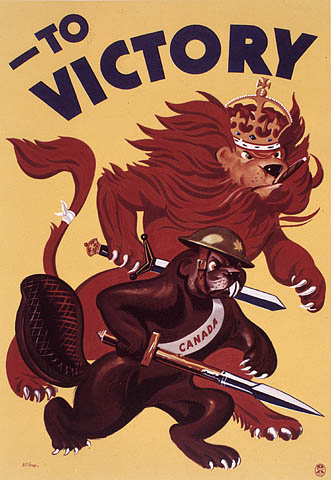
Victory
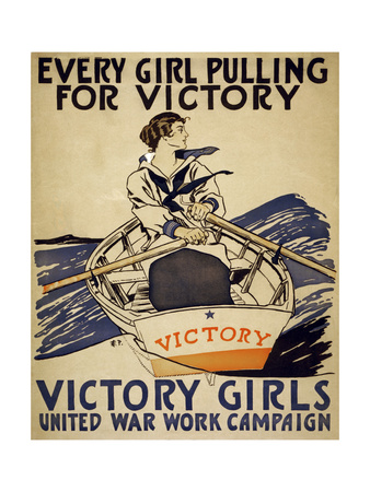
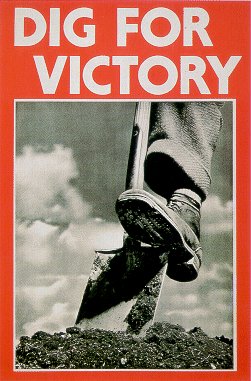
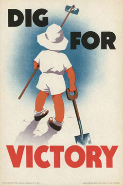
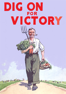
British victory posters were produced to boost morale. They were also seen by the Germans and was a way to undermine their morale. Often the posters put a positive spin on things that were not positive. They sometimes included aspects of the other kinds of posters such as growing your own food. In 1941, the British Ministry of Agriculture started a campaign 'Dig for Victory.' This campaign encouraged people to grow their own food in times of harsh rationing [4]. The posters also indicate that the women at home could also help with victory by replacing men's jobs.
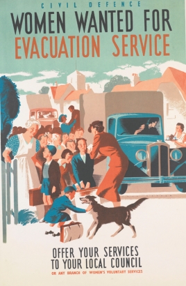
Evacuation
Evacuation: The evacuation posters during WWII were very straightforward. They told the viewer about evacuating London in case of aerial bombings. These posters were made to get the idea in the back of peoples’ minds. This way when it came time to evacuate, such as Operation Pied Piper, the idea of evacuation wasn’t new to them and they understood what they had to do. These posters mostly depicted the evacuation of women and children. The idea was that the men could handle themselves or stay back and fight for the city. The women and children had to be brought out of the city to be protected. During World War II, it was estimated that over 1.5 million people were evacuated from their homes[5]. The posters were often bright and colorful to draw attention and catch the viewers eye. Bright colors are also synonymous advertising related to children so this also caught the child’s eye. If the posters were not bright and colorful, then they were every simple; they had just a few words. This allowed the posters to be read quickly as the viewer walked by quickly on the platform to catch their train.
After the bomb threats began to materialize, people began to return to their homes. By 1939, almost half of the evacuees had returned home. This was not advised by the government because their still felt that bomb threats were imminent. This led them to start posting material advising mothers not to bring their children home. These kinds of posters appealed to mothers’ maternal sense. The poster depicted below shows Hitler convincing a mother watching over her children to bring the children back to the city. It implies that he will do horrible things to them if he brings them back based on his language and body positioning[6].
Blackout
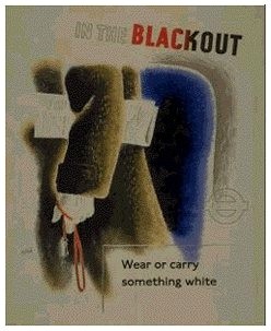
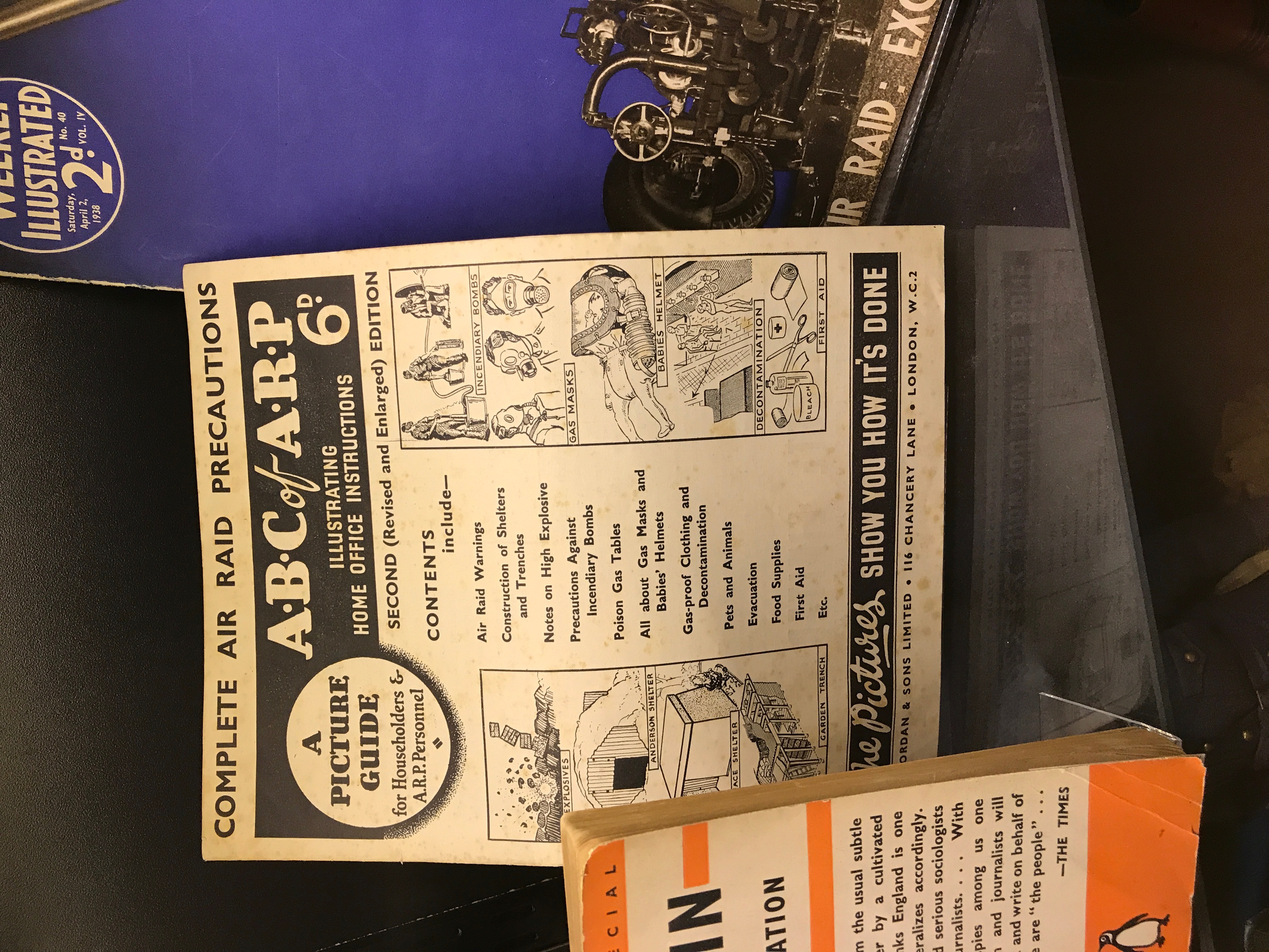
Blackouts were crucial to keeping civilians safe. During the war Britain shut off the power to the entire city. The reasoning behind this was that the Axis bombers would have a hard time conducting aerial attacks at night if there were no lights on in the city. This could help them to miss their target, saving historical landmarks and countless civilian lives. This required full cooperation from civilians. The government provided blackout material so that people can cover their windows so that absolutely no light can get out. People often needed two or three sheets of material in order to achieve this. People became assigned the position if A.R.P. (air raid precaution) warden. They wore a helmet with a W on the front so they could be easily recognized. They were in charge of making sure their neighbors were completely blacked out. The warden would go around and knock on doors and tell people if they had light showing. They could also report someone who did not comply with the blackout. The report could lead to a hefty fine or a court appearance. [7]
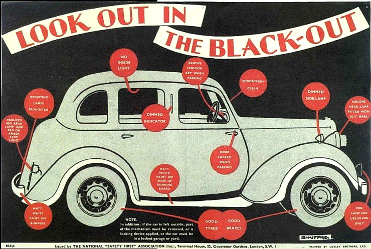
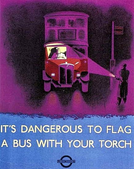
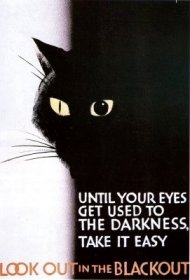
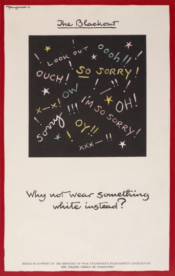
Blackout posters helped to remind people of the importance of blackouts. They would tell the viewer the times the blackouts were imposed, or how to stay safe during it. The posters also warned people of the dangers of the blackout such as crime or potential hazards of moving at night. There were also publications about how your diet can help you ti stay safe during this time. The posters were often used dark colors to reinforce the idea of a blackout. Below is a gallery of posters produced by the ministry of information regarding the blackout.
Preventing Waste
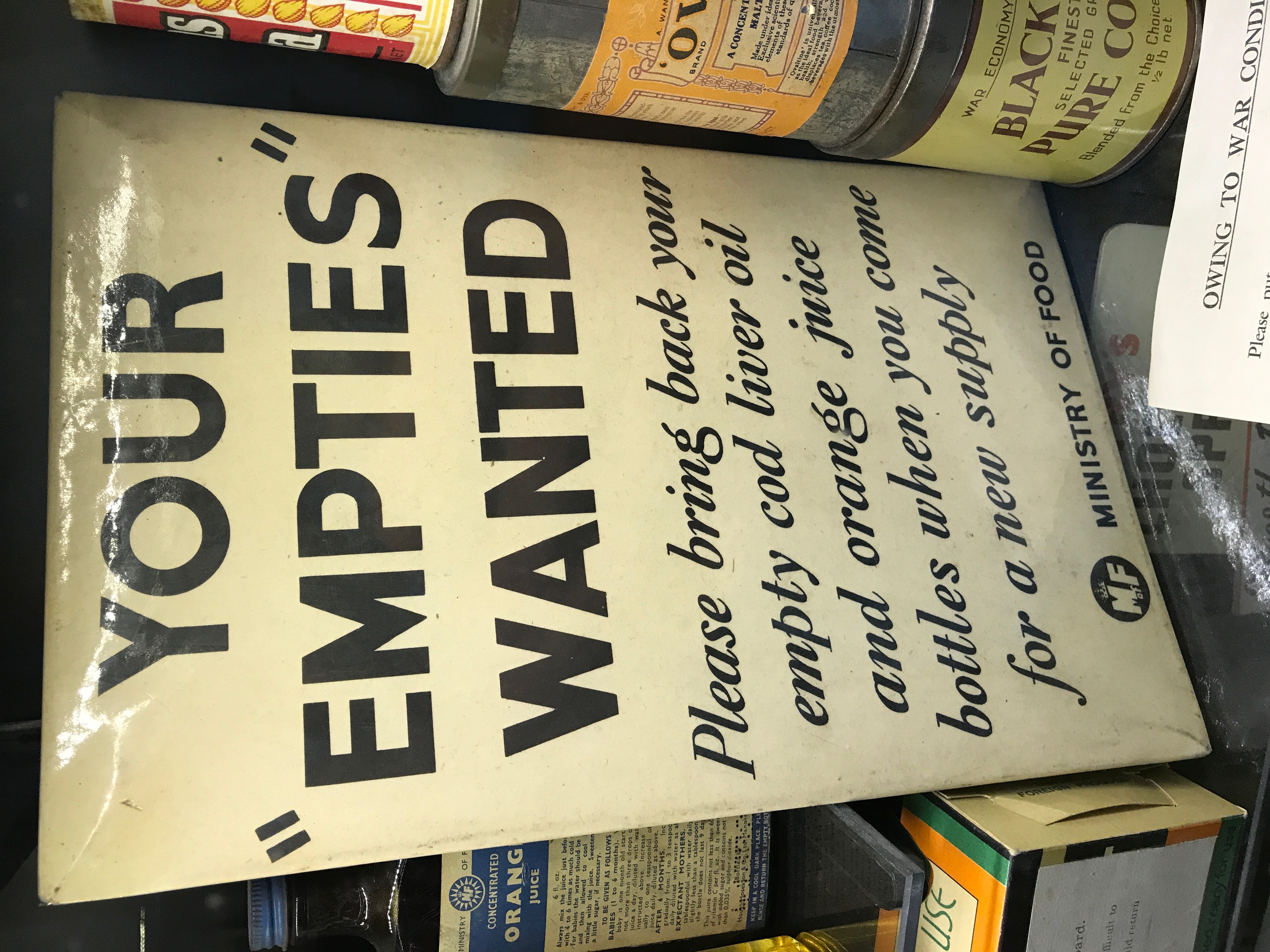
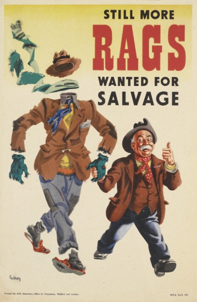
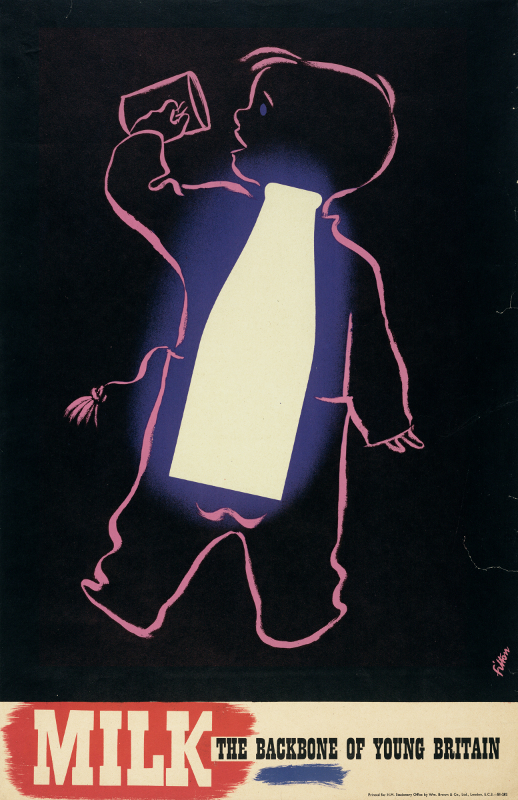
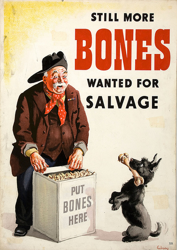
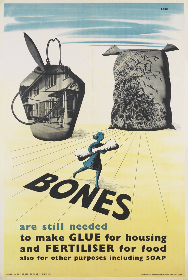
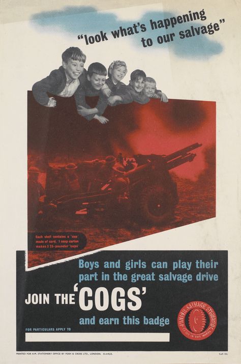
Waste was a major concern during WWII. Waste caused factories to have to build consumer goods instead of war materials. Posters during this time called for recycling, rationing, and self-growing. Clothing is a major source of waste. Posters called for ‘Make Do and Mend.’ This called for people to not buy new clothes. It encouraged them to be content with the clothing they had now, and if something was tattered that they mend it themselves. There were also posters rag donations. It encouraged people to donate any material scraps to rag collectors so that the material could be used for blankets and uniforms for the soldiers. Food waste was another concern during the war. The food supply was limited during the war. To help combat this problem the government created a series of posters. One kind encouraged people to grow their own food. This allowed people to grow what they like and not put strain on farmers or the food packaging industry. This saved tin cans and other materials needed to pack food so that they could be used for war materials such as helmets and bullets. There were also posters created about portion size. The food supply was limited since some food companies changed their factories to create war materials. These posters had slogans such as ‘A clear plate means a clear conscience.’ This encouraged people not to take more food than they could eat. This helped to prevent waste and aimed to allow everyone an equal opportunity to food. There was also a campaign about milk. Calcium intake among vulnerable sections of British Society was a priority for the Ministry of Food. The increased calcium was believed to help keep pregnant women and children healthy. During this time, Milk rations were increased for these two groups. This even initiated a provision of free milk to school children from 1946 to 1971. The posters had slogans such as ‘Milk: The Backbone Of Young Britain.’ This poster depicted a child with a glass bottle of milk as a spine drinking a glass of milk. Aside from food people were encouraged to recycle. Children were encouraged to collect metal, paper, and rags for recycling. The poster below depicts soap cartons collected by children being used as artillery shells in war. Bones were also highly sought after. The recycling of bones allowed them to be used as glue or fertilizer. During the war Britain had to be self-sufficient due to the attacks shipping.[8]
Good v. Evil
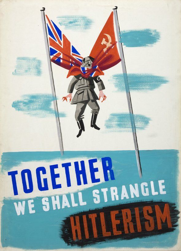
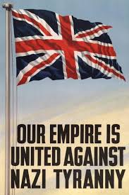
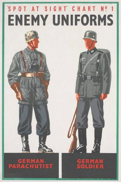
These types of posters were used as propaganda during the war. It was a way for the British government to justify their involvement in the war. The posters also aimed at the viewers’ emotions. They were aimed to boost morale and share specified ideologies. It was important during this time that people knew who the enemy was. This eliminated the possibility of people questioning the ethics of the war and reduced the probability of becoming traitors[9]. The posters portrayed the Germans as evil, heartless people that needed to be stopped.
Support
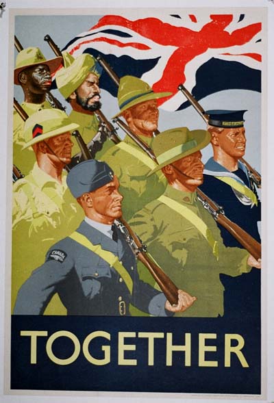
Support posters are probably most of the propaganda posters you've seen. They called for all men and women to help Britain win the war. Some called for women to work in factories to make weapons or planes while the men were at war. Other posters called for women to work on farms. They conveyed the message that everyone had an important role to play. This allowed the public to feel involved in the war.
Careless Talk
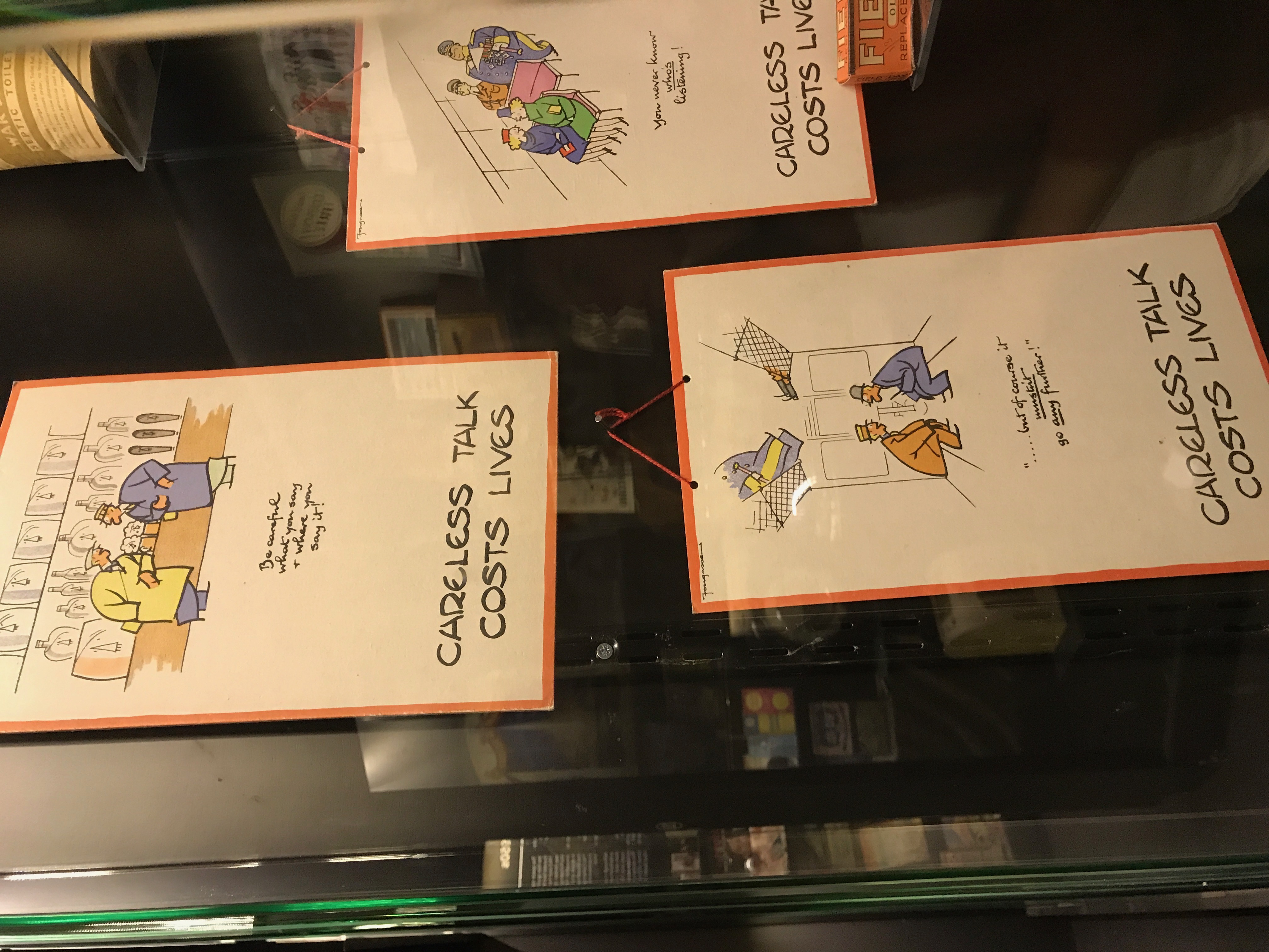
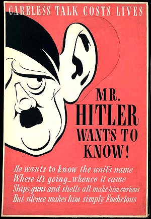
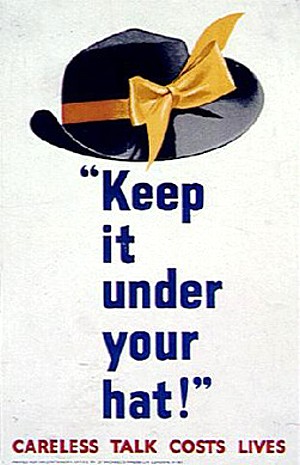
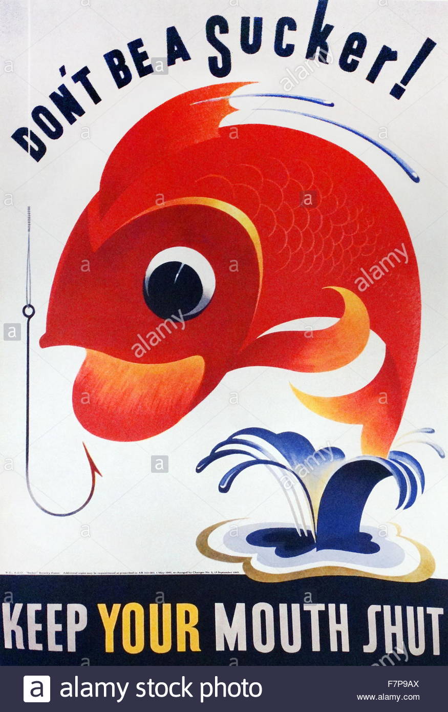
'Careless Talk Costs Lives' became some of the most notable posters from this era. The campaign against carless talk was very important. It was intended to keeping people from divulging information to enemy sympathizers or enemy spies. Casual talk could allow the enemy to target specific targets and cause mass causalities. With the influx of anti-Nazi German refugees had people on edge that they were spies actually working for the Germans. To add to the hysteria, these refugees were rounded up, arrested, and sent to the isle of man. Not wanting to leave anything to chance, Winston Churchill ordered an anti-gossip campaign in 1941: careless talk [10].
Section 2: Deliverable
Comparisons
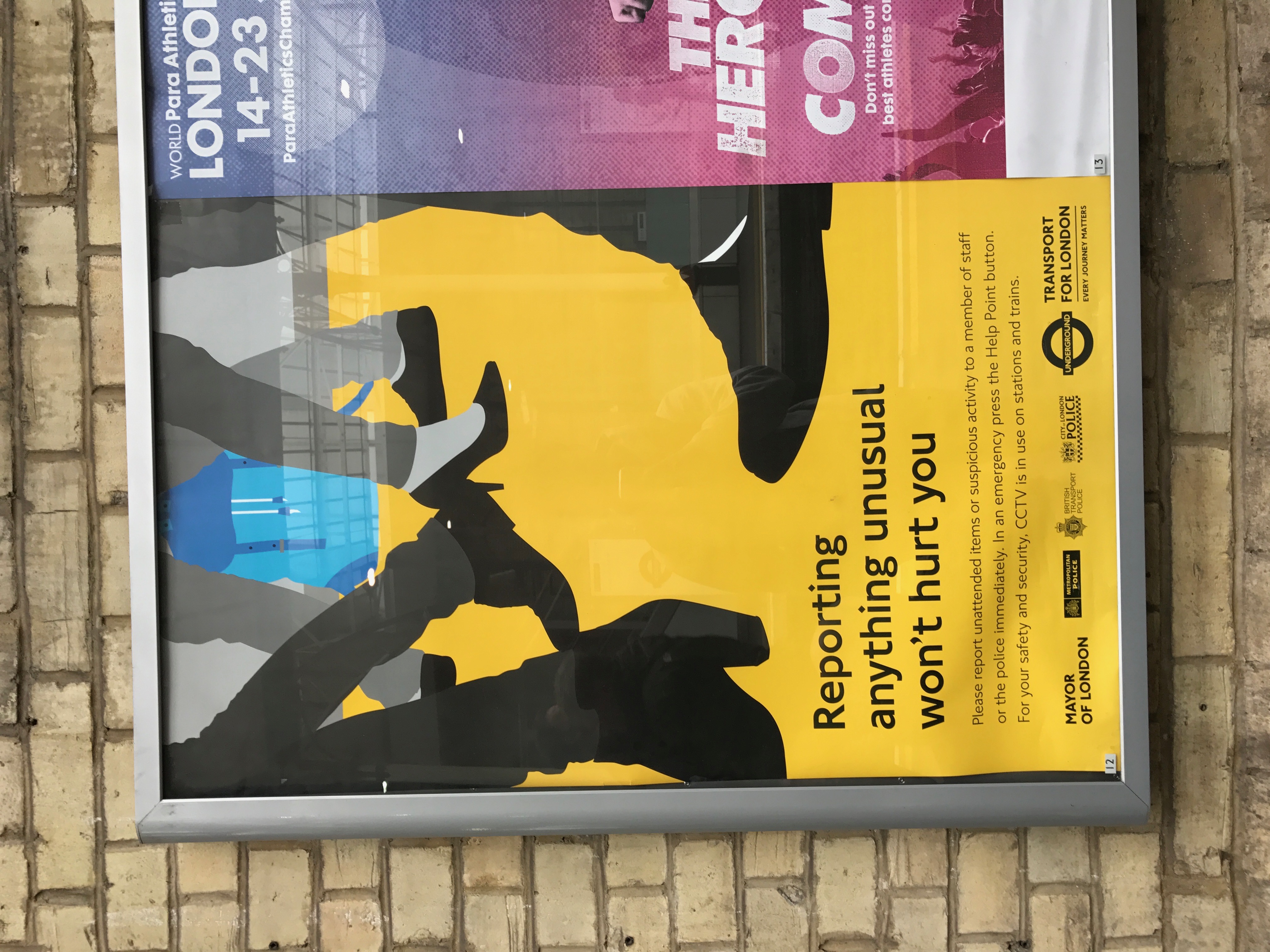
Current day war advertising isn't as it was during World War II. This is because there isn't a direct enemy to fight against. Today we are fighting with the concept of terrorism instead of a dictator like Hitler. In my opinion, today's war is so much more complicated. Instead of fighting a person, we're trying to fight a radical idea. Today's advertising reflects this. Today in tube stations, you will find some sort of poster about reporting something unusual. The poster usually depicts a bag that was left on the ground by someone and everyone walking around it. This poster is meant to make the passenger more aware of their surroundings in order to keep them safe. By placing these posters, the idea of suspicious solitary bags will be in the backs of peoples' minds. This will make them more likely to report something more unusual.
Similarities
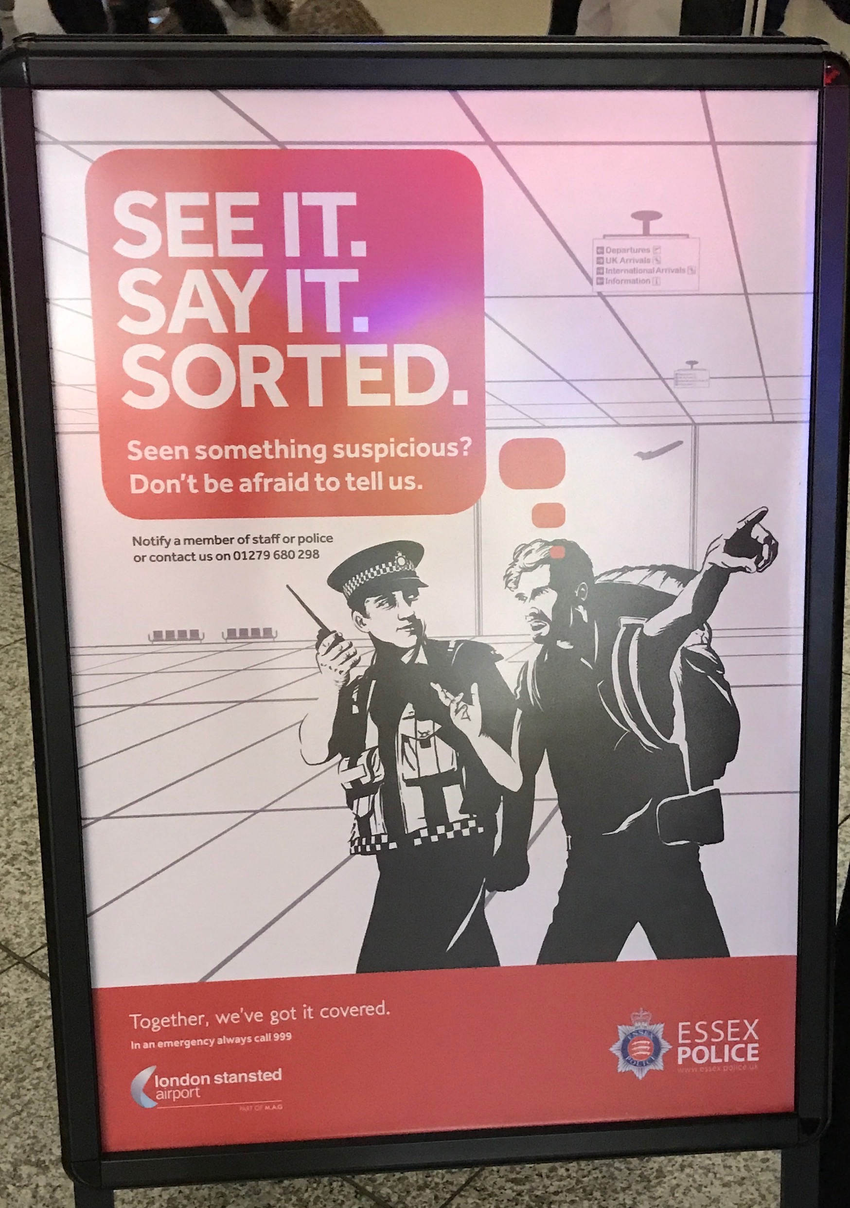
Through my analysis of these posters, I have noticed they have similar color and layout patterns. I believe this to be due to the idea that people will only read a few words of a poster as they walk by. More likely than not they will not stop to read the entire thing because it looks long and that it will waste their precious time. By bolding the important text and phrasing it as a command, it is urging the importance of the message it is trying to portray. Shown below is the poster I mentioned, 'Report Anything Unusual Won't Hurt You.' The background of the poster is yellow. Yellow has been known to be the color that draws the most attention to the eye or signal danger, making it more likely to be seen; this is why school buses and some poisonous plants are yellow. The text is short, bolded and phrased as a command, making it very easy to get the attention of the reader. Also shown below is a poster I saw in Stansted airport in London. This was two days after the terror attacks on London Bridge and Borough Market. The sign says 'See it, Say it, Sorted.' Again this poster uses short commands and contrasting colors to draw attention to the eye. This poster has a white background and a red text box making it very bold on the poster. It depicts a man reporting an incident to a police officer and it appears the police officer is handling the situation. This is meant to show how easy it is to diffuse a potentially dangerous situation.
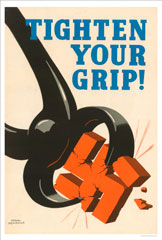
The World War II posters are very similar. They have bright colors and command sentences. Instead of a bright background, they used colored text on a white background for a lot of posters. Most of the posters had one sentence in a much larger text relating to the picture behind it. This can been on the 'Tighten your Grip' poster. The sentence is bold, bright, and relating to the picture, similar to modern day posters.
I feel the similar histories behind the posters are what allowed them to become so similar. Currently, the war on terror is unpredictable. We have no way of knowing when or where an attack can happen. The only real way to combat this is to prepare people for the worst and urge them to remain vigilant. This was the same approach used during the air raids/blackouts during World War 2. The civilians had no way of knowing it was coming or where they were going to attack. They could only fight it by making sure their windows were completely blacked out. Since this approach worked well, I feel the government is trying the same approach now to fight terror. In my opinion it is working well. People are reporting suspicious activity and remaining proactive, not reactive. I say this because a few times on this trip I've had to wait upwards of thirty minutes for a train because someone had left a piece go baggage and someone reported it to the authorities.
Differences
The most obvious difference between the two sets of posters is content. There were more things to warn the public about during World War II than there is now. Currently, there is no declared war so precautions like rationings and evacuations are not necessary. The war on terror is hard because there is no way to prevent it, like using blackouts to avoid air raids. The only way to combat terrorism is to remind people to stay vigilant. There is also a difference in language. In the World War II posters, the language suggests that by you doing your part, you can help to win the war. This is clear in the rationing, growing your own food, recycling, and evacuation posters. Today's posters use language that implies that it is a team effort in order to win the war on terror. It uses language such as we and together. Today's society places teamwork and cooperation as a main focus. By wording the posters this way, it allows the viewer to feel like they are part of something bigger than themselves. There is also the idea that if you do not do your part you are letting your team down.
Interpretations
Based on the number of posters produced during both time periods, the government placed a great amount of emphasis on the topics. The posters from World War 2 seem to be cartoon-like. I feel there is a few reasons for this. The cartoon-like pictures allowed people to get the message across without scaring them. Everyone grew up watching cartoons and more often then not the cartoons taught us things. The posters are acting in the same way. It allows the message to come across in a cartoon world and not necessarily the one they are living in. This makes the threat seem less dangerous and people will still get the message it is trying to portray. I also feel that the posters were created in this fashion due to the lack of computers. I know from personal experience it much easier to draw cartoon-like things than it is to draw real-life objects. Since there were no computers or image editing software, they had to draw the posters by hand.
Today I feel the opposite is true. Due to the exposure people have to violence, whether it be in movies, video games, TV shows, etc., people are becoming numb to it. The way advertisers are trying to captivate the viewer's attention now is to use real-life and bold examples. The use of computers helps them to achieve this. The posters now also make me feel as if the situation described can happen near me at any time. This keeps me on my toes and keeps me vigilant.
If I had to choose which era of posters made me more aware and wanting to participate, I don't believe I would be able to fairly choose.I have never faced things that occurred during World War 2: blackouts, rationing, careless talk, recycling, and evacuations. The problems in each set of posters depicted societal problems at that time. We do not face rationings and evacuations today just as in the 1940's, they did not have to worry about reporting suspicious baggage or having an uneasy feeling in a large crowd. For the time period they were intended for, these posters did a fantastic job of getting an attempted solution across to a societal problem.
Future of Advertising
Advertising is changing rapidly. It has to adapt to changing societies and current world problems. This means new medias to get the message across. Posters are a great way for people to get information as they pass by. But advances in technology can allow for screens to rotate through countless posters in the same amount of space where one poster once hung. These digital advertisements are a lot cheaper to produce and easier to change. They can also incorporate multi-media elements such as video and sound. This can increase the probability of attracting the person passing by's attention. This will allow the advertisement to be more effective and have a further reach. These digital posters also have the potential to be shared on social media. Social media is a world-wide platform for sending information. In a matter of minutes, information has the potential to be seen by millions of people. Currently governments use social media to get information to people but it doesn't seem to be effective. For example, the President of the United States has 18.4 million followers on twitter (source: twitter). The current population of the United States is 321.4 million people. For this example, lets just say that all 18.4 million followers live in the United States. In reality there is probably a good number of followers who don't. In this situation, this means that only 5% of the population follows the President on twitter. This does not seem like an effective medium to spread information. In my opinion, a more effective medium the government could pursue in the future is push notifications to your phone. This means that you would get an alert if the government wants to tell you something important. This system is currently in place for Amber Alerts and Emergency Alerts. It would not be unlikely that the government begins to use this system more often.
In general, the future of advertising is going to stray away from the use of paper and incorporate more technology. This is present in every day life. E-readers are replacing books, Google is replacing encyclopedias and libraries and phone games are replacing board games. There is a push around the world to use less paper and be more eco-friendly. This initiative will force the government to follow the trend of going paperless. I do not believe the language or layout of these posters will changing. The style of bright colors and command sentences have proven to be effective. This has been used in posters for the past century. I do not see a new style taking precedent any time soon.
Conclusion
In this section, provide a summary or recap of your work, as well as potential areas of further inquiry (for yourself, future students, or other researchers).
References
- Age, A. (2005, March 28). 1940s War, Cold War and Consumerism. Retrieved May 24, 2017, from http://adage.com/article/75-years-of-ideas/1940s-war-cold-war-consumerism/102702/
- McDonough, J., & Egolf, K. (2015). The advertising age encyclopedia of advertising. Routledge.
- World War Two : Government Posters. (2008). Retrieved May 29, 2017, from https://nationalarchives.gov.uk/documents/education/propaganda.pdf
- Samborski, J. World War II Propaganda.
- Messinger, G. S. (1992). British propaganda and the state in the First World War. Manchester University Press.
- Museum of Brands, Packaging and Advertising, London UK
- Clouting, L. (n.d.). The Evacuated Children Of The Second World War. Retrieved June 01, 2017, from http://www.iwm.org.uk/history/the-evacuated-children-of-the-second-world-war
- Harris, K., & Webb, C. (n.d.). Second World War Posters. Retrieved June 1, 2017, from http://www.iwm.org.uk/learning/resources/second-world-war-posters-0
- Dig for Victory. (n.d.). Retrieved June 06, 2017, from http://www.bl.uk/learning/timeline/item107597.html
- Aldgate, A., & Richards, J. (2007). Britain can take it: The British cinema in the Second World War. IB Tauris.
- New Restrictions on the Home Front- Britain is Blacked Out. (n.d.). Retrieved June 05, 2017, from http://www.homesweethomefront.co.uk/web_pages/hshf_blackout_pg.htm
- Dawson, E., & Rafferty, P. (2001). 'Careless talk costs lives': a case study examining the operation of information in British domestic posters of the Second World War. New review of information and library research, 7, 129-155.
